Changelog
Released
New Blocks - Jun 2026
Added 73 new blocks
New Blocks
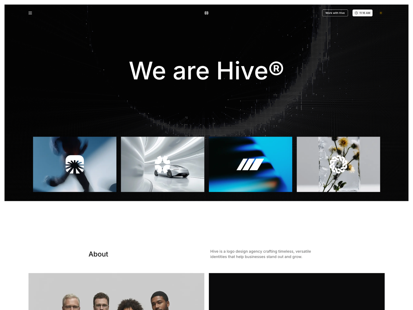
Rob Austin
Founder
Released
New Template - Verdict
A professional small business and services template built on shadcn/ui and Tailwind. Available in both Next.js and Astro editions, ideal for professional service businesses.

Rob Austin
Founder
Released
Shadcn Admin Kit v2.2.0
Shadcn Admin Kit v2.2.0 adds two major app sections — Project Management and Todo — integrated into the shared admin shell with sidebar navigation, mock data, and mobile polish throughout.
Project Management App
Adds a full Project Management section under /project-management/*, integrated into the admin sidebar and app shell.
Dashboards (4 variants)
- Dashboard 1 — Command-center workspace with profile rail, work-hour analysis chart, issues table, time tracker, events/focus sections
- Dashboard 2 — Portfolio-style overview with issue map and theme-driven charts
- Dashboard 3 — Project tracking and status visualization
- Dashboard 4 — Dependency dashboard with delivery-flow metrics and insights
Projects
- Project List 1–4 — Card, table, sidebar, and filtered list layouts with sticky section headers and dark-mode polish
- Project Detail 1–2 — Rich detail screens with:
- Tabbed layout (overview, activity, embedded issue views)
- Side rail (notes, files, milestones, schedule)
- Interactive dependency canvas
- Delivery flow panel
- Mobile-optimized header and meta panels
Teams & Members
- Team List 1–3 — Team directory with task-card and card-grid variants
- Member List 1–3 — Table view, card grid, and invite-panel screens
Issues — multiple view types
| View | Routes | Highlights |
|---|---|---|
| List | issue-list-1, issue-list-2 | Plane/Huly-style grouped lists, assignee avatars, dense row layout |
| Kanban | issue-kanban-1–3 | Drag-and-drop reordering, pipeline/status-bar/stats variants |
| Calendar | issue-calendar-1, 2 | Weekly grid, draggable events, editable event drawer |
| Gantt | issue-gantt-1 | Timeline with week/month/quarter views, quick-add footer |
| Spreadsheet | issue-spreadsheet-1 | Spreadsheet-style issue grid with sticky columns |
| Detail | issue-detail-1, 2 | Comments feed, interactive subtasks, linked endpoints, activity pane |
Inbox
- Inbox 1–4 — Support inbox shell, ticket conversations, issue preview/composer, full-width layout
- Inbox Email 1 — Opened email reading view with navigation back to inbox
Shared infrastructure
- Large mock-data layer (
project-details,projects,clients, etc.) - Reusable PM components (gantt, kanban, calendar, issue core, meta/property grids)
- Theme controls for PM-specific styling
- Mobile responsiveness pass across dashboards, lists, gantt, calendar, kanban, inbox, and detail screens
- Sidebar nav group: Project Management with all routes linked
Todo App
Integrates the shadcn-todo-app as a first-class admin app at /todo/*, inside the shared admin layout (sidebar + header).
Core task management
- All Tasks (
/todo) — Main inbox with add/edit/complete/delete - Smart lists — Today, Upcoming, Important
- Projects — Per-project task views (
/todo/projects/[id]) - Create Task — Dedicated full-page create flow (
/tasks/new) - Task Detail — Full page (
/task/[id]) plus intercepting modal (@modal/(.)task/[id]) for in-context editing
View modes
- List — Sortable, filterable task list with manual reorder (drag-and-drop)
- Kanban — Board view by status
- Calendar — Due-date calendar view
Task features
- Priorities, labels, starred/important flag
- Due dates and reminders
- Subtasks and comments
- Sort options: manual, due date, priority, title, created date
- Filters: project, priority, label, starred-only
- In-memory state via Zustand store (mock data, no backend)
Additional pages
- Activity — Task activity log
- Notifications — Notification center UI
- Trash — Deleted tasks (
/deleted) - Settings — Tabbed settings (Account, General, Subscription, Themes, Integrations, Apps)
UX & integration polish
- Moved todo app inside the admin app shell (shared sidebar/header)
- Centralized routing via
src/lib/todo-routes.ts(todoRouteshelper) - Display preferences — Font size, density, text/display font choices
- Search dialog in todo nav
- Friendly not-found page for invalid in-memory task links
- Todo-specific calendar colocated under the route group
- Sidebar nav group: Todo with tasks, projects, and manage links
At a glance
| Project Management (#31) | Todo (#32) | |
|---|---|---|
| Routes | 32 pages | 12 pages |
| Scope | ~172 files, +33k lines | ~141 files, +15k lines |
| Data | Mock JSON / in-memory | Zustand + mock data |
| Sidebar | Dashboard, Projects, Teams, Members, Issues, Inbox | Tasks, Projects, Manage |
Rob Austin
Founder
Released
New Blocks - May 2026
Added 111 new blocks
New Blocks
Rob Austin
Founder
Released
New Template - Meridian
A premium developer tools SaaS template with a signature intro animation, Motion/GSAP interactions, and Fumadocs-powered MDX docs with ⌘K search. Available in both Next.js and Astro editions.

Tech stack:
- Next.js 16 or Astro 6
- shadcn/ui & Tailwind CSS 4
- Motion & GSAP
- Fumadocs MDX docs
Rob Austin
Founder
Released
New Feature - Shadcnblocks IDE Extension
Browse and install shadcn/ui blocks directly from your IDE with the new Shadcn IDE Extension. Search, preview, and install 1300+ blocks without leaving your editor.
What you can do
- Browse blocks in your IDE — Search and preview all 1300+ blocks directly inside VS Code, Cursor, and more.
- One-click install — Install any block into your project without leaving your editor.
- Works with your workflow — Uses the same shadcn/ui CLI under the hood, so blocks land in your codebase ready to use.
Rob Austin
Founder
Released
New Shadcn Page Builder
You can now compose full pages from Shadcnblocks right inside the site using The new Shadcn UI Page Builder. The Shadcn Page Builder lives in the Explorer alongside blocks and components, so you can browse library pages, open the builder, and arrange sections without leaving the workflow.
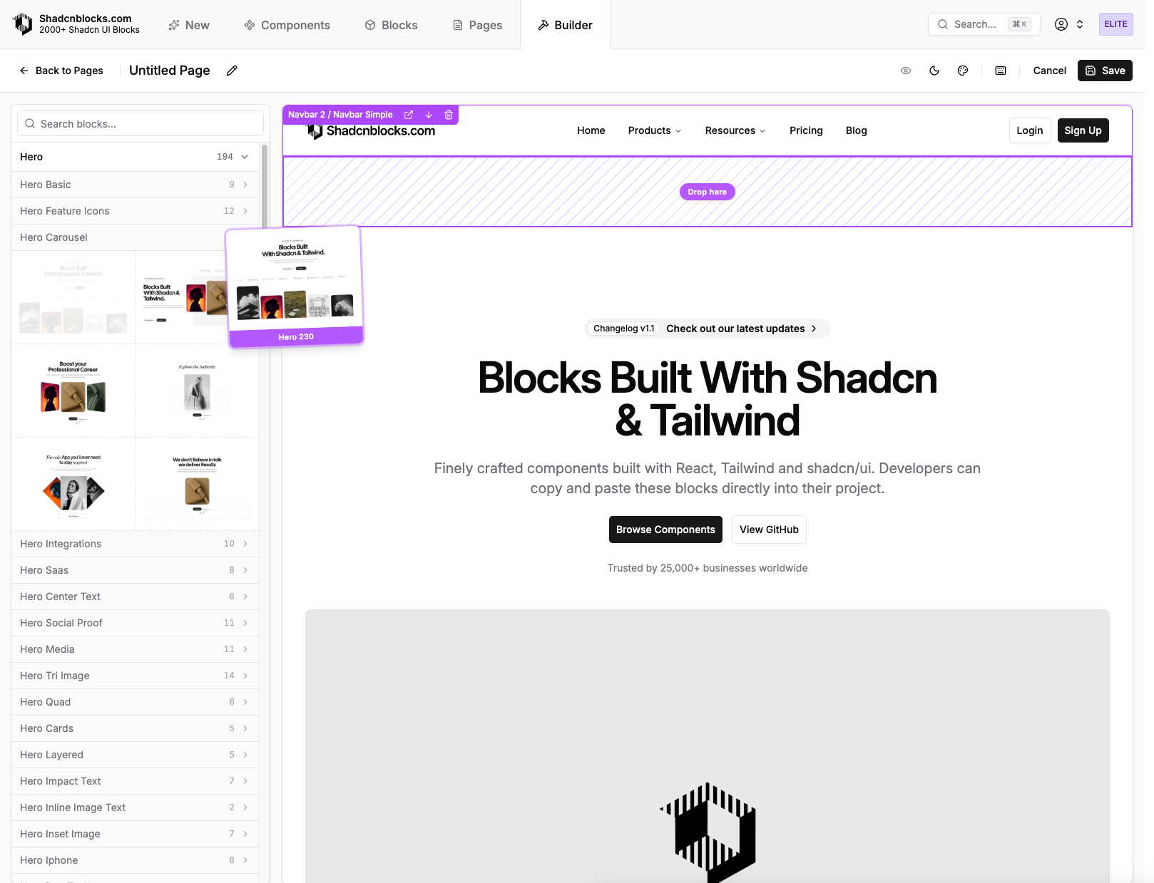
What you can do
- Browse pre-built pages — Explore pre-built pages the same way you explore blocks and components.
- Open the builder — Start from Shadcn Page Builder to create or edit a page layout: add blocks, reorder sections, and tune structure in a dedicated editor.
- Install with the Shadcn CLI — Pull page layouts into your project using the same shadcn/ui CLI workflow you use for blocks and components, so pages land in your codebase ready to extend.
Rob Austin
Founder
Released
New Blocks - Apr 2026
Added 87 new blocks
New Blocks
Rob Austin
Founder
Released
New Blocks - Mar 2026
Added 56 new blocks
New Blocks
Rob Austin
Founder
Released
Astro 6 Templates Update
All ouf our premium Shadcn UI Astro templates have been upgraded to Astro 6.
This is a major refresh for anyone building with our Astro templates. We have upgraded the full Astro template lineup to Astro 6 so you start from the current framework generation—better defaults, a cleaner upgrade path, and access to the latest Astro ecosystem improvements out of the box.
Deployment: tested on three major platforms
Shipping to production should not be guesswork. We have added and verified deployment guidance and configuration for three of the most common hosts for static and server-rendered Astro apps:
- Vercel — fast global delivery and straightforward Git-based deploys
- Netlify — mature build pipelines and edge-friendly hosting
- Cloudflare Pages — strong performance at the edge with a simple Pages workflow
Browse the full catalog and grab the Astro versions of any template you need on our Templates page.
Rob Austin
Founder
Released
Figma Kit v2.0
Shadcn Figma Kit v2.0 Released 🔥
- Light/dark mode support via Figma variables
- Theme system with Shadcn, Tweakcn, and custom theme support
- Two-layer variable architecture for independent theme and mode switching
- Typography system mapped to Tailwind text classes
- Lucide icons with instance swapping
- All shadcn/ui components rebuilt from the ground up
- 500+ pro blocks with responsive variants (Desktop, Tablet, Mobile)
- All blocks published in Assets panel and instance swappable
- Token names match actual Shadcn CSS variables
Rob Austin
Founder
Released
New Feature: Base UI Support
We're excited to announce Base UI support for all Shadcnblocks components. You can now choose between Radix UI and Base UI as the underlying primitive library for your shadcn/ui components.
Why Base UI?
Base UI is a headless component library from the MUI team. It offers:
- Smaller bundle sizes compared to Radix UI
- Zero styling overhead
- Active development and regular updates
How to Use
- Open the Explorer
- Select Base UI in the sidebar's UI Library dropdown
- Preview blocks with Base UI primitives
- Download a pre-configured
components.json - Install blocks with the CLI—they'll use Base UI automatically
Configuration
Your components.json now supports library-style combinations:
{
  "style": "base-vega"
}
Available options: base-vega, base-nova, base-maia, base-lyra, base-mira
All 5 component styles work with both Radix UI and Base UI.
Rob Austin
Founder
Released
New Feature: Component Styles
Introducing component styles for shadcn/ui—the same styles available in the Shadcn UI Create page. This gives you control over the visual appearance of every component in your project.
Available Styles
- Vega (New York) — The classic shadcn/ui look. Clean, neutral, and familiar.
- Nova — Reduced padding and margins for compact layouts.
- Maia — Soft and rounded, with generous spacing.
- Lyra — Boxy and sharp. Pairs well with mono fonts.
- Mira — Compact. Made for dense interfaces.
Preview in the Explorer
The Explorer now includes a Component Style selector in the sidebar. Switch between styles instantly to see how any block looks with different visual treatments.
How It Works
Styles are configured in your components.json:
{
  "style": "radix-maia"
}
The format is {library}-{style}, combining your UI library choice (Radix or Base) with your visual style preference.
All Combinations
radix-vega,radix-nova,radix-maia,radix-lyra,radix-mirabase-vega,base-nova,base-maia,base-lyra,base-mira
When you install blocks via the CLI, they automatically use your configured style.
Rob Austin
Founder
Released
Explorer Upgrades: Styles, Base UI & Performance
The Explorer has received a major upgrade with new features and significant performance improvements.
New Sidebar Options
- Component Style Selector — Preview blocks in all 5 styles (Vega, Nova, Maia, Lyra, Mira)
- UI Library Selector — Switch between Radix UI and Base UI
- Improved Theme Picker — Faster theme switching with better previews
- Full-width Dropdowns — Cleaner, more accessible interface
Configuration Export
- Smart components.json — Downloads now include your selected style and UI library
- Docs Link — Quick access to installation documentation from the toolbar
- Improved CLI Display — Full command visible on larger screens
Performance Improvements
- Faster initial page load with optimized API calls
- Smoother scrolling in the block grid with virtualization
- Reduced re-renders when changing preview options
- Better memory management for large block libraries
Updated Paywall Experience
- Clearer messaging about what's included with Pro access
- Detailed feature checklist showing all benefits
- Consistent "Get All Access" call-to-action
Quality of Life
- Bug report button with improved accessibility
- Fixed scrollbar shift when opening dropdowns
- Better mobile responsiveness in the sidebar
Rob Austin
Founder
Released
New Blocks - App 1
Added 188 new blocks
New Blocks
Rob Austin
Founder
Released
New Blocks - Dec 2025
Added 182 new blocks
New Blocks
Rob Austin
Founder
Released
Over 1,000 New Component Patterns Released
We're excited to announce the release of over 1,000 new component patterns to shadcnblocks!
These components are currently free and provide more complex usage examples for all the core shadcn/ui components.
For more information about this release, check out our announcement post about the Kibo UI acquisition.
Rob Austin
Founder
Released
New Blocks - Nov 2025
Added 50 new blocks
New Blocks
Rob Austin
Founder
Released
New Blocks - Oct 2025
Added 100 new epic Portfolio blocks!
New Blocks
Rob Austin
Founder
Released
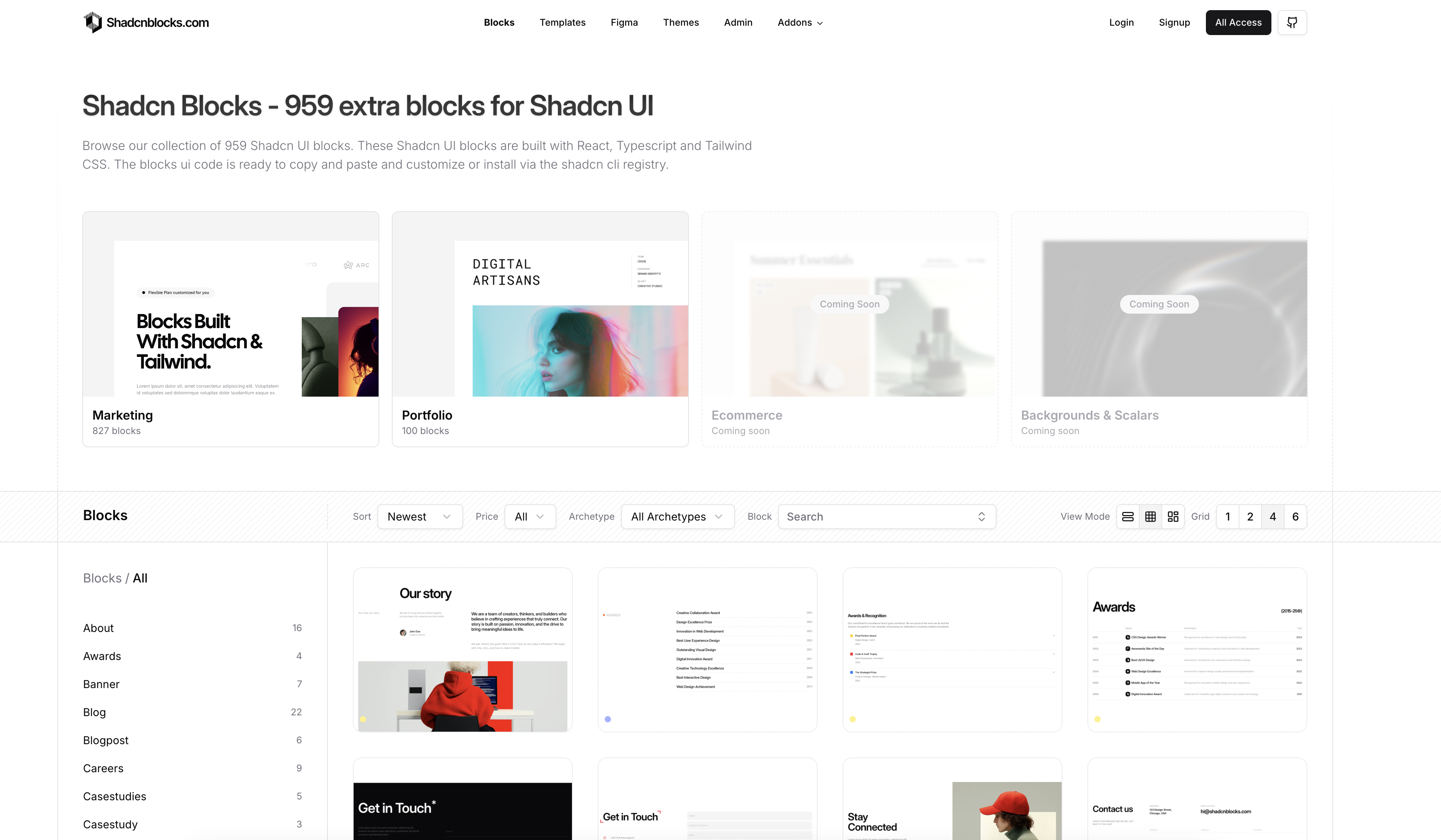
New Feature: Improved Block Viewer
We've updated our Blocks page with an improved UX/UI.
New features include:
- Filter by archetype (marketing, portfolio etc)
- New sidebar that with block categories, provides better organization with clear category groupings
- Sticky filters and sorting bar that remains fixed as you scroll
Rob Austin
Founder
Released
New Feature: Open Source
We're excited to announce that we've open sourced our Mainline template and all of our free blocks!
The Mainline template is now available on GitHub with both Next.js and Astro editions. This is our most popular template featuring a minimal yet unique landing page design built with shadcn/ui and Tailwind 4, including all the core pages and sections you need for a marketing website.
All free blocks in our library are also now open source and available for the community to use, contribute to, and learn from. This is part of our commitment to supporting the open source ecosystem and making high-quality components accessible to everyone.
Download, fork, and contribute to these projects on GitHub. We can't wait to see what you build with them!
Rob Austin
Founder
Released
New Blocks - Sep 2025
Added 50 new blocks
New Blocks
Rob Austin
Founder
Released
Fumadocs & Starlight Docs
We’ve expanded the Scalar and Plasma templates with full documentation pages and MDX changelogs.
- The Next.js version now integrates with Fumadocs
- The Astro version now uses Astro Starlight
Originally, these two templates were designed as “developer SaaS” marketing sites. Based on your feedback, we’ve now added Docs and Changelog pages.
Rob Austin
Founder