Integration 3 block design & features
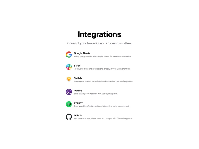
The Integration3 component provides a centralized section to showcase and explain integrations with various external services, enhancing workflow through seamless connectivity. It effectively communicates key integration benefits through a visually structured layout that highlights both icons and descriptions, making it easier for users to understand what each service offers.
This component serves as a shadcn block that brings emphasis to the integrations users can leverage, combining both visual and textual content to deliver a comprehensive overview. Key sections include a prominent header and subheader, followed by an organized list of integrations, each with an associated icon for immediate recognition, title, and a brief description. This design choice supports an informative and engaging user experience, suitable for showcasing how various services can enhance operational efficiency.