Shadcn UI Integration Blocks, Sections & Components
Integration blocks are dedicated sections of a webpage focused on integration content. They appear on landing pages, product pages, and marketing sites as key elements that communicate value and drive user engagement.
Each block is a self-contained React component which you can copy/paste the code or install via the shadcn CLI. You own the code and can modify however you like, or us AI and LLMS to quickly change the design.
Our integration blocks combine headlines, supporting text, images, icons, CTA buttons, and responsive layouts. Each block is designed with clear visual hierarchy and consistent spacing to integrate seamlessly into any page structure.
Choosing the Right Integration Section
Different goals call for different integration sections. We’ve organized our integration blocks into subgroups so you can find the right layout for your use case:
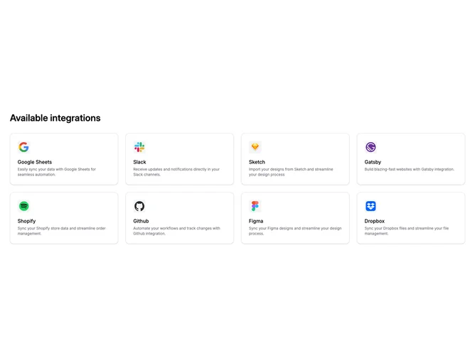
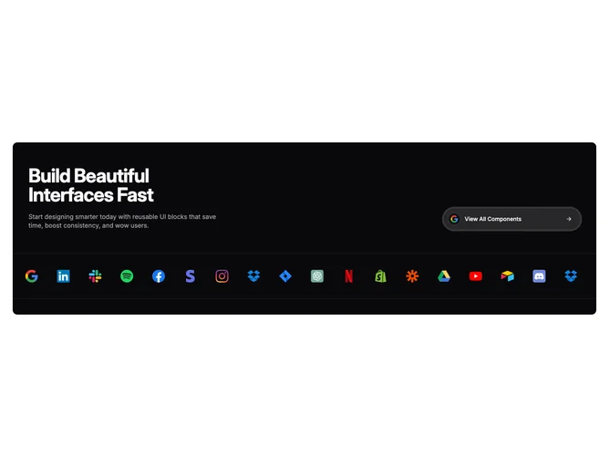
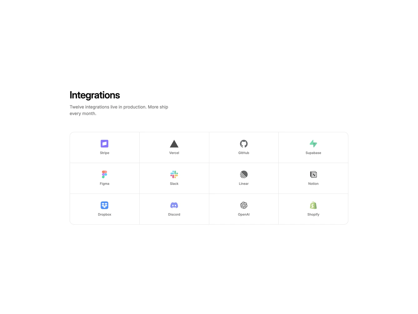
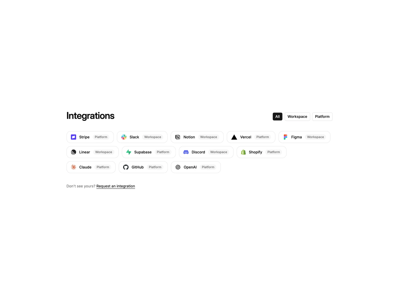
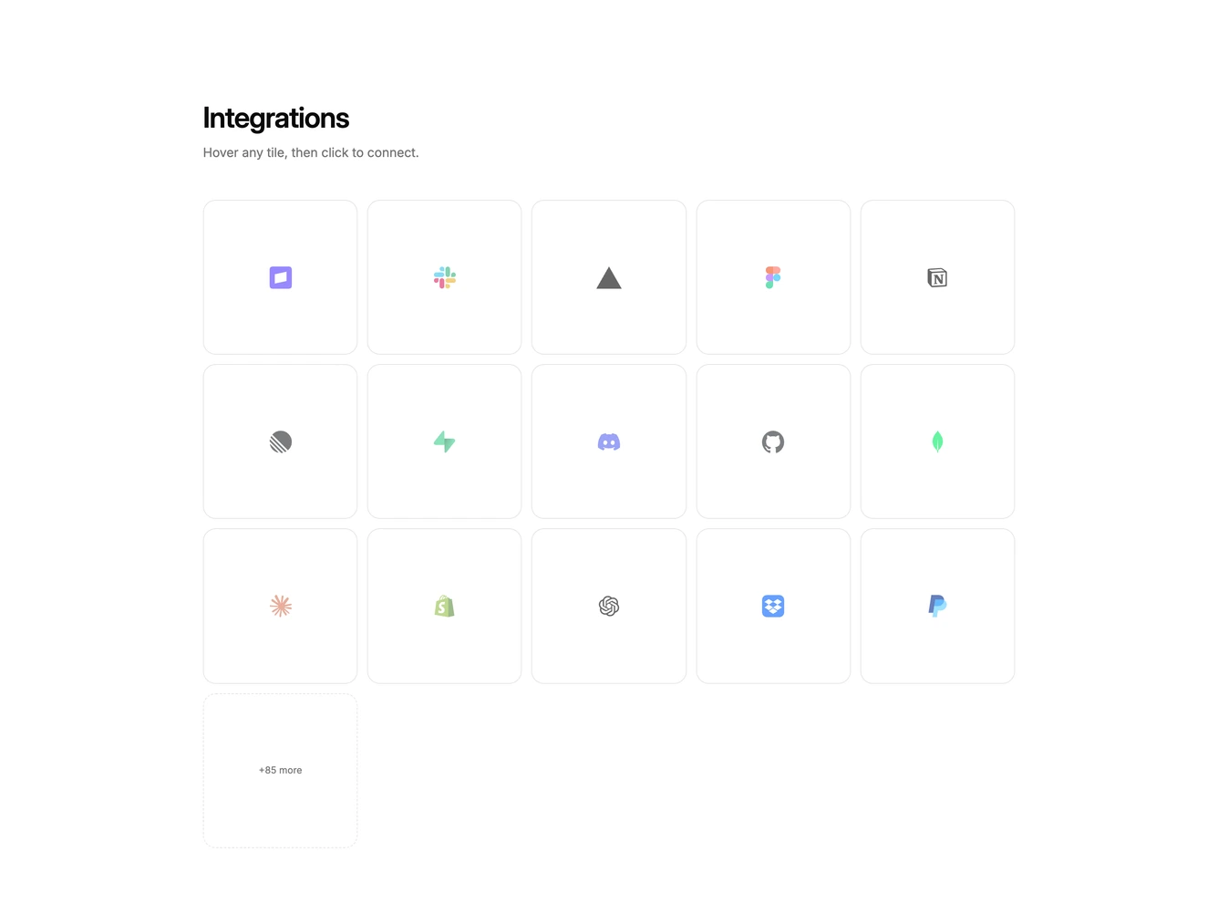
- Shadcn Integration Logo Grid - Dense grids of partner marks that you can scan, hover, or click to connect.
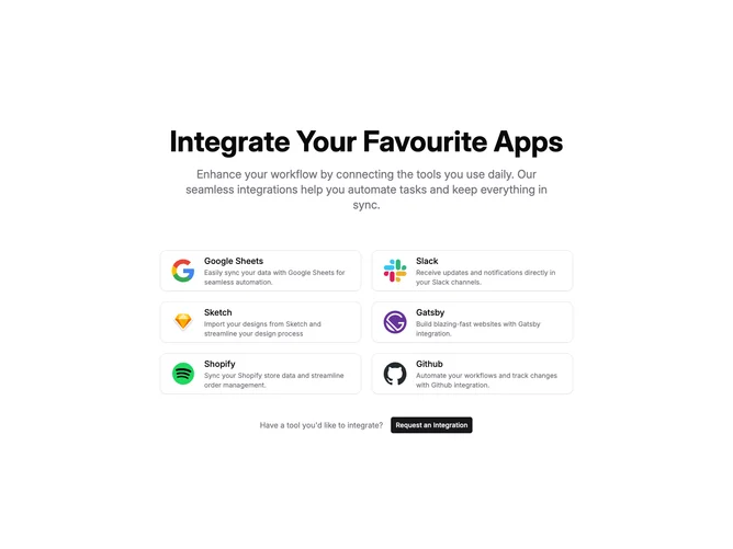
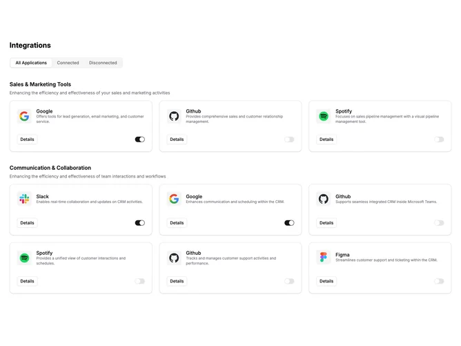
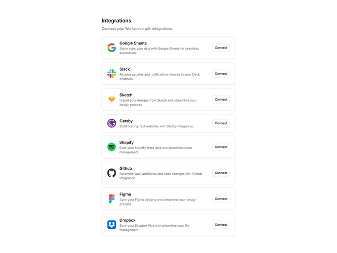
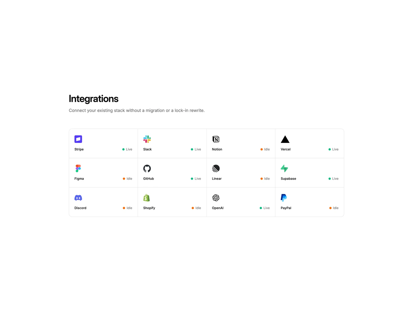
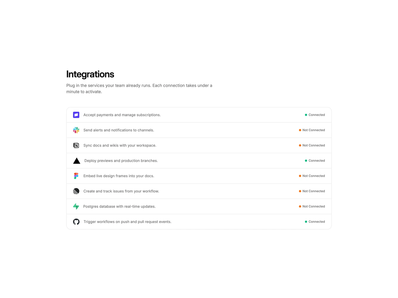
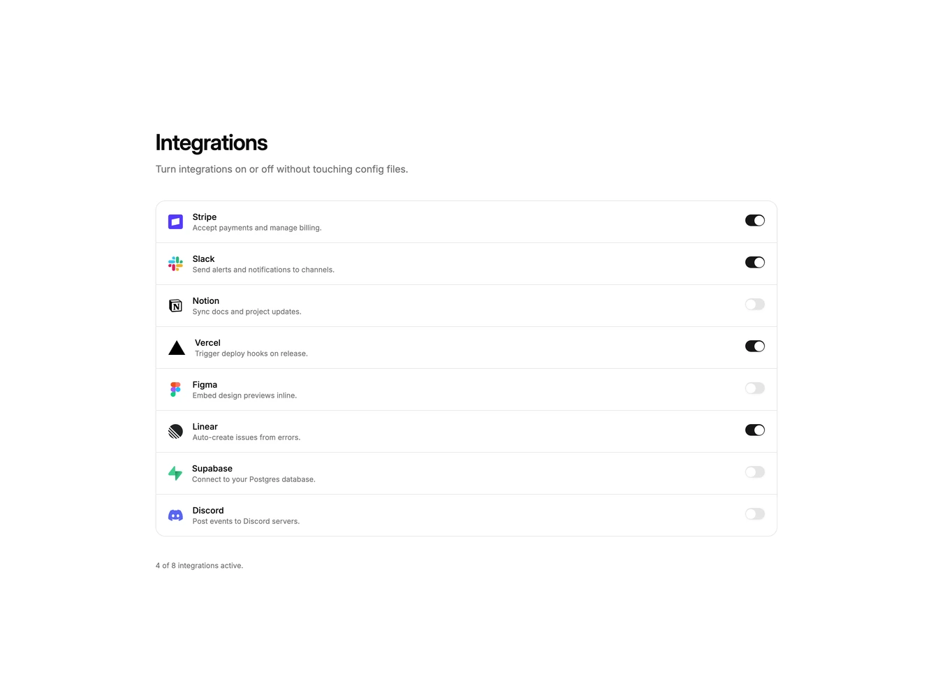
- Shadcn Integration Settings - Settings-style lists for enabling, connecting, and managing integrations.
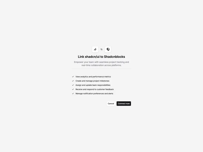
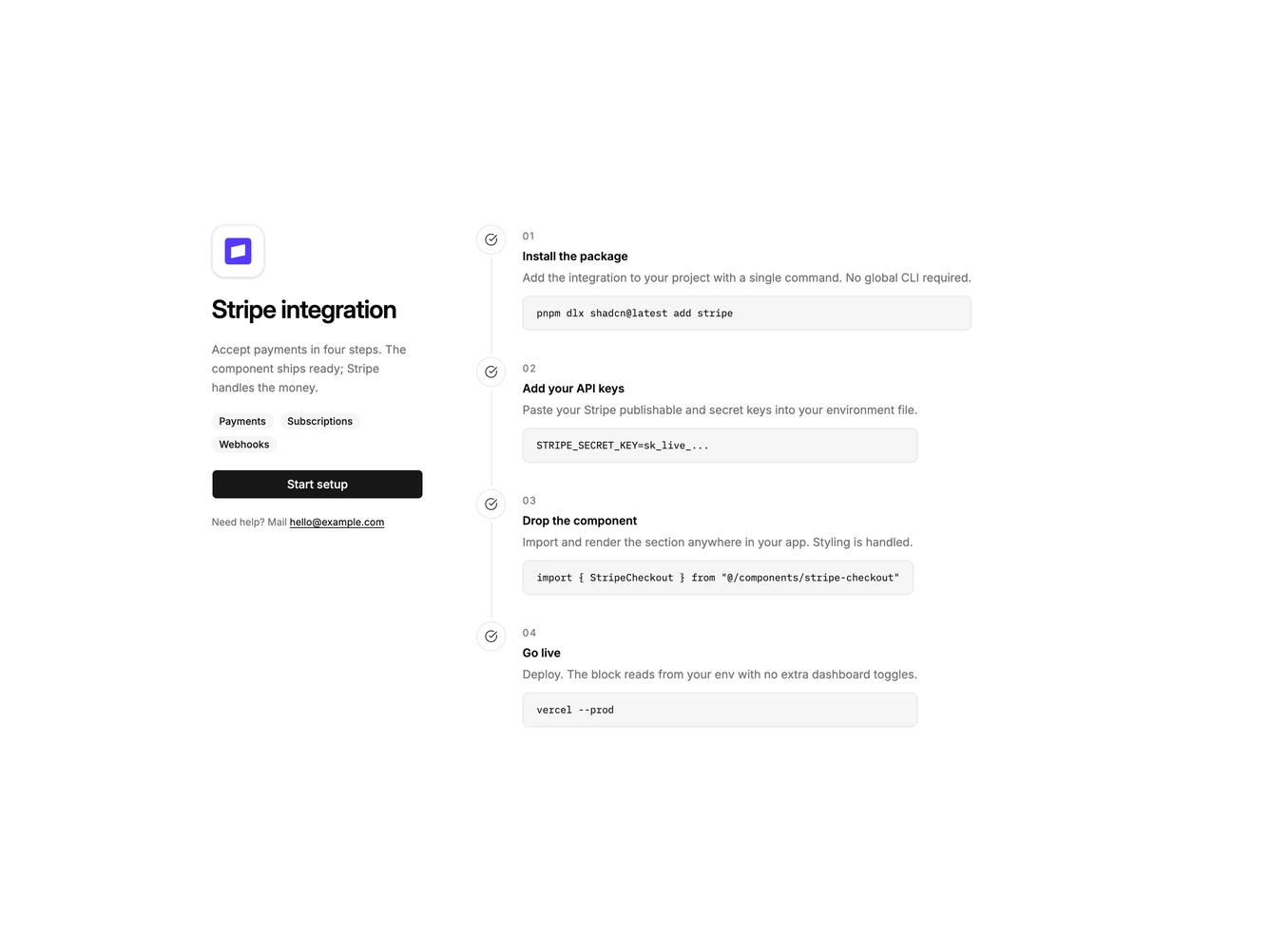
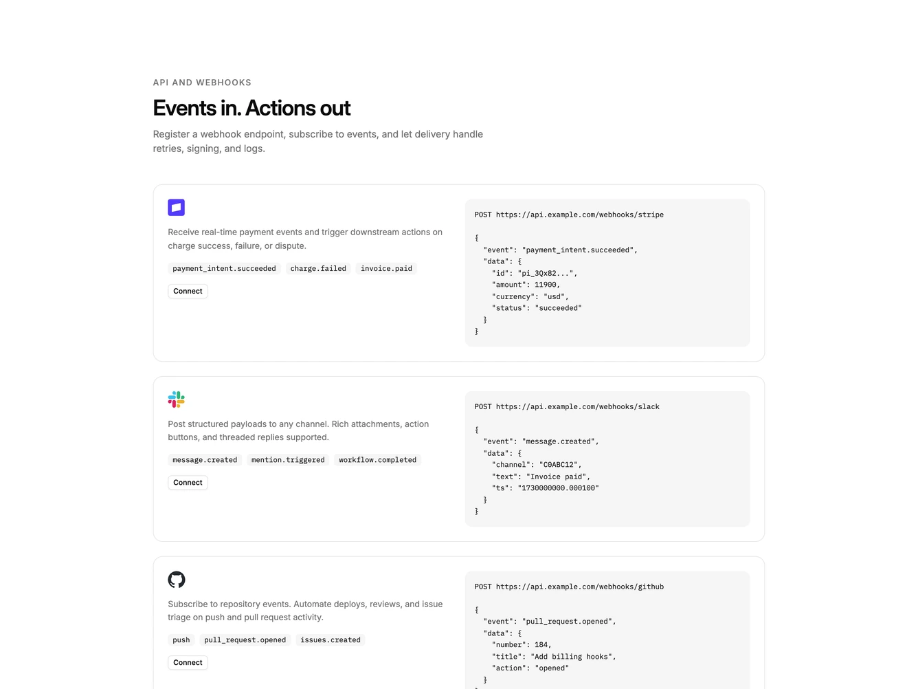
- Shadcn Integration Setup - Single-partner setup: install steps, permission prompts, or webhook payloads.
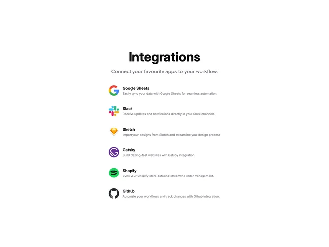
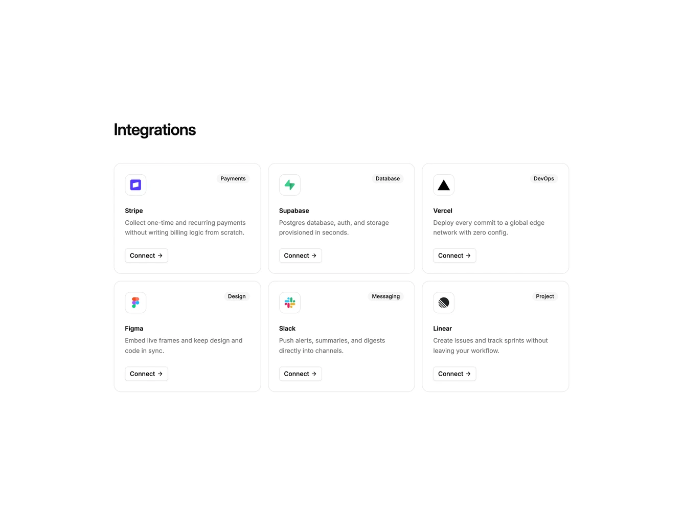
- Shadcn Integration Other - Unique integration layouts that do not fit catalog, grid, settings, or setup patterns.
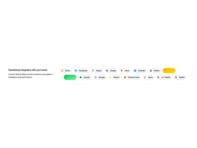
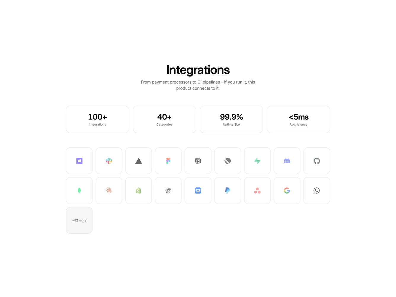
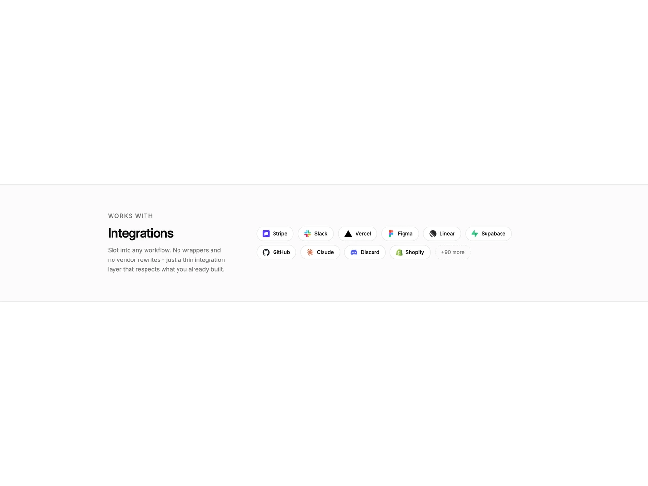
- Shadcn Integration Logo Cloud - Wrapping logo strips, marquees, and works-with pills for marketing proof.
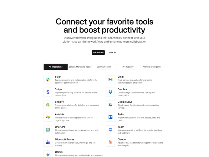
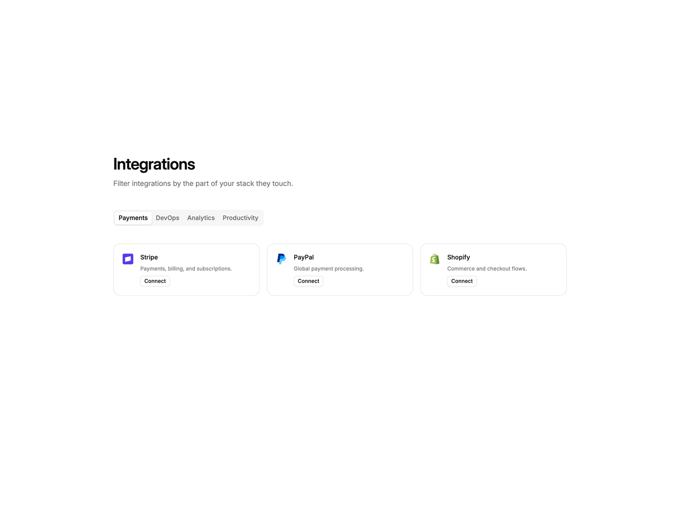
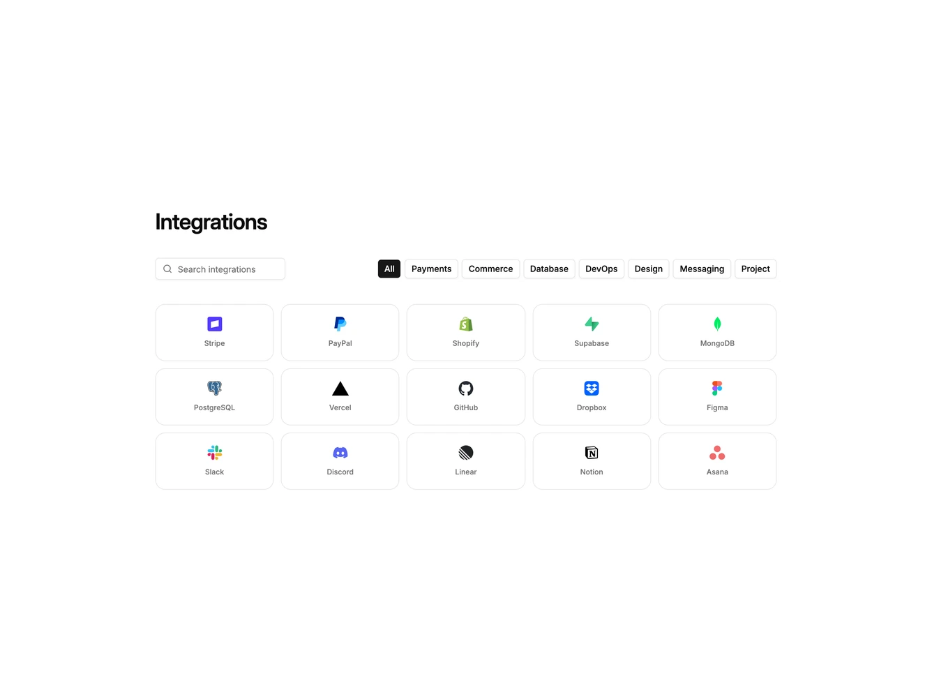
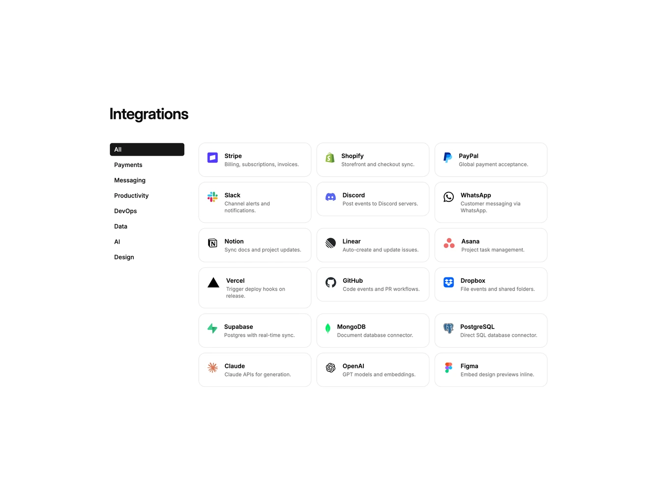
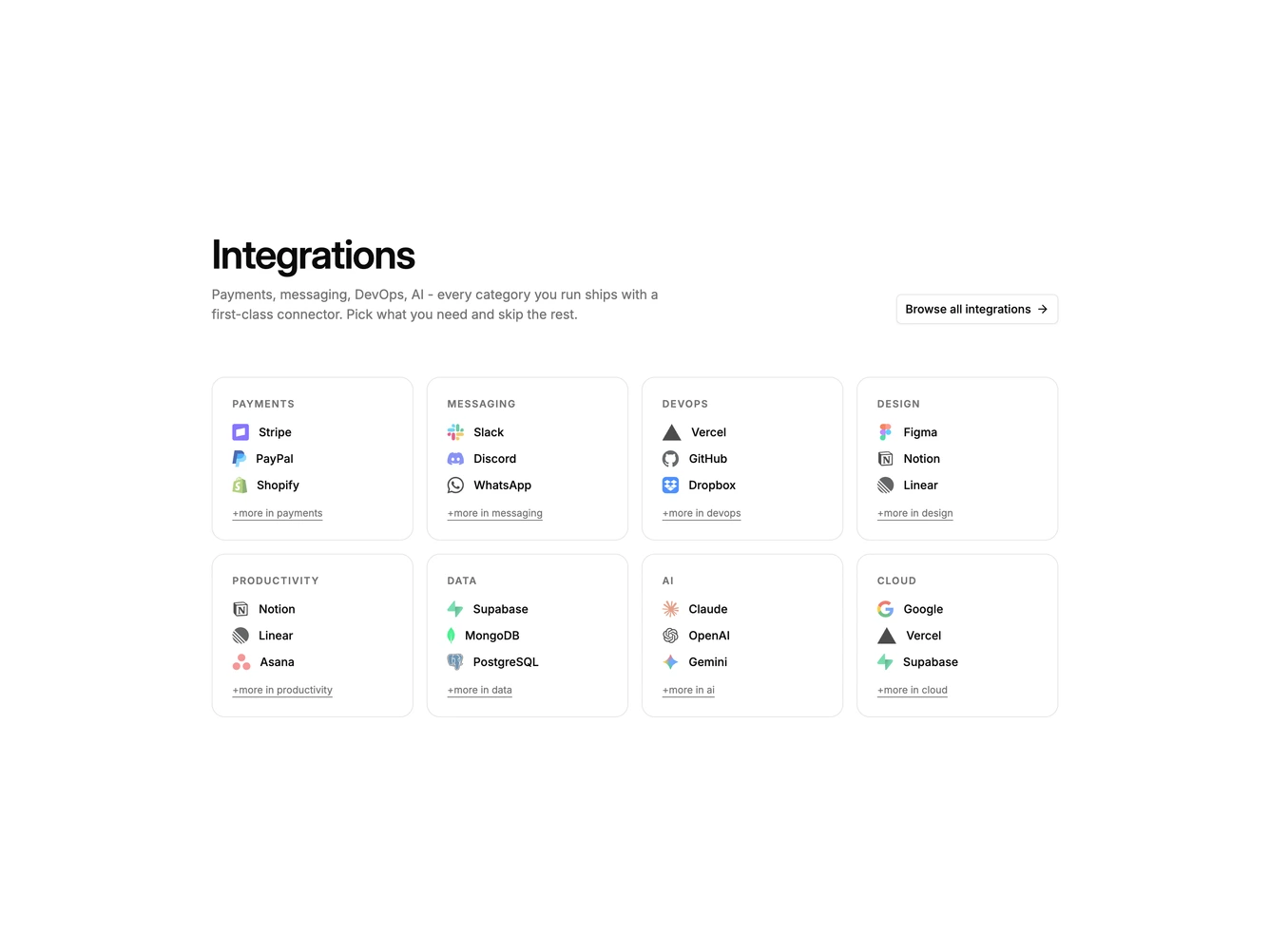
- Shadcn Integration Catalog - Filterable directories of tools with tabs, search, chips, or a category sidebar.
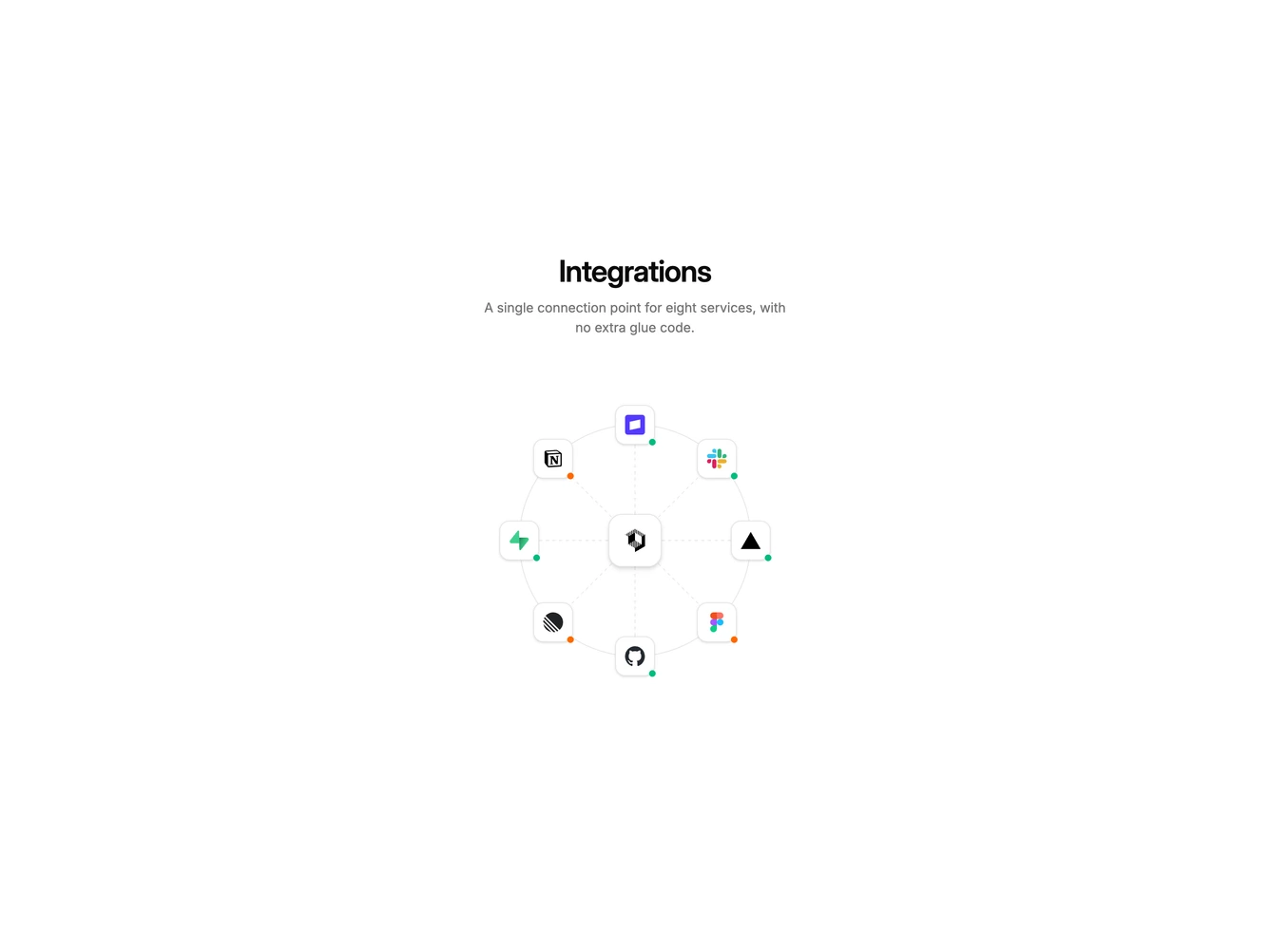
- Shadcn Integration Diagram - Interactive hub-and-spoke diagrams that map a product to connected services.
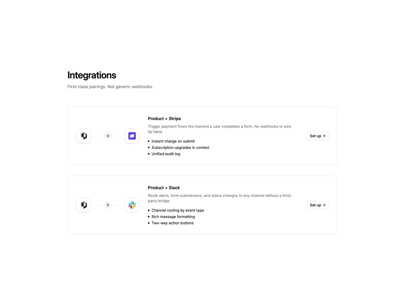
- Shadcn Integration Pairing - First-class pairings that show two products connected, with setup for the destination tool.
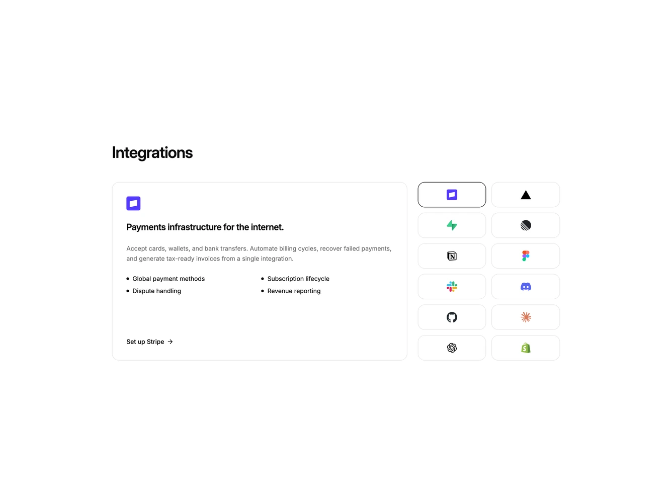
- Shadcn Integration Featured - A highlighted partner story beside supporting logos or an icon picker.
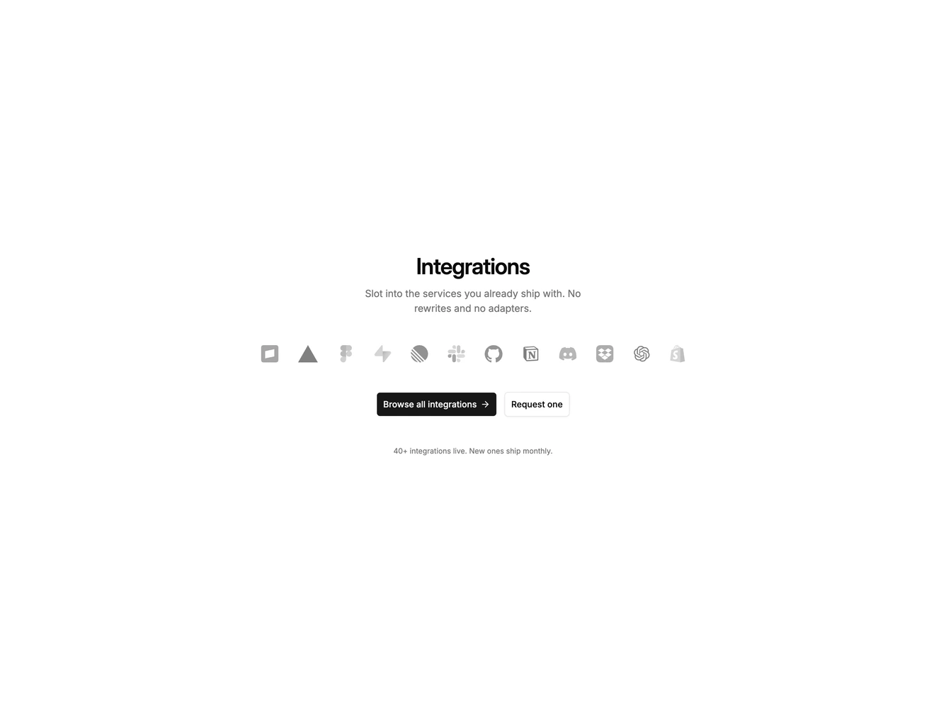
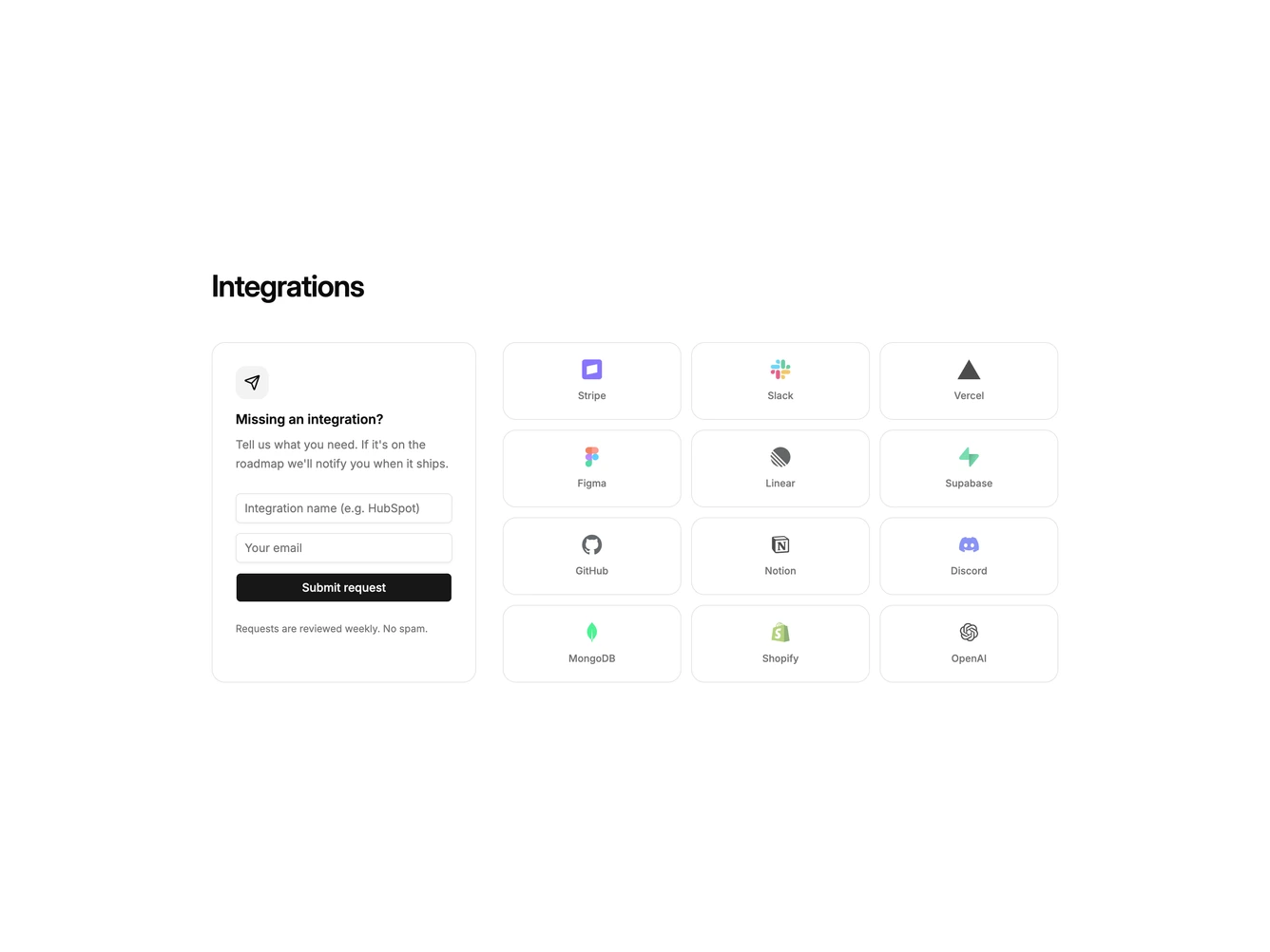
- Shadcn Integration Request - Request a missing integration beside a grid of tools that already ship.