Integration 6 block design & features
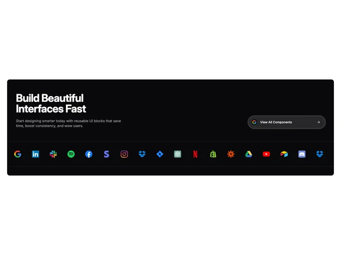
Integration6 is a UI component designed to enhance the visual presentation and interactivity of user interfaces by incorporating carousel displays of logos within a neatly organized layout. This component prominently features a title and a succinct description that emphasizes the benefits of using reusable UI blocks for design efficiency and user engagement. At its core, it integrates an interactive carousel that showcases a rotating display of logos alongside a dynamic button, enhancing the user’s experience by inviting further exploration.
The component is built with a highly structured layout in mind, where the primary goal is to streamline and aesthetically enrich interfaces. It uses a dual-carousel setup, one embedded within a button and one below the primary call-to-action area, to provide a comprehensive showcase of partner or service logos. The component captures attention with bold typography and adaptive styling that maintains a clean separation between elements through dividers, which reinforces its organized appearance. The inclusion of shadcn UI elements, such as the button and separator, along with shadcn block principles ensures consistency and ease of integration across various design systems.