Getting Started
Install shadcn/ui blocks in your React and Tailwind CSS project using the shadcn CLI. Complete setup guide.
This guide walks you through browsing, previewing, and installing blocks from Shadcn Blocks in your project.
Prerequisites
Our blocks are built with React, Tailwind CSS, and shadcn/ui — the same stack you’re already using. They work seamlessly in any React + Tailwind project, including Next.js, Astro, Remix, Vite, and more.
To install blocks your project needs to have Tailwind and shadcn/ui setup:
- A
components.jsonfile — Configures how the shadcn CLI installs components (paths, styles, aliases) - A
globals.cssfile — Contains the CSS variables that power theming
Don’t have these yet? See Project Setup below, or run npx shadcn init to generate them automatically.
Installing Blocks
Browsing Blocks
The Blocks library is the easiest way to browse and install blocks:
- Browse blocks - Use filters and search to find blocks
- Preview blocks - Click any block to see it in detail
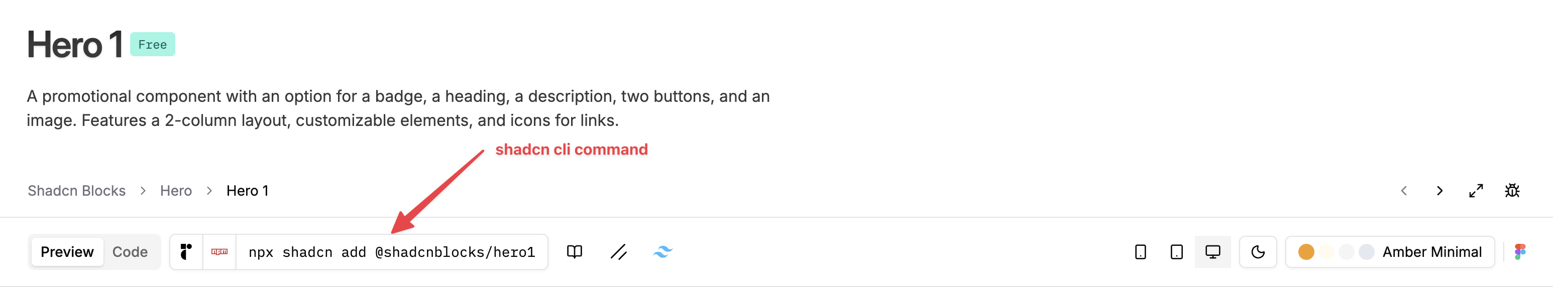
- Copy the CLI command - Click the command in the toolbar to copy it
- Run in your terminal - Paste and execute the command
Copy & Paste
You can view and copy the source code directly by clicking the Code tab on any block. This lets you manually paste the code into your project.
Limitations of copy & paste:
- No automatic dependency installation - You’ll need to manually install any npm packages the block requires
- No component dependencies - If the block uses shadcn components (Button, Card, etc.), you’ll need to install those separately
For these reasons, we recommend using the Shadcn CLI for installation whenever possible.
Shadcn CLI Command (Recommended)
Our blocks can be installed using the official Shadcn CLI shadcn.
npx shadcn add @shadcnblocks/hero-1The command to install each block can be found in toolbar on each block page.
You can also select your preferred package manager:
# pnpm
pnpm dlx shadcn add @shadcnblocks/hero-1

# yarn
yarn dlx shadcn add @shadcnblocks/hero-1

# bun
bunx shadcn add @shadcnblocks/hero-1
Pro Blocks & API Authentication
To install Pro and Premium blocks via the CLI, you’ll need to set up API key authentication.
1. Get your API key
Visit your Dashboard → API Keys and create a new key.
2. Add to your environment
# .env
SHADCNBLOCKS_API_KEY=sk_live_your_api_key_here
3. Update the @shadcnblocks registry
Add or update the @shadcnblocks registry with authentication headers in your components.json
{
  "registries": {
    "@shadcnblocks": {
      "url": "https://shadcnblocks.com/r/{name}",
      "headers": {
        "Authorization": "Bearer ${SHADCNBLOCKS_API_KEY}"
      }
    }
  }
}
Now you can install any pro block:
npx shadcn add @shadcnblocks/hero-125For full details and troubleshooting, see the shadcn CLI guide.
Why Use the Shadcn CLI?
The Shadcn CLI is the recommended way to install blocks because it:
1. Respects Your components.json Configuration
Your components.json defines important settings that the CLI uses:
- Style - Which component style variant to use (Vega, Nova, Maia, Lyra, Mira)
- Base color - Your project’s color scheme
- CSS variables - Whether to use CSS variables for colors
- Tailwind config - Path to your Tailwind configuration
- Component aliases - Where components should be installed
2. Chooses the Correct UI Library and Style
The Shadcn CLI automatically selects between Radix UI and Base UI, and applies the correct component style, based on the style property in your components.json:
// components.json
{
  "$schema": "https://ui.shadcn.com/schema.json",
  "style": "radix-vega",
}
When you install blocks using the Shadcn CLI, the style value in your components.json is responsible for which underlying primitive library (Radix or Base UI) and which shadcn “style” to install.
3. Handles Dependencies Automatically
The Shadcn CLI:
- Installs required NPM packages
- Adds dependent components (e.g., if a block uses
Button, it installsButtontoo) - Updates your Tailwind config if needed
- Respects your project structure
Project Setup
Installing shadcn/ui
Using Shadcn Create
For completely new projects you can use the shadcn official create - https://ui.shadcn.com/create - This will install a new Next.js, Vite or Tanstack project with pre-configured components.json and globals.css.
On Existing projects
If you have an existing project add a components.json in your project root:
{
"$schema": "https://ui.shadcn.com/schema.json",
"style": "radix-vega",
"rsc": true,
"tsx": true,
"tailwind": {
"config": "",
"css": "app/globals.css",
"baseColor": "neutral",
"cssVariables": true,
"prefix": ""
},
"iconLibrary": "lucide",
"rtl": false,
"aliases": {
"components": "@/components",
"utils": "@/lib/utils",
"ui": "@/components/ui",
"lib": "@/lib",
"hooks": "@/hooks"
},
"menuColor": "default",
"menuAccent": "subtle",
"registries": {
"@shadcnblocks": "https://shadcnblocks.com/r/{name}"
}
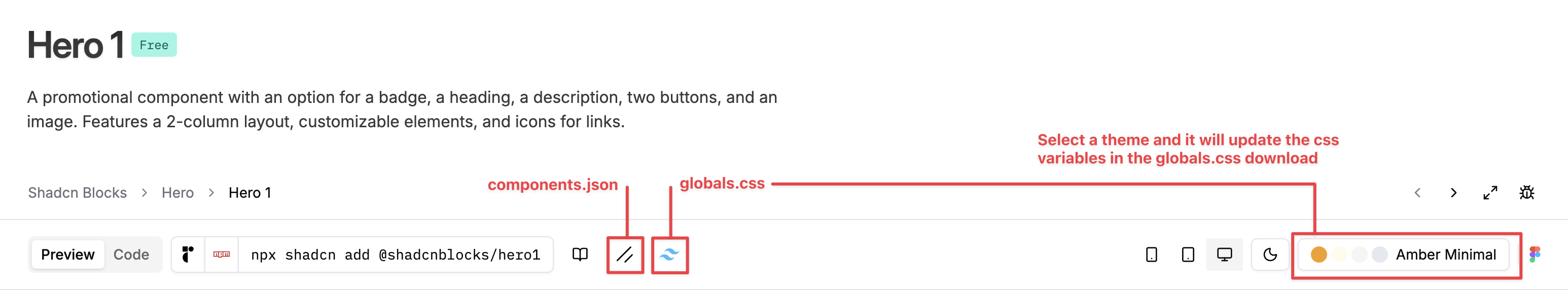
}You can also generate a components.json from the toolbar on any of our block pages.
Configuring Tailwind
Installing Tailwind
Ensure you have Tailwind installed - https://tailwindcss.com/docs/installation/framework-guides
Install the additional Tailwind plugins
npm install @tailwindcss/typography tw-animate-cssUpdating globals.css
Download our CSS file here Download globals.css and overwrite (or update) your existing main Tailwind CSS file.
Tip: Most new Nextjs projects install this file at app/globals.css
The globals.css includes all the CSS variables needed for shadcn/ui components, including light and dark mode support. It uses the default shadcn theme. You can also download a globals.css from the block toolbar by clicking the Tailwind icon. If you have a theme selected, the downloaded file will include that theme’s color variables.
Tip: Ensure that the path to the globals.css is correct in your components.json - check the tailwind.css property.
Your Ready to install blocks
Now you can install any of blocks using copy/paste or the shadcn CLI.
Next Steps
- Browse blocks - The classic blocks library
- Explorer - Advanced browsing with sidebar options
- Component examples - Individual component variations
- Templates - Full page templates
On This Page
- Prerequisites
- Installing Blocks
- Browsing Blocks
- Copy & Paste
- Shadcn CLI Command (Recommended)
- Pro Blocks & API Authentication
- Why Use the Shadcn CLI?
- 1. Respects Your components.json Configuration
- 2. Chooses the Correct UI Library and Style
- 3. Handles Dependencies Automatically
- Project Setup
- Installing shadcn/ui
- Configuring Tailwind
- Your Ready to install blocks
- Next Steps