Integration 1 block design & features
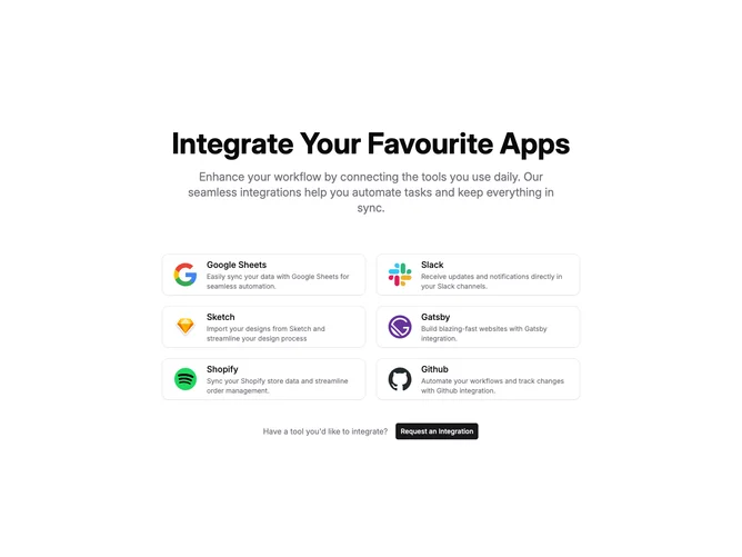
The Integration1 component is designed to showcase various application integrations that enhance user workflows by connecting popular tools. This component visually presents integrations through a series of feature cards, emphasizing user-friendly and seamless automation. Each card, a shadcn UI block, includes an icon, title, and description that provides users with pertinent information on how each integration can optimize tasks they perform daily.
With a focus on design and user engagement, the Integration1 component is structured to draw attention to the ability to integrate favorite apps, making it easier for users to manage multiple platforms efficiently. The layout employs a strong visual hierarchy, using shadcn block patterns as a backdrop to engender a cohesive aesthetic. Users are encouraged to take action by requesting additional integrations, aligning the component with user-centric expansion.