
Integration 15 block design & features
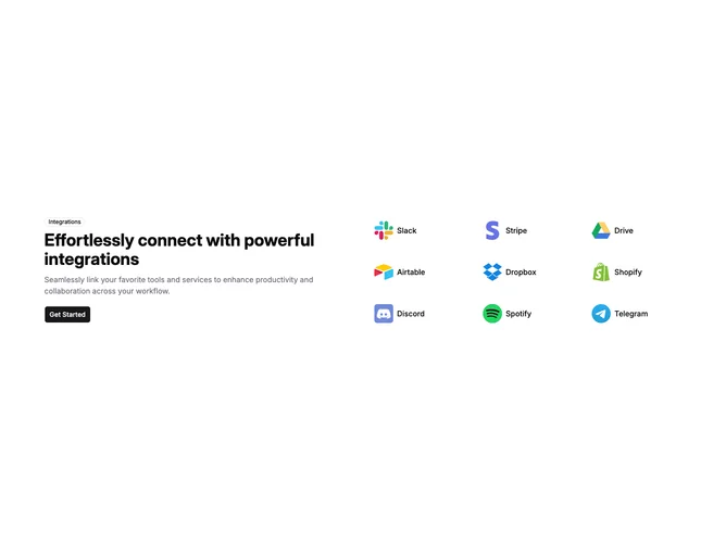
Integration15 is a split integrations section built with Shadcn UI badge and button components. The left column stacks an outline Integrations badge, bold headline, muted paragraph, and a primary Get Started button. The right side is a dense grid of linked rows, each with a tool logo, name, and a View Documentation line that expands on hover with an arrow icon.
Light background with left-aligned marketing copy and compact logo rows. Hover softens a muted wash behind each integration and opens the documentation hint from zero height. Spacing is generous between columns and tighter inside the logo grid. Static aside from that hover reveal.
Clean and practical with a standard SaaS integrations layout. Simple to moderate complexity and mostly content-driven: intro copy, CTA, and a list of logo links. Distinctive detail is the hover documentation teaser rather than heavy card chrome.
Stacks to a single column below extra-large breakpoints, with the logo grid shifting from three columns down to two on medium screens and one on the smallest.