
Integration 21 block design & features
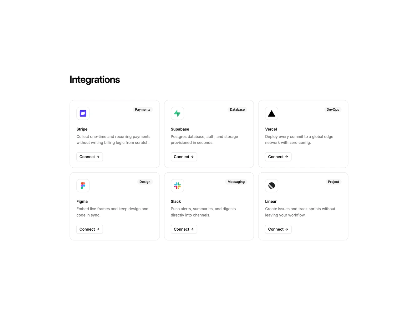
Integration21 is a tagged card grid built with Shadcn UI Badge, Button, Dialog, Input, Label, and Switch. A heading introduces six equal cards. Each card has a bordered logo tile, a secondary category badge, a name, a longer description, and an outline connect button with an arrow. Clicking connect opens a dialog with that tool's logo, an API key field, a test mode switch, and cancel or connect actions.
Cards share rounded shells and a muted hover fill. Hierarchy is logo and badge first, copy second, action last. The dialog is a single column with a small bordered logo tile above the title. After connecting, the card button switches to a connected state and the dialog can disconnect.
This is a standard marketing integration grid with more copy than a logo cloud. Complexity is moderate and mixed: six tools with tags and blurbs plus a working connect form for each tool.
On small screens the grid is one column, then two, then three. The dialog stays a single column.