


Shadcn Footer Blocks

Browse 44+ Shadcn UI Footer blocks, sections & components built with React, Tailwind CSS and shadcn/ui. Copy & paste the code or install via the shadcn CLI.

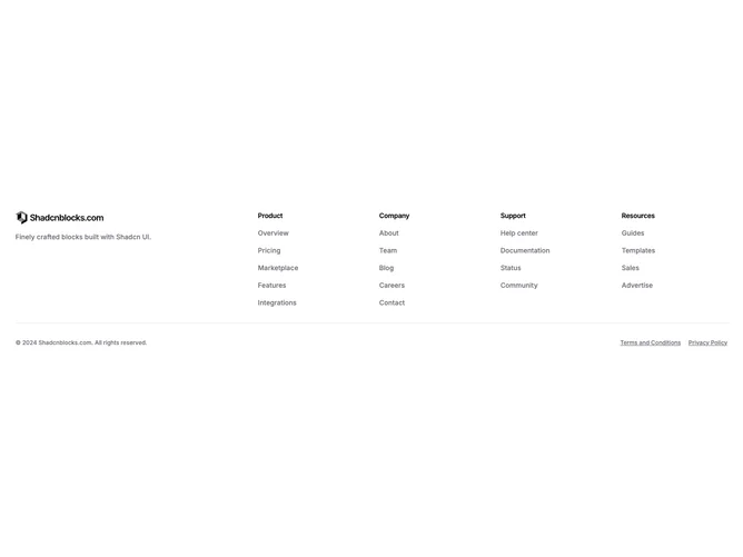
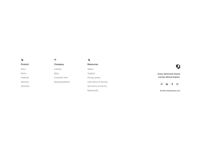
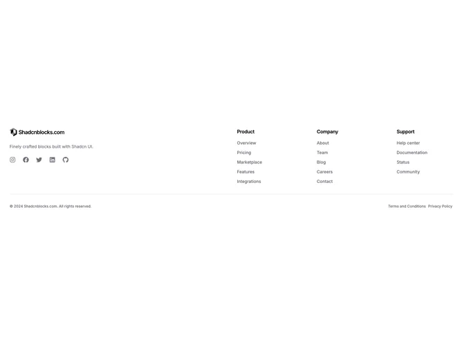
Shadcn Footer 2 - Footer with logo, tagline, link columns, and legal row

Footer with logo, tagline, link columns, and legal row

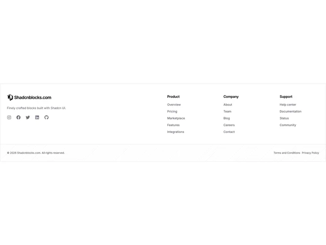
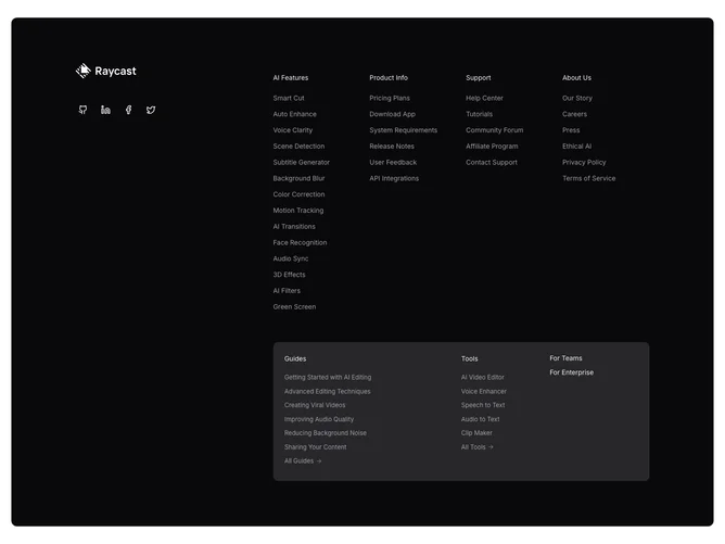
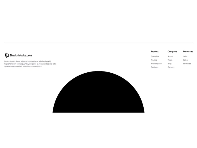
Shadcn Footer 51 - Boxed Columns Footer With Pattern Bar

Boxed Columns Footer With Pattern Bar

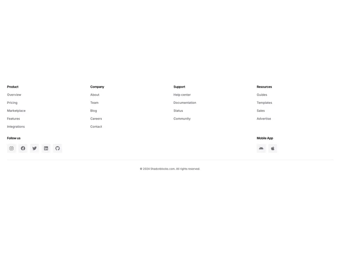
Shadcn Footer 5 - Footer with link columns, social icons, and mobile app links

Footer with link columns, social icons, and mobile app links

Shadcn Footer 10 - Minimal footer with brand image and live clock

Minimal footer with brand image and live clock

Shadcn Footer 24 - Contact footer with bold heading, email, social links, phone, and nav grid

Contact footer with bold heading, email, social links, phone, and nav grid

Shadcn Footer 19 - Mega footer with two navigation tiers, social icons, and highlighted section

Mega footer with two navigation tiers, social icons, and highlighted section

Shadcn Footer 21 - Footer with icon-labeled link columns, logo, tagline, and social buttons

Footer with icon-labeled link columns, logo, tagline, and social buttons

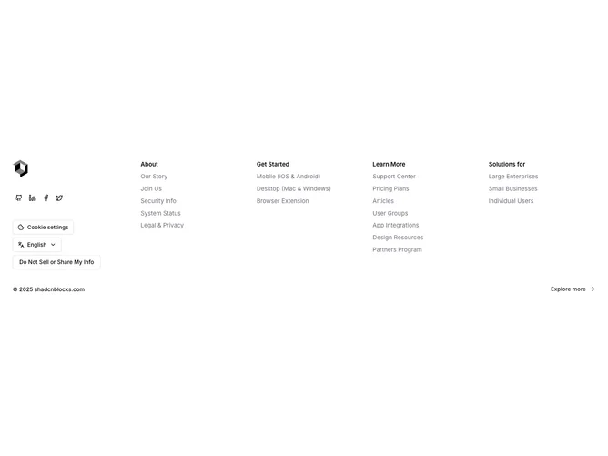
Shadcn Footer 18 - Footer with social icons, cookie drawer, language picker, privacy dialog, and link columns

Footer with social icons, cookie drawer, language picker, privacy dialog, and link columns

Shadcn Footer 7 - Footer with logo, description, social icons, link columns, and legal row

Footer with logo, description, social icons, link columns, and legal row

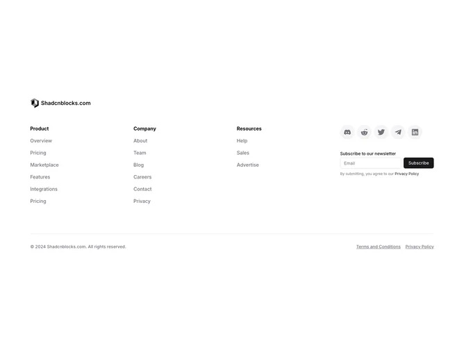
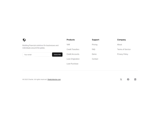
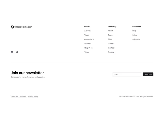
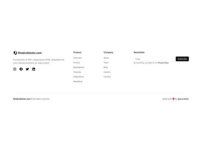
Shadcn Footer 3 - Footer with logo, link columns, social icons, and newsletter form

Footer with logo, link columns, social icons, and newsletter form

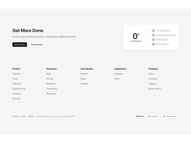
Shadcn Footer 9 - Footer with call-to-action, pricing card, link columns, and social buttons

Footer with call-to-action, pricing card, link columns, and social buttons

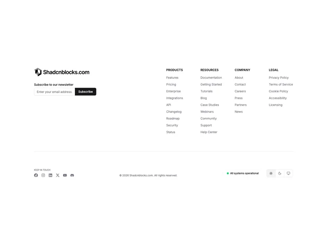
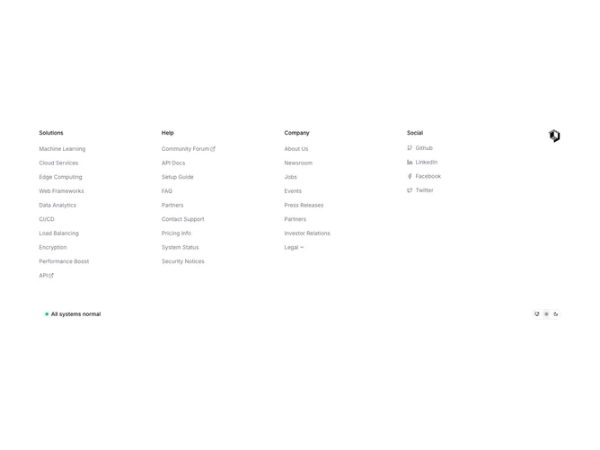
Shadcn Footer 17 - Mega footer with dropdowns, drawers, theme toggle, and status indicator

Mega footer with dropdowns, drawers, theme toggle, and status indicator

Shadcn Footer 23 - Footer with logo, link columns, and animated globe

Footer with logo, link columns, and animated globe

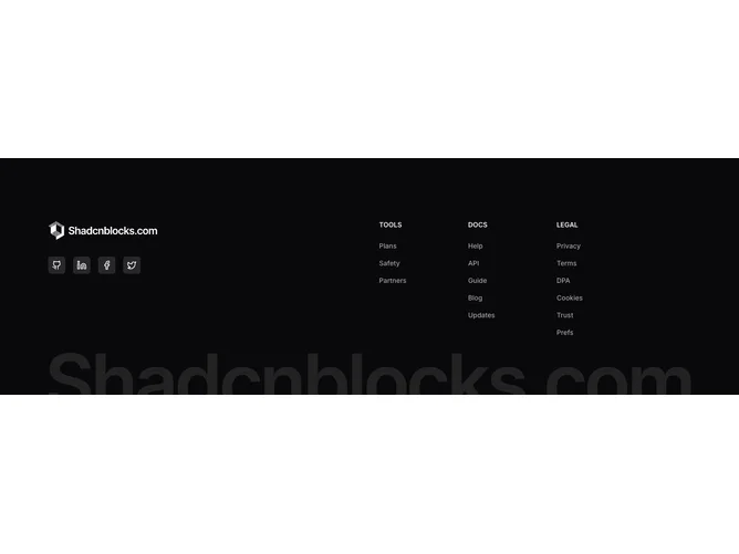
Shadcn Footer 16 - Dark footer with accordion navigation, social buttons, and brand watermark

Dark footer with accordion navigation, social buttons, and brand watermark

Shadcn Footer 14 - Footer with logo, newsletter, three link columns, and social icons

Footer with logo, newsletter, three link columns, and social icons

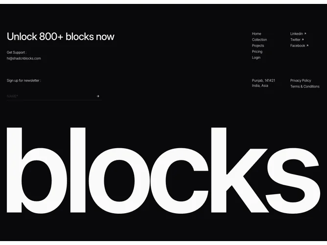
Shadcn Footer 50 - CTA Footer with Large Brand Typography

CTA Footer with Large Brand Typography

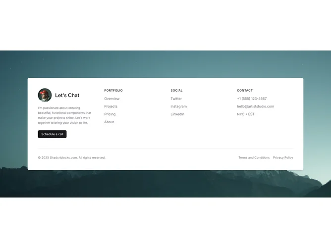
Shadcn Footer 25 - Footer with background image, profile card, link columns, and contact details

Footer with background image, profile card, link columns, and contact details

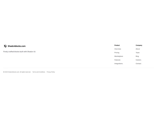
Shadcn Footer 6 - Compact footer with logo, description, and two link columns

Compact footer with logo, description, and two link columns

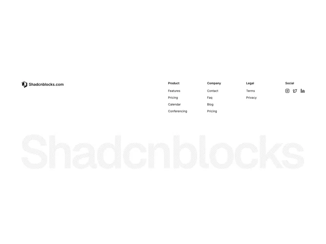
Shadcn Footer 11 - Footer with logo, link columns, social icons, and giant brand image

Footer with logo, link columns, social icons, and giant brand image

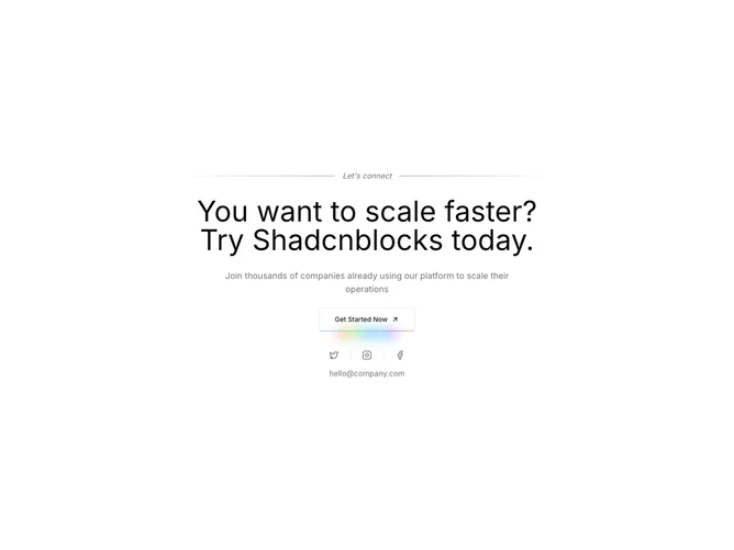
Shadcn Footer 27 - Animated CTA footer with social links and separator

Animated CTA footer with social links and separator

Shadcn Footer 4 - Footer with logo, social icons, link columns, newsletter, and legal links

Footer with logo, social icons, link columns, newsletter, and legal links

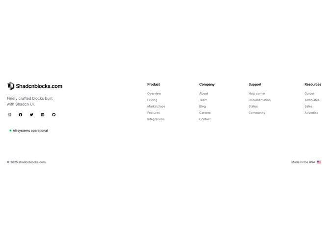
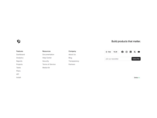
Shadcn Footer 15 - Footer with logo, social icons, status badge, link columns, and country flag

Footer with logo, social icons, status badge, link columns, and country flag

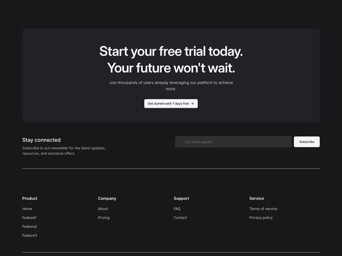
Shadcn Footer 13 - Dark CTA footer with trial banner, newsletter, link columns, and social icons

Dark CTA footer with trial banner, newsletter, link columns, and social icons

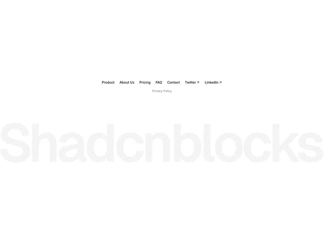
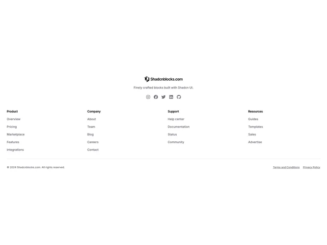
Shadcn Footer 12 - Centered footer with inline links, social links, and giant brand image

Centered footer with inline links, social links, and giant brand image

Shadcn Footer 8 - Footer with logo, social icons, link columns, and newsletter

Footer with logo, social icons, link columns, and newsletter

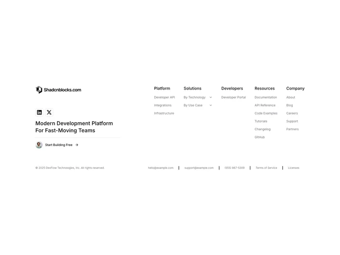
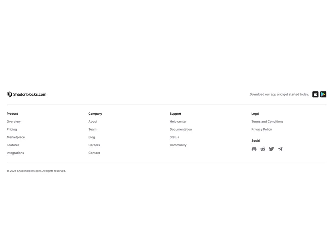
Shadcn Footer 1 - Footer with logo, link columns, app download buttons, and social icons

Footer with logo, link columns, app download buttons, and social icons

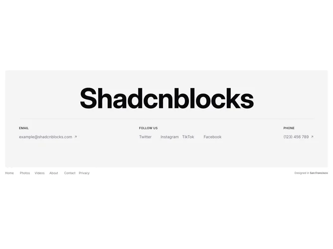
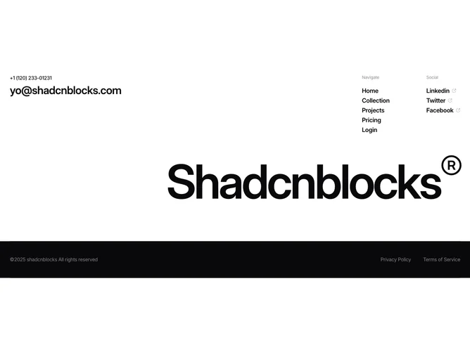
Shadcn Footer 30 - Designer footer with giant brand name, contact info, navigation, and social links

Designer footer with giant brand name, contact info, navigation, and social links

Shadcn Footer 31 - Dark footer with headline, newsletter form, navigation, social links, and animated logo

Dark footer with headline, newsletter form, navigation, social links, and animated logo

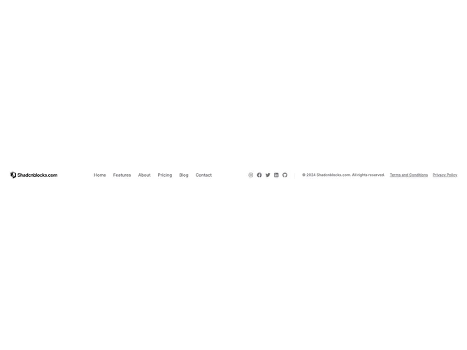
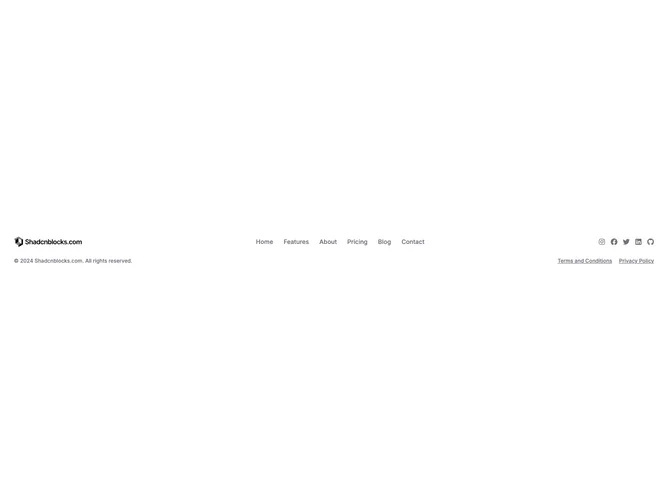
Shadcn Footer 60 - Compact Footer Bar Without Legal Row

Compact Footer Bar Without Legal Row

Shadcn Footer 61 - Compact Footer Single Wrap Row With Inline Meta

Compact Footer Single Wrap Row With Inline Meta

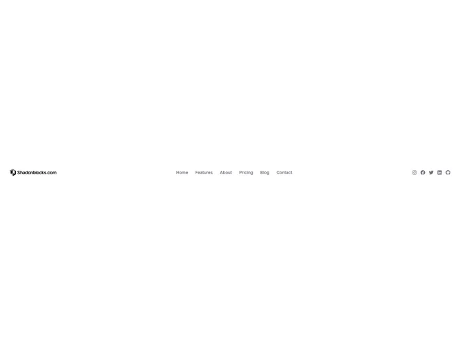
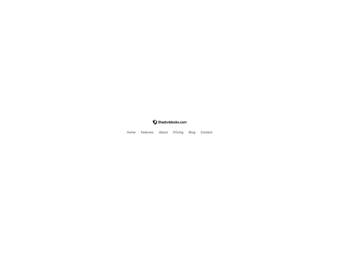
Shadcn Footer 62 - Compact Logo And Menu Footer

Compact Logo And Menu Footer

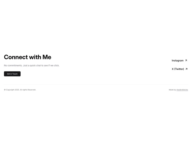
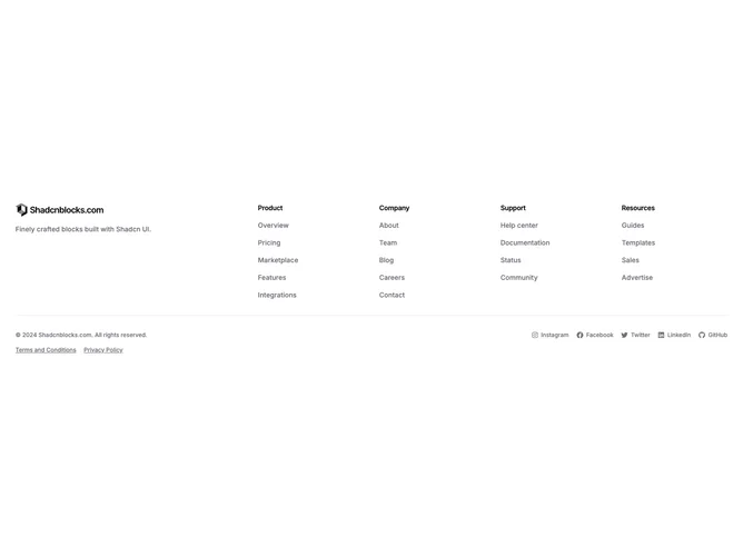
Shadcn Footer 55 - Footer With Text Social Links

Footer With Text Social Links

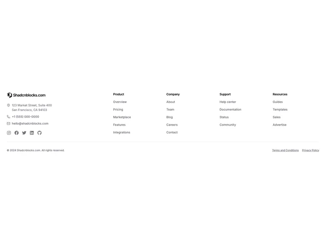
Shadcn Footer 56 - Footer With Address And Contact Column

Footer With Address And Contact Column

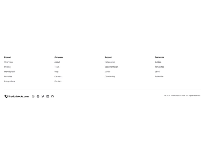
Shadcn Footer 57 - Inverted Footer Navigation First

Inverted Footer Navigation First

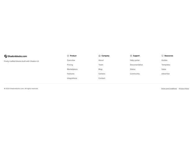
Shadcn Footer 58 - Footer With Section Title Icons

Footer With Section Title Icons

Shadcn Footer 59 - Compact Single Row Footer Bar

Compact Single Row Footer Bar

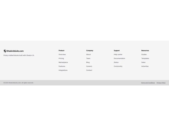
Shadcn Footer 52 - Muted Grid Footer With Contrasting Bar

Muted Grid Footer With Contrasting Bar

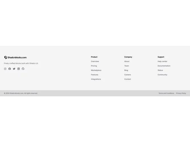
Shadcn Footer 53 - Muted Split Footer With Social And Contrasting Bar

Muted Split Footer With Social And Contrasting Bar

Shadcn Footer 54 - Centered Container Width Footer

Centered Container Width Footer

Footer blocks are dedicated sections of a webpage focused on footer content. They appear on landing pages, product pages, and marketing sites as key elements that communicate value and drive user engagement.

Each block is a self-contained React component which you can copy/paste the code or install via the shadcn CLI. You own the code and can modify however you like, or us AI and LLMS to quickly change the design.

Our footer blocks combine headlines, supporting text, images, icons, CTA buttons, and responsive layouts. Each block is designed with clear visual hierarchy and consistent spacing to integrate seamlessly into any page structure.

Different goals call for different footer sections. We’ve organized our footer blocks into subgroups so you can find the right layout for your use case:

Frequently Asked Questions

How are Shadcnblocks footer blocks built?
Shadcnblocks footer blocks are built with React, Tailwind CSS, and shadcn/ui components.

What technologies are used to build Shadcnblocks footer sections?
Shadcnblocks footer sections are built with React, Tailwind CSS, and shadcn/ui components. They use standard React components and Tailwind utility classes for styling.

What frameworks do Shadcnblocks footer components work with?
Shadcnblocks footer components work with any React-based framework including Next.js, Remix, Astro, and Vite.

Can I customize Shadcnblocks footer blocks?
Yes. Every block is source code you add directly to your project. You can modify the text, images, colors, layout, and behavior using standard React and Tailwind patterns.

Do Shadcnblocks footer sections support dark mode?
Yes. All blocks use shadcn/ui’s theming system and support light and dark mode out of the box.

How do I install a Shadcnblocks footer block?
The best way to install a Shadcnblocks footer block is to use the shadcn CLI: npx shadcn add @shadcnblocks/{blockId}.

Can I copy and paste the code into my project?
Yes. Every block is ready to copy and paste the code directly into your project. Just click the “code” tab on any block to view the source code.