Shadcn UI Footer Block
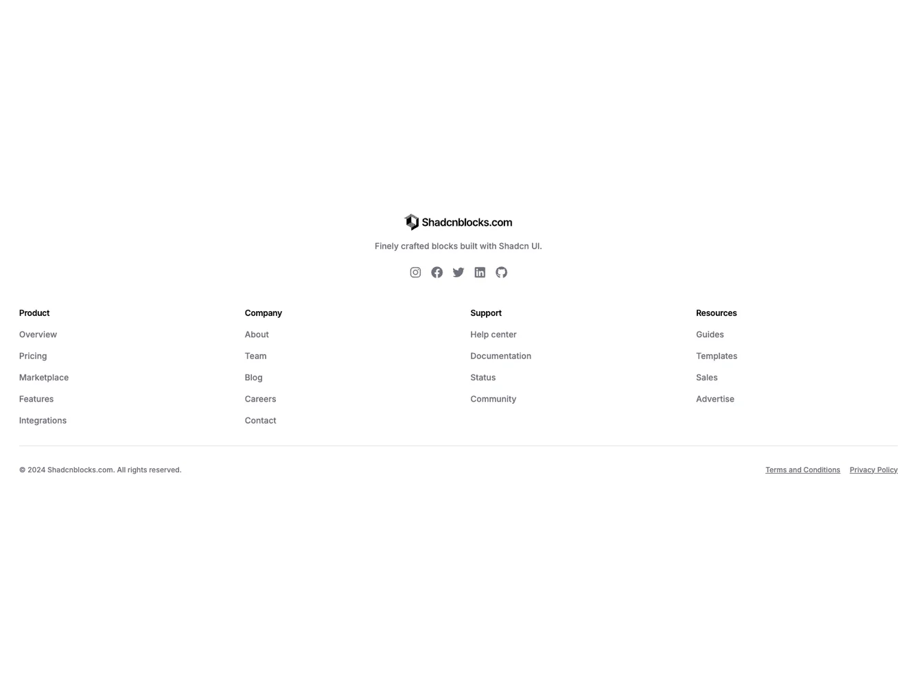
The Footer54 component keeps the layout inside the standard container width: logo, description, and social icons are center aligned at the top, then a full-width grid inside that container presents up to four link columns with left-aligned text in each cell. The main body uses the same shadcn/ui typography scale as sibling footer-basic blocks, with small section headings and muted link colors. There is no muted or tinted background on the footer; surfaces stay transparent so the page background shows through. Copyright and legal links sit in a row below the grid, separated by a simple top border like other basic footers.
Visually the block reads as a landing-page style closer: symmetrical top branding, then a sitemap grid that spans the content column. The legal line is separated by a hairline rule only, without a second color band.
It is a moderate layout variant centered on alignment rather than on extra components, so content needs are the same as other shared footer-basic packs: logo assets, section data, social icons, and legal strings.
On small screens the link grid uses two columns before expanding to four on medium and large breakpoints; the copyright row centers on mobile and spreads across a row on desktop.