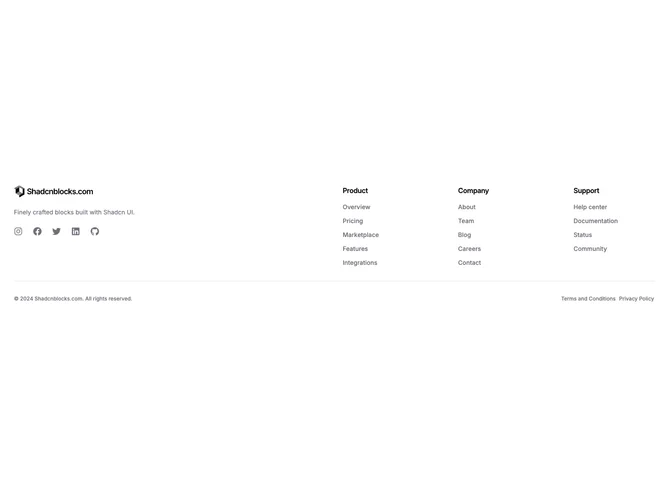
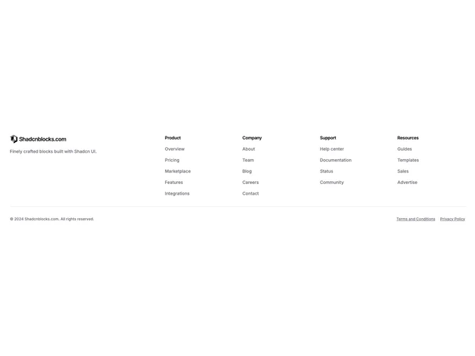
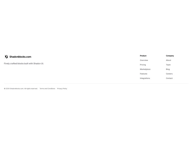
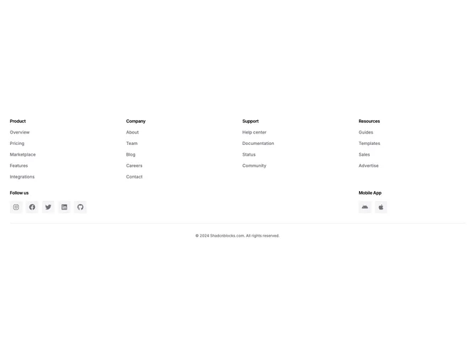
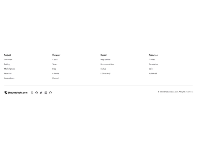
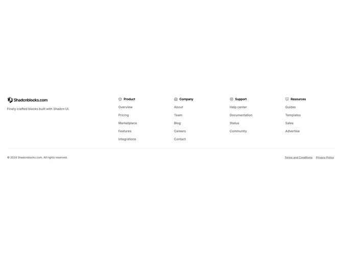
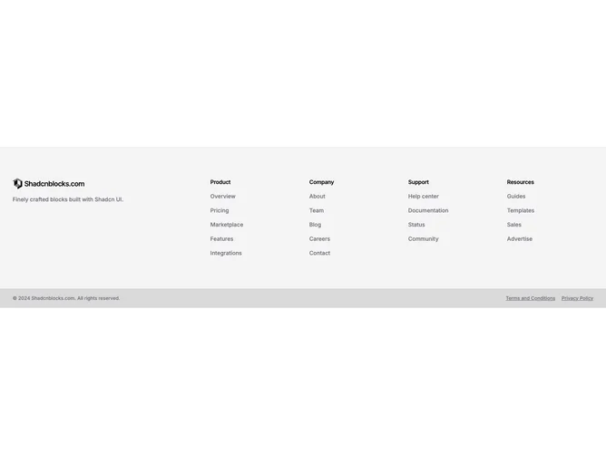
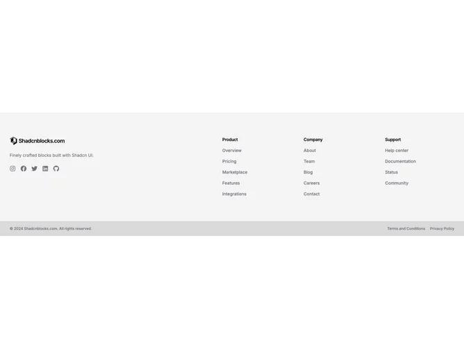
Shadcn Footer Basic Blocks

Browse and download 13+ Shadcn UI Footer Basic blocks. Built with React, Tailwind and shadcn/ui. These shadcn components are ready to download, copy and paste or install with the shadcn registry.

Shadcn Footer 51 - Boxed Columns Footer With Pattern Bar

Boxed Columns Footer With Pattern Bar

Shadcn Footer 55 - Footer With Text Social Links

Footer With Text Social Links

Shadcn Footer 57 - Inverted Footer Navigation First

Inverted Footer Navigation First

Shadcn Footer 56 - Footer With Address And Contact Column

Footer With Address And Contact Column

Shadcn Footer 58 - Footer With Section Title Icons

Footer With Section Title Icons

Shadcn Footer 52 - Muted Grid Footer With Contrasting Bar

Muted Grid Footer With Contrasting Bar

Shadcn Footer 53 - Muted Split Footer With Social And Contrasting Bar

Muted Split Footer With Social And Contrasting Bar

Shadcn Footer 54 - Centered Container Width Footer

Centered Container Width Footer

A shadcn footer basic block is a clean, straightforward footer layout with minimal visual complexity. It appears on landing pages, marketing sites, and product pages as a versatile starting point that prioritizes clarity and readability.

Each block is a self-contained React component which you can copy/paste the code or install via the shadcn CLI. You own the code — customize the layout, content, and styling using Tailwind utility classes.