
Shadcn Footer Giant Text Blocks

Browse and download 4+ Shadcn UI Footer Giant Text blocks. Built with React, Tailwind and shadcn/ui. These shadcn components are ready to download, copy and paste or install with the shadcn registry.

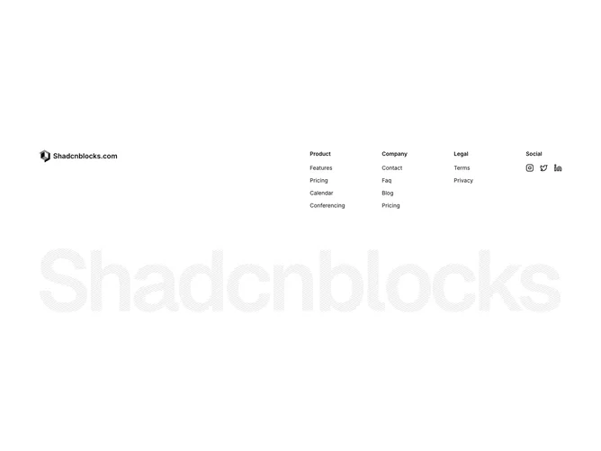
Shadcn Footer 11 - Footer with logo, link columns, social icons, and giant brand image

Footer with logo, link columns, social icons, and giant brand image

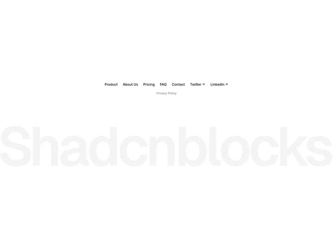
Shadcn Footer 12 - Centered footer with inline links, social links, and giant brand image

Centered footer with inline links, social links, and giant brand image

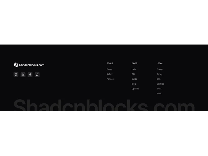
Shadcn Footer 16 - Dark footer with accordion navigation, social buttons, and brand watermark

Dark footer with accordion navigation, social buttons, and brand watermark

Shadcn Footer 50 - CTA Footer with Large Brand Typography

CTA Footer with Large Brand Typography

A shadcn footer giant text block provides a specialized footer layout focused on the giant text pattern. It appears on landing pages, product pages, and marketing sites where footer content needs a distinct visual treatment.

Each block is a self-contained React component which you can copy/paste the code or install via the shadcn CLI. You own the code — customize the layout, content, and styling using Tailwind utility classes.