Footer 16 block design & features
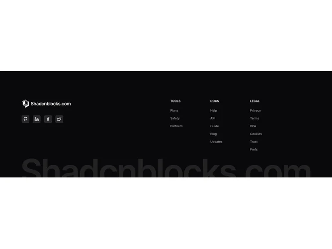
The Footer16 component is a comprehensive footer section designed to enhance the bottom area of a web page. It creates a structured footer with distinct areas for navigation links and social media integrations. The footer prominently features a logo link, several social media icon buttons, and categorized navigation links, making it a suitable end-point for any web page in need of clear, organized information and connectivity options.
Delving deeper, the Footer16 component is meticulously organized to provide an intuitive user experience. It includes social media links embedded in buttons, offering a condensed yet impactful way for users to connect across different platforms. The navigation is divided into sections such as "Tools," "Docs," and "Legal," each of which can be expanded or collapsed depending on the screen size, using an accordion on smaller devices. This use of shadcn components ensures that the layout remains clean and user-friendly, even in narrower viewing environments. Moreover, the footer contains branding elements, including a logo and background imagery, realized through a shadcn block design, which serves both aesthetic and functional purposes.