Footer 12 block design & features
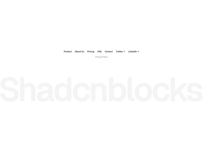
All content is center-aligned. A single horizontal row wraps navigation links (Product, About Us, Pricing, FAQ, Contact) alongside social links (Twitter, LinkedIn) that each carry a small ArrowUpRight icon. Below this row, a second centered line displays legal links in smaller muted text. A full-width brand PNG image sits beneath with generous top margin, serving as the visual anchor of the section.
Links use medium-weight text with an opacity-based hover transition rather than a color change, giving interactions a fade-in quality. Social links are visually distinguished from navigation links by the appended arrow icon. Legal text drops to a smaller size and muted foreground, creating clear hierarchy. The brand image renders at a specified width and height with no border or background.
The centered, single-row approach makes this one of the most minimal footer layouts in the collection. The giant brand image below carries all the visual weight, leaving the link area almost purely functional.
The layout is inherently responsive since the link row uses flex-wrap, allowing items to reflow on narrow screens. The brand image scales proportionally at all viewport sizes.