Shadcn Product List Blocks

Browse 10+ Shadcn UI Product List sections built with React, Tailwind CSS and shadcn/ui. Copy & paste the code or install via the shadcn CLI.

Shadcn Product List 8 - Product grid with expandable cart form

Product grid with expandable cart form

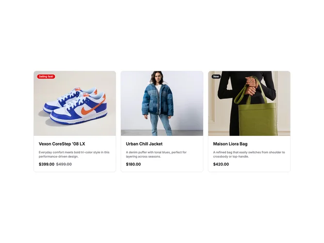
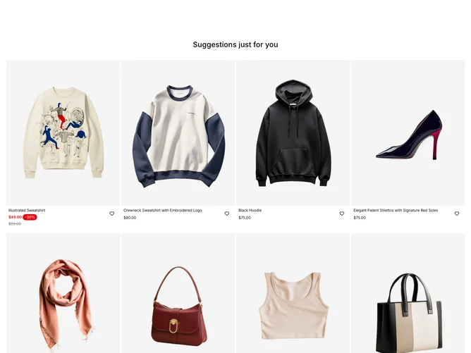
Shadcn Product List 1 - Product grid with badges

Product grid with badges

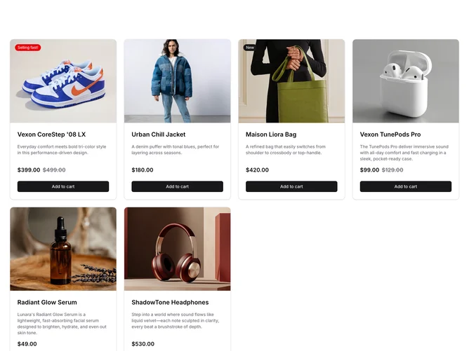
Shadcn Product List 3 - Product grid with hover add to cart

Product grid with hover add to cart

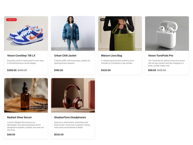
Shadcn Product List 2 - Product grid with add to cart

Product grid with add to cart

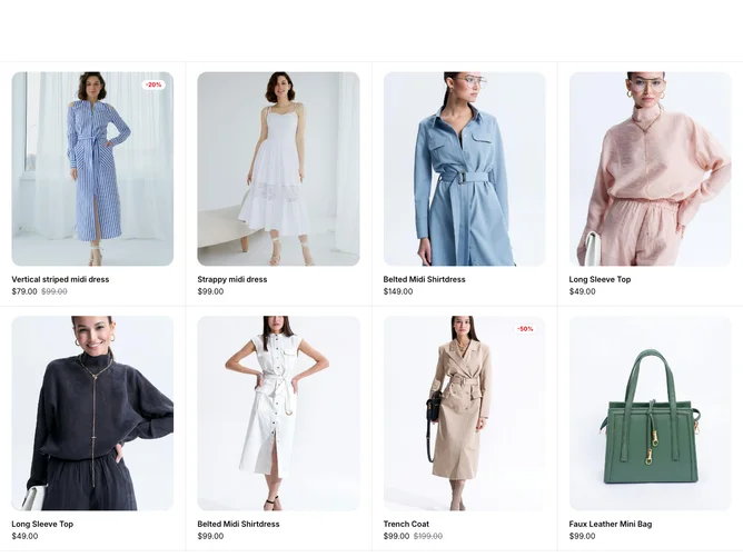
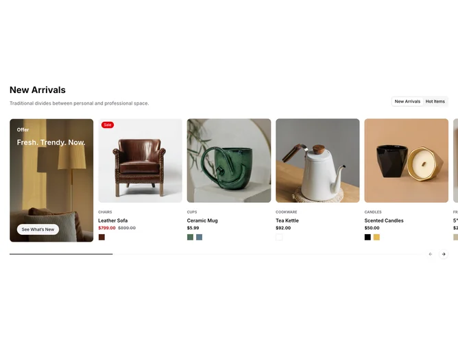
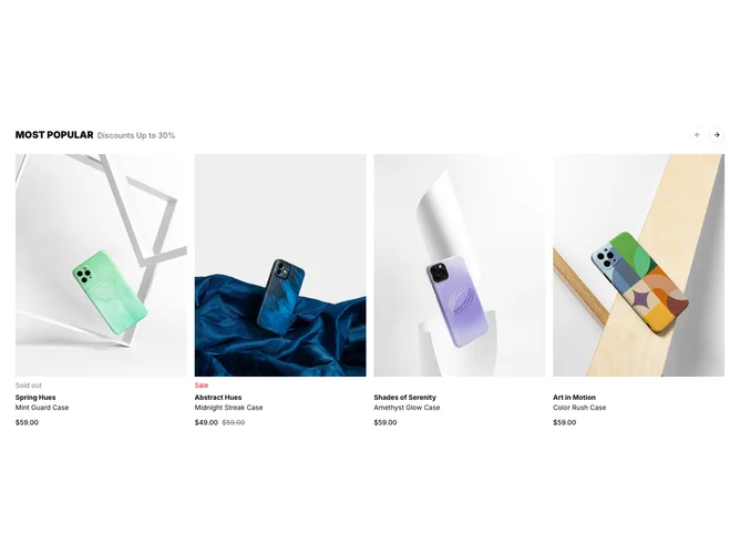
Shadcn Product List 9 - Tabbed product carousel with promo

Tabbed product carousel with promo

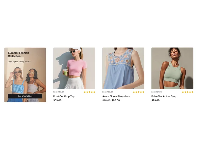
Shadcn Product List 4 - Product grid with promo card

Product grid with promo card

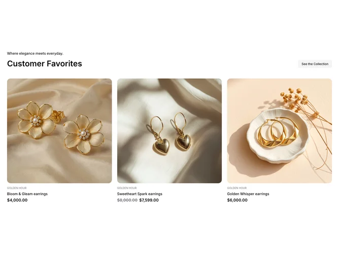
Shadcn Product List 5 - Product grid with collection header

Product grid with collection header

Shadcn Product List 7 - Product grid with size picker

Product grid with size picker

Shadcn Product List 6 - Product carousel with color variants

Product carousel with color variants

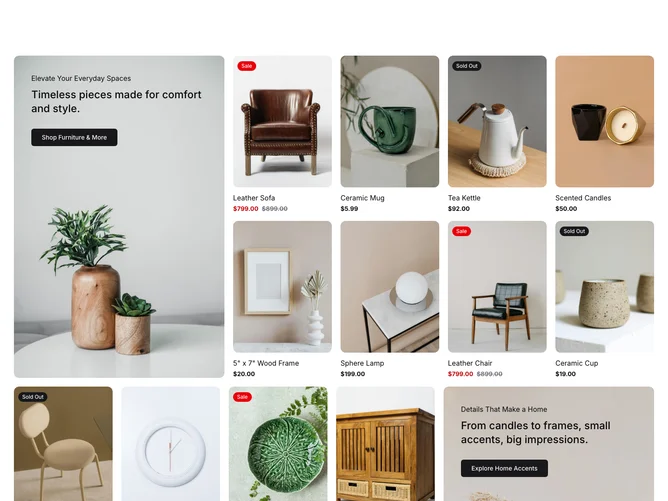
Shadcn Product List 10 - Product rows with featured promo

Product rows with featured promo

Shadcn UI Product List Blocks, Sections & Components

Product List blocks are dedicated sections of a webpage focused on product list content. They appear on landing pages, product pages, and marketing sites as key elements that communicate value and drive user engagement.

Each block is a self-contained React component which you can copy/paste the code or install via the shadcn CLI. You own the code and can modify however you like, or us AI and LLMS to quickly change the design.

Our product list blocks combine headlines, supporting text, images, icons, CTA buttons, and responsive layouts. Each block is designed with clear visual hierarchy and consistent spacing to integrate seamlessly into any page structure.

FAQs

What is a Shadcn Product List section?

A shadcn Product List section is a React block for a marketing page. Shadcnblocks Product List sections are built with Tailwind and shadcn/ui.

How do I install a Shadcnblocks Product List block?

Two ways. Copy and paste the code from the block page (in the code view), or install with the shadcn CLI. For example to install with the CLI run npx shadcn add @shadcnblocks/product-list8 - See the installation docs for setting up shadcn/ui if your project isn't using it already.

Can I use Shadcnblocks Product List sections in Next.js or Astro?

Yes. Shadcnblocks work with any React project. That includes Next.js, Astro, Remix, and Vite.

Do Shadcnblocks Product List blocks work with Radix UI, Base UI and React Aria?

Yes. Our blocks support Radix UI, Base UI and React Aria (beta). They will use whatever primitive library you have defined in your project's components.json. You can find more info at Radix UI or Base UI or React Aria .

Can I customize Shadcnblocks Product List sections?

Yes. You can customize every aspect of the code. Shadcnblocks are downloaded as components that live in your codebase (not npm modules), so editing the code is just like your own code.

How does theming work on Shadcnblocks Product List components?

Our blocks use shadcn/ui theme variables in Tailwind CSS. CSS variables cover light mode, dark mode, and the rest of the shadcn design tokens. You can install any theme from our Shadcn Themes page.

How do I choose the right Shadcn Product List section?

Use the subgroup list above. Start from the layout you already have assets for, then change the copy and the image.