Product List 9 block design & features
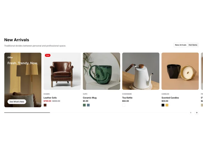
The ProductList9 component showcases a dynamic collection of products with visually engaging promotional content in a structured and interactive manner. It leverages the Shadcn UI framework to present products divided into categories like "New Arrivals" and "Hot Items," complete with promotions and detailed product displays. Featuring carousel navigation, this component allows users to explore various product offerings with fluid transitions and a contemporary design. Shadcn blocks such as Tabs and Carousels contribute to a seamless navigation experience while emphasizing product details and categories.
At the core of the ProductList9 component is its ability to present products in a highly visual manner, employing several unique features of Shadcn UI. The component integrates interactive elements like product variants, animated image carousels, and smooth transitions. The use of PromoCards highlights special deals or new arrivals with bold imagery and clear call-to-action buttons. Detailed Price displays ensure consumers make informed purchases, while Badge components emphasize specific product attributes or discounts. This component successfully combines functionality with a sleek layout, differentiating itself with the ability to dynamically showcase diverse product categories and promotions, making it a versatile choice for any modern e-commerce solution.