Product List 3 block design & features
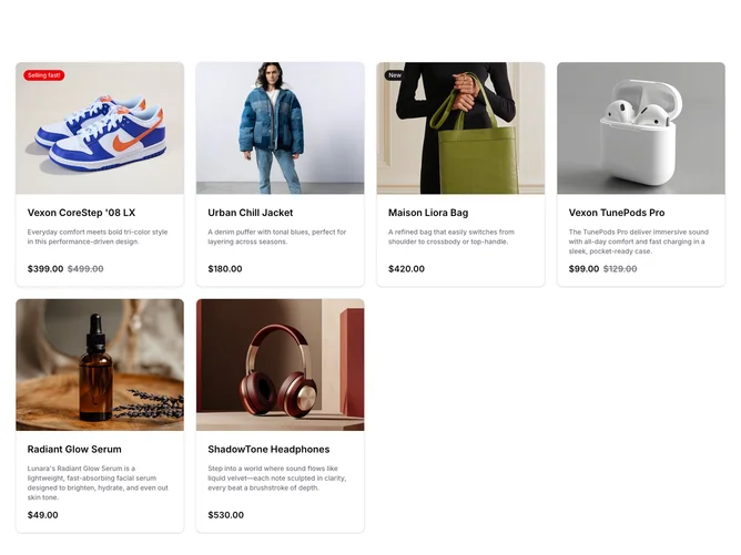
The ProductList3 component is a shadcn block that dynamically renders a collection of products in a grid layout. Each product is represented by a ProductCard, showcasing essential product details, such as imagery, name, description, and pricing. The cards are interactive, each linking to a detailed view of the product, further enriching the browsing experience. With auto-fit grid layout capabilities, this shadcn component efficiently utilizes space, adapting seamlessly to various container sizes to provide a coherent presentation of the products.
Diving deeper into the design, the ProductCard employs a well-structured layout. It includes a header featuring an image wrapped within an aspect ratio container, ensuring visual consistency. This shadcn ui also incorporates bespoke actions such as an "Add to cart" button, strategically revealed on hover for enhanced user interaction. The badge system highlights specific product attributes, like sales status or newness, with customizable colors, adding to the component's uniqueness. The pricing display, accommodating sale and regular pricing, visually communicates discounts, making it a versatile choice for any e-commerce implementation.