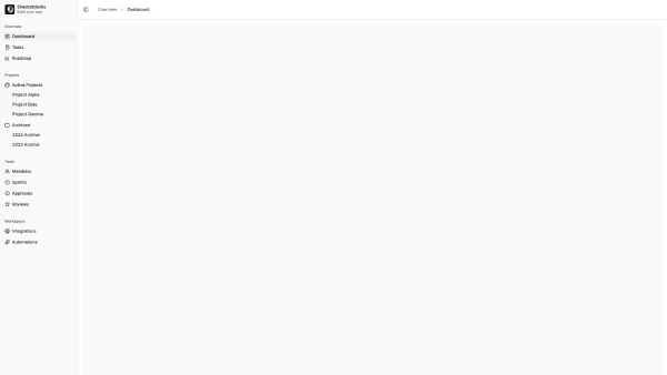
Shadcn UI Sidebar Blocks
A sidebar section provides persistent navigation and quick access to key application areas. It typically appears as a vertical panel along the left edge of the interface, serving as the primary navigation structure for complex applications and dashboards.
Sidebar blocks combine navigation links, collapsible menu groups, user profiles, search inputs, and action buttons. Effective implementations balance information density with scannable hierarchy; clear section groupings, visual indicators for active states, and smooth collapse animations for nested items.
Most shadcn sidebar sections follow one of a few patterns: the full-height navigation with collapsible groups, the compact icon-only sidebar with tooltips, or the hybrid sidebar with expandable panels. Browse our blocks to find one that fits your application structure, then customize the navigation items and layout to match your requirements.
