
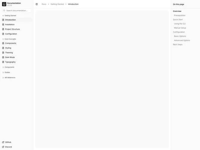
Sidebar 20 block design & features
Sidebar20 is a documentation shell built with shadcn/ui. The left rail starts with a book mark, the word Documentation, and a version label, then a search field that says Search documentation. Collapsible sections cover Getting Started, Core Concepts, Components, Guides, and API Reference, each with page links and a file icon. GitHub and Discord sit at the bottom as external links. The center header breadcrumbs Docs / Getting Started / Introduction above a muted canvas. The right rail is a sticky On this page outline with nested heading levels such as Overview, Quick Start, and Configuration.
Look at the type and you get a quiet, text-forward layout. Section chevrons rotate as groups open. The active Introduction row is highlighted. Second-level outline items indent. Density is comfortable on the left and lighter on the outline.
The style is the current default for a component-library docs site: minimal, serious, and familiar. Dual rails with a table of contents are a standard docs pattern, executed here without extra decoration. Complexity is moderate and content-driven. You need a real docs tree, a page outline, and a version string.
The outline rail hides below large breakpoints. Earlier breadcrumb segments hide on narrow viewports, leaving the current page title.