Sidebar 1 block design & features
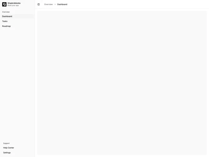
Sidebar1 is a basic sidebar layout using the shadcn sidebar component. The sidebar has a logo header, labeled navigation groups with icons, and footer links for help and settings. The main content area includes a header with toggle button, separator, and breadcrumbs. A rail appears when collapsed.
Light background with standard shadcn sidebar styling. Navigation items use icons with text labels. Groups are separated by labeled sections. The toggle button collapses the sidebar to icon-only mode. Breadcrumbs show the current navigation path.
This is the simplest sidebar variant, providing a solid foundation for dashboard layouts. The grouped navigation keeps items organized. A good starting point for applications with straightforward navigation needs.