
Sidebar 10 block design & features
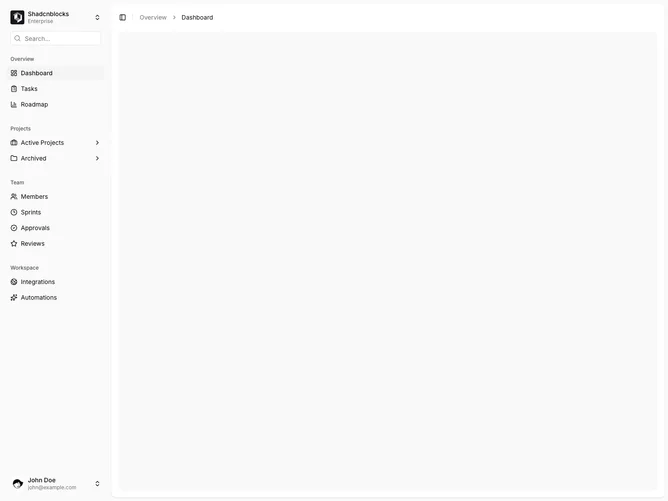
Sidebar10 is an inset app shell built with shadcn/ui. The sidebar sits inside the page frame so the main column feels padded rather than flush to the edge. The header repeats the workspace switcher and search field. Grouped navigation covers Overview, Projects, Team, and Workspace, with nested project links that expand in place. A user footer with avatar and account menu closes the rail. The inset main area has a collapse trigger, breadcrumbs, and a muted rounded canvas.
Color stays in the default sidebar palette: muted labels, a quiet search icon, and a highlighted active row. Because the variant is inset, the content pane wraps the rail with visible margin and the canvas reads as a contained card. Spacing is compact in the menu and more open in the main column. The layout is static aside from expand and menu motion.
Aesthetically this is the softer, boxed take on the same dashboard pattern. It stays close to the shadcn default inset sidebar rather than inventing a new visual language. Complexity is moderate and content-driven, same as the floating sibling: workspaces, a nested nav tree, and a signed-in user.
The trigger and breadcrumb sit in a tight header row. Nested project lists stay in the rail instead of overlaying the canvas.