Sidebar 2 block design & features
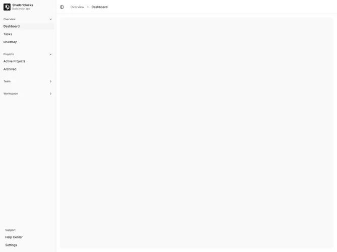
Sidebar2 extends the basic sidebar with collapsible submenu functionality. Navigation items can have nested children that expand when clicked. Chevron icons indicate expandable items and rotate when open. Submenus appear indented below their parent items.
Light background with standard sidebar styling. Collapsible items show chevron icons that animate on expand/collapse. Nested items use submenu styling with indentation. Groups can have default open/closed states. The main content area includes breadcrumbs and toggle.
This variant adds hierarchy to navigation, suitable for apps with nested sections like projects with sub-pages. The collapsible pattern keeps the sidebar compact while providing access to deeper navigation levels.