
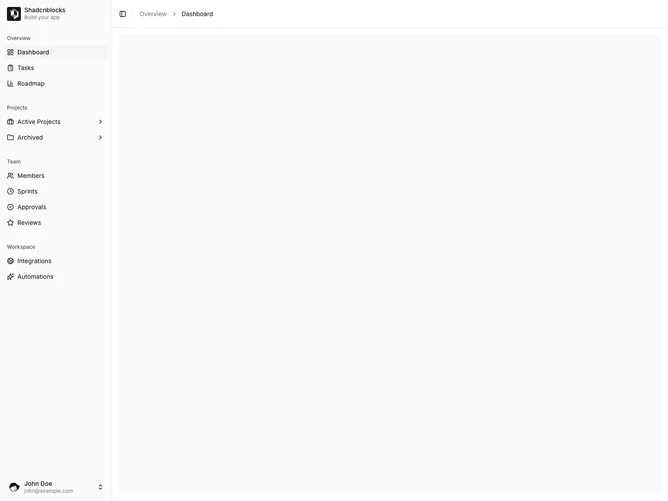
Sidebar 21 block design & features
Sidebar21 is a drill-down app rail built with Shadcn UI. The default view uses a brand lockup in the header (logo, name, tagline) and labeled groups in the body. Items without children are plain links. Items with children show a trailing chevron and, on click, replace the entire menu. The drill-down header has a back arrow, the parent icon, and the parent label above a flat list of children. The user footer with avatar and account menu stays in both views.
The drill-down header picks up a bottom border so the back row reads as a separate bar. The back control is a quiet square hit target. Child rows keep the same compact icon-and-label treatment as the root menu. Surfaces stay in default sidebar tokens. Only one level is visible at a time.
This has a mobile-settings or stacked-navigation feel, more sequential than the inline collapse and dropdown variants. Swapping the whole rail is a distinctive interaction in the set. Complexity is moderate and content-driven: you still need a nested tree, plus brand and user data.
The footer and collapse rail remain while the body swaps. The main column header is unchanged: trigger, rule, and breadcrumbs.