Shadcn Blog Post Blocks

Browse 13+ Shadcn UI Blog Post blocks, sections & components built with React, Tailwind CSS and shadcn/ui. Copy & paste the code or install via the shadcn CLI.

Shadcn Blogpost 2 - Article with sticky sidebar

Article with sticky sidebar

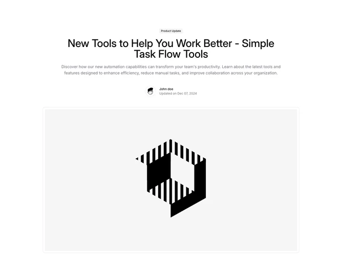
Shadcn Blogpost 7 - Blog post layout with animated header

Blog post layout with animated header

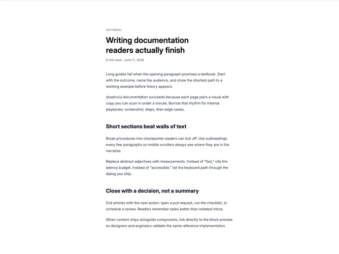
Shadcn Blogpost 5 - Article with bold headline and offset section rail

Article with bold headline and offset section rail

Shadcn Blogpost 1 - Centered article with alert and table

Centered article with alert and table

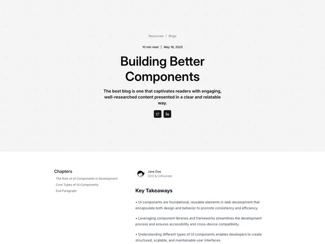
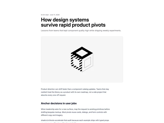
Shadcn Blogpost 6 - Article with chapter list and patterned hero

Article with chapter list and patterned hero

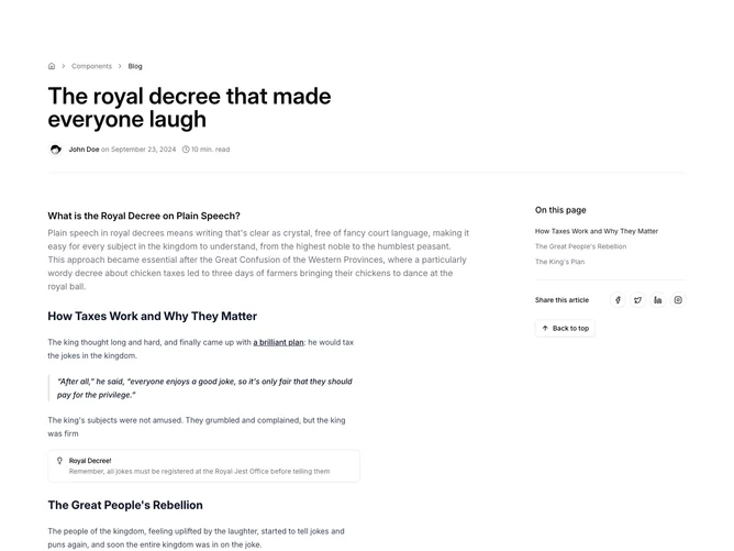
Shadcn Blogpost 4 - Article with breadcrumbs, share rail, and back to top

Article with breadcrumbs, share rail, and back to top

Shadcn Blogpost 3 - Article layout with sticky nav and promo column

Article layout with sticky nav and promo column

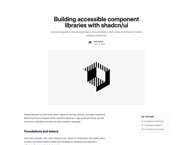
Shadcn Blogpost 8 - Article with sidebar table of contents

Article with sidebar table of contents

Shadcn Blogpost 9 - Article with author bio and share row

Article with author bio and share row

Shadcn Blogpost 10 - Narrow article with reading progress bar

Narrow article with reading progress bar

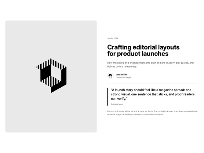
Shadcn Blogpost 11 - Split hero with quote pull block

Split hero with quote pull block

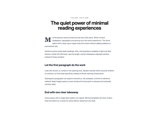
Shadcn Blogpost 12 - Centered minimal article with drop cap

Centered minimal article with drop cap

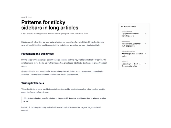
Shadcn Blogpost 13 - Two-column article with sticky related links

Two-column article with sticky related links

Shadcn UI Blog Post Blocks, Sections & Components

Blog Post blocks are dedicated sections of a webpage focused on blog post content. They appear on landing pages, product pages, and marketing sites as key elements that communicate value and drive user engagement.

Each block is a self-contained React component which you can copy/paste the code or install via the shadcn CLI. You own the code and can modify however you like, or us AI and LLMS to quickly change the design.

Our blog post blocks combine headlines, supporting text, images, icons, CTA buttons, and responsive layouts. Each block is designed with clear visual hierarchy and consistent spacing to integrate seamlessly into any page structure.

Choosing the Right Blog Post Section

Different goals call for different blog post sections. We’ve organized our blog post blocks into subgroups so you can find the right layout for your use case:

Frequently Asked Questions

How are Shadcnblocks blog post blocks built?
Shadcnblocks blog post blocks are built with React, Tailwind CSS, and shadcn/ui components.

What technologies are used to build Shadcnblocks blog post sections?
Shadcnblocks blog post sections are built with React, Tailwind CSS, and shadcn/ui components. They use standard React components and Tailwind utility classes for styling.

What frameworks do Shadcnblocks blog post components work with?
Shadcnblocks blog post components work with any React-based framework including Next.js, Remix, Astro, and Vite.

Can I customize Shadcnblocks blog post blocks?
Yes. Every block is source code you add directly to your project. You can modify the text, images, colors, layout, and behavior using standard React and Tailwind patterns.

Do Shadcnblocks blog post sections support dark mode?
Yes. All blocks use shadcn/ui’s theming system and support light and dark mode out of the box.

How do I install a Shadcnblocks blog post block?
The best way to install a Shadcnblocks blog post block is to use the shadcn CLI: npx shadcn add @shadcnblocks/{blockId}.

Can I copy and paste the code into my project?
Yes. Every block is ready to copy and paste the code directly into your project. Just click the “code” tab on any block to view the source code.