
Blogpost 34 block design & features
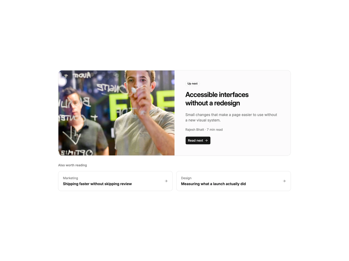
Blogpost34 points readers to one next article, built with Shadcn UI Badge and Button components. A wide rounded card splits into a cover image and a content panel holding an "Up next" badge, the post title as the heading, a summary, the author and read time, and a "Read next" button. Underneath, an "Also worth reading" label introduces two smaller bordered links with a category, title, and arrow.
The main card sits on a soft muted surface with a thin border, and the badge uses the page background so it stands out. The smaller links fill with the muted color on hover and their arrows slide right. The single large card makes the next step obvious rather than offering a long list of choices.
It works well for series and guides where there is a clear next article. Complexity is low, and it needs one strong cover image plus two extra post titles.
On phones the cover sits above the content and the two small links stack.