

Shadcn UI Pricing Blocks, Sections & Components
Pricing blocks are the make-or-break section of any product or SaaS page. They present your plans, features, and price points in a layout that helps visitors compare options and convert. Whether you need a simple single-plan card, a side-by-side comparison table, or a full-featured multi-tier layout with toggles and add-ons, a well-designed pricing section removes friction from the buying decision.
Each block is a self-contained React component which you can copy/paste the code or install via the shadcn CLI. You own the code and can modify however you like, or us AI and LLMS to quickly change the design.
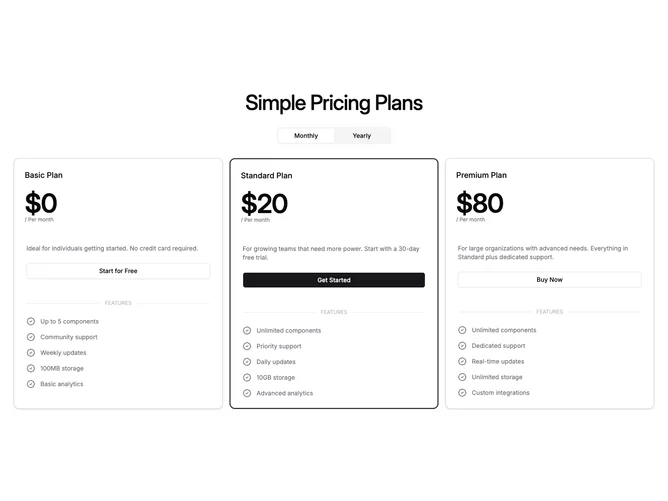
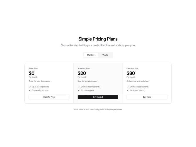
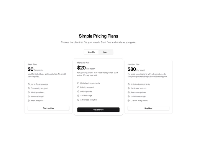
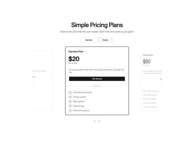
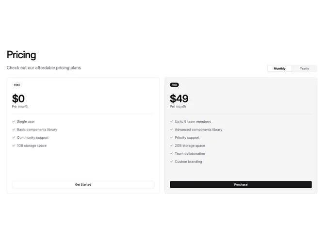
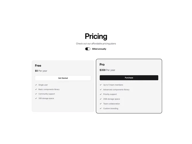
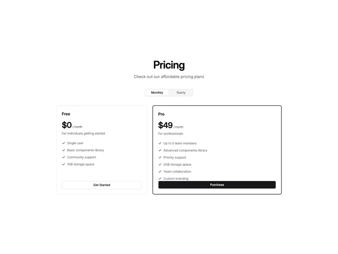
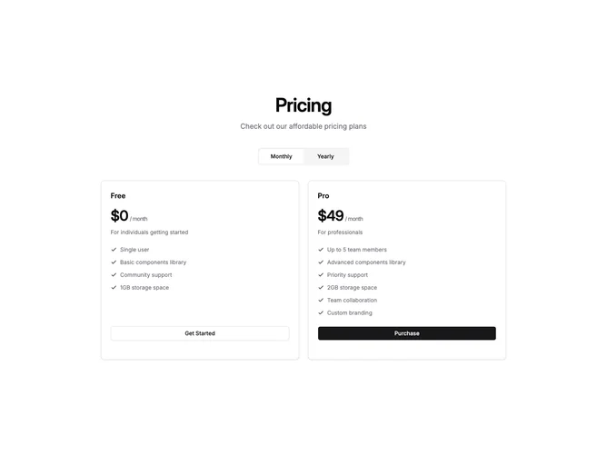
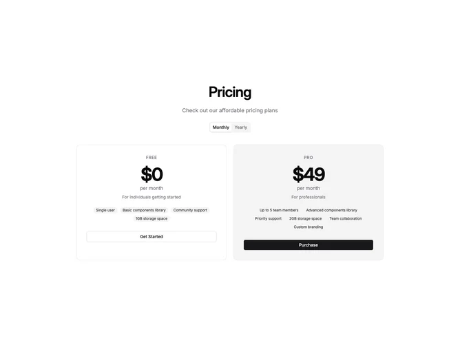
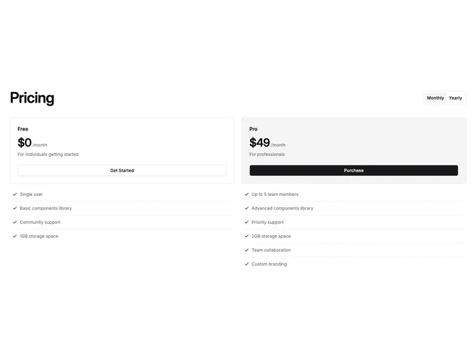
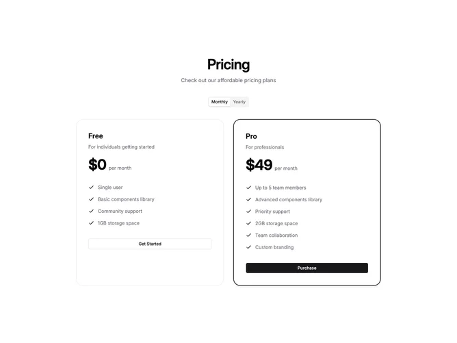
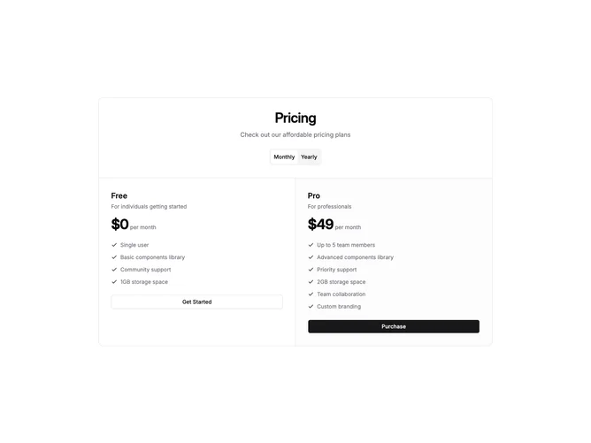
Our pricing block collection includes card-based layouts for 2, 3, and 4 plans, comparison tables with feature rows, single-plan spotlight sections, and add-on selectors. Each variant supports monthly/annual toggle patterns, highlighted recommended plans, and clear CTA hierarchy. Built with shadcn/ui components and Tailwind CSS, they adapt to any color scheme and work seamlessly in both light and dark mode.
Choosing the Right Pricing Section
Different goals call for different pricing sections. We’ve organized our pricing blocks into subgroups so you can find the right layout for your use case:
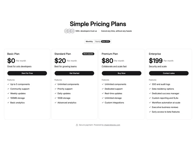
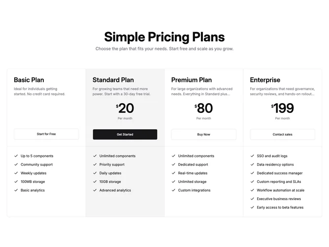
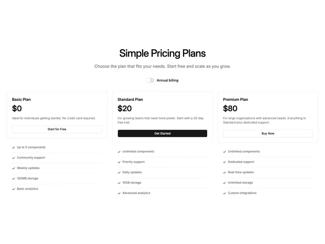
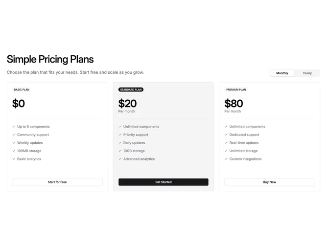
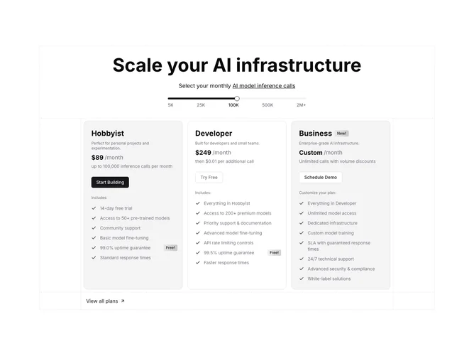
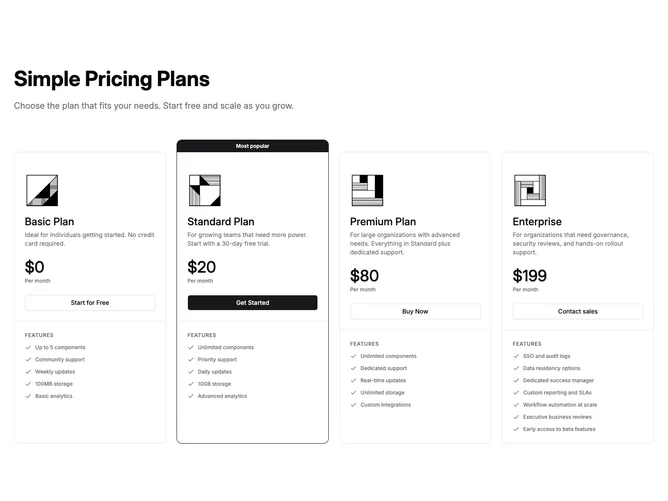
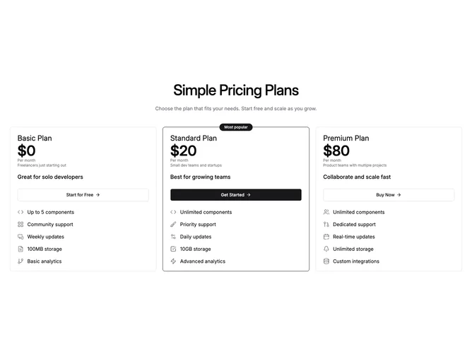
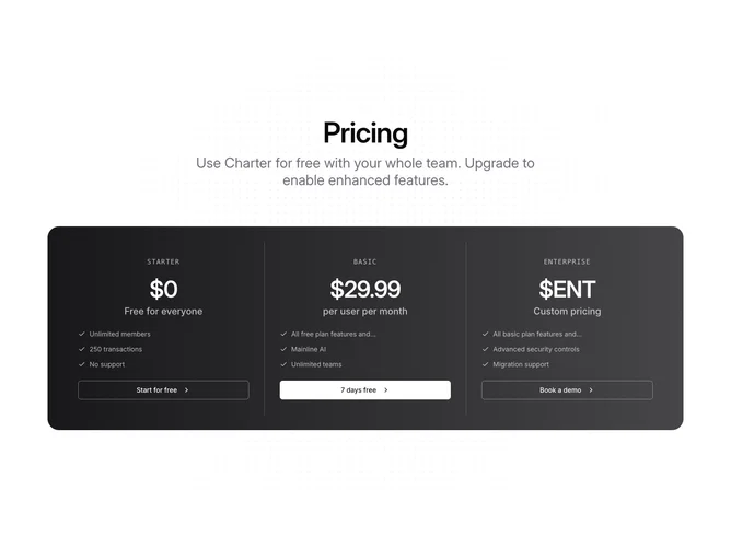
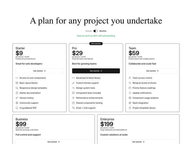
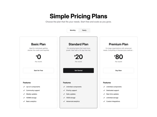
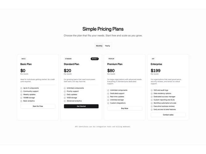
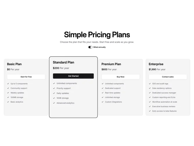
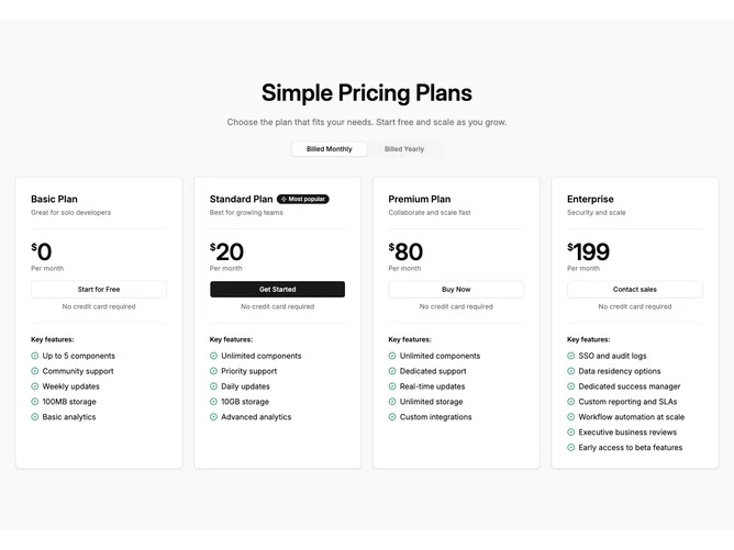
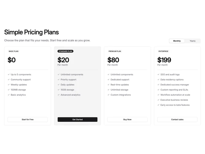
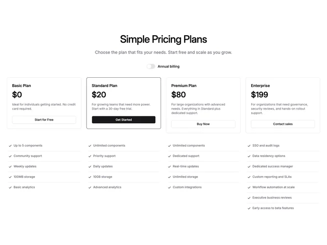
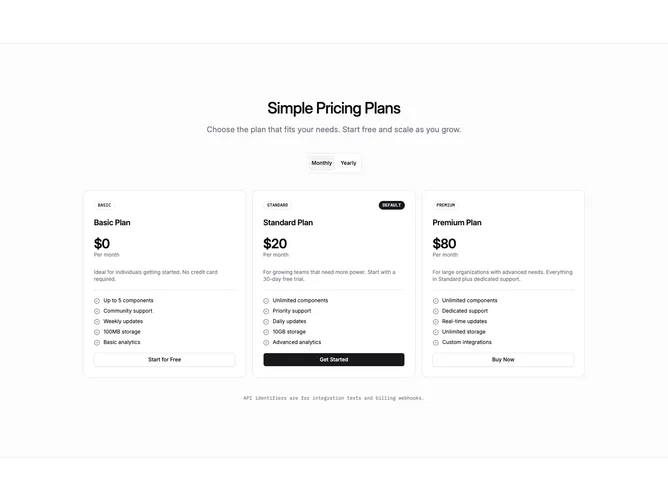
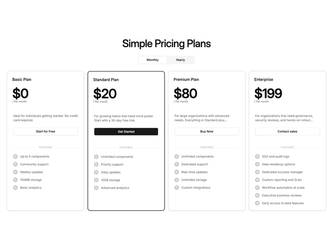
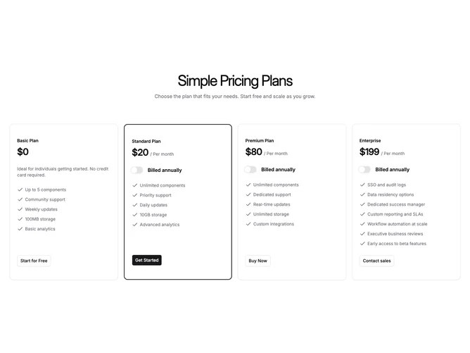
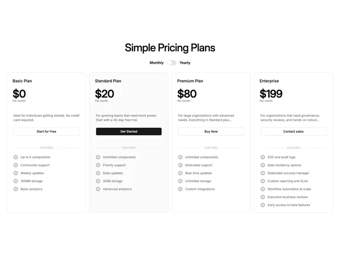
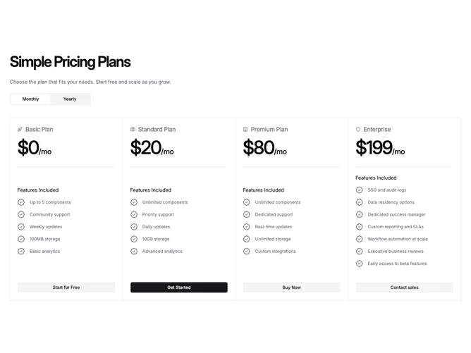
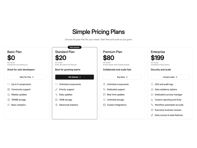
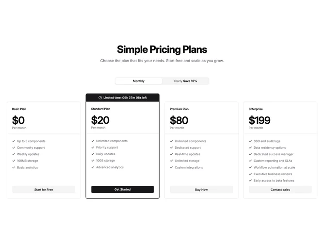
- Shadcn Pricing Cards (4 Plans) - Pricing Cards (4 Plans) layouts structured around 4 plans.
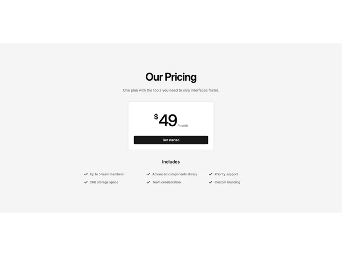
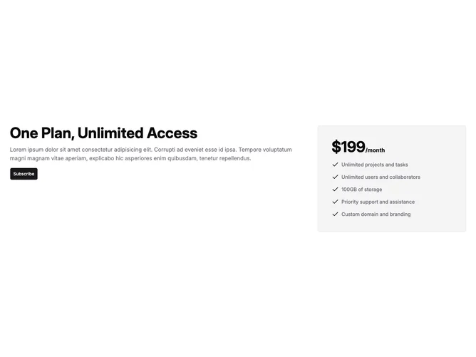
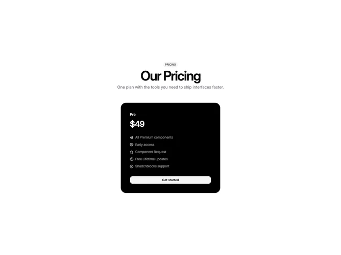
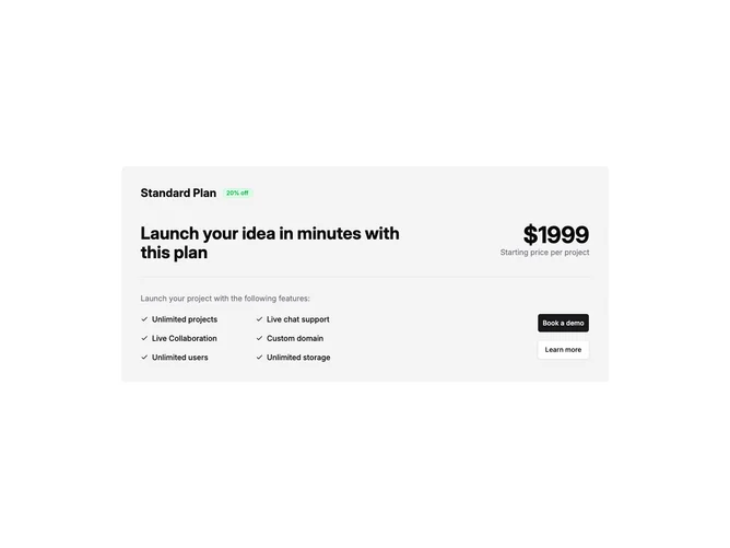
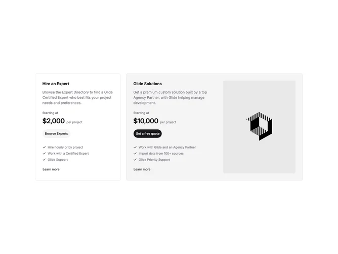
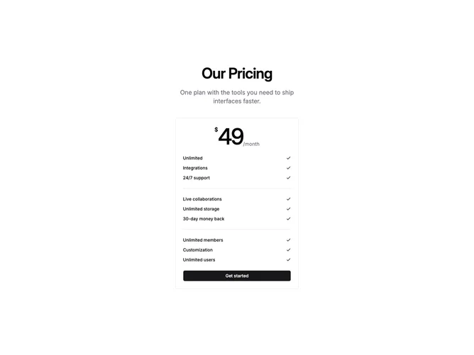
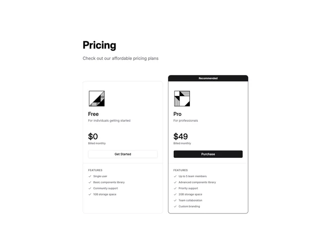
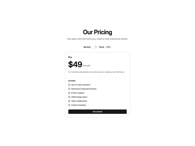
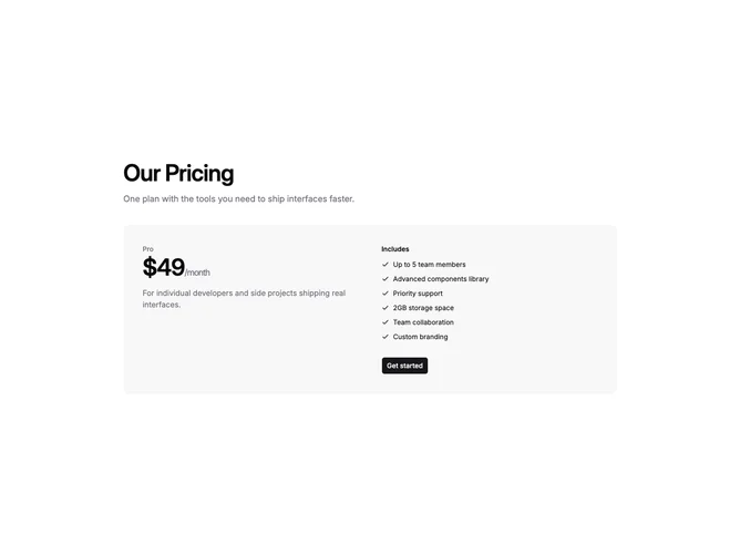
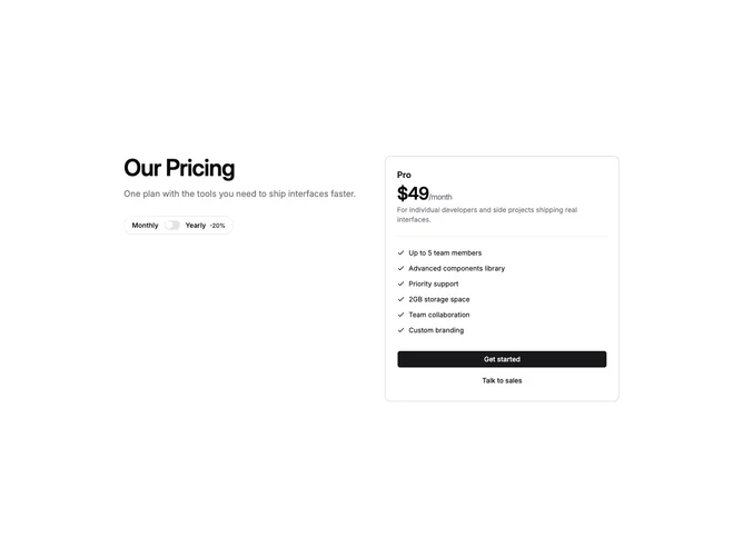
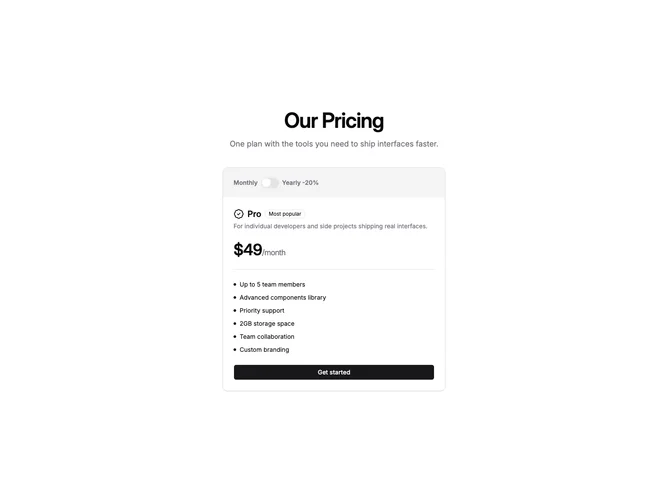
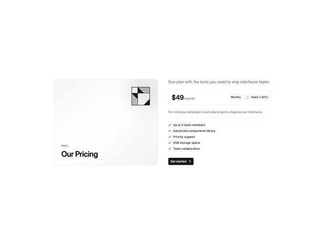
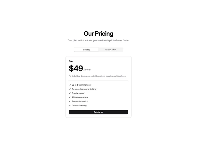
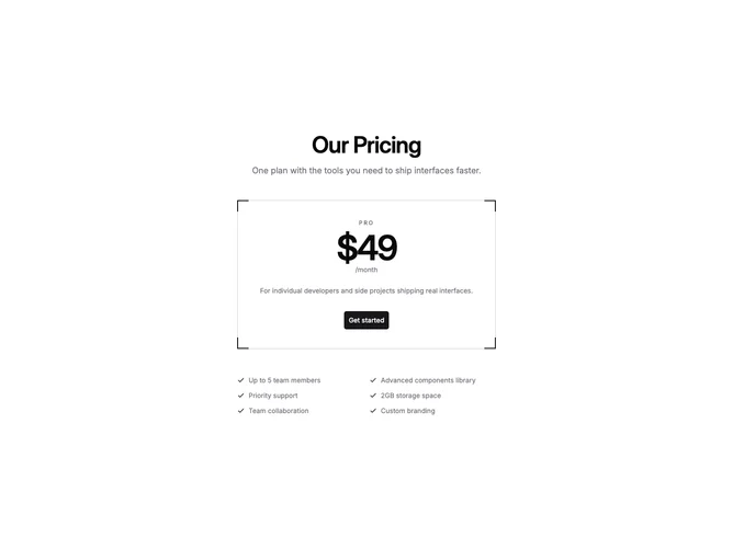
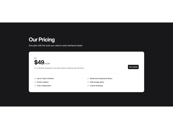
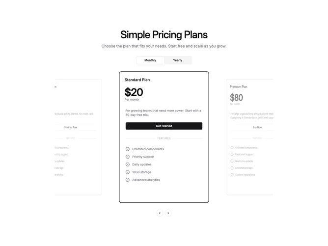
- Shadcn Pricing Card Single - Single-item pricing layouts for products with one plan or simple offerings.
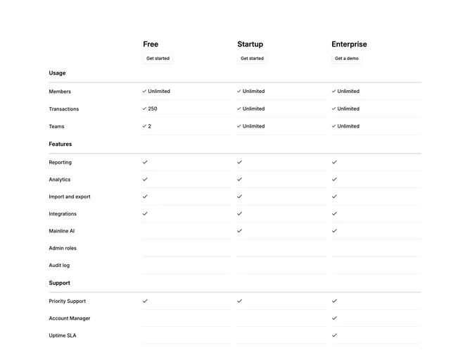
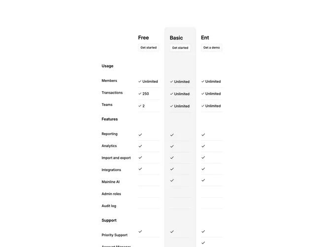
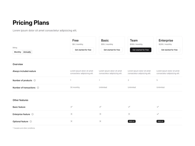
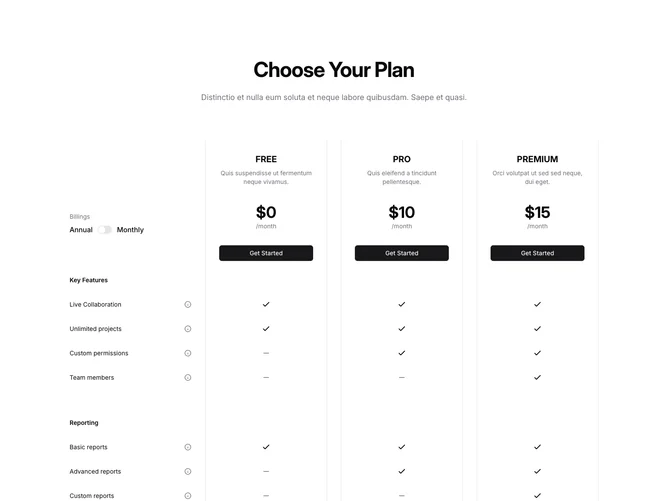
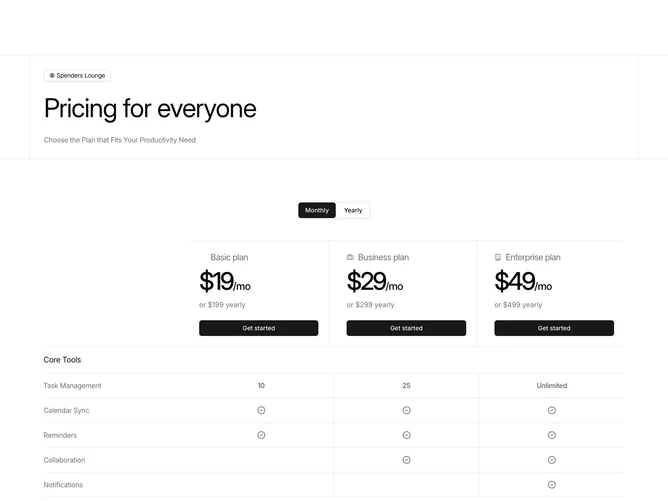
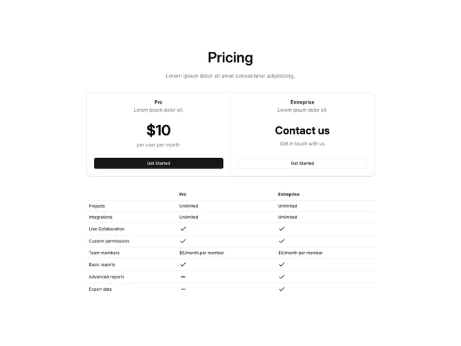
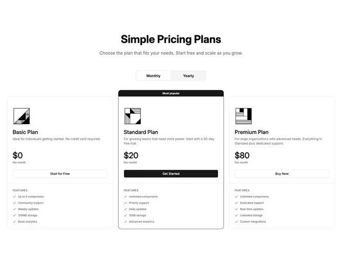
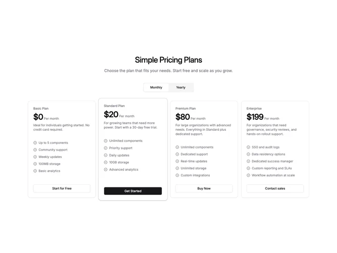
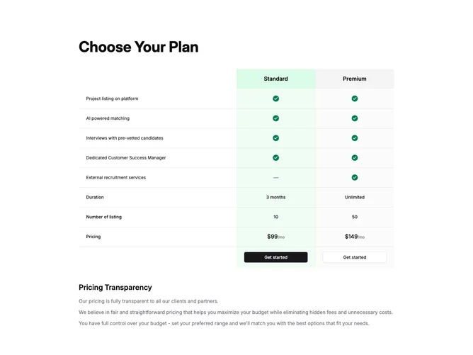
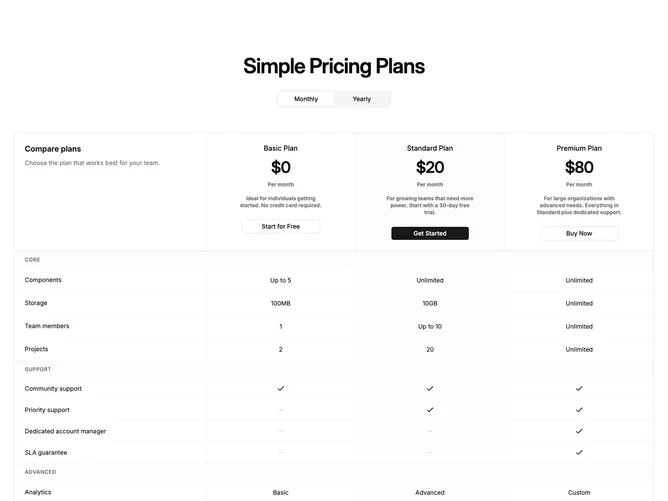
- Shadcn Pricing Table (4 Plans) - Pricing Table (4 Plans) layouts in a structured table format for side-by-side comparison.
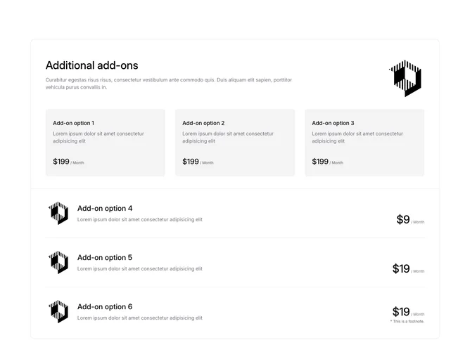
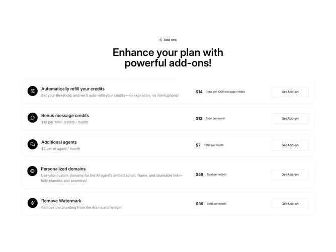
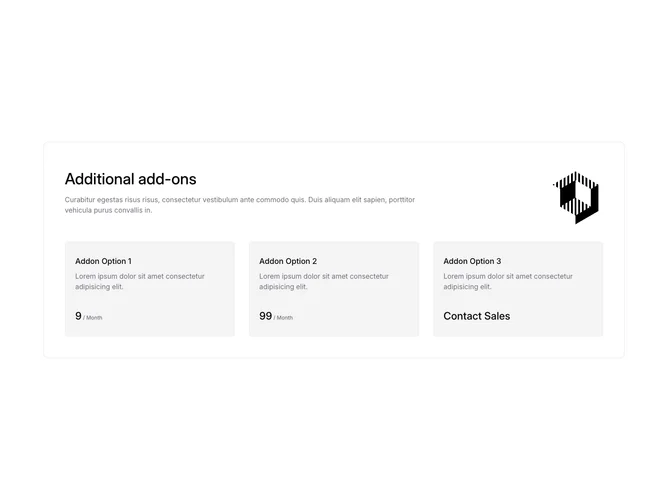
- Shadcn Pricing Addons - Add-on and supplemental pricing layouts that accompany a main selection.
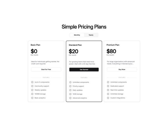
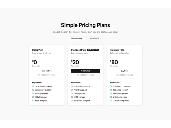
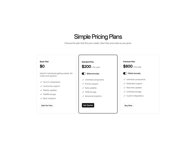
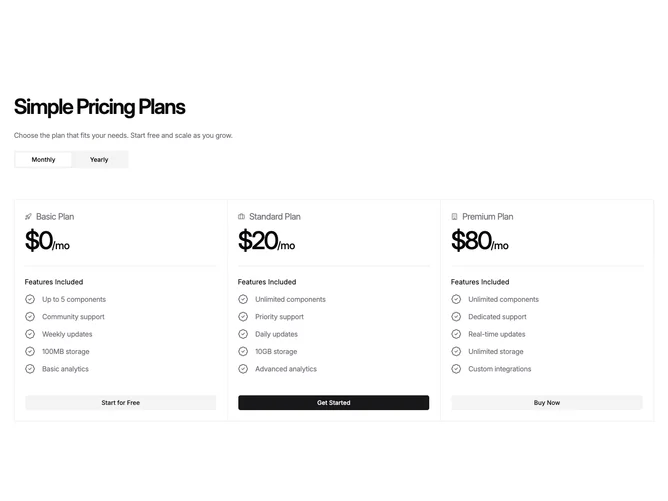
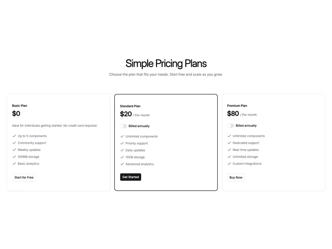
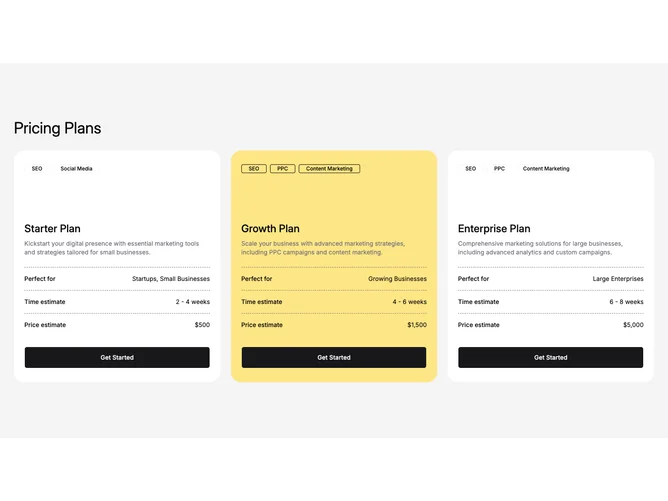
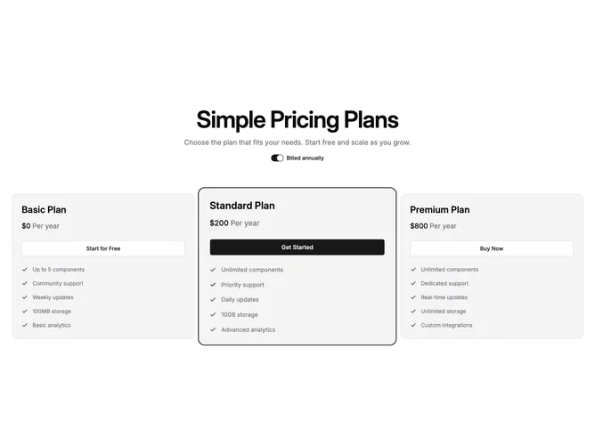
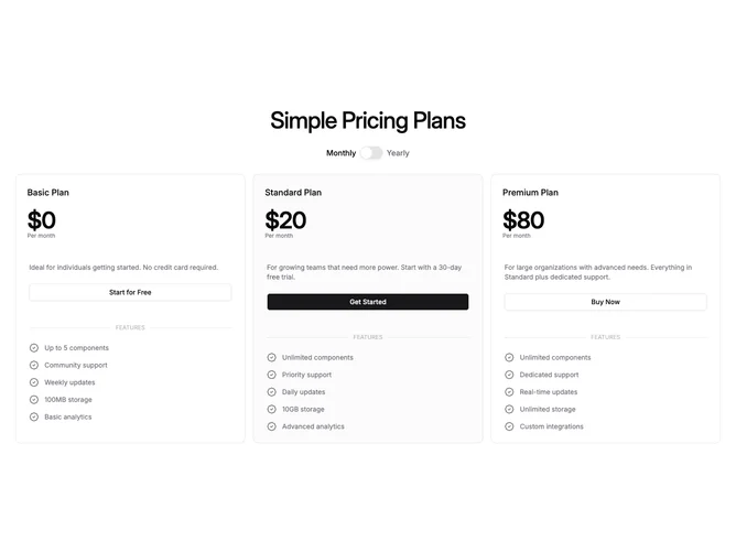
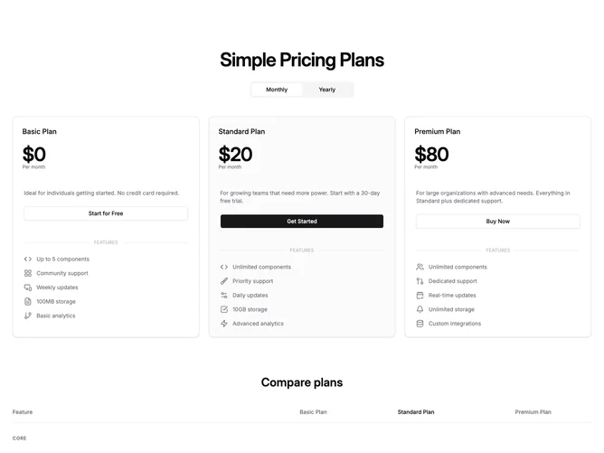
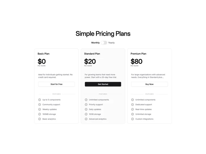
- Shadcn Pricing Cards (3 Plans) - Pricing Cards (3 Plans) layouts structured around 3 plans.
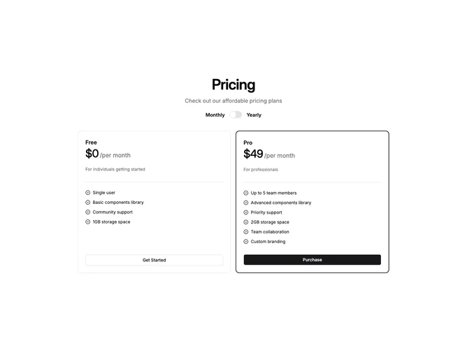
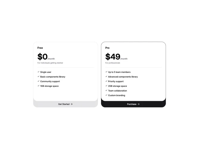
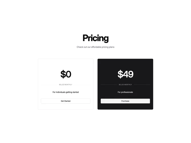
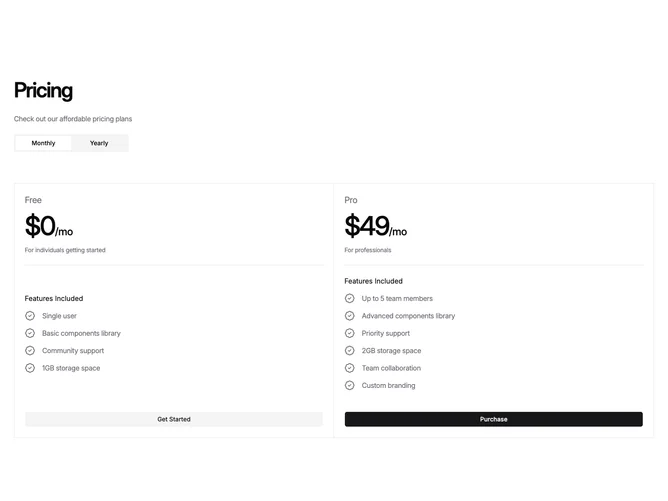
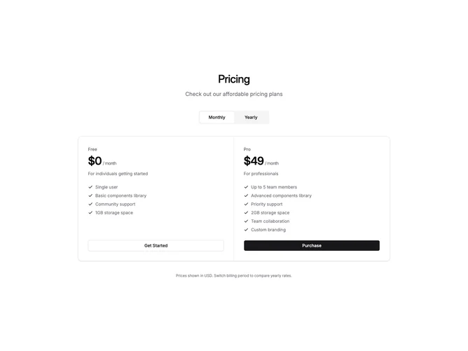
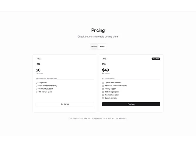
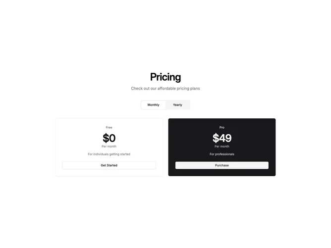
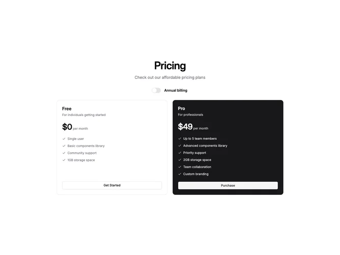
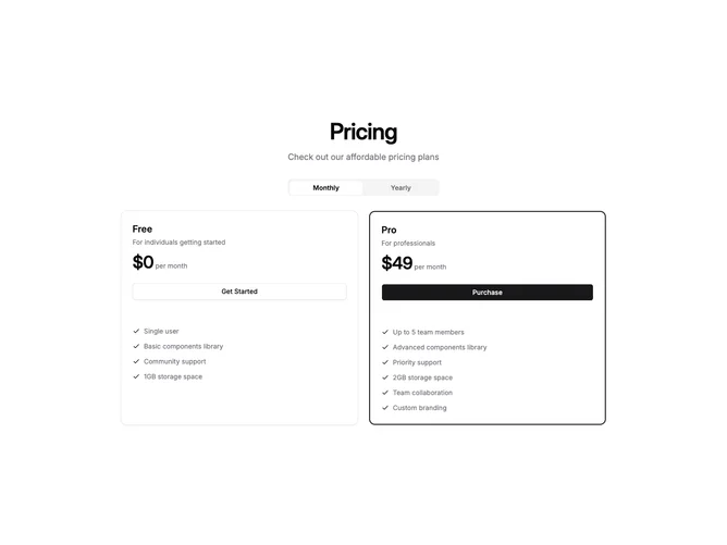
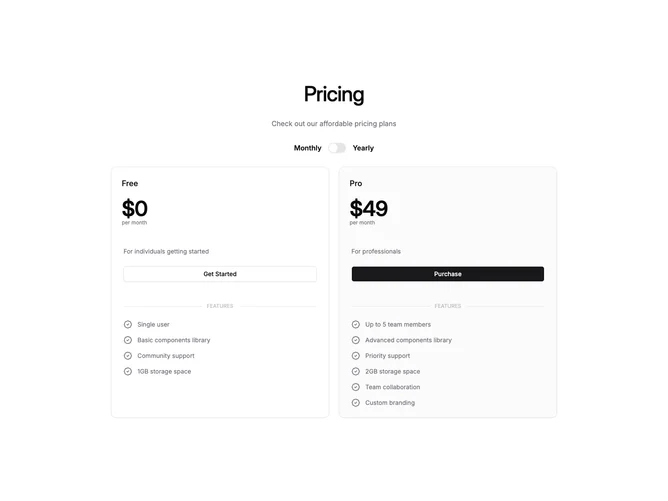
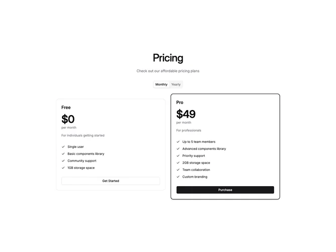
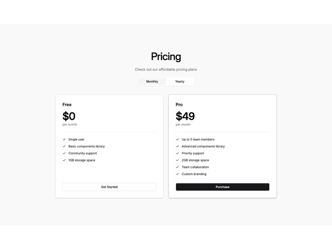
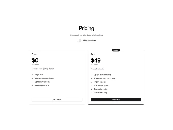
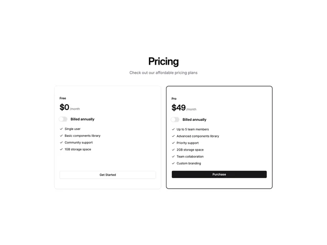
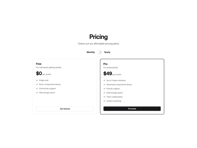
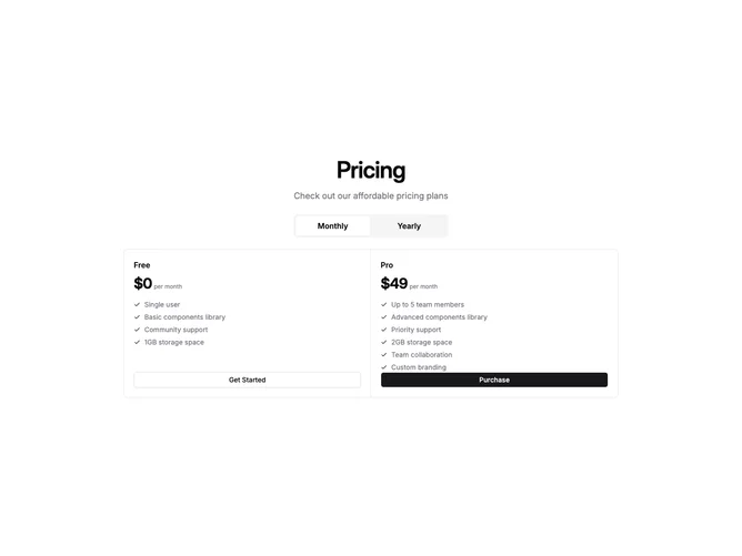
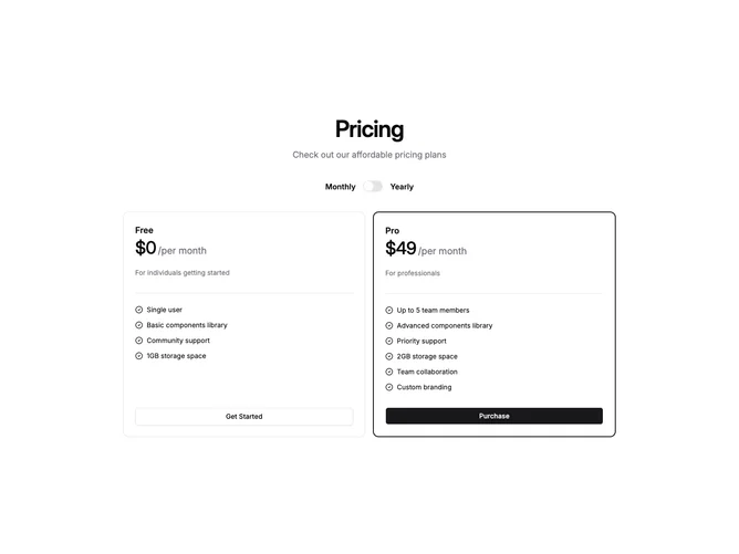
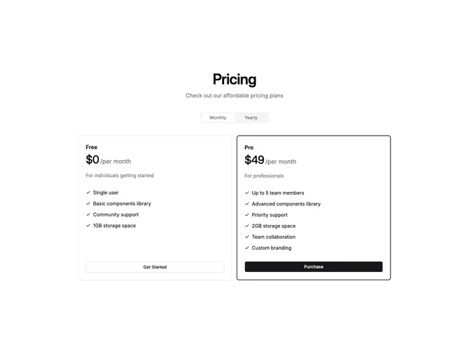
- Shadcn Pricing Cards (2 Plans) - Card-based pricing layouts with clear visual separation between items.
- Shadcn Pricing Table (3 Plans) - Pricing Table (3 Plans) layouts in a structured table format for side-by-side comparison.
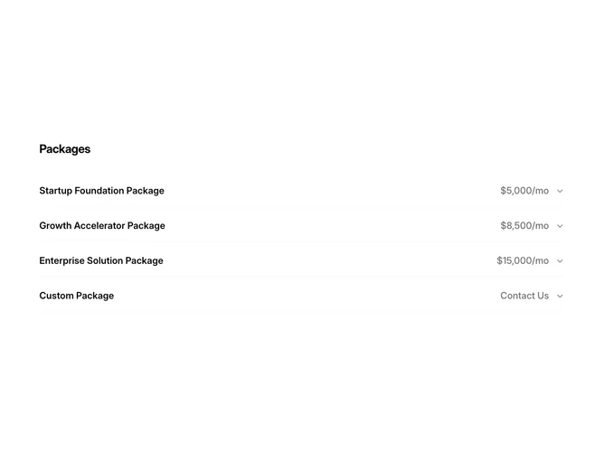
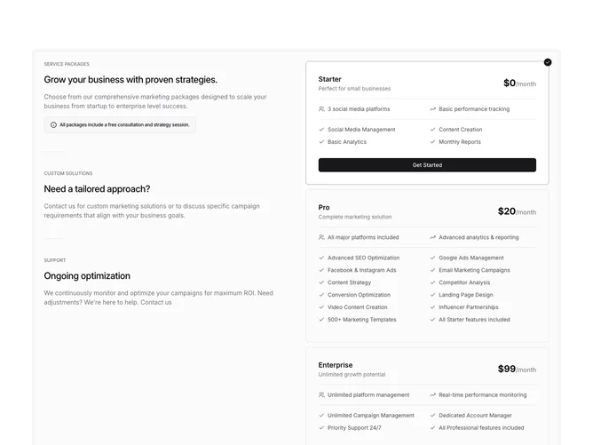
- Shadcn Pricing Other - Unique and creative pricing layouts that go beyond standard patterns.
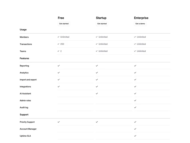
- Shadcn Pricing Table - Pricing Table layouts in a structured table format for side-by-side comparison.
Frequently Asked Questions
How are Shadcnblocks pricing blocks built?
Shadcnblocks pricing blocks are built with React, Tailwind CSS, and shadcn/ui components.
What technologies are used to build Shadcnblocks pricing sections?
Shadcnblocks pricing sections are built with React, Tailwind CSS, and shadcn/ui components. They use standard React components and Tailwind utility classes for styling.
What frameworks do Shadcnblocks pricing components work with?
Shadcnblocks pricing components work with any React-based framework including Next.js, Remix, Astro, and Vite.
Can I customize Shadcnblocks pricing blocks?
Yes. Every block is source code you add directly to your project. You can modify the text, images, colors, layout, and behavior using standard React and Tailwind patterns.
Do Shadcnblocks pricing sections support dark mode?
Yes. All blocks use shadcn/ui’s theming system and support light and dark mode out of the box.
How do I install a Shadcnblocks pricing block?
The best way to install a Shadcnblocks pricing block is to use the shadcn CLI: npx shadcn add @shadcnblocks/{blockId}.
Can I copy and paste the code into my project?
Yes. Every block is ready to copy and paste the code directly into your project. Just click the “code” tab on any block to view the source code.