
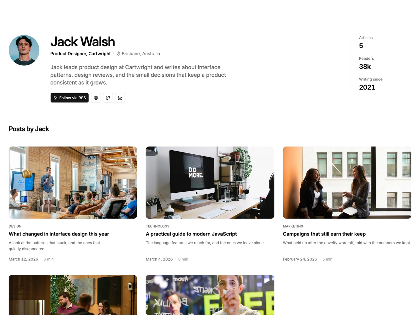
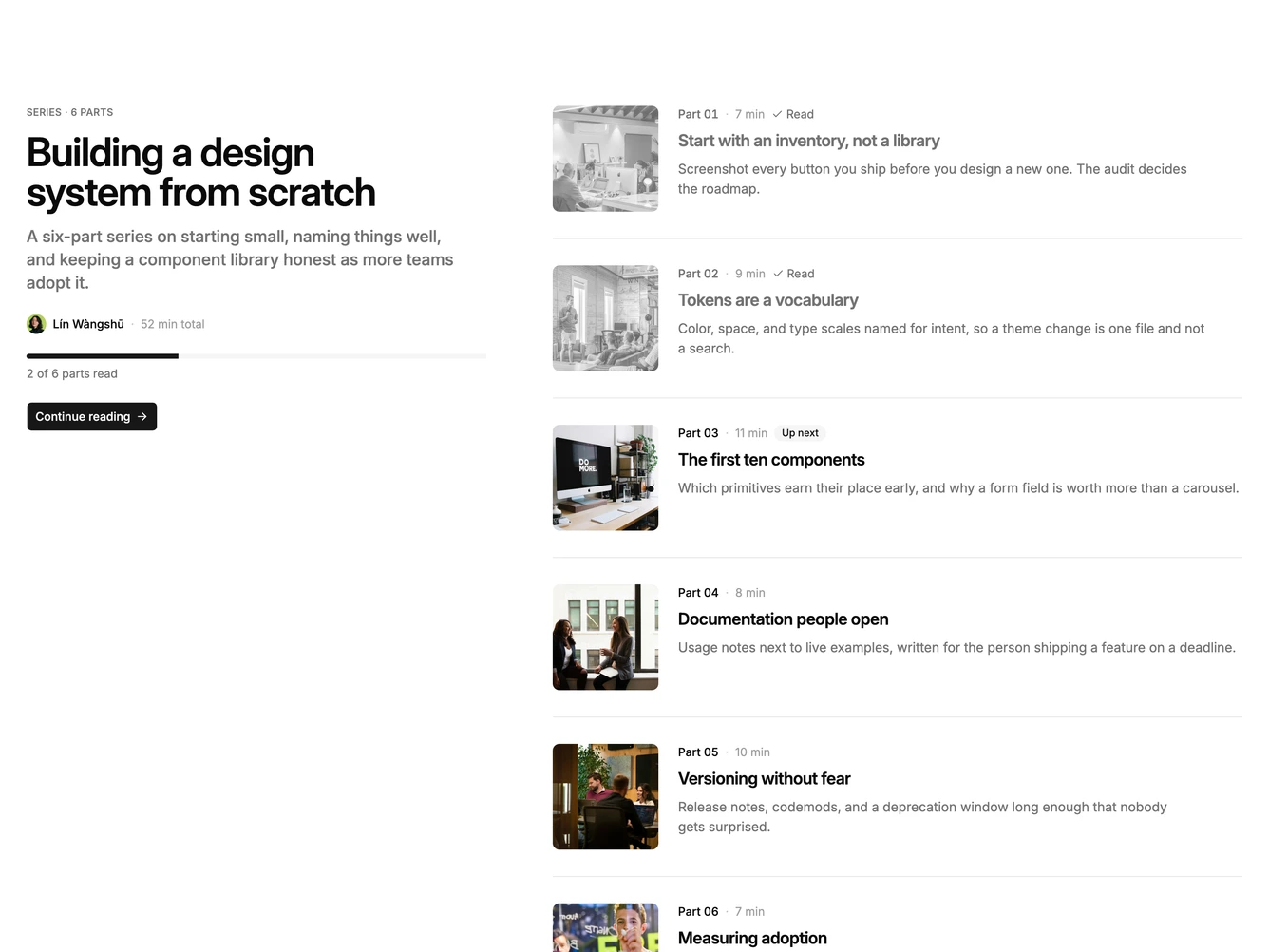
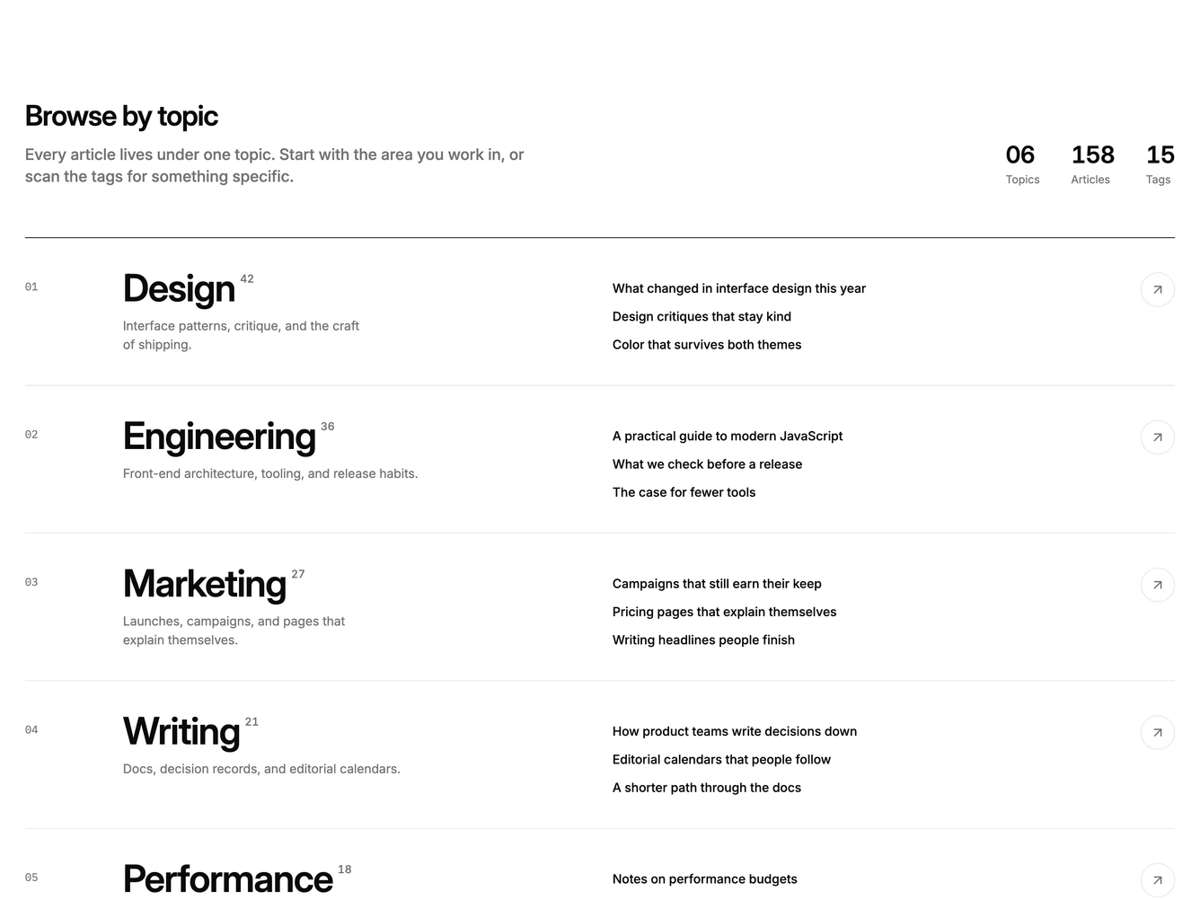
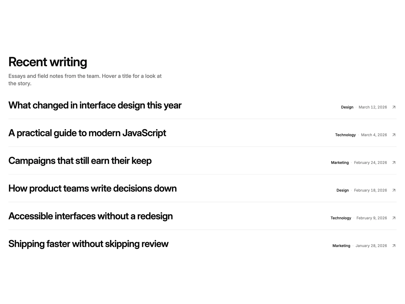
Shadcn Blog Blocks

Browse 54+ Shadcn UI Blog sections built with React, Tailwind CSS and shadcn/ui. Copy & paste the code or install via the shadcn CLI.

Shadcn Blog 1 - Latest posts grid with filters

Latest posts grid with filters

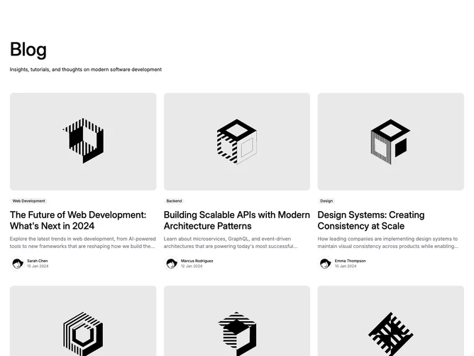
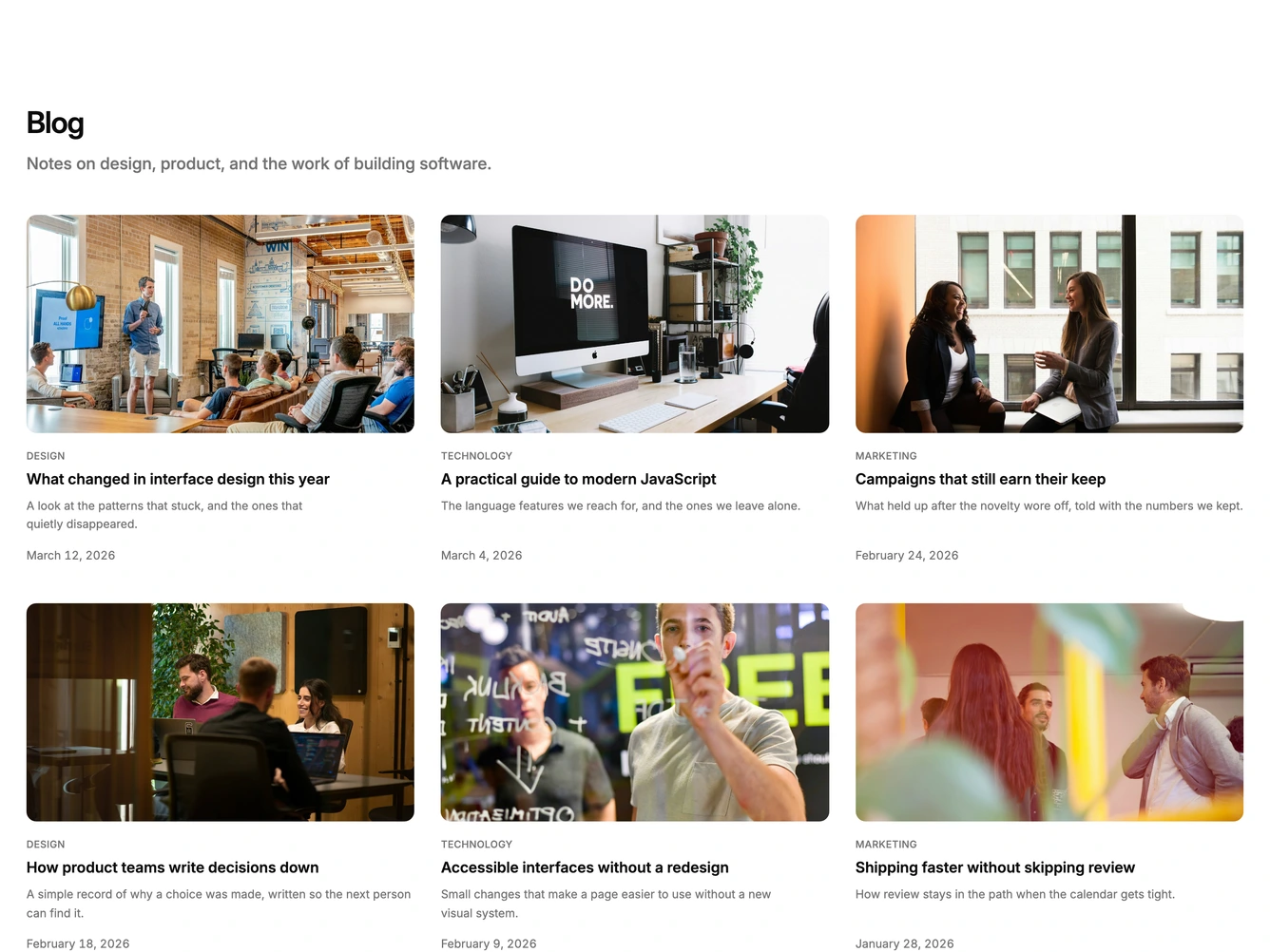
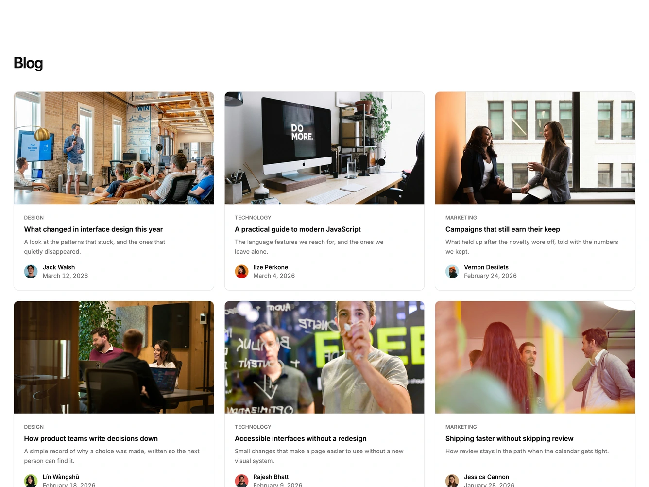
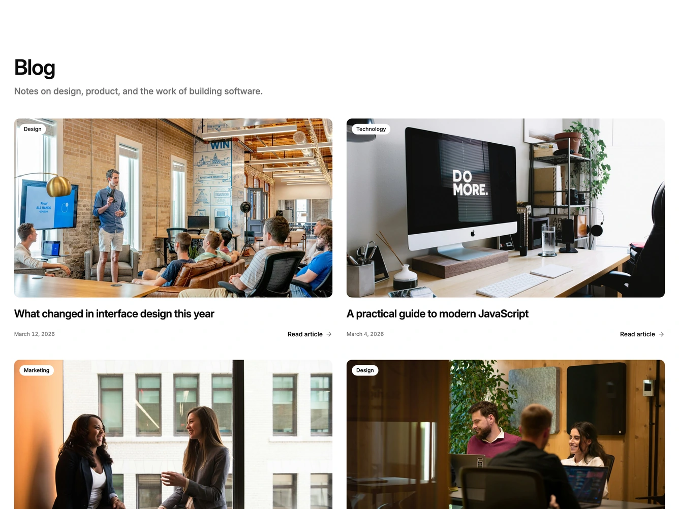
Shadcn Blog 3 - Blog grid with labeled posts

Blog grid with labeled posts

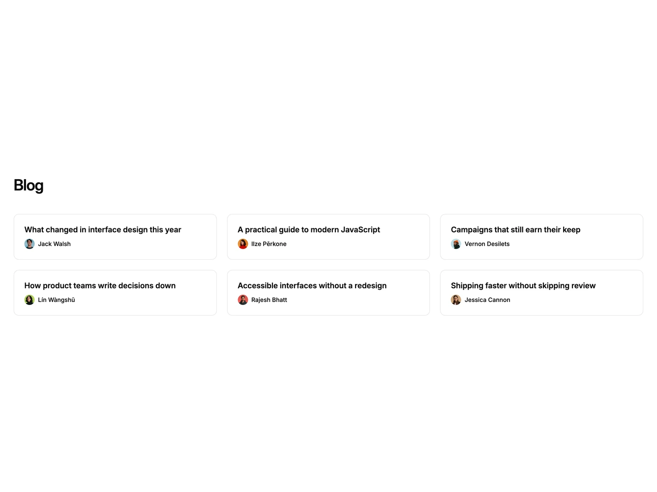
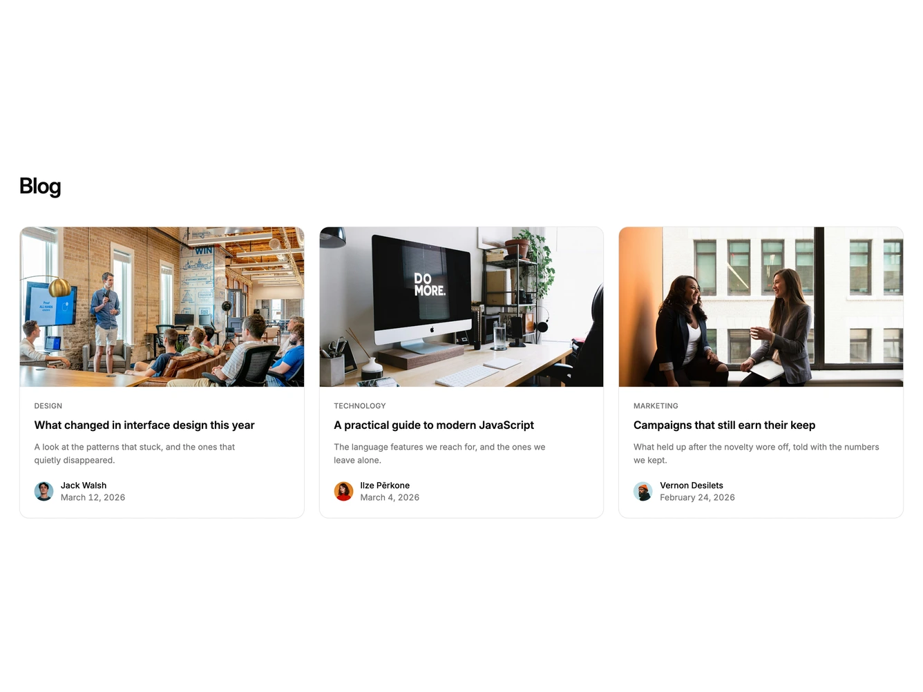
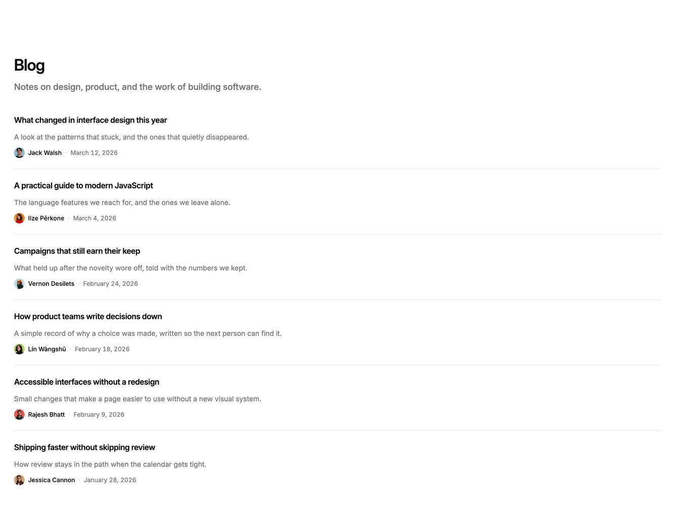
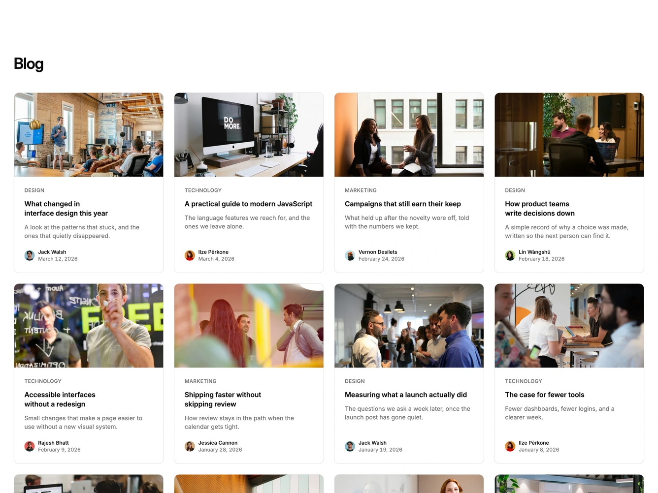
Shadcn Blog 4 - Blog grid with avatars and mobile view-all

Blog grid with avatars and mobile view-all

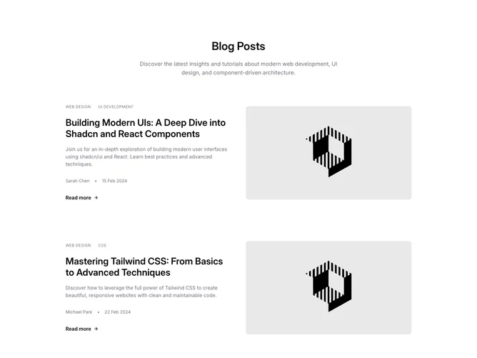
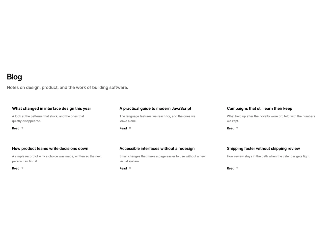
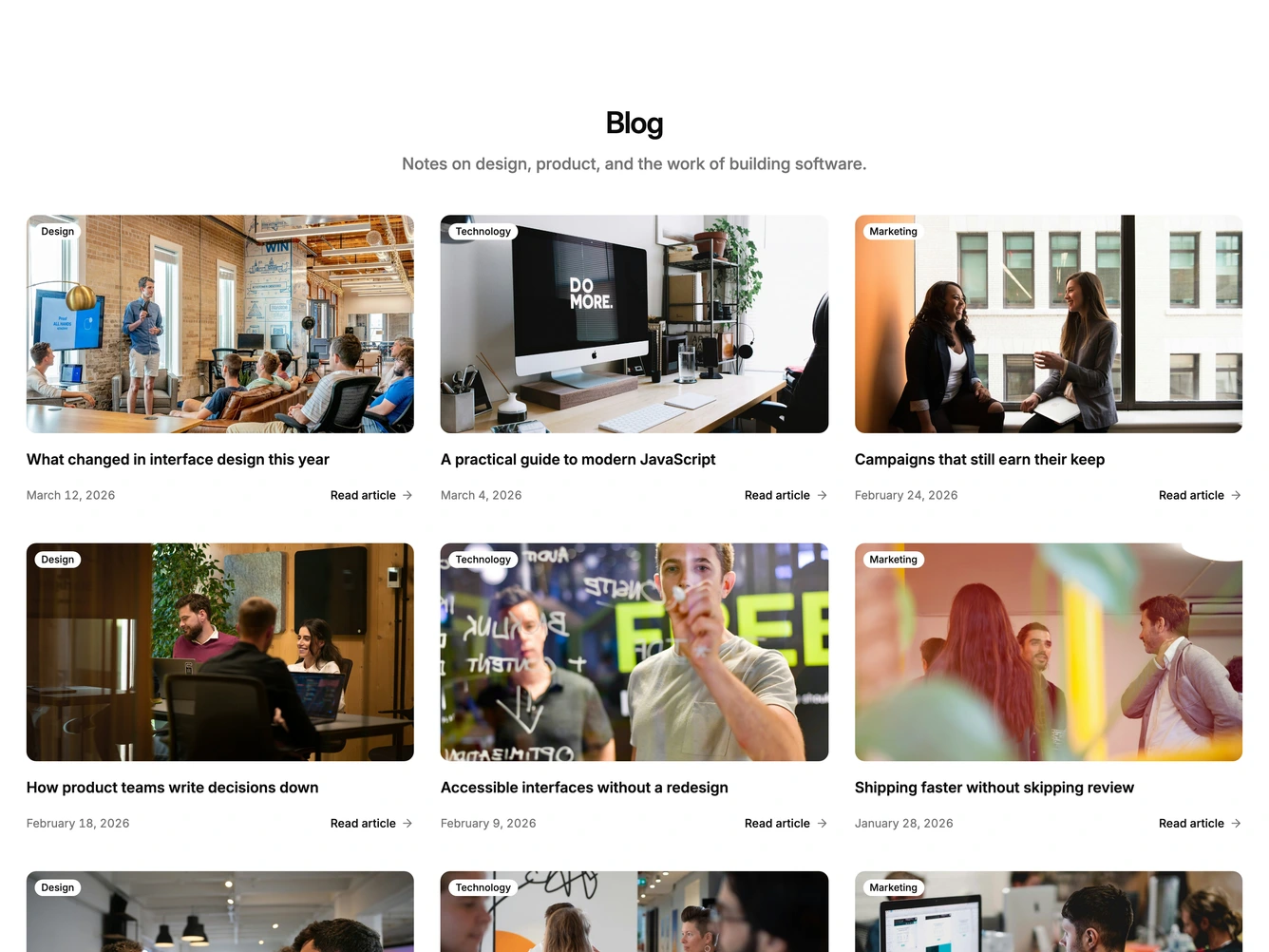
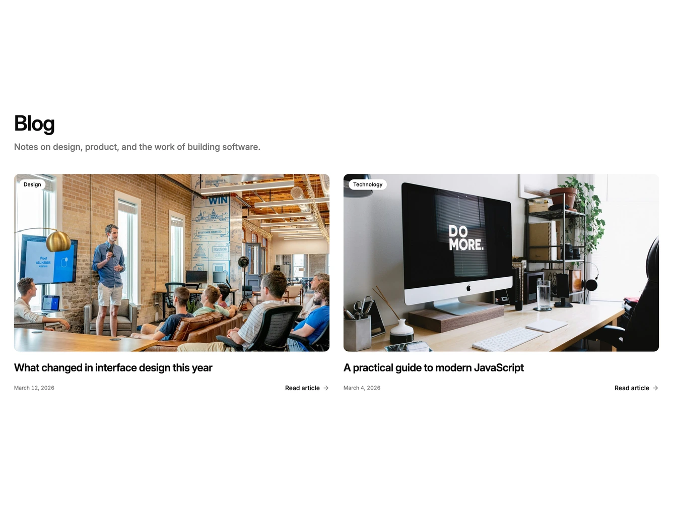
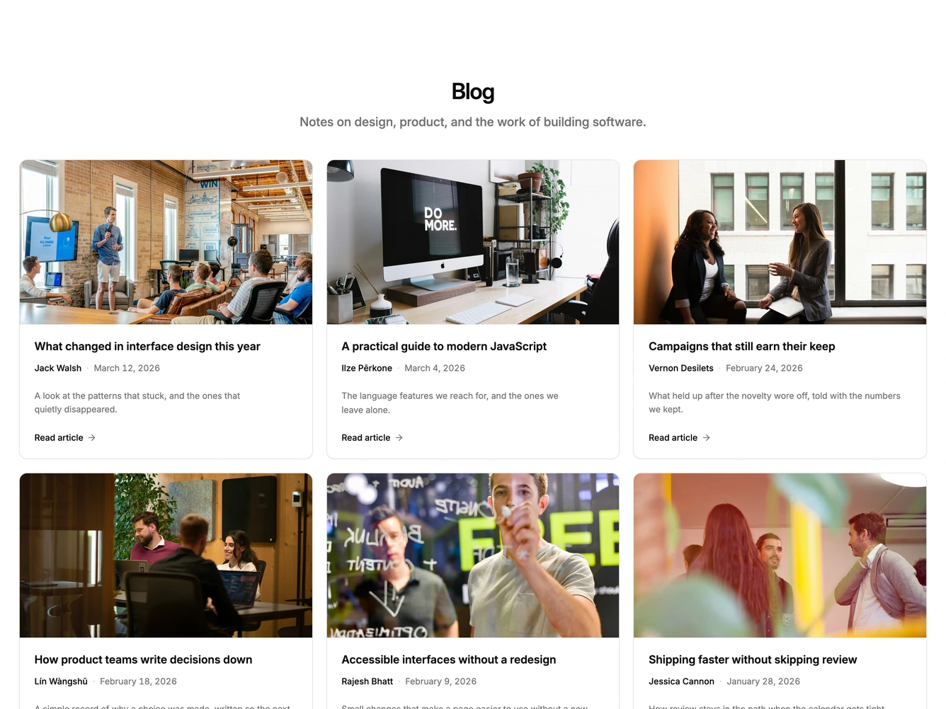
Shadcn Blog 7 - Centered blog cards with read-more links

Centered blog cards with read-more links

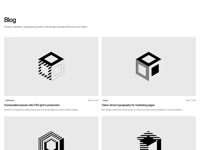
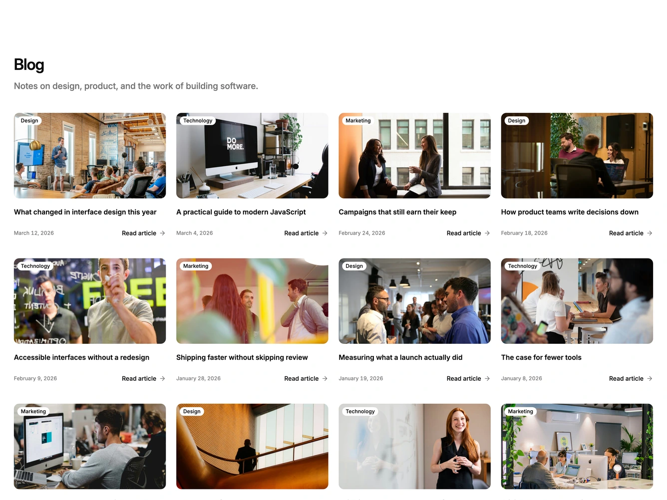
Shadcn Blog 5 - Large blog grid with nine posts

Large blog grid with nine posts

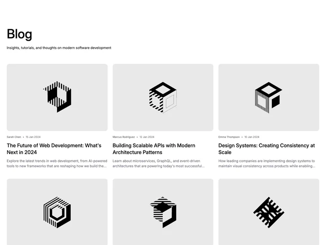
Shadcn Blog 6 - Blog grid with byline-first cards

Blog grid with byline-first cards

Shadcn Blog 8 - Offset blog rows with tags

Offset blog rows with tags

Shadcn Blog 11 - Blog posts with sticky intro

Blog posts with sticky intro

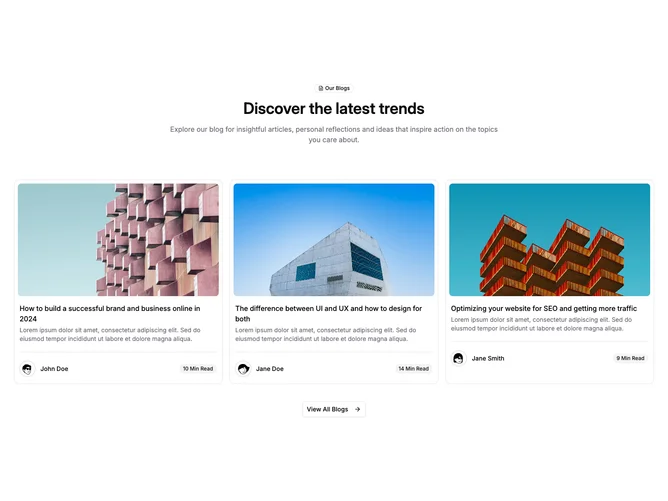
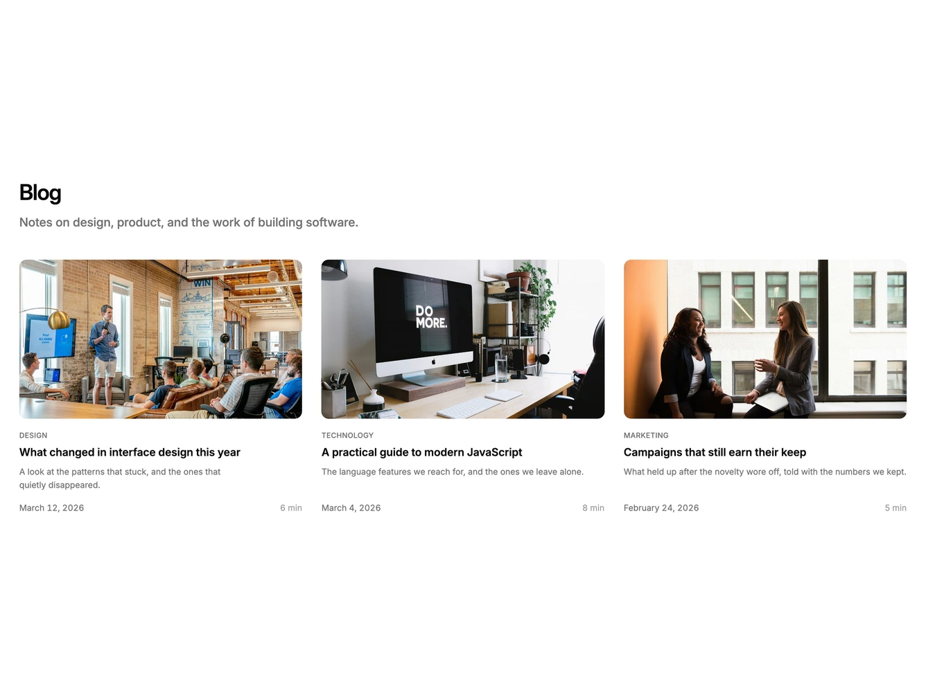
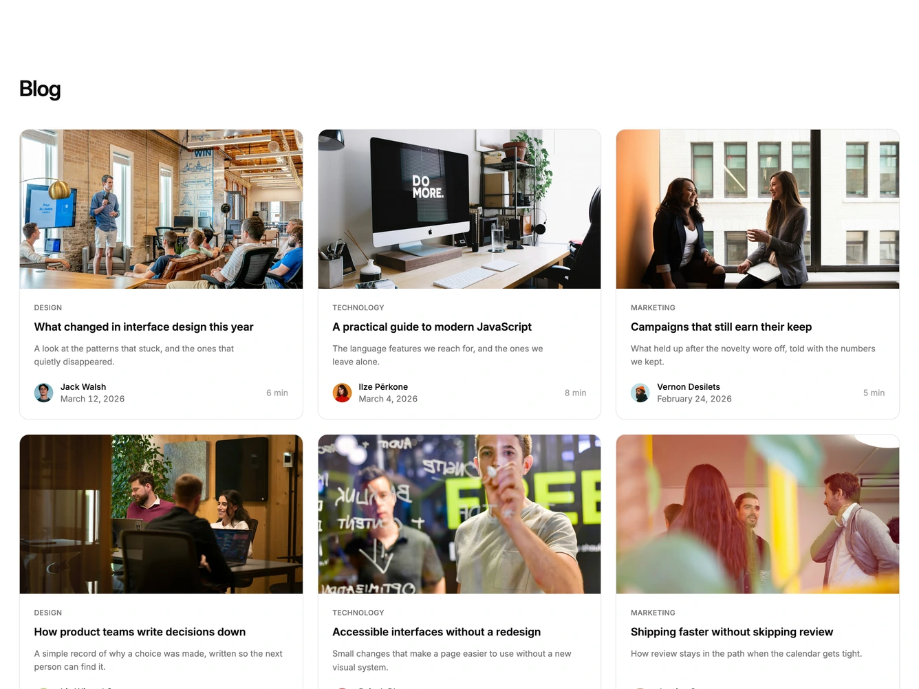
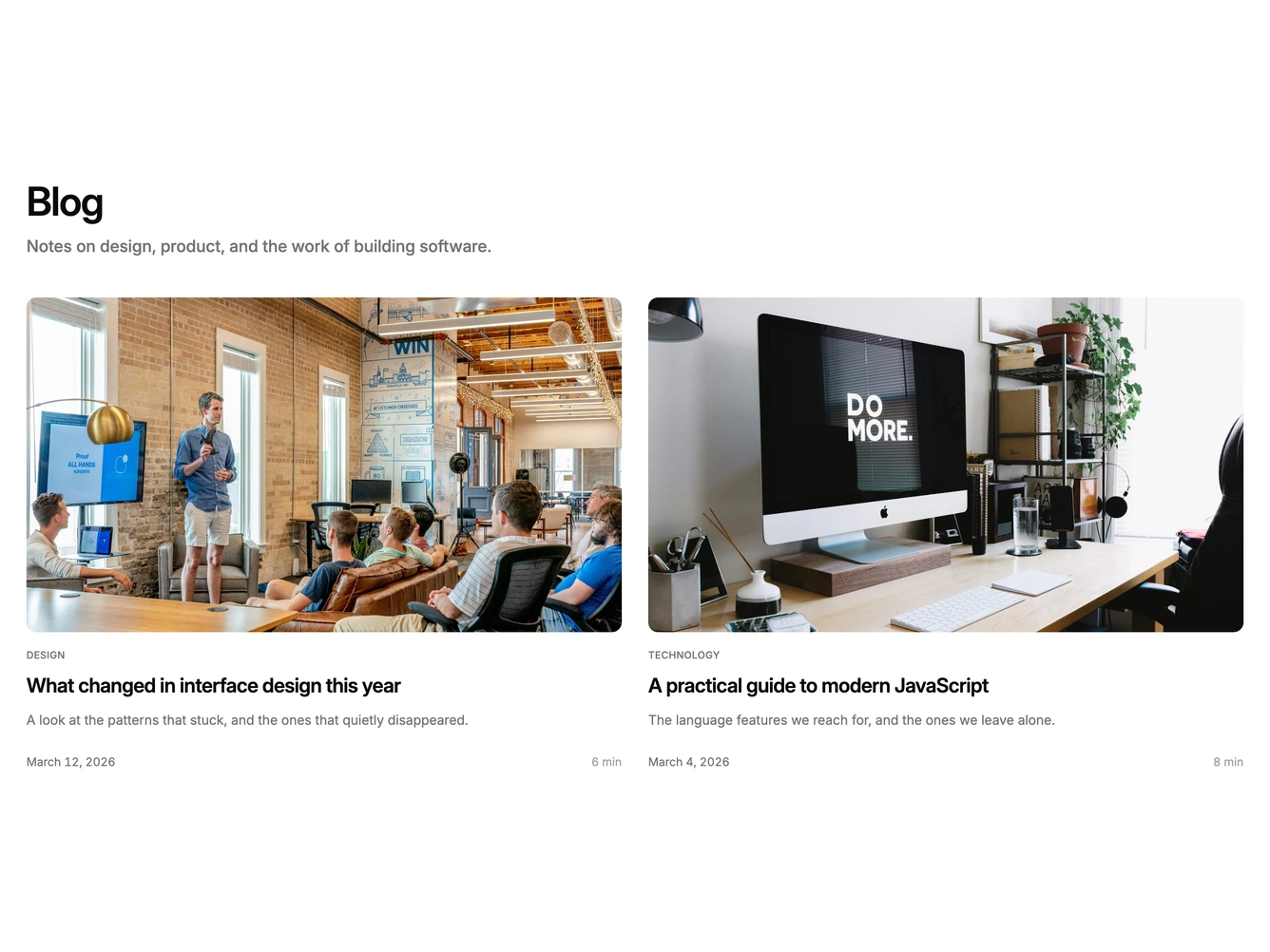
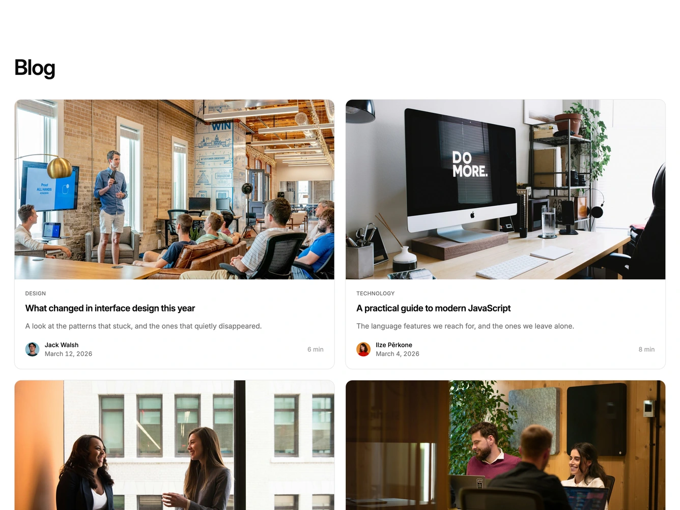
Shadcn Blog 12 - Blog cards with read times

Blog cards with read times

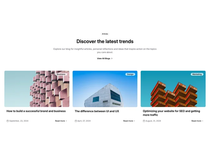
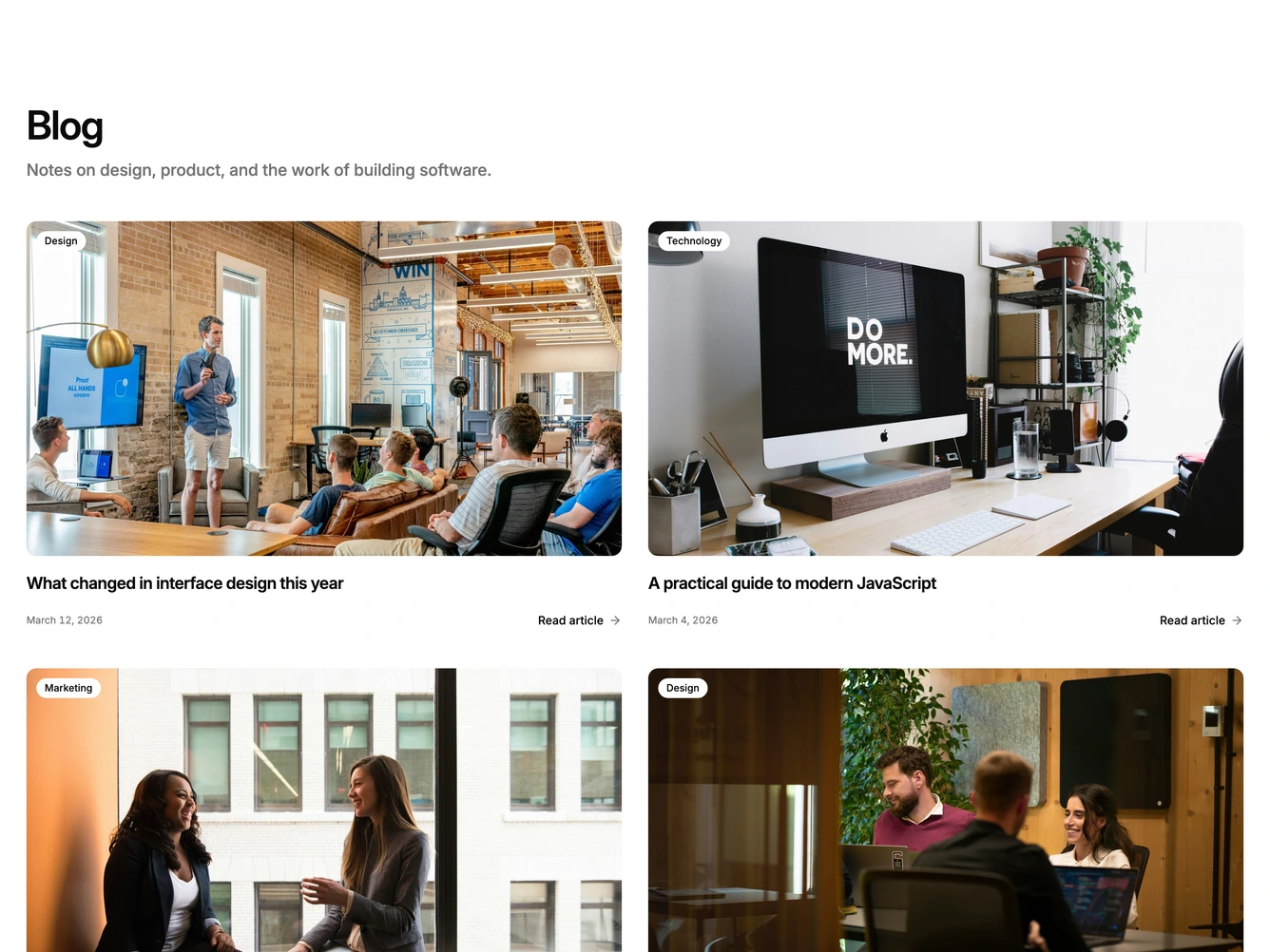
Shadcn Blog 13 - Article grid with category overlays

Article grid with category overlays

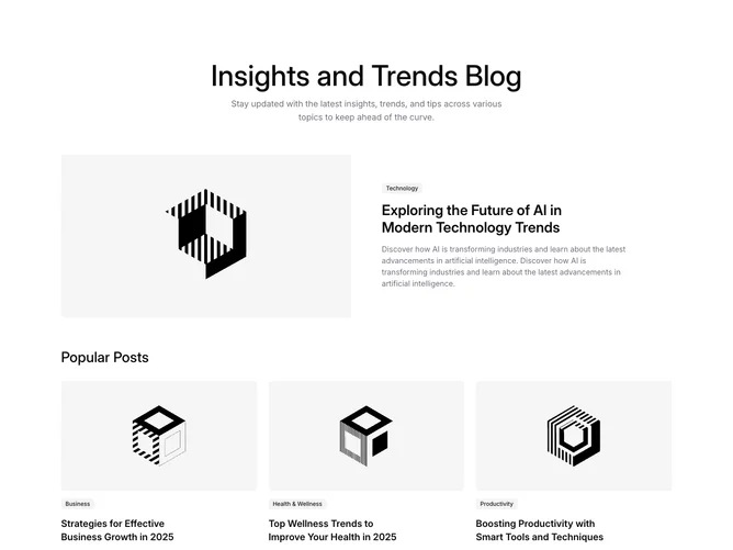
Shadcn Blog 14 - Featured article with popular posts

Featured article with popular posts

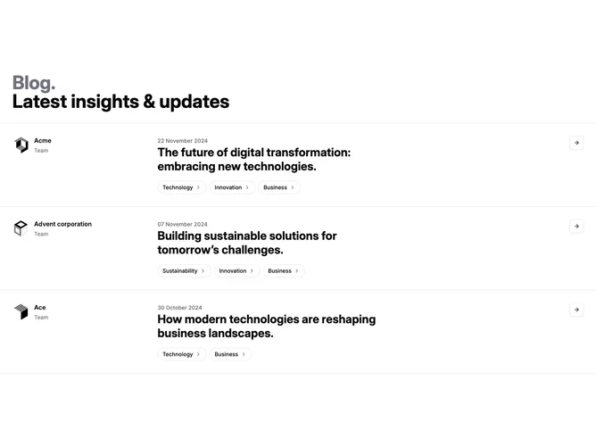
Shadcn Blog 16 - Blog row with team branding and category pills

Blog row with team branding and category pills

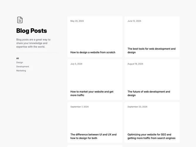
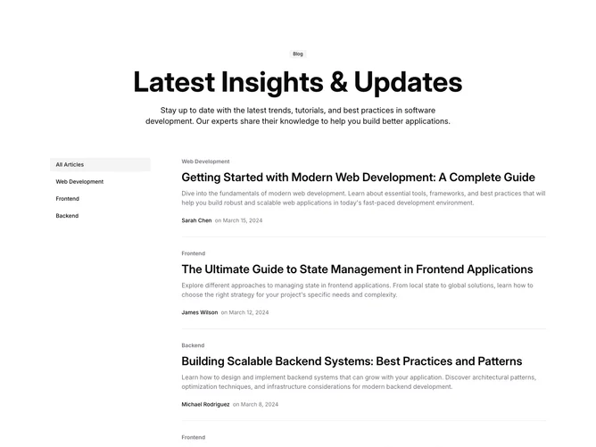
Shadcn Blog 17 - Blog listing with sidebar category filters

Blog listing with sidebar category filters

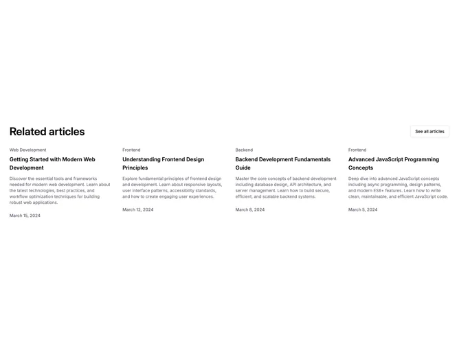
Shadcn Blog 19 - Related articles grid with outline action

Related articles grid with outline action

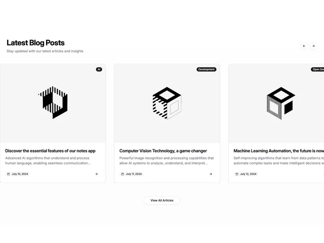
Shadcn Blog 21 - Blog carousel with card slides and controls

Blog carousel with card slides and controls

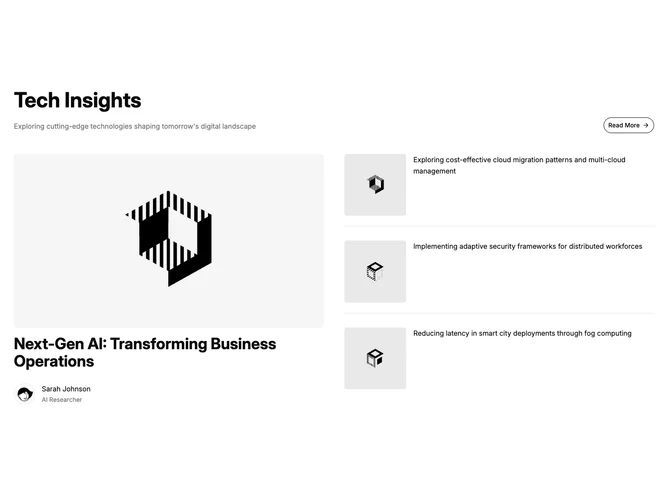
Shadcn Blog 22 - Featured article with secondary topic strip

Featured article with secondary topic strip

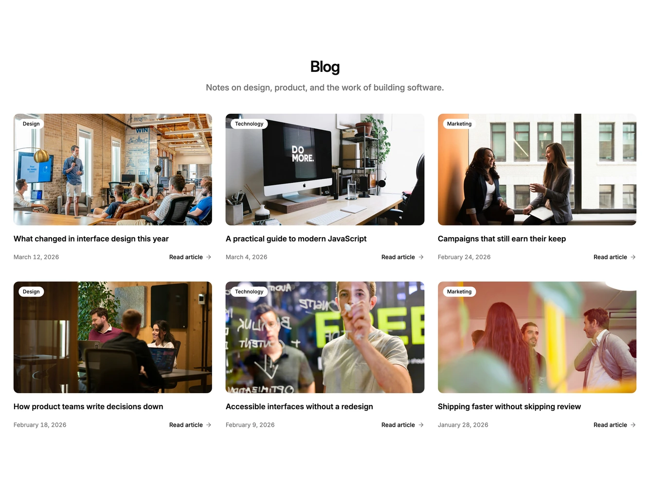
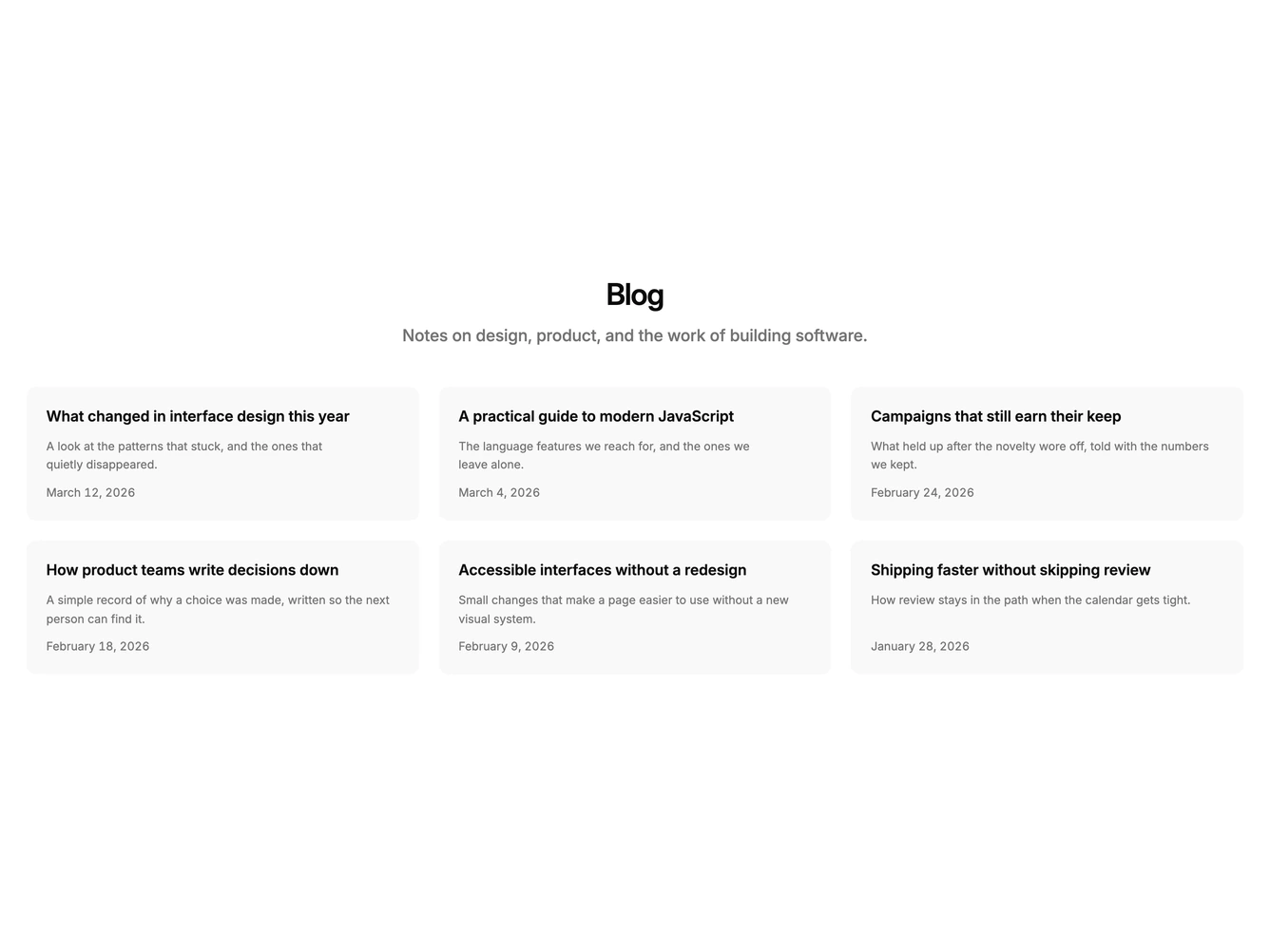
Shadcn Blog 23 - Stacked blog cards with centered header

Stacked blog cards with centered header

Shadcn Blog 24 - Horizontal blog cards with thumbnails

Horizontal blog cards with thumbnails

Shadcn Blog 26 - Magazine blog split with oversized wordmark

Magazine blog split with oversized wordmark

Shadcn Blog 27 - Filtered blog grid with spotlight band

Filtered blog grid with spotlight band

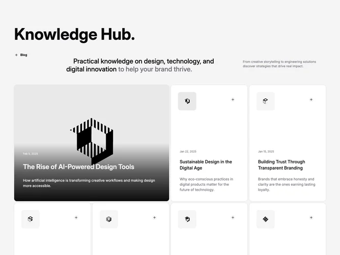
Shadcn Blog 28 - Tech blog grid with expanded lead tile

Tech blog grid with expanded lead tile

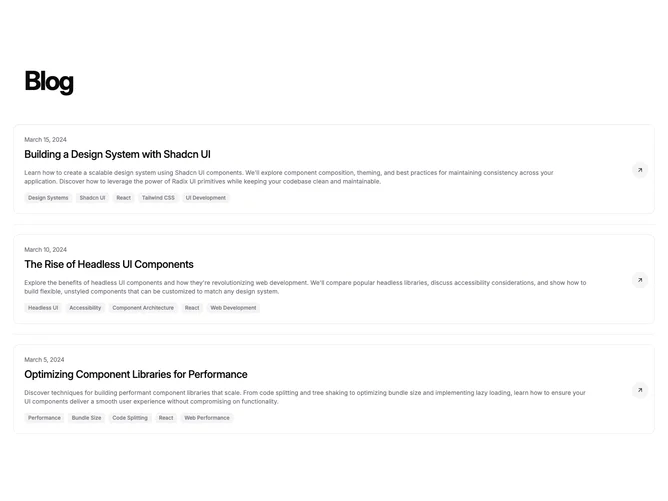
Shadcn Blog 29 - Blog list with tags and link control

Blog list with tags and link control

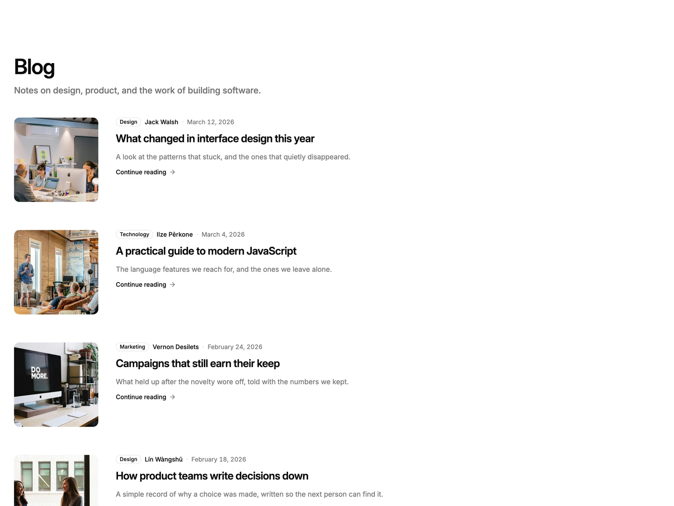
Shadcn Blog 30 - Blog rows with square art and read link

Blog rows with square art and read link

Shadcn Blog 31 - Animated blog grid with featured post

Animated blog grid with featured post

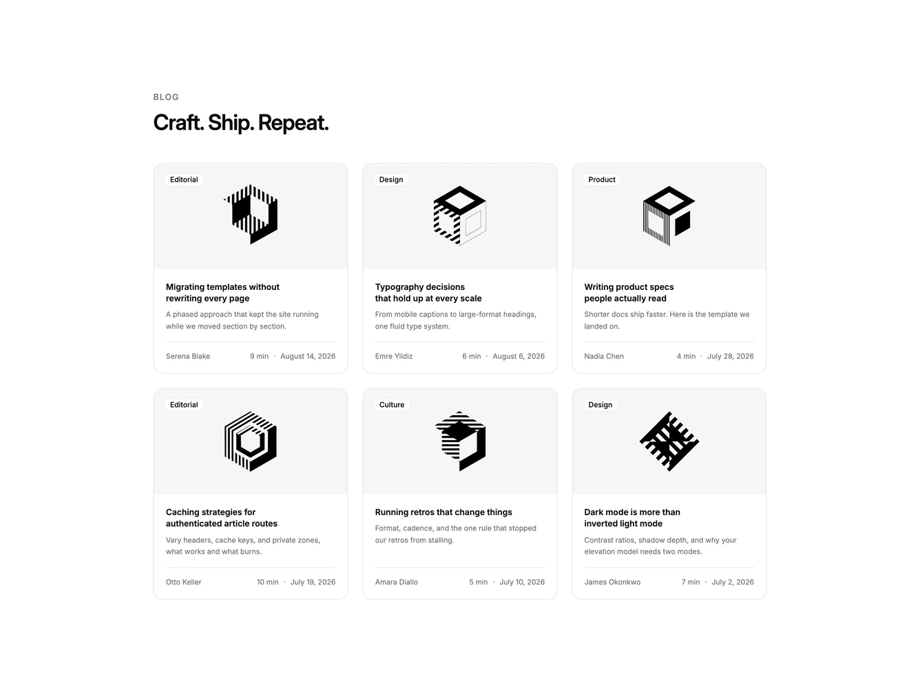
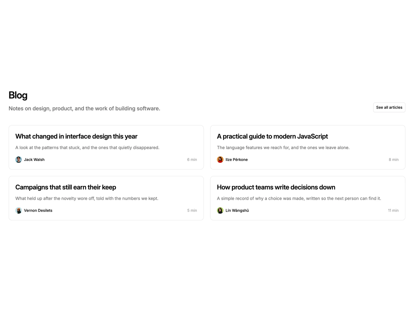
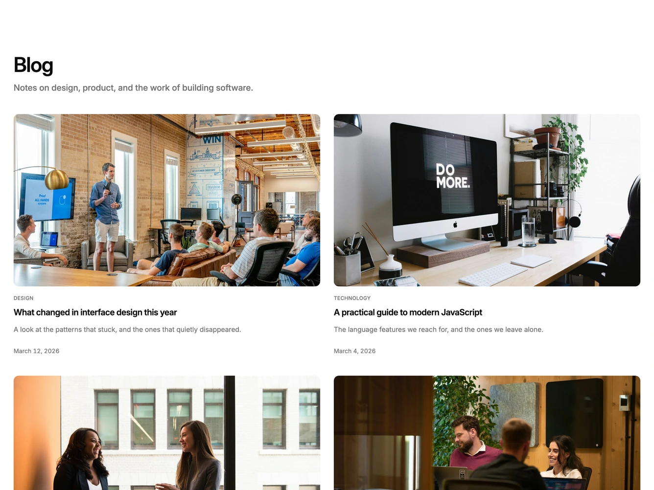
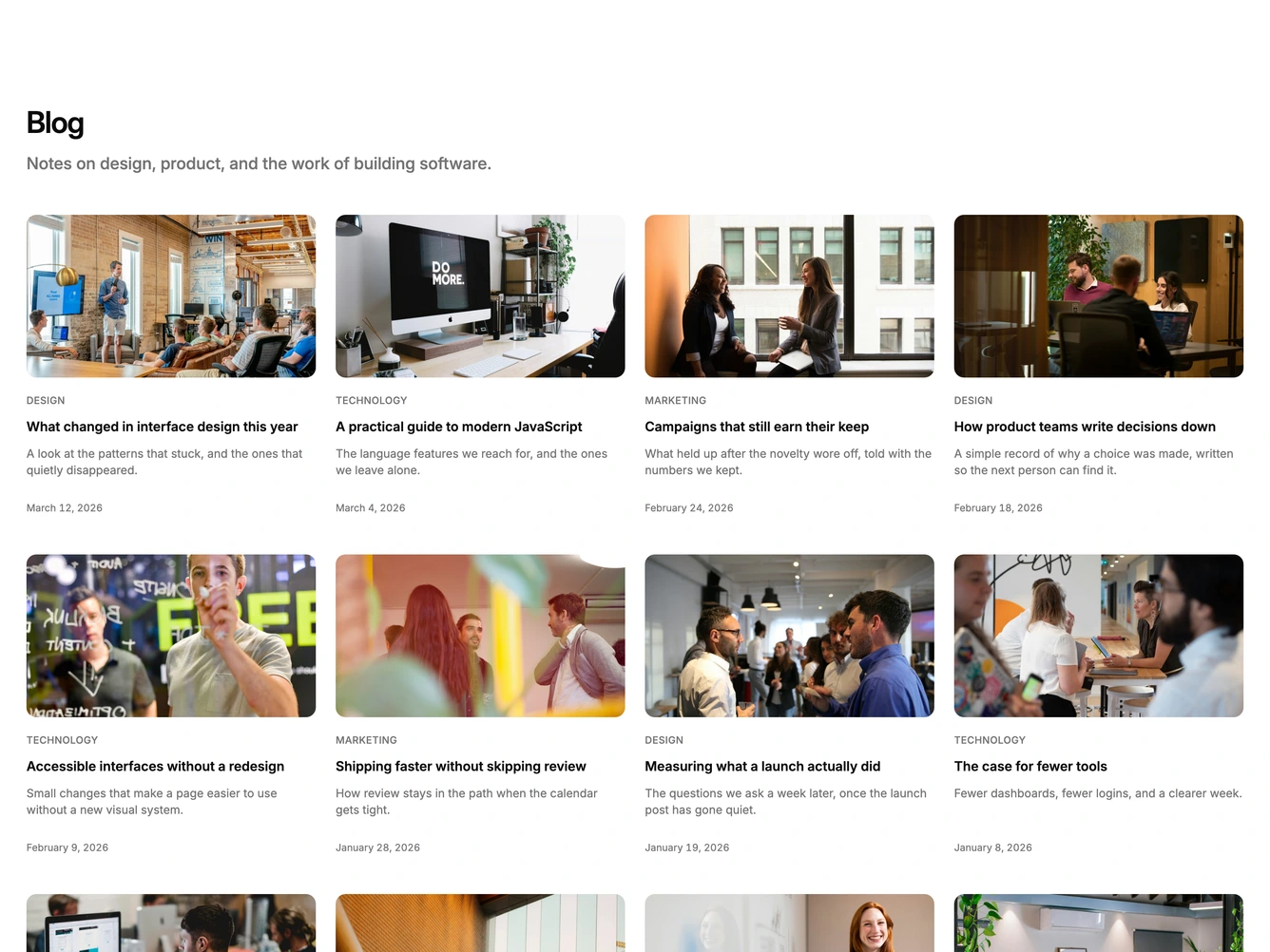
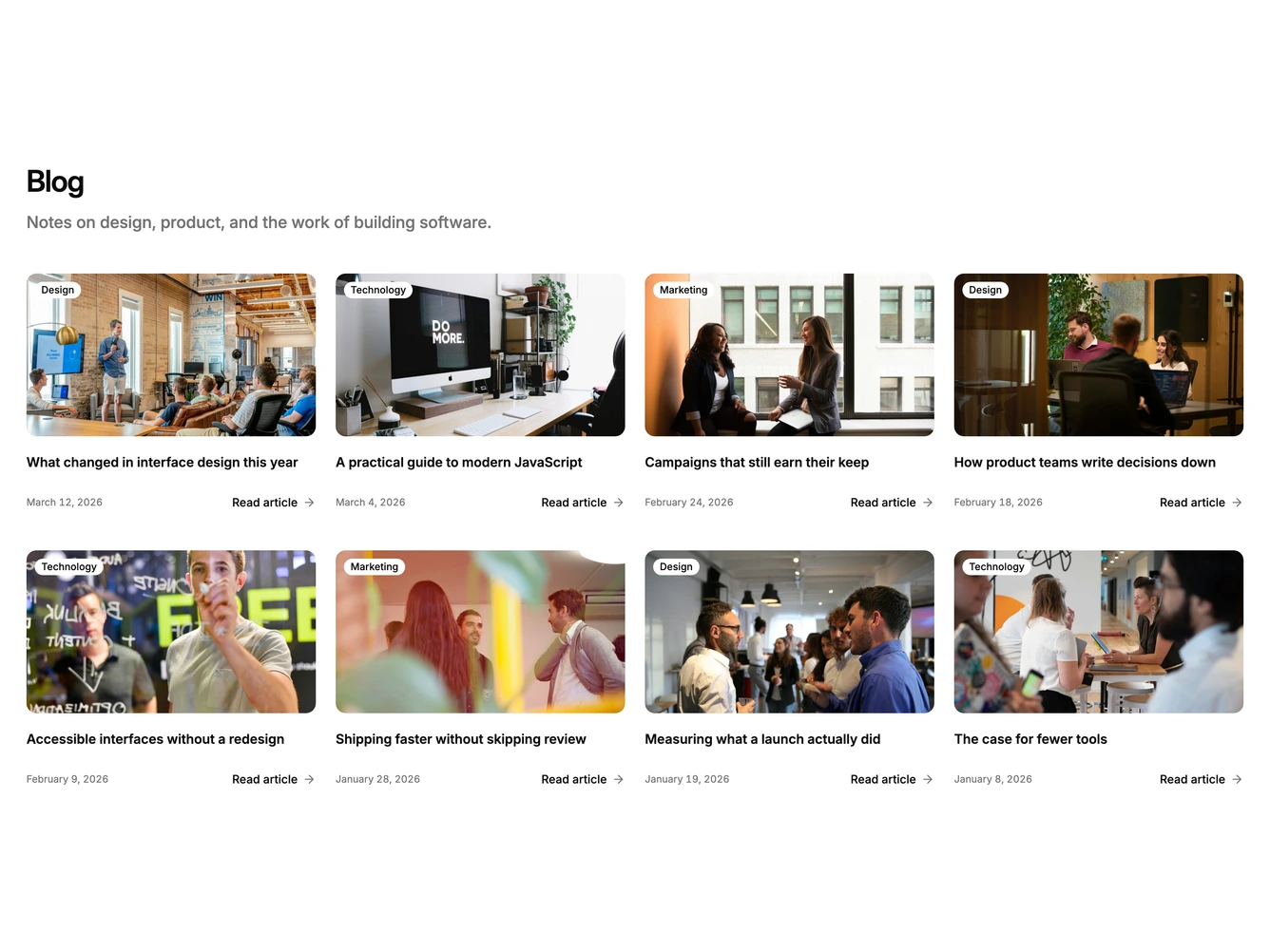
Shadcn Blog 32 - Two-column blog card grid

Two-column blog card grid

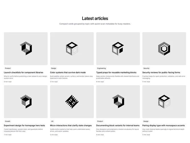
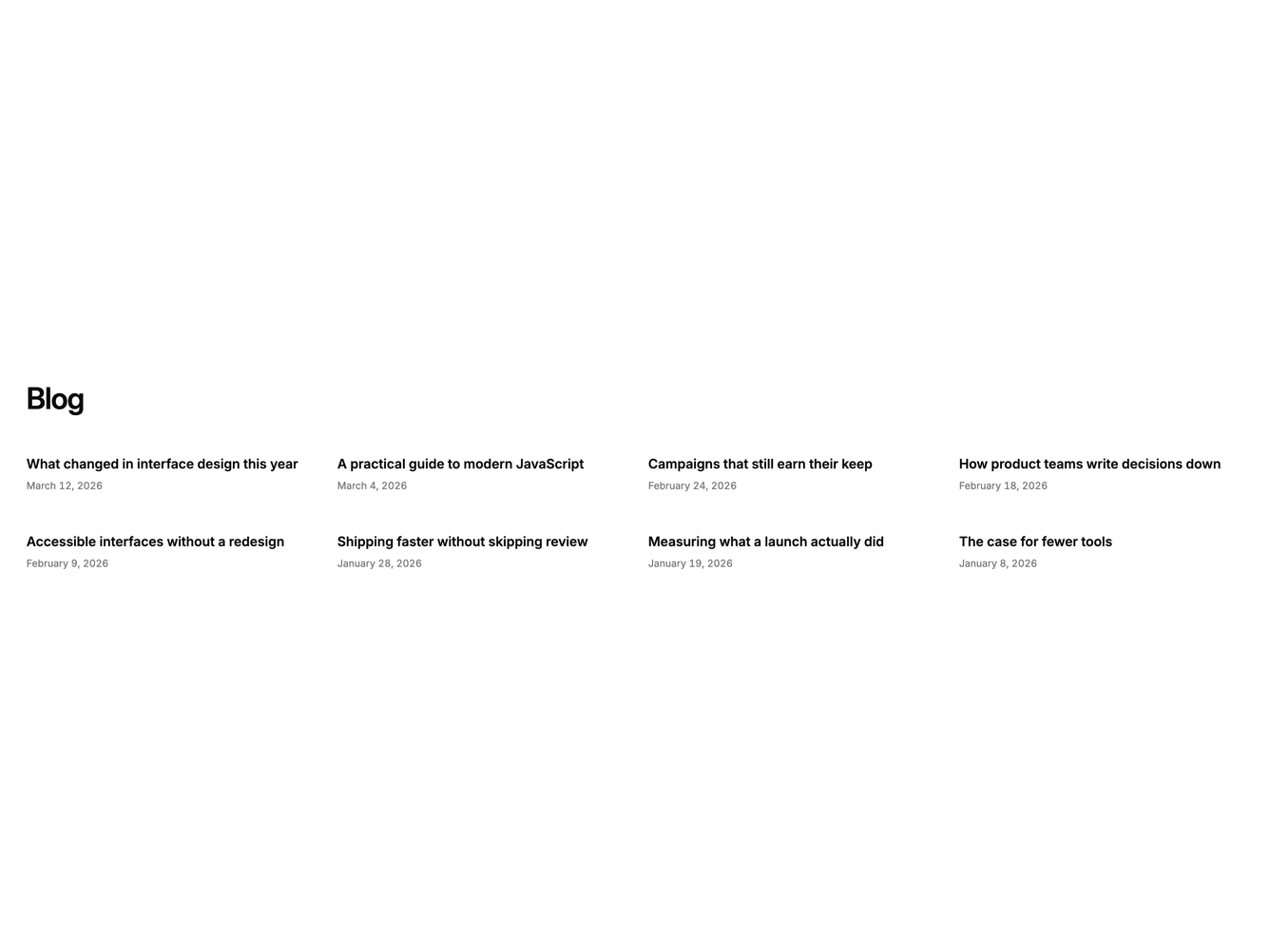
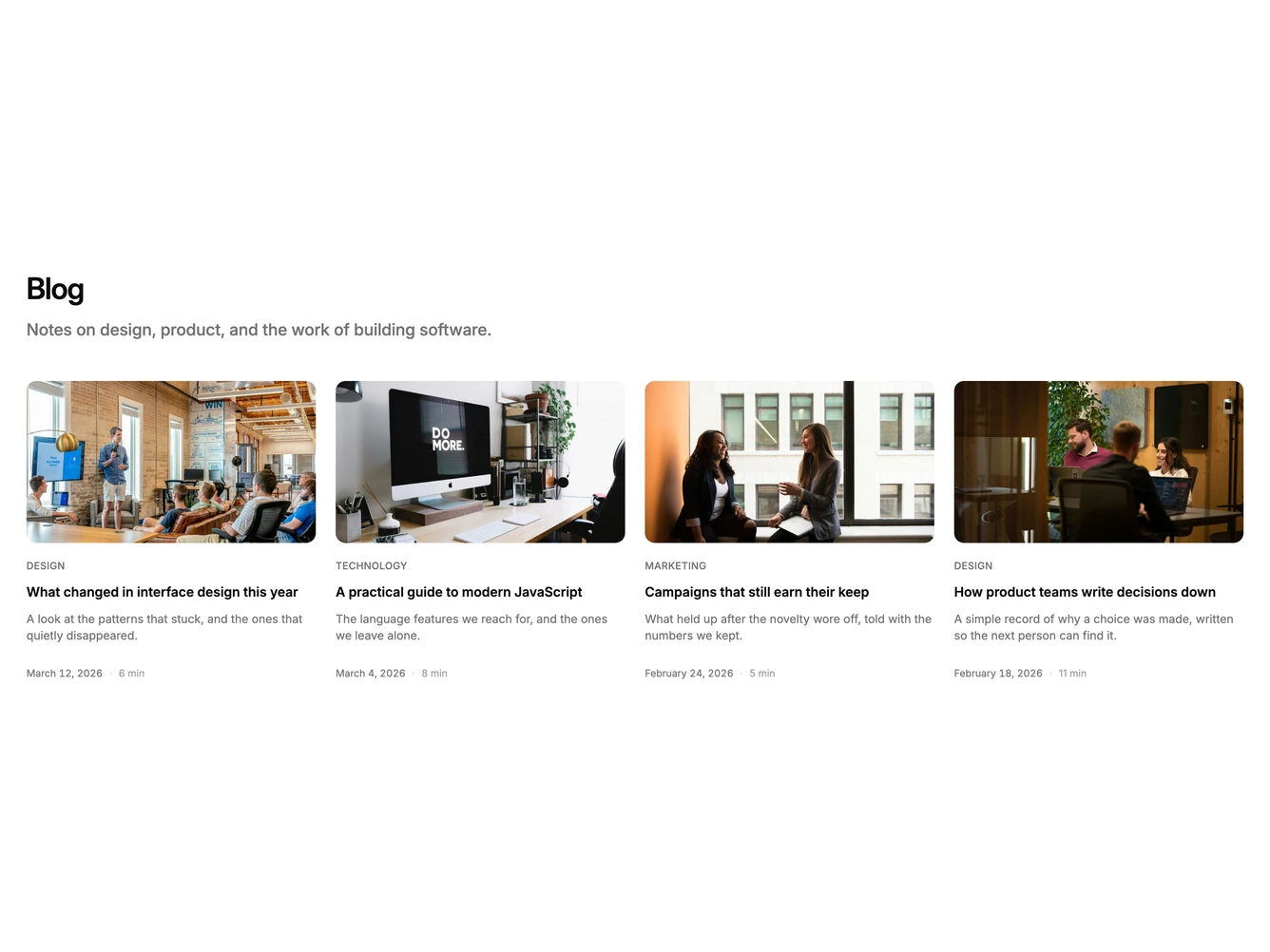
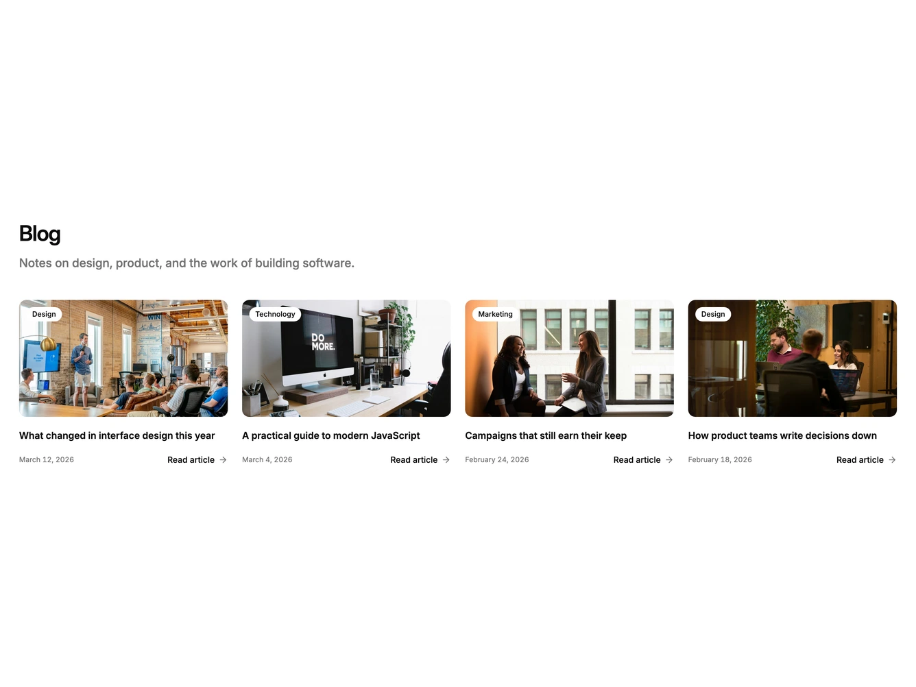
Shadcn Blog 33 - Compact four-column blog cards

Compact four-column blog cards

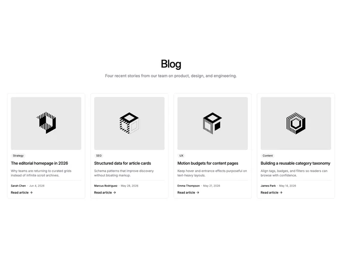
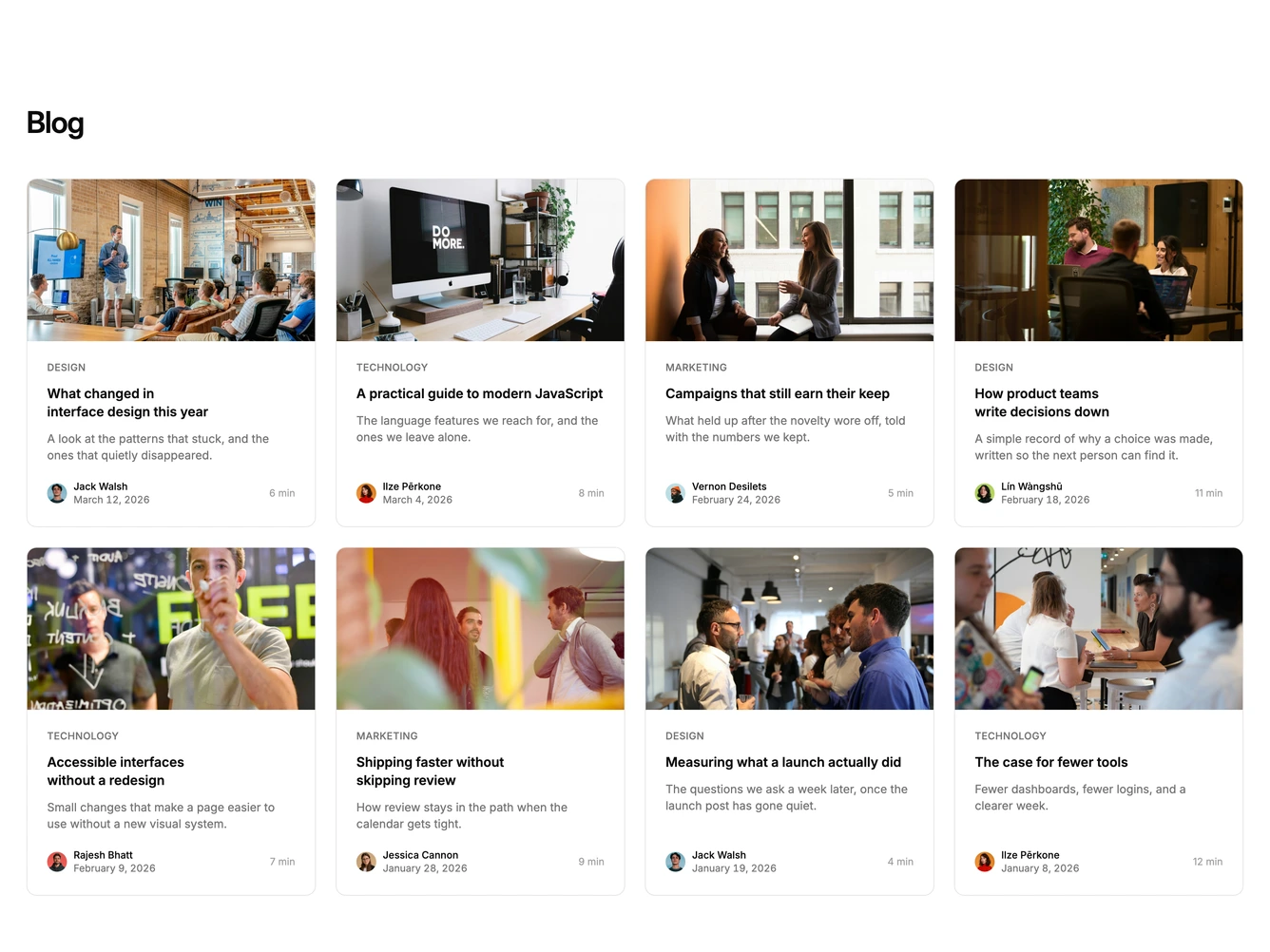
Shadcn Blog 34 - Four-column bordered blog cards

Four-column bordered blog cards

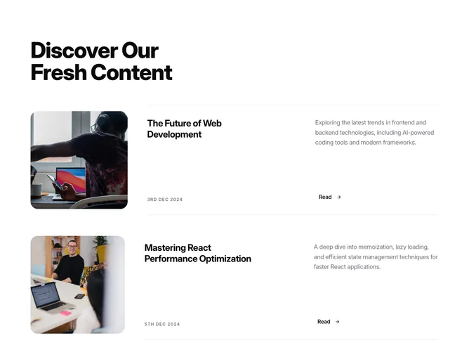
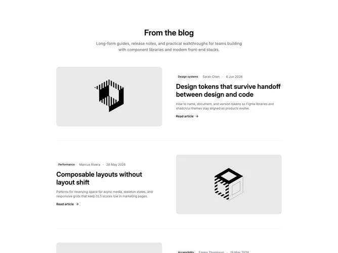
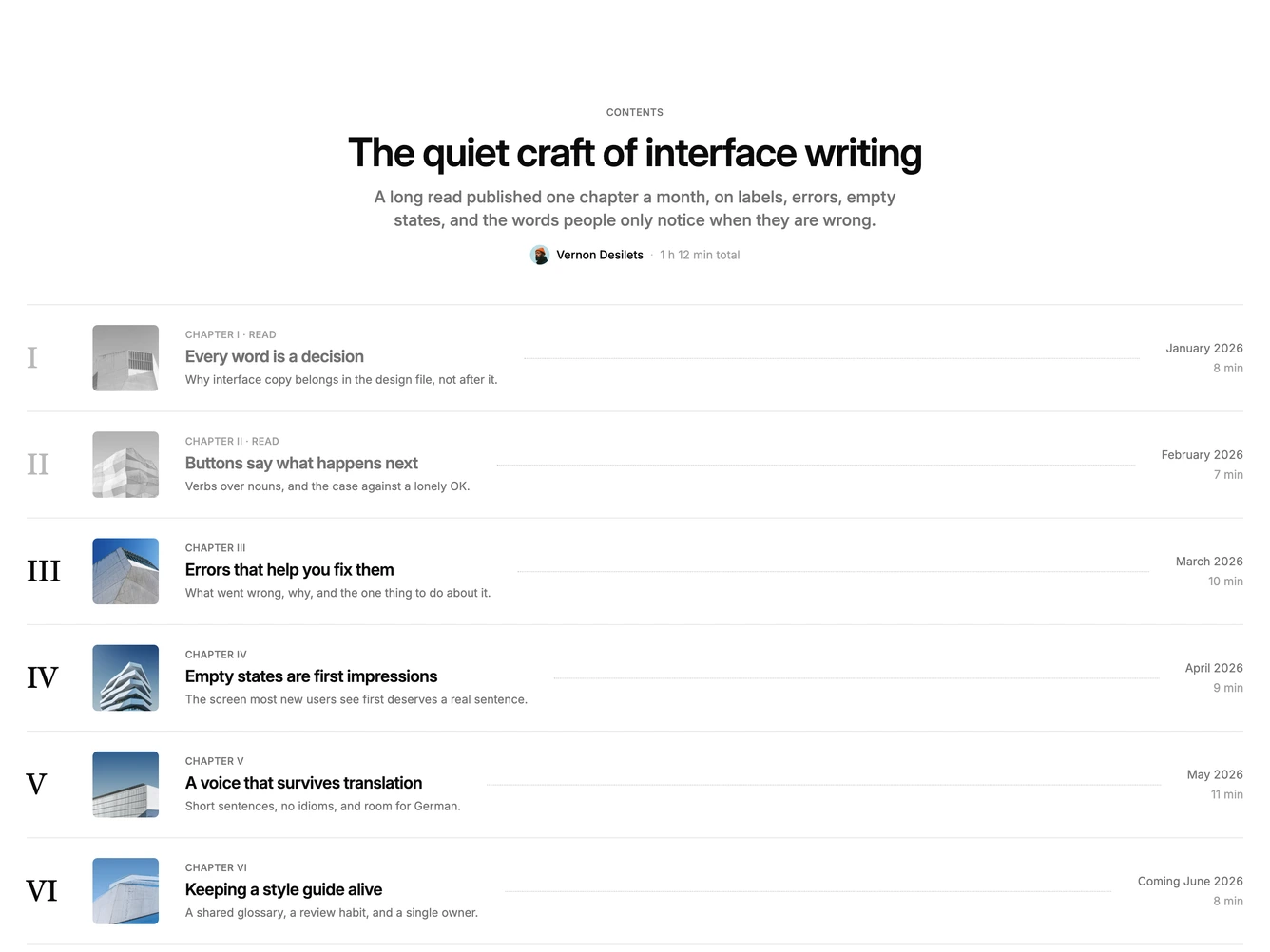
Shadcn Blog 35 - Alternating blog rows with dividers

Alternating blog rows with dividers

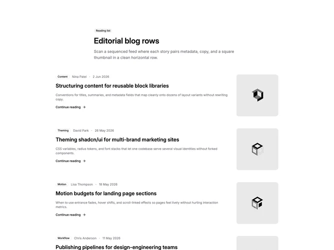
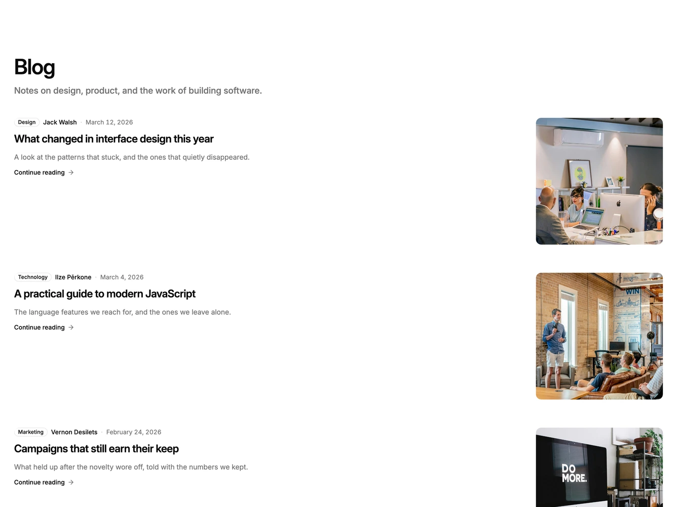
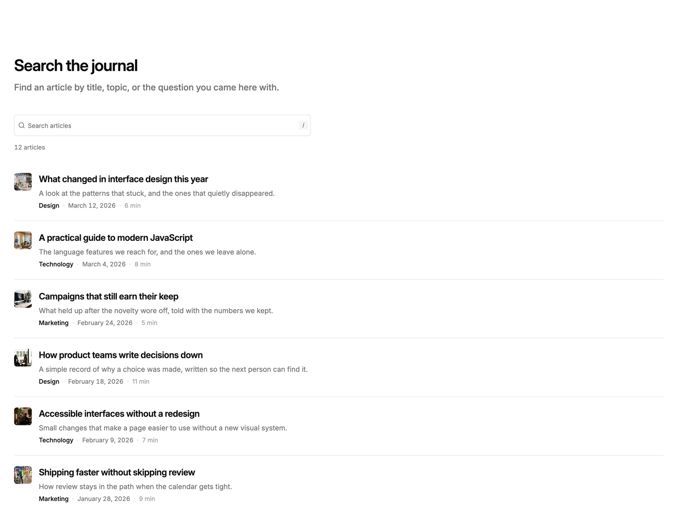
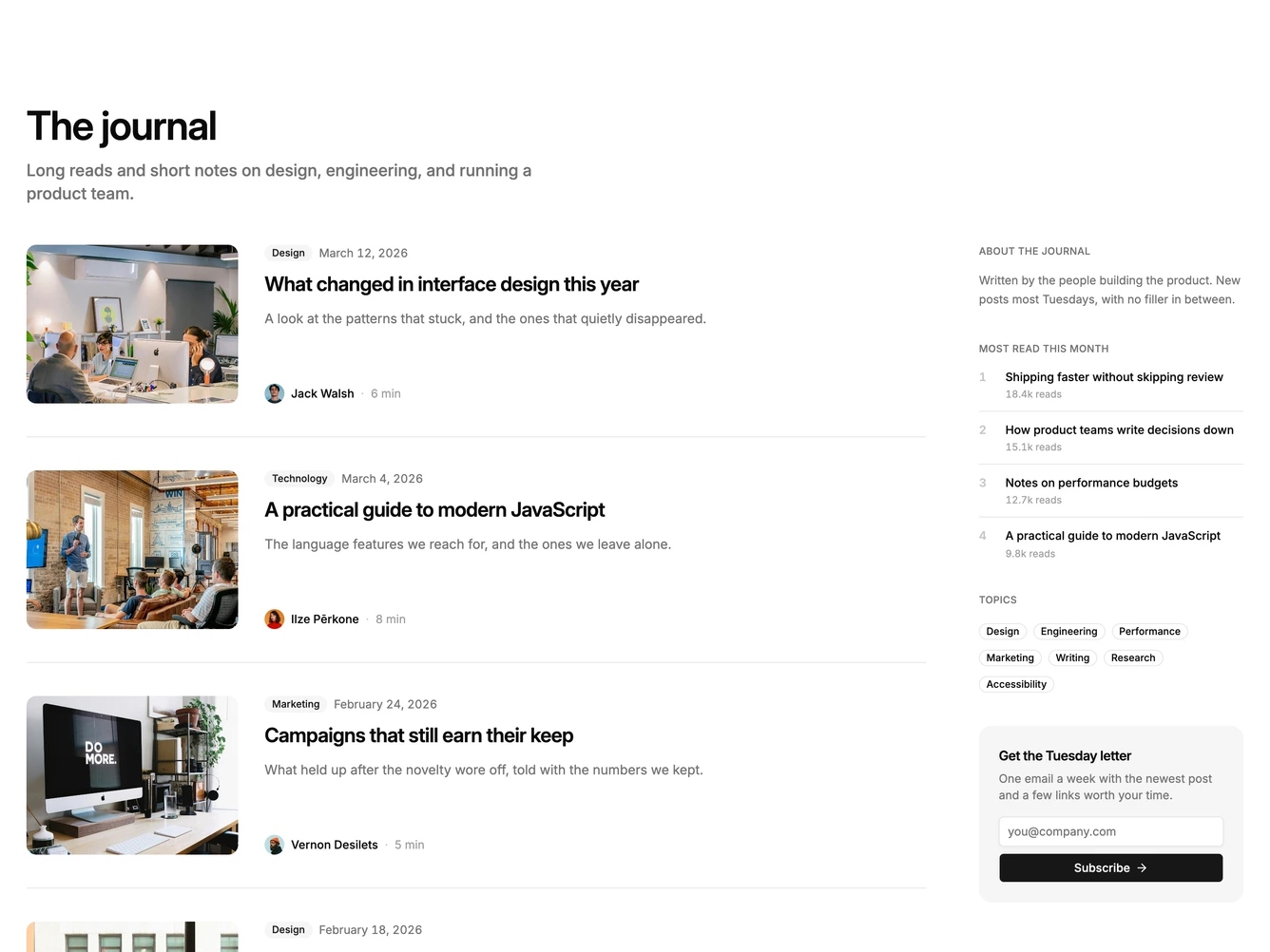
Shadcn Blog 36 - Blog rows with metadata and thumbnails

Blog rows with metadata and thumbnails

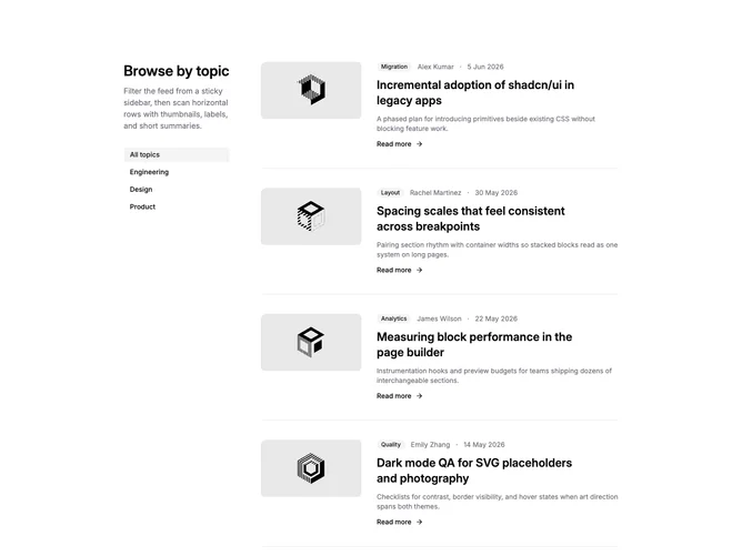
Shadcn Blog 37 - Filtered blog rows with category sidebar

Filtered blog rows with category sidebar

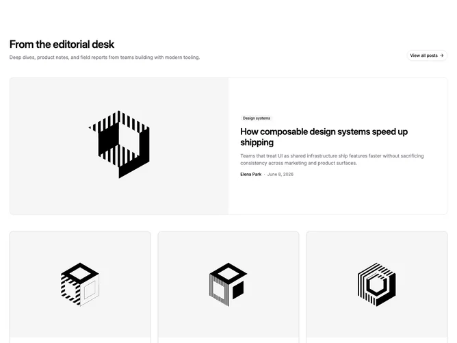
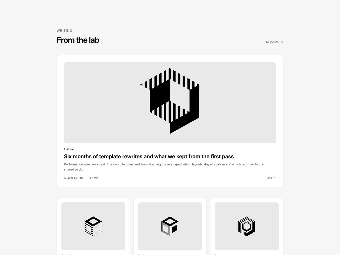
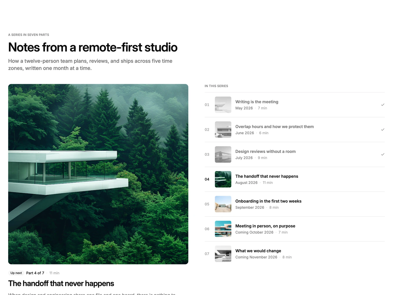
Shadcn Blog 38 - Featured hero with three cards

Featured hero with three cards

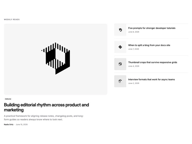
Shadcn Blog 39 - Magazine layout with mini post stack

Magazine layout with mini post stack

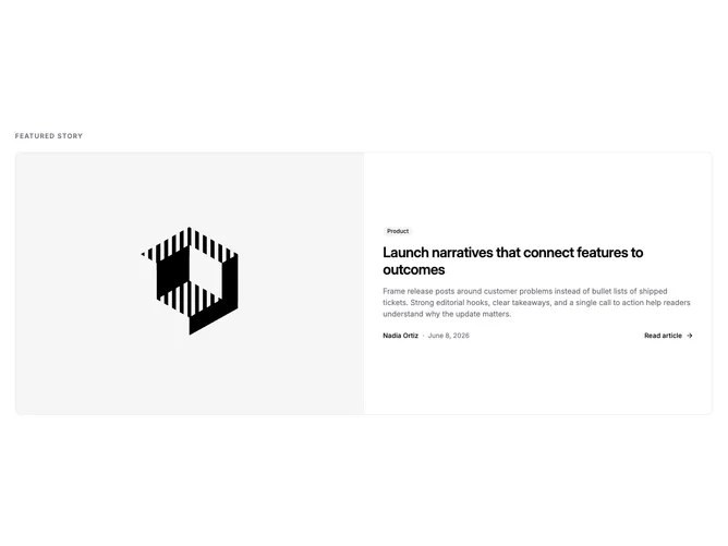
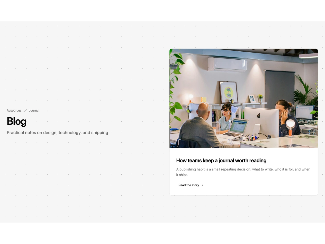
Shadcn Blog 40 - Single featured blog post row

Single featured blog post row

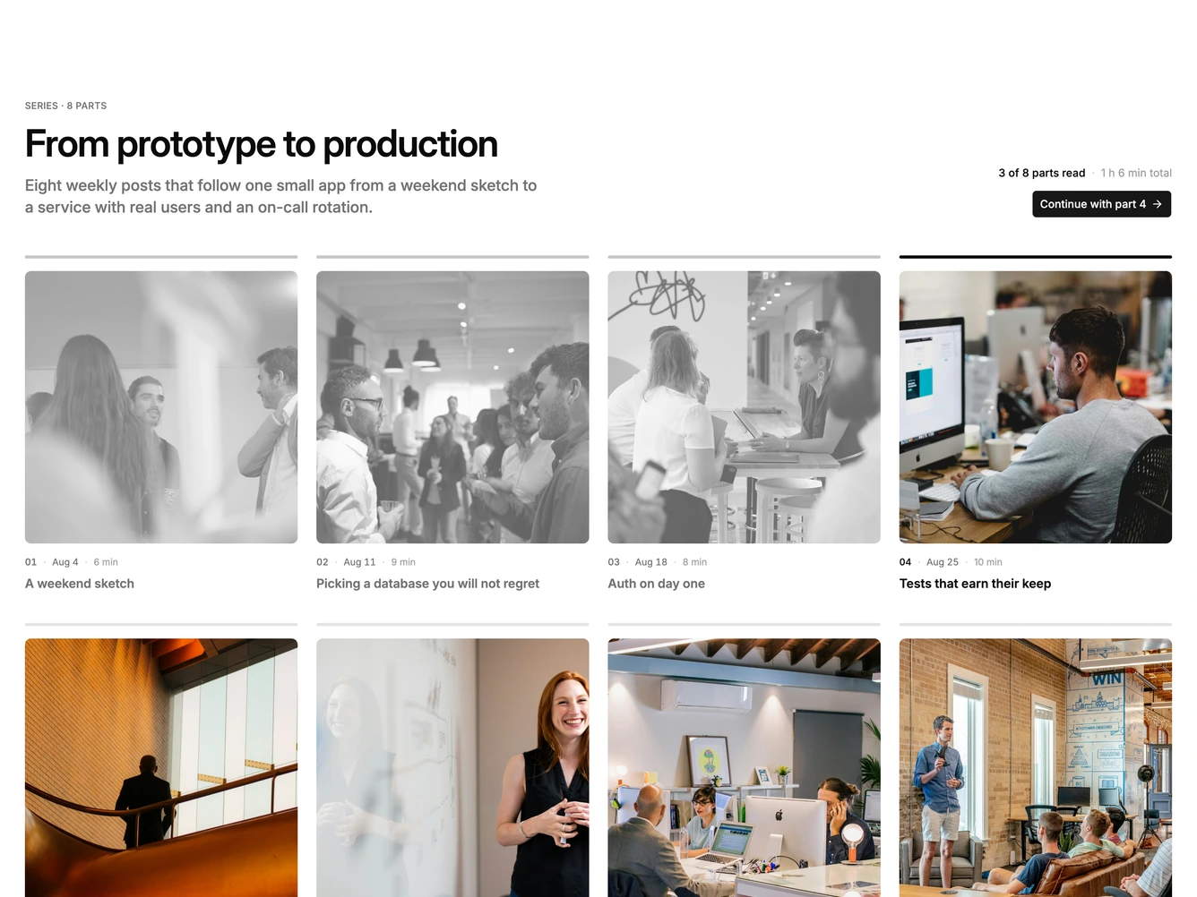
Shadcn Blog 41 - Three-card horizontal blog carousel

Three-card horizontal blog carousel

Shadcn Blog 42 - Full-bleed blog carousel with dot indicators

Full-bleed blog carousel with dot indicators

Shadcn Blog 43 - Split blog section with side carousel

Split blog section with side carousel

Shadcn Blog 44 - Timeline blog feed with date markers

Timeline blog feed with date markers

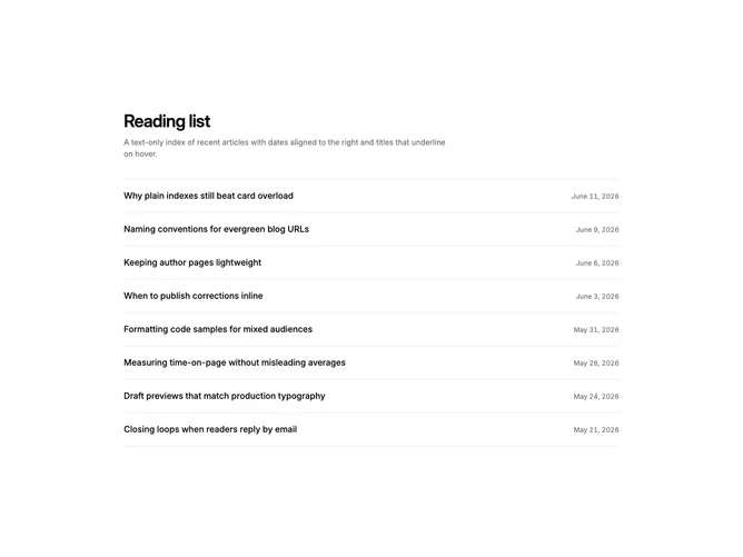
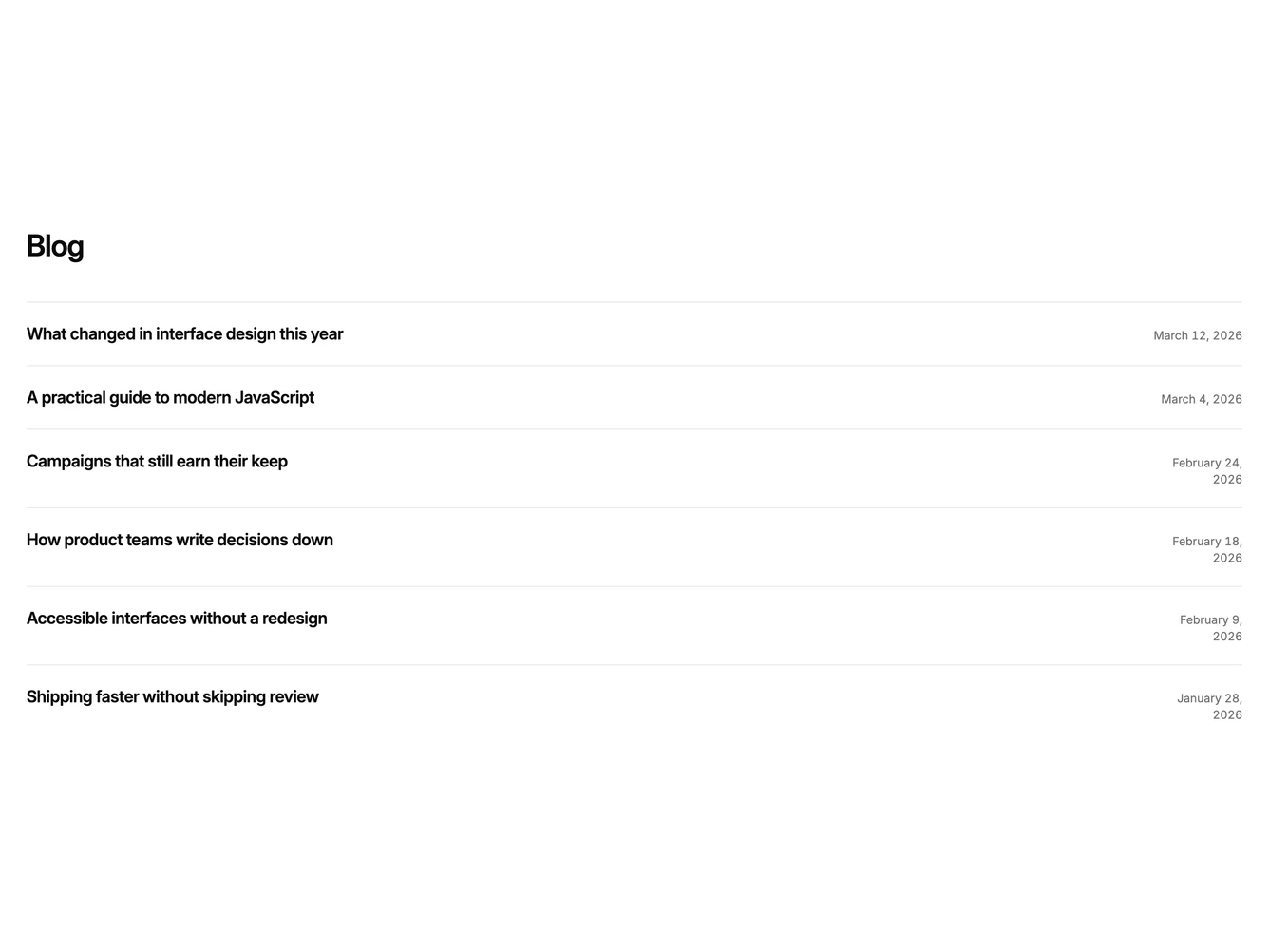
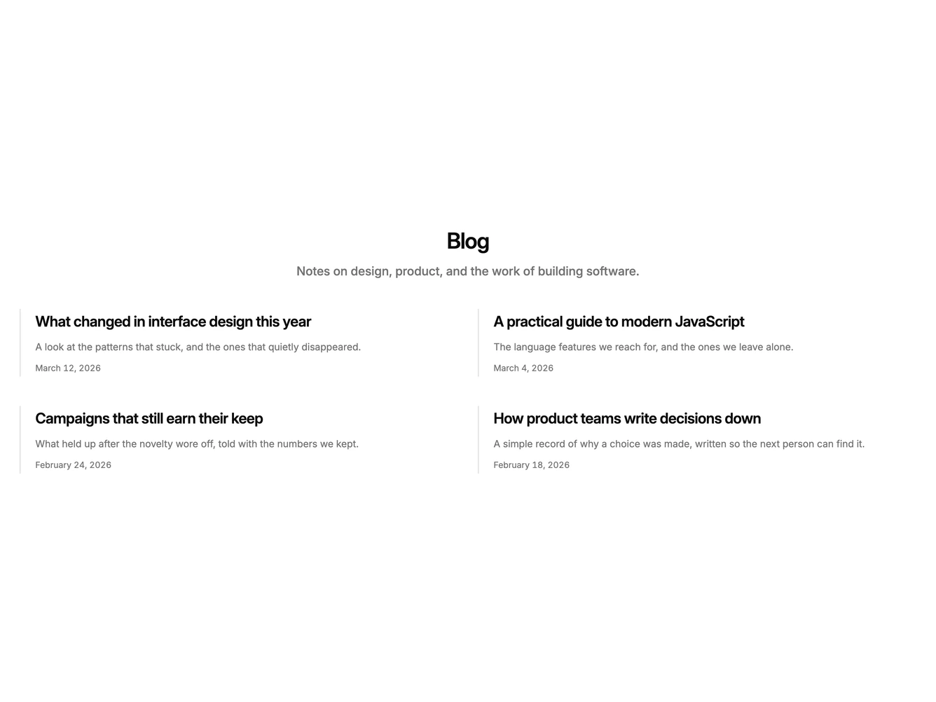
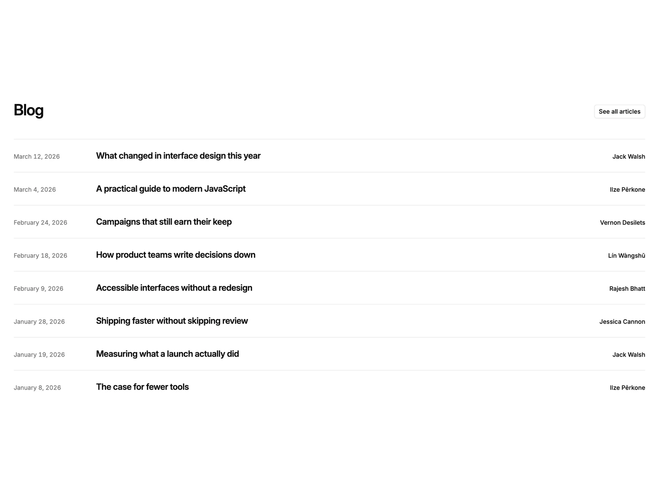
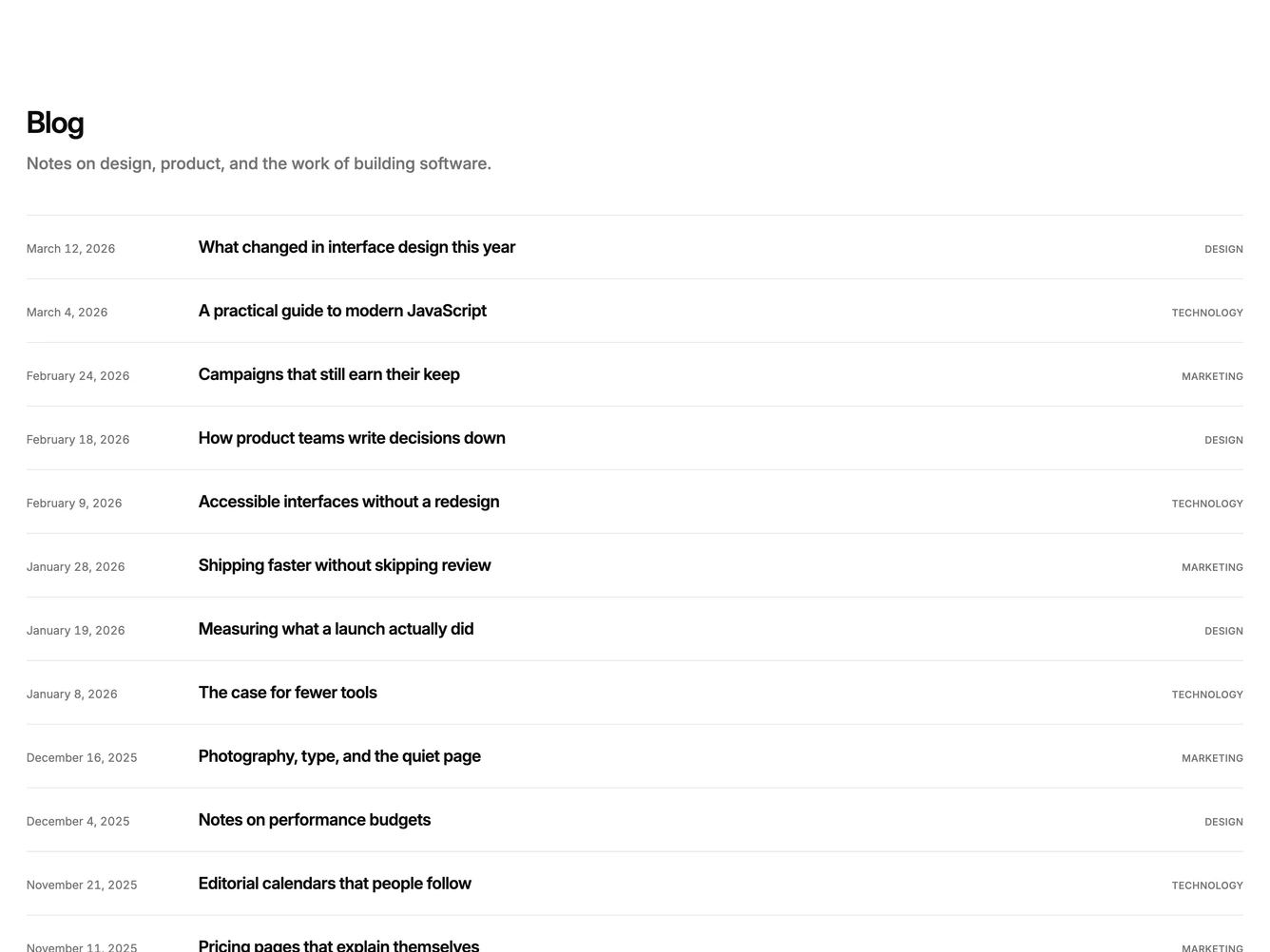
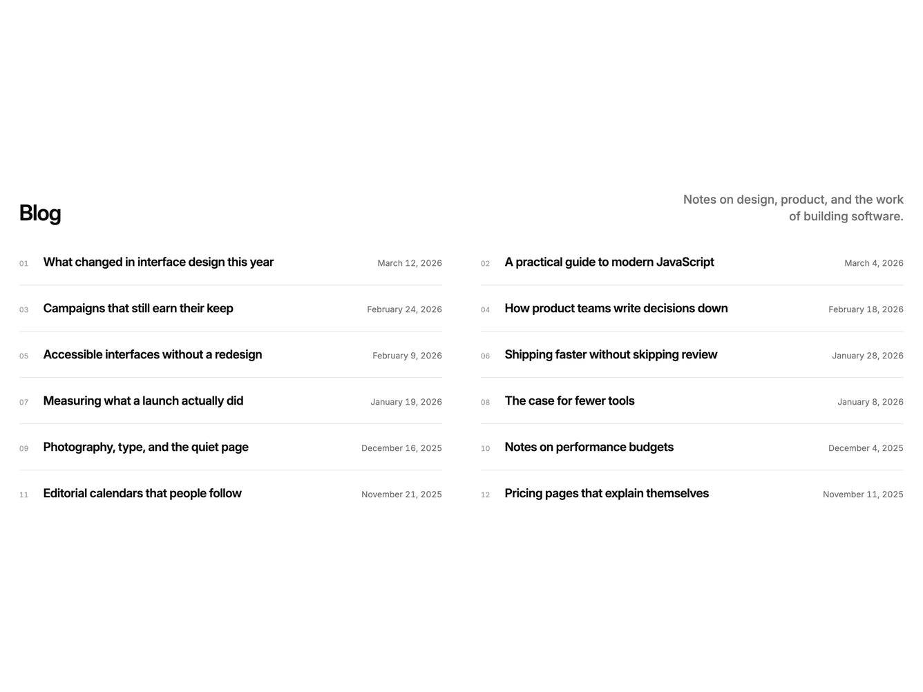
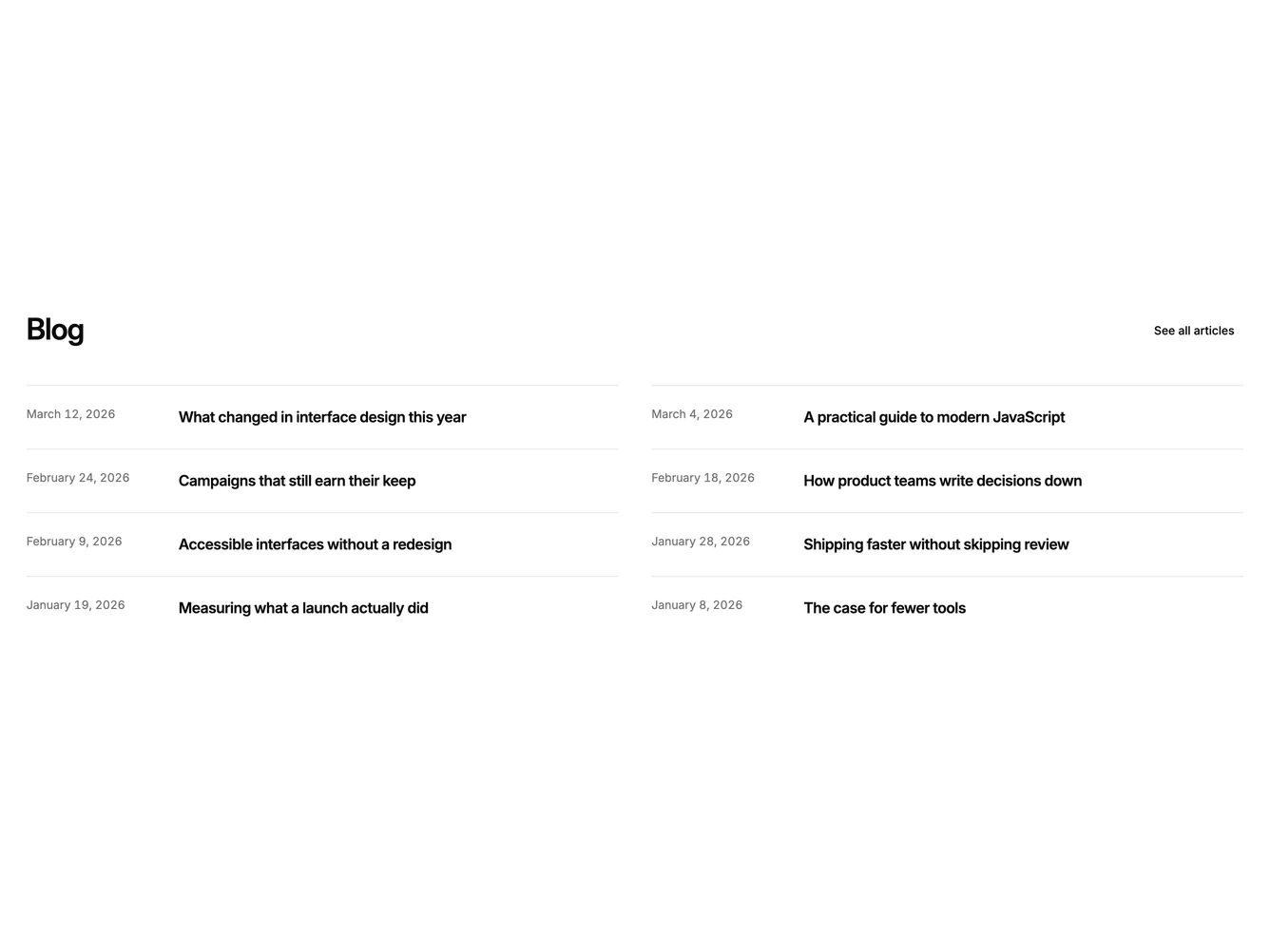
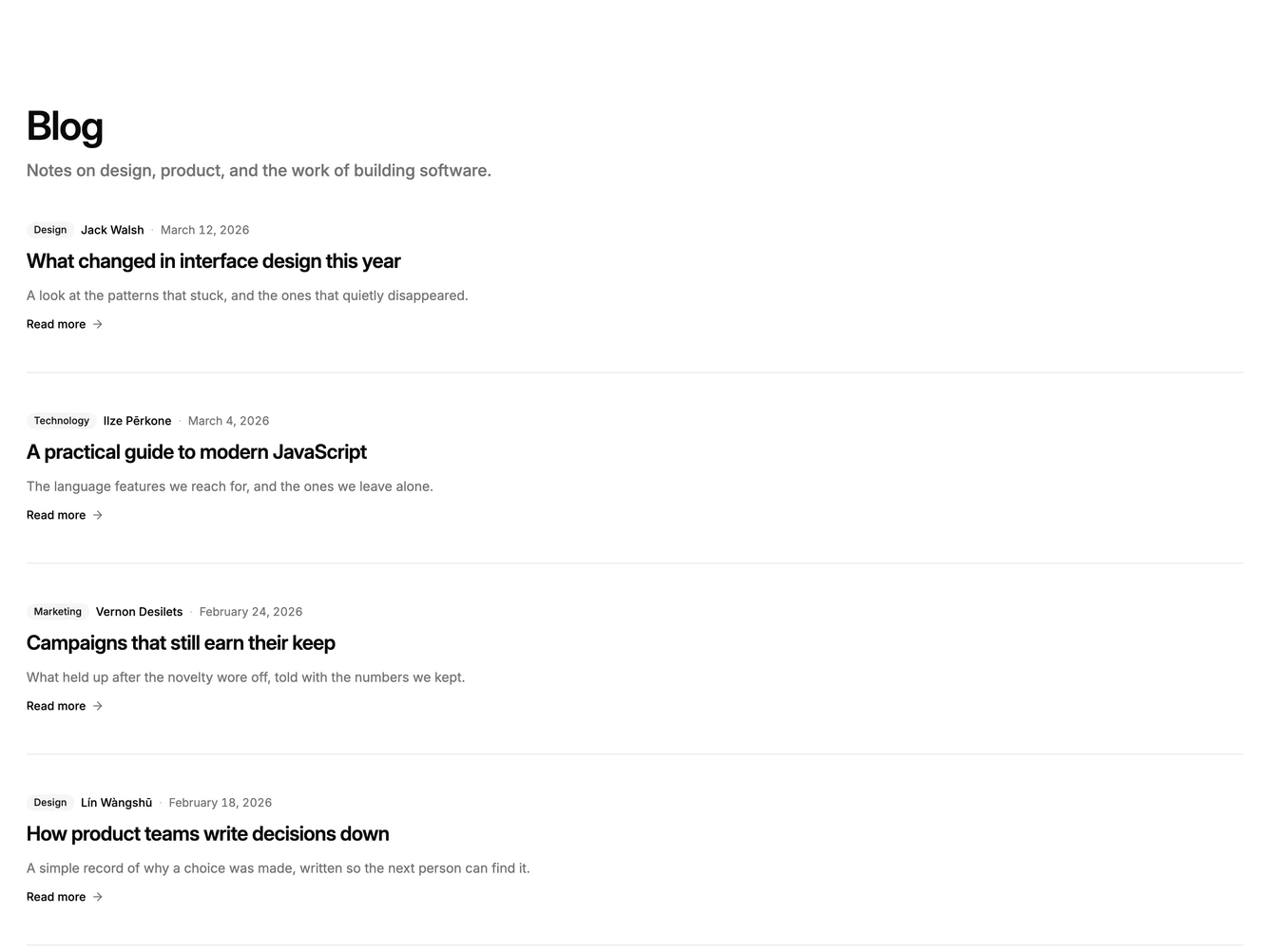
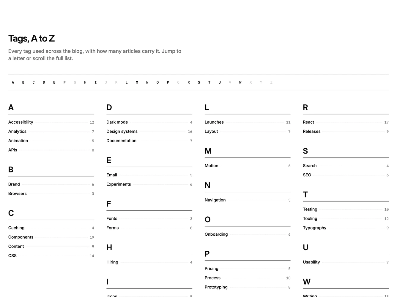
Shadcn Blog 45 - Minimal text-only blog index

Minimal text-only blog index

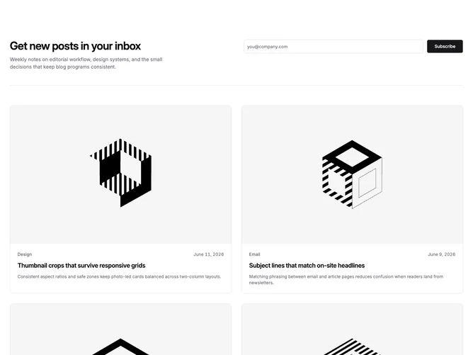
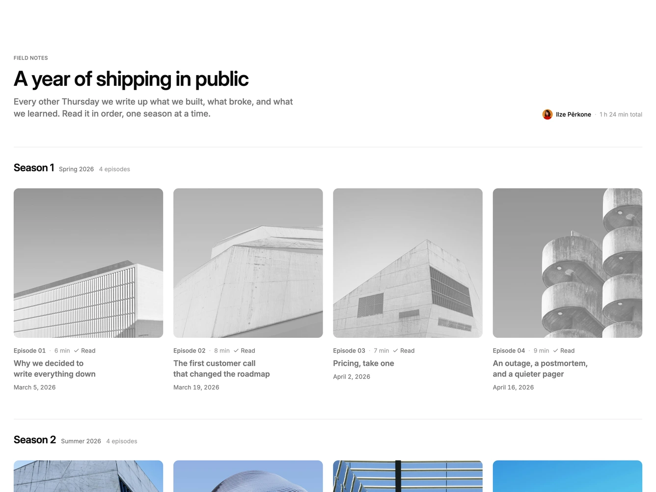
Shadcn Blog 46 - Newsletter header with photo grid

Newsletter header with photo grid

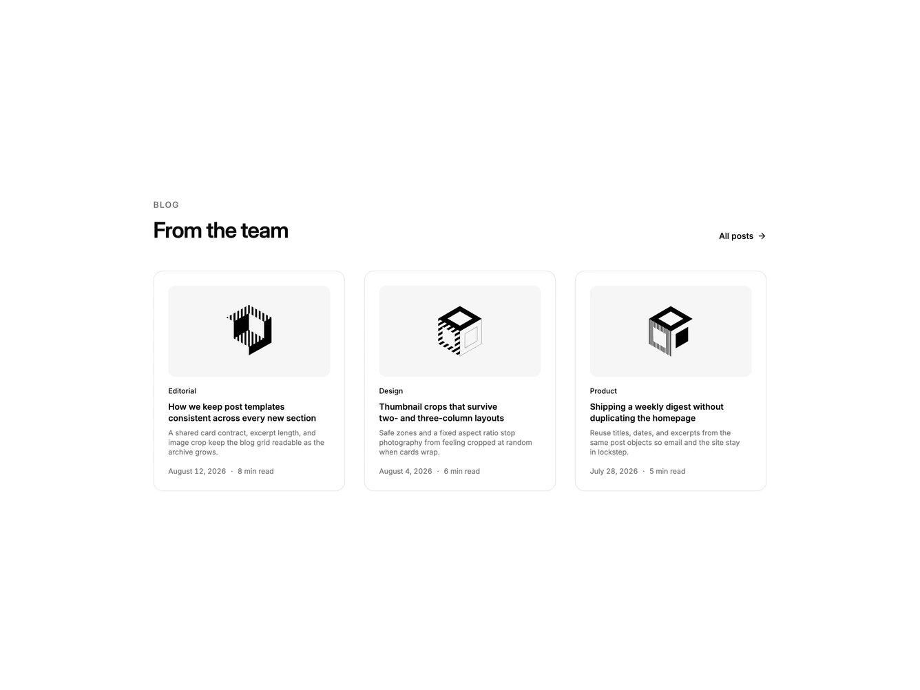
Shadcn Blog 47 - Three-column team blog cards

Three-column team blog cards

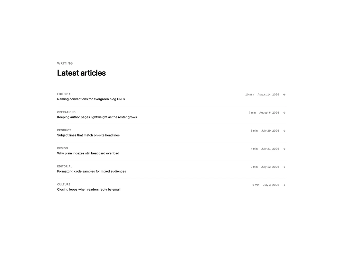
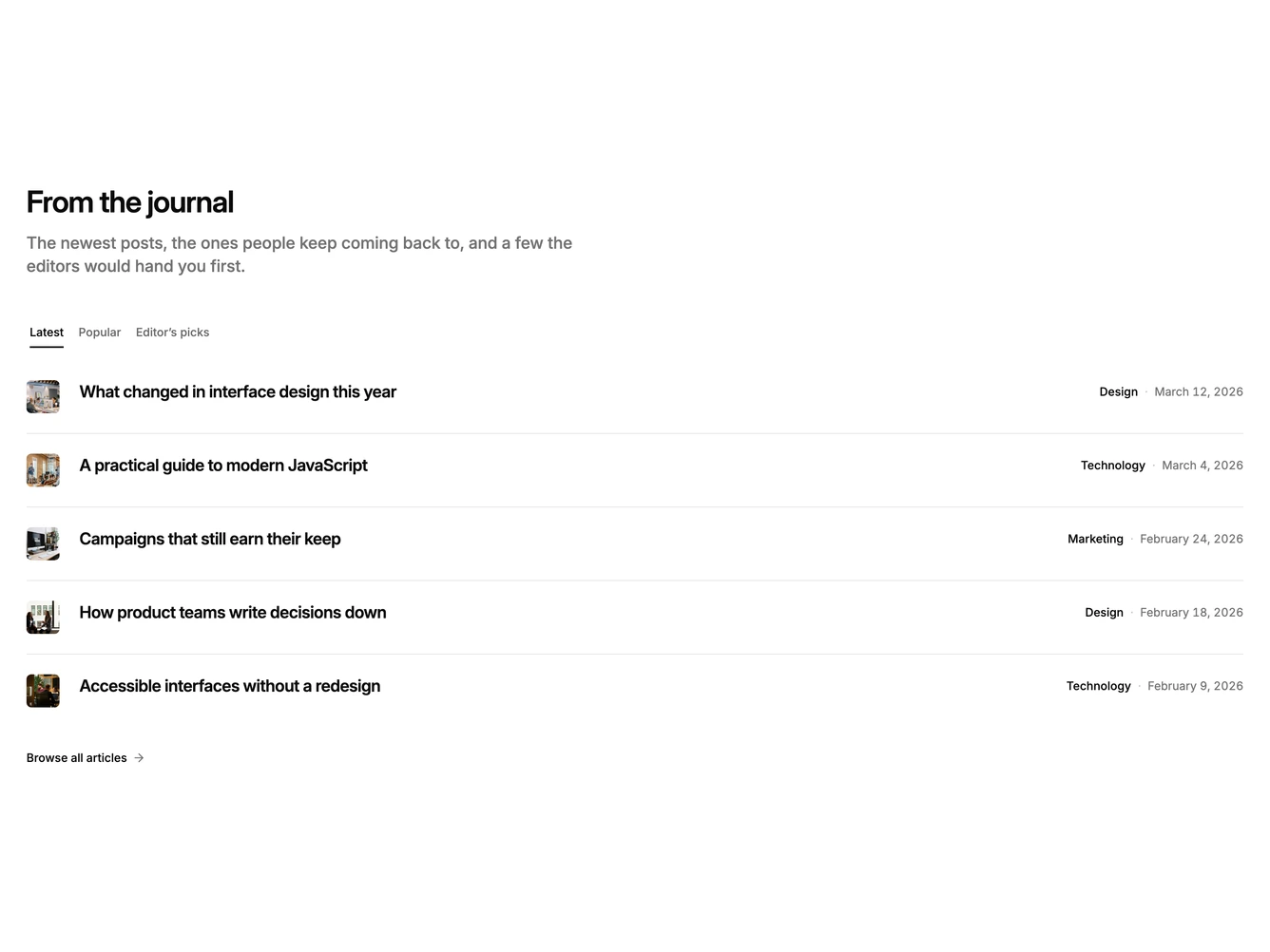
Shadcn Blog 48 - Divided latest-articles list

Divided latest-articles list

Shadcn Blog 49 - Featured post with stacked side cards

Featured post with stacked side cards

Shadcn Blog 50 - Magazine bento with mixed card spans

Magazine bento with mixed card spans

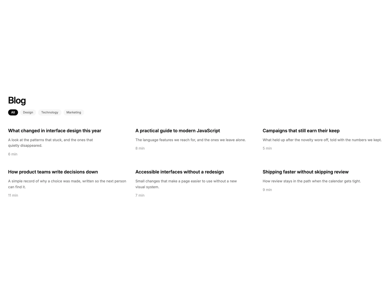
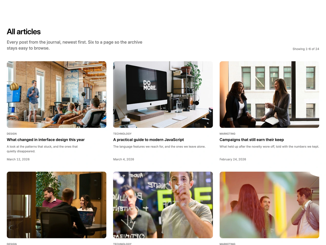
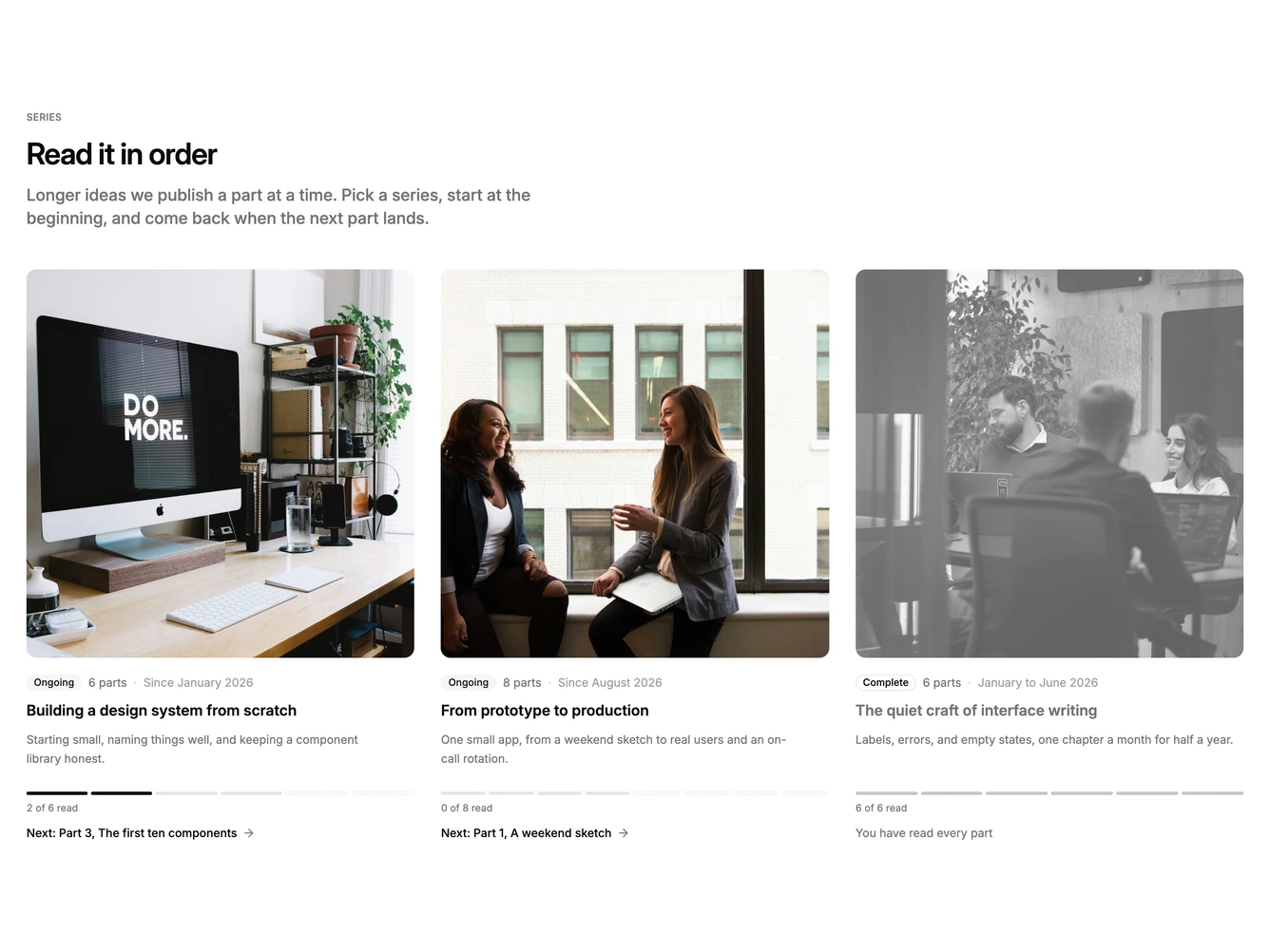
Shadcn Blog 51 - Filterable article card grid

Filterable article card grid

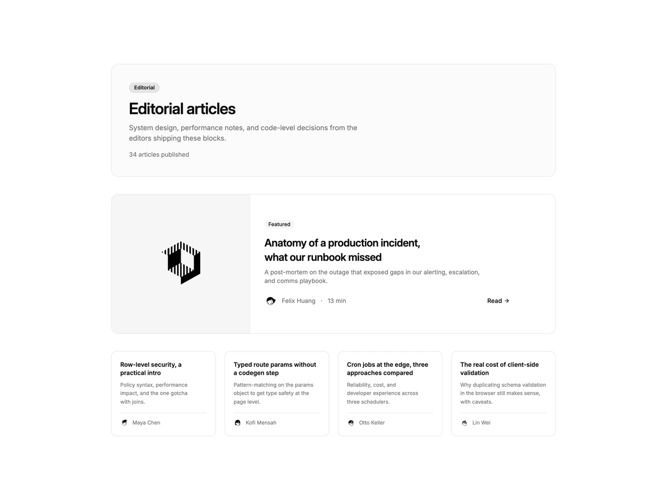
Shadcn Blog 52 - Editorial hero with compact post grid

Editorial hero with compact post grid

Shadcn Blog 53 - Muted featured story with three cards

Muted featured story with three cards

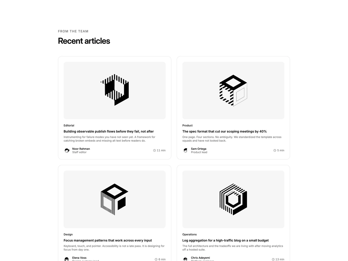
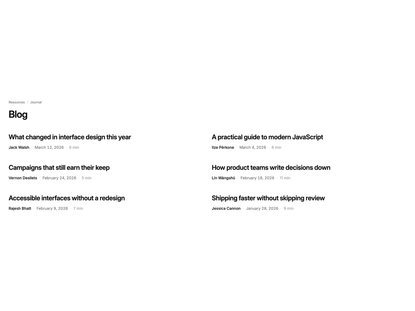
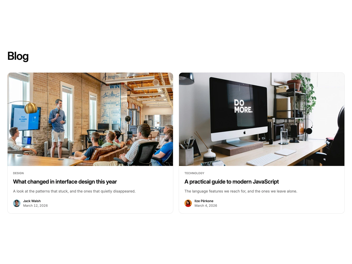
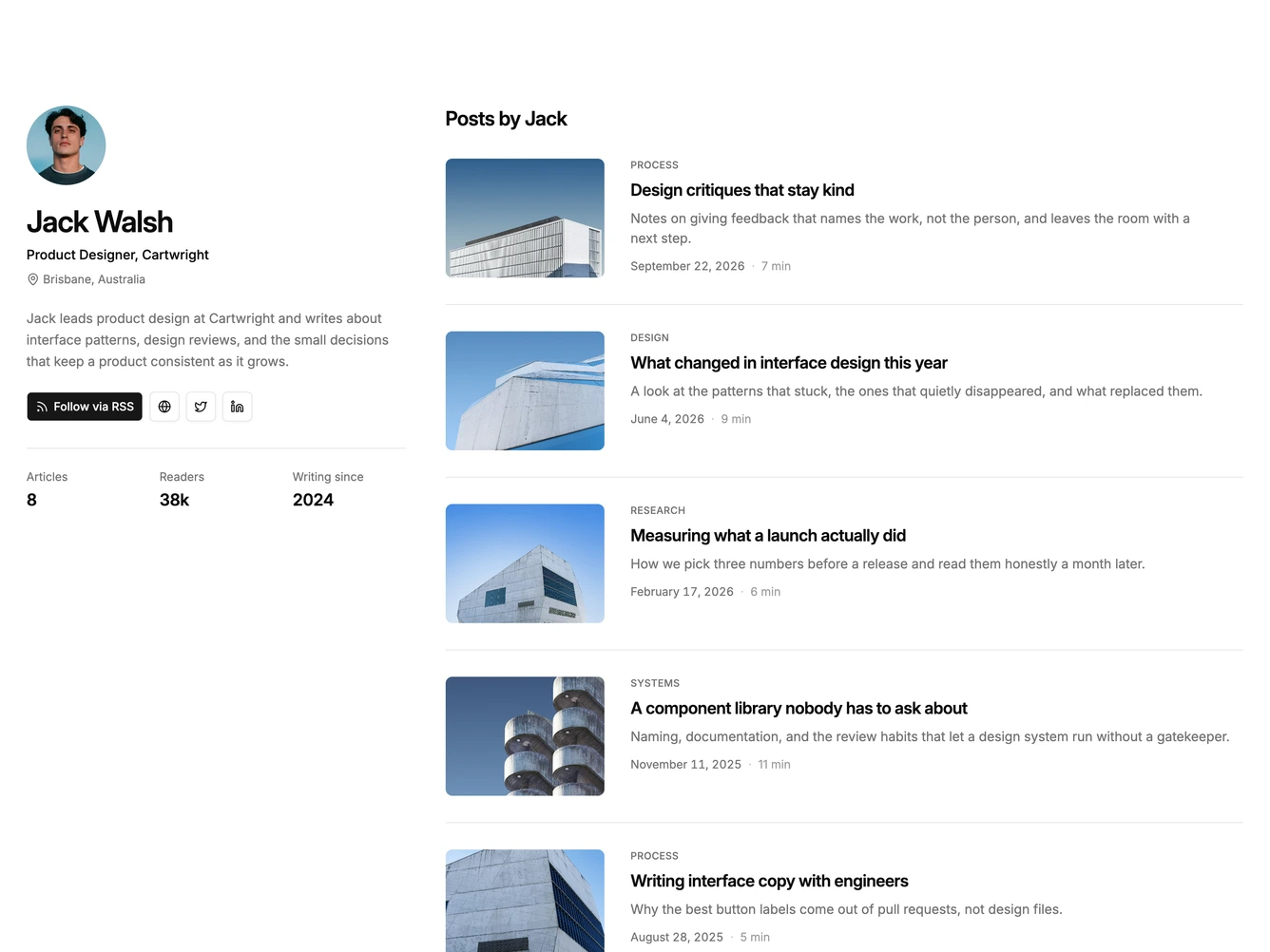
Shadcn Blog 54 - Two-column cards with author bylines

Two-column cards with author bylines

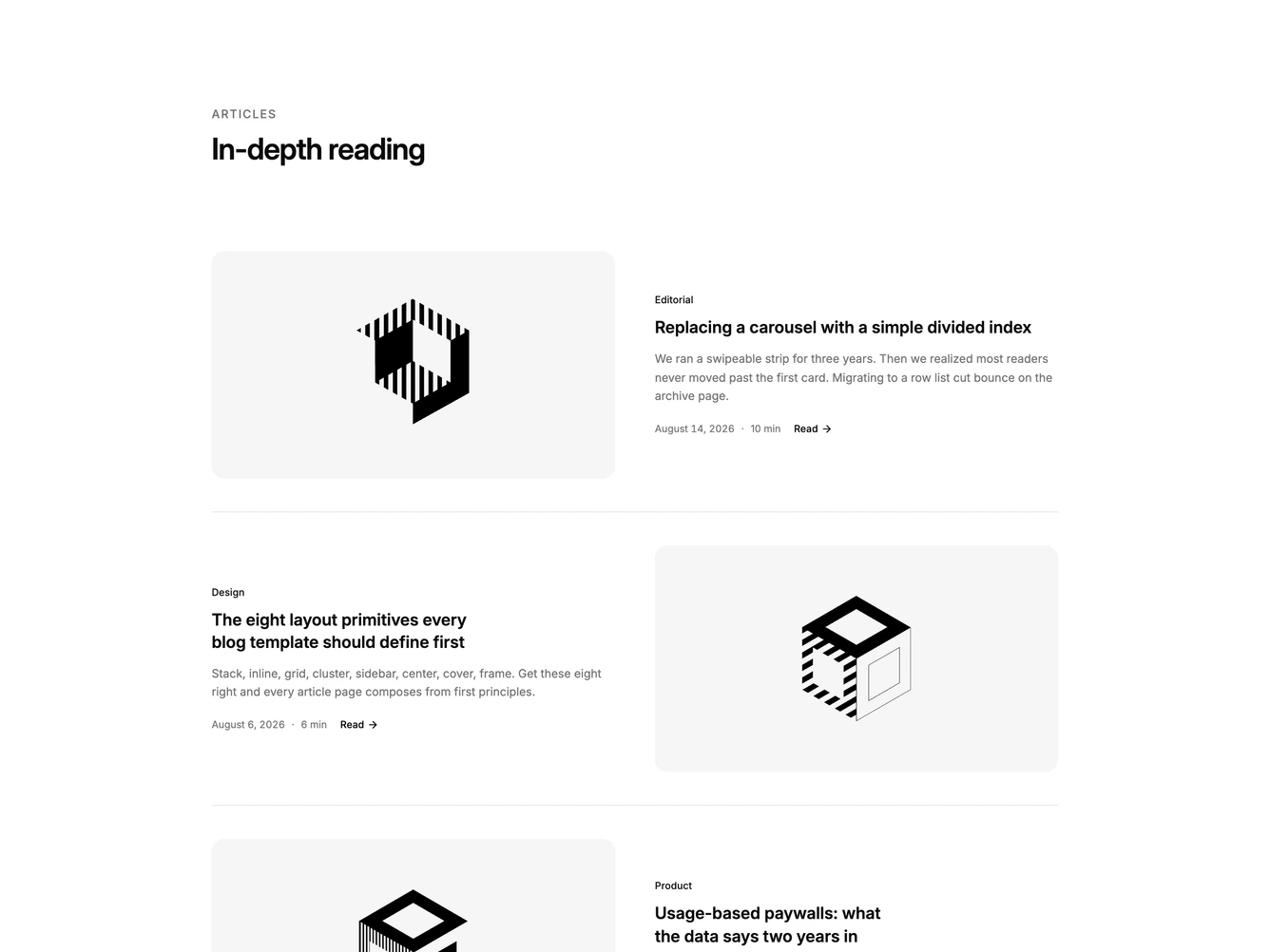
Shadcn Blog 55 - Alternating image and copy rows

Alternating image and copy rows

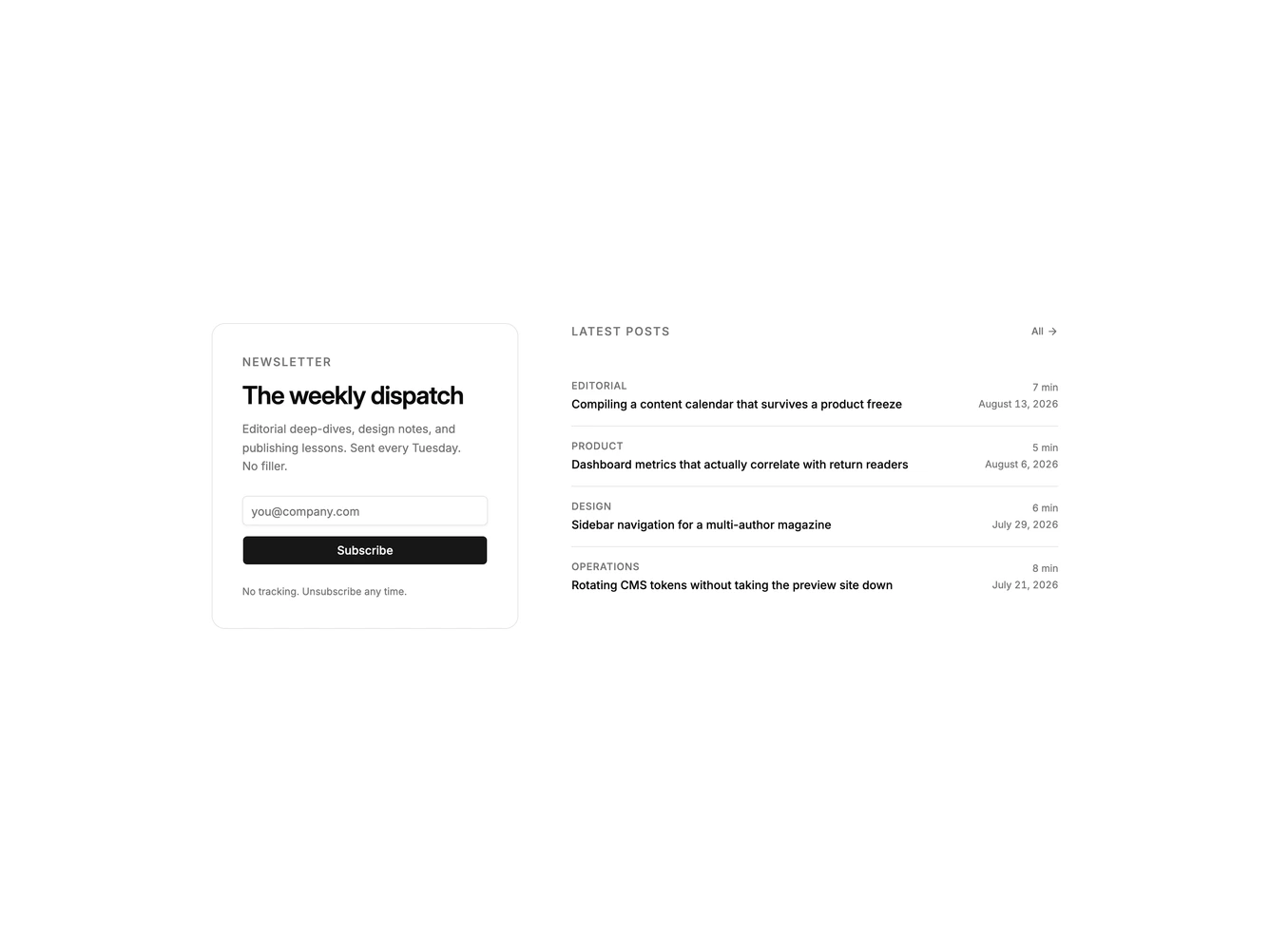
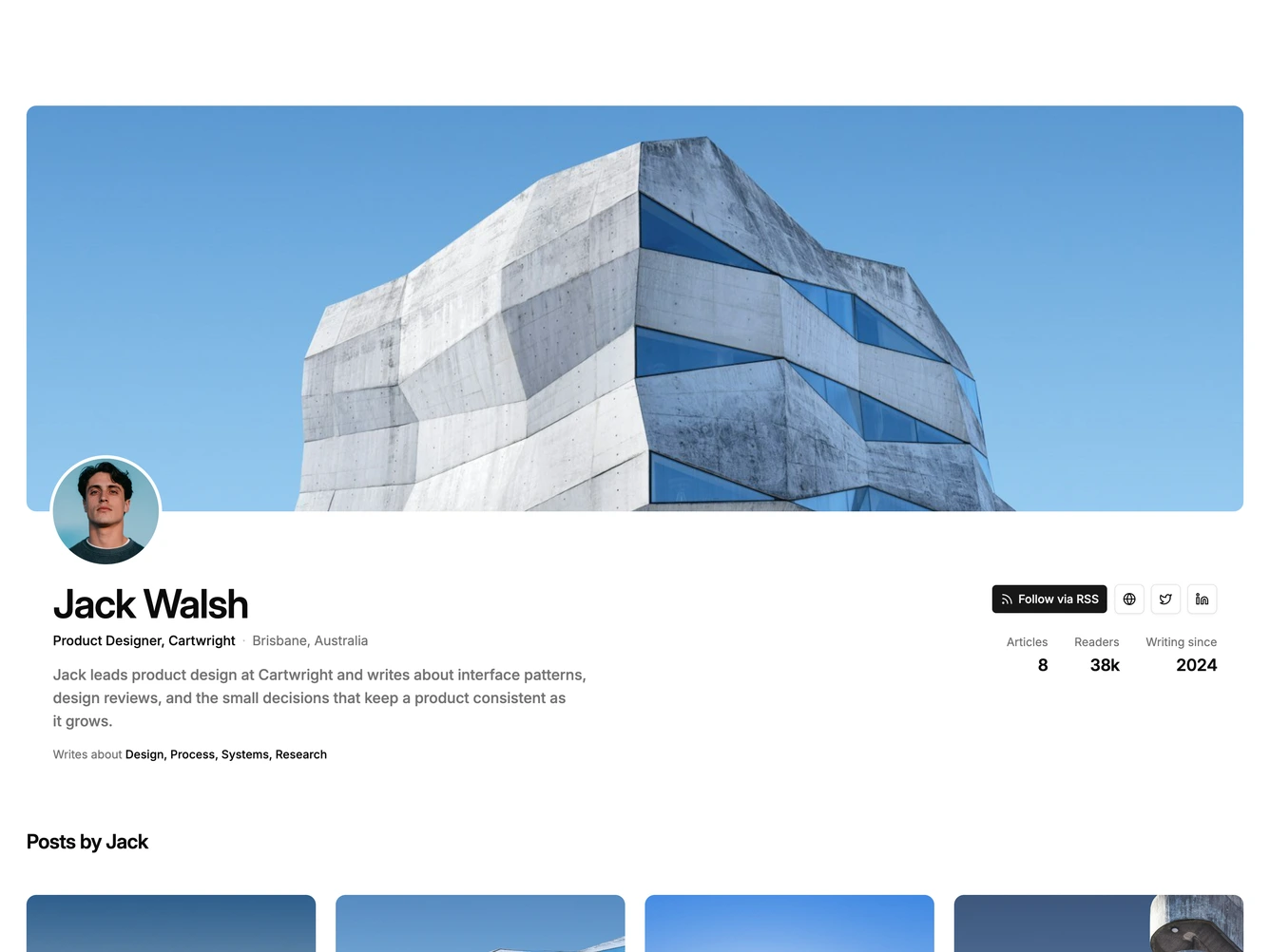
Shadcn Blog 56 - Newsletter panel with latest posts

Newsletter panel with latest posts

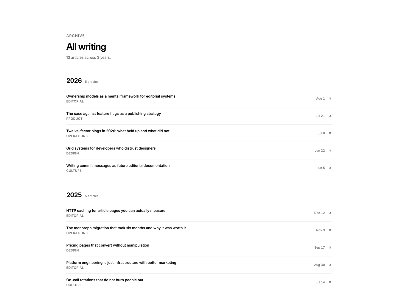
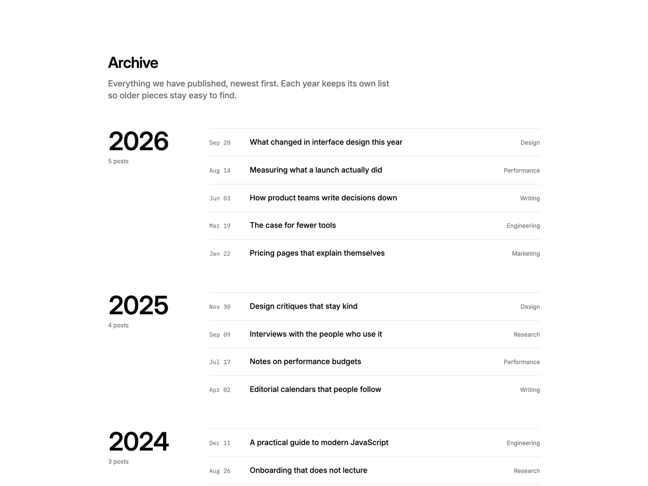
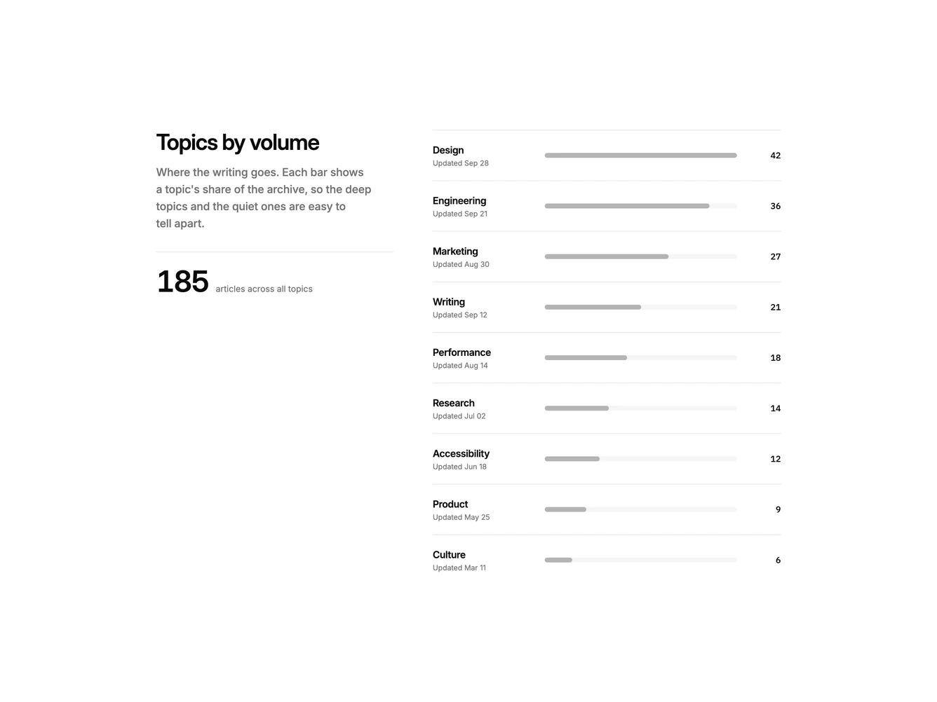
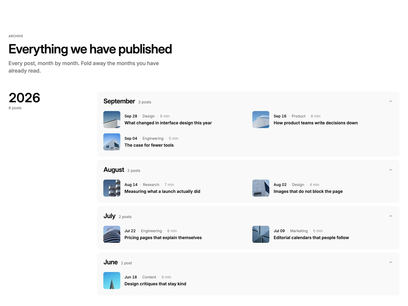
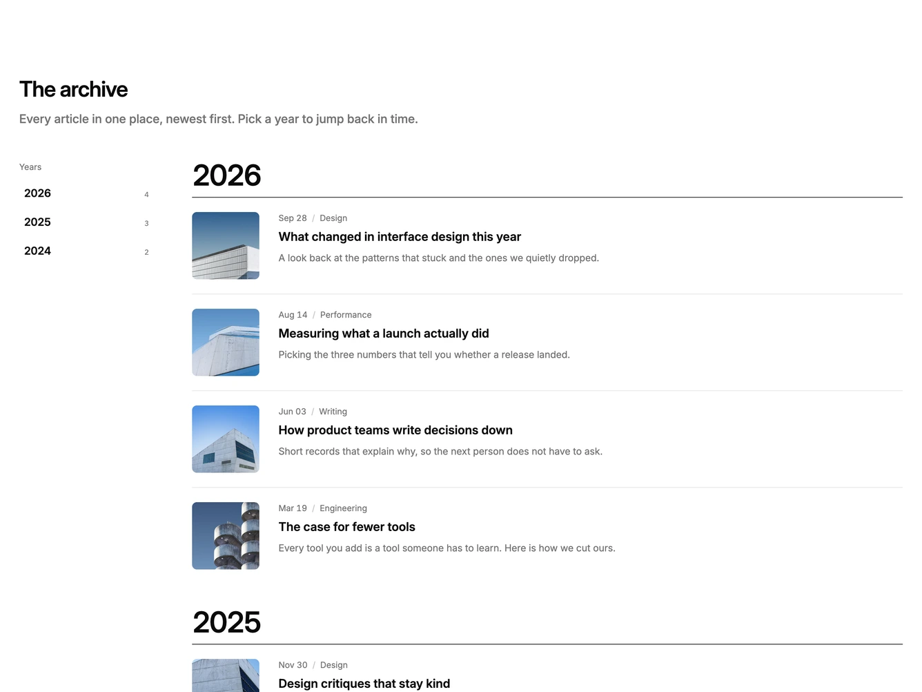
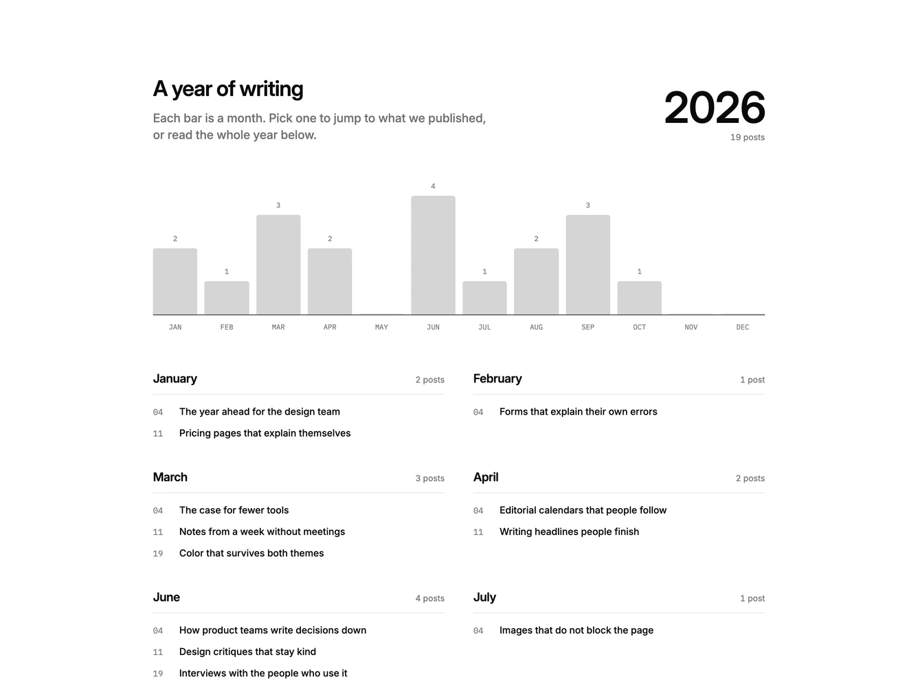
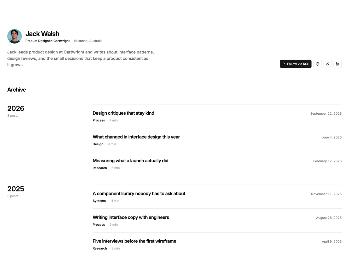
Shadcn Blog 57 - Year-grouped writing archive

Year-grouped writing archive

Shadcn Blog 60 - Photo cards with hover overlay actions

Photo cards with hover overlay actions

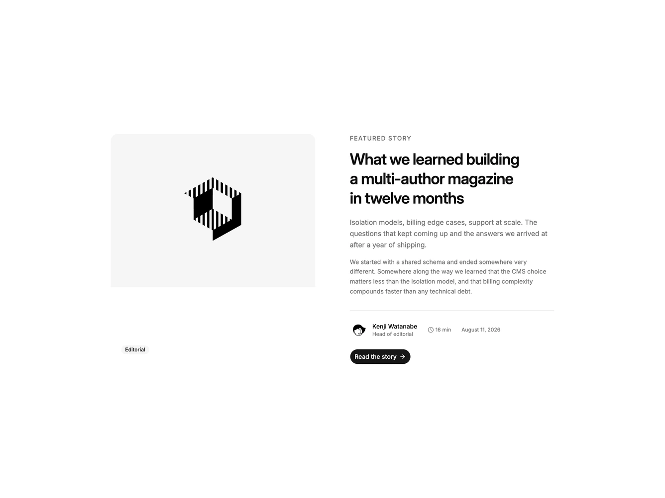
Shadcn Blog 62 - Split featured story with byline

Split featured story with byline

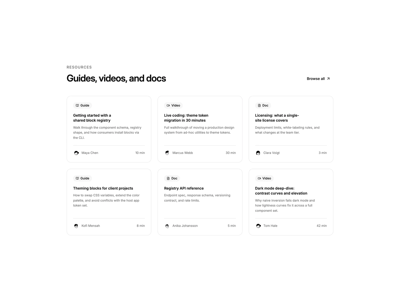
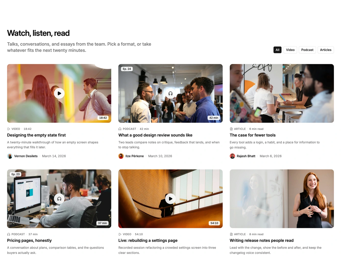
Shadcn Blog 63 - Resource cards for guides videos and docs

Resource cards for guides videos and docs

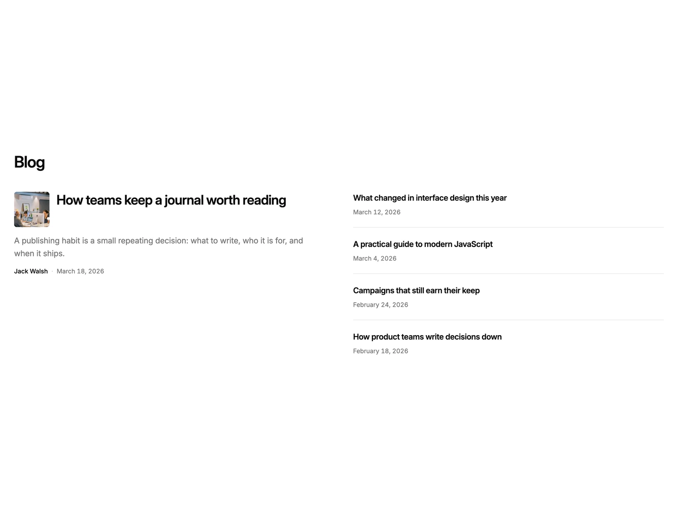
Shadcn Blog 67 - Featured split with supporting grid

Featured split with supporting grid

Shadcn UI Blog Blocks, Sections & Components

Blog blocks are dedicated sections of a webpage focused on blog content. They appear on landing pages, product pages, and marketing sites as key elements that communicate value and drive user engagement.

Each block is a self-contained React component which you can copy/paste the code or install via the shadcn CLI. You own the code and can modify however you like, or us AI and LLMS to quickly change the design.

Our blog blocks combine headlines, supporting text, images, icons, CTA buttons, and responsive layouts. Each block is designed with clear visual hierarchy and consistent spacing to integrate seamlessly into any page structure.

Choosing the Right Blog Section

Different goals call for different blog sections. We’ve organized our blog blocks into subgroups so you can find the right layout for your use case:

  • Shadcn Blog Card Grid - Card-based blog layouts with clear visual separation between items.
  • Shadcn Blog Other - Unique and creative blog layouts that go beyond standard patterns.
  • Shadcn Blog Feature - Blog Feature layouts for landing pages, product pages, and marketing sites.
  • Shadcn Blog Row - Blog Row layouts for landing pages, product pages, and marketing sites.
  • Shadcn Blog Carousel - Swipeable blog carousel and slider layouts for compact multi-item display.

FAQs

What is a Shadcn Blog section?

A shadcn Blog section is a React block for a marketing page. Shadcnblocks Blog sections are built with Tailwind and shadcn/ui.

How do I install a Shadcnblocks Blog block?

Two ways. Copy and paste the code from the block page (in the code view), or install with the shadcn CLI. For example to install with the CLI run npx shadcn add @shadcnblocks/blog1 - See the installation docs for setting up shadcn/ui if your project isn't using it already.

Can I use Shadcnblocks Blog sections in Next.js or Astro?

Yes. Shadcnblocks work with any React project. That includes Next.js, Astro, Remix, and Vite.

Do Shadcnblocks Blog blocks work with Radix UI and Base UI?

Yes. Our blocks support both Base UI and Radix UI. They will use whatever primitive library you have defined in your project's components.json. You can find more info at Base UI or Radix UI .

Can I customize Shadcnblocks Blog sections?

Yes. You can customize every aspect of the code. Shadcnblocks are downloaded as components that live in your codebase (not npm modules), so editing the code is just like your own code.

How does theming work on Shadcnblocks Blog components?

Our blocks use shadcn/ui theme variables in Tailwind CSS. CSS variables cover light mode, dark mode, and the rest of the shadcn design tokens. You can install any theme from our Shadcn Themes page.

How do I choose the right Shadcn Blog section?

Use the subgroup list above. Start from the layout you already have assets for, then change the copy and the image.