Blog 8 block design & features
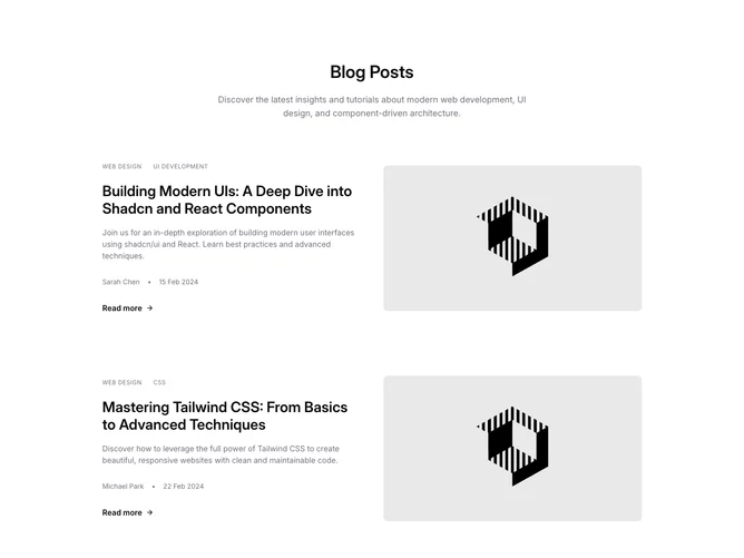
Blog8 is a two-post blog row section built with Shadcn UI, opening with a centered heading and muted description. Below it, two wide rows stack with generous space between them and no dividers. Each row splits into two equal columns: the left holds a line of uppercase tags, a large linked title, a summary paragraph, an author and date byline, and a "Read more" link with an arrow, while the right holds a rounded 16:9 image that fills its column. Each row sits in a borderless, transparent Card shell.
The surface is flat and neutral, with no shadows or borders anywhere and only a muted frame behind each image. Tags are small, spaced-out uppercase labels in muted gray. Titles are semibold and the largest in the row family, stepping up to near display size on wide screens, while the byline pairs a medium-weight author name with a muted date behind a faint dot. Image and title are separate links: the image dims slightly on hover, the title underlines, and the read-more arrow darkens alongside its own underline. Nothing animates on entrance.
Among the blog rows, this one gives each story the most room. Limiting it to two posts with half-width images makes it read as a featured pair rather than a feed, and the centered header lends a slightly more formal, magazine-cover tone than the left-aligned siblings. Structurally simple, it depends on two strong landscape images and posts that carry tags, an author, and a date.
On phones each row stacks with the image above the copy. From small screens up the image moves to the right column, and from medium screens it centers vertically against the text. Title, image, and read-more links open in a new tab by default.