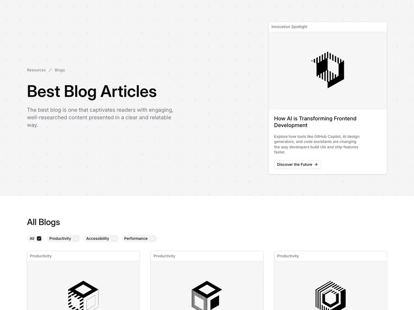
Shadcn UI Blog Block
The Blog27 component offers a comprehensive and engaging layout designed to display a rich collection of blog articles. This shadcn block is specifically tailored to present content in a visually appealing manner, making it easier for viewers to navigate through different blog categories and find articles matching their interests. By utilizing dynamic filtering and pagination, this component not only enhances user experience but also ensures efficient content delivery.
The component is built around several integrated sub-components such as a breadcrumb for easy navigation, a filter form for category selection, and a blog card for detailed article representation. The filter form allows seamless category filtering, enabling users to focus on their preferred topics while the pagination mechanism ensures that the content remains digestible by loading articles in sets. The BlogCard component elegantly combines images, titles, summaries, and call-to-action buttons, creating an informative preview for each post, making it a quintessential part of the shadcn ui.
Dependencies
| Package | Type |
|---|---|
| @hookform/resolvers | NPM |
| lucide-react | NPM |
| react | NPM |
| react-hook-form | NPM |
| zod | NPM |
aspect-ratio @shadcn | Registry |
breadcrumb @shadcn | Registry |
button @shadcn | Registry |
card @shadcn | Registry |
checkbox @shadcn | Registry |
field @shadcn | Registry |
label @shadcn | Registry |
