Shadcn Blog Card Grid Blocks

Browse and download 12+ Shadcn UI Blog Card Grid blocks. Built with React, Tailwind and shadcn/ui. These shadcn components are ready to download, copy and paste or install with the shadcn registry.

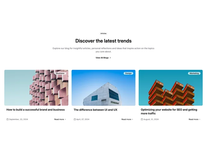
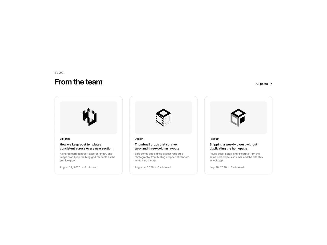
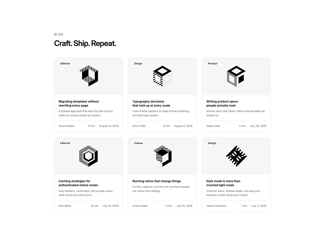
Shadcn Blog 3 - Blog grid with labeled posts

Blog grid with labeled posts

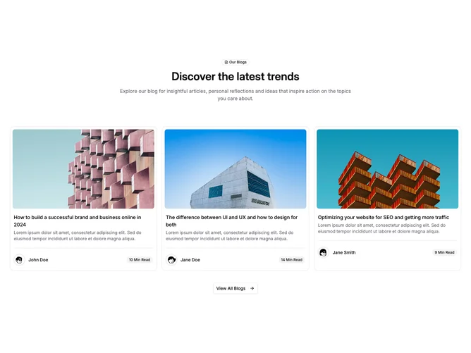
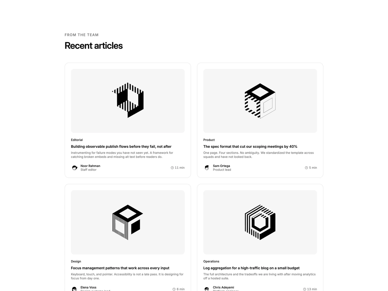
Shadcn Blog 4 - Blog grid with avatars and mobile view-all

Blog grid with avatars and mobile view-all

Shadcn Blog 7 - Centered blog cards with read-more links

Centered blog cards with read-more links

Shadcn Blog 34 - Four-column bordered blog cards

Four-column bordered blog cards

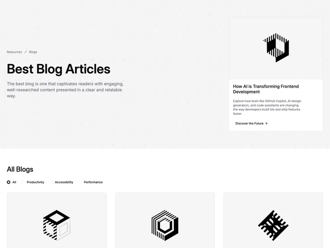
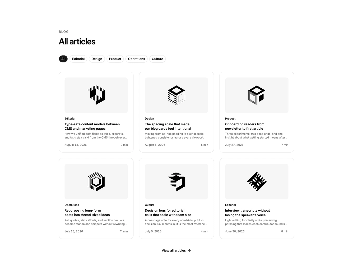
Shadcn Blog 1 - Latest posts grid with filters

Latest posts grid with filters

Shadcn Blog 5 - Large blog grid with nine posts

Large blog grid with nine posts

Shadcn Blog 6 - Blog grid with byline-first cards

Blog grid with byline-first cards

Shadcn Blog 33 - Compact four-column blog cards

Compact four-column blog cards

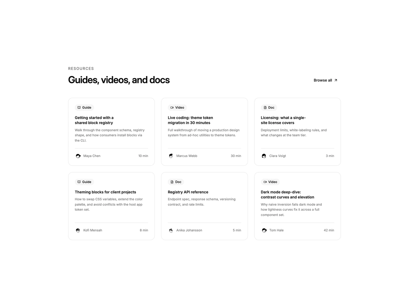
Shadcn Blog 12 - Blog cards with read times

Blog cards with read times

Shadcn Blog 13 - Article grid with category overlays

Article grid with category overlays

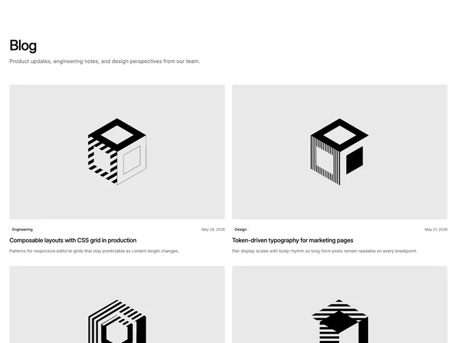
Shadcn Blog 32 - Two-column blog card grid

Two-column blog card grid

Shadcn Blog 27 - Filtered blog grid with spotlight band

Filtered blog grid with spotlight band

Shadcn Blog Card Grid Blocks, Sections & Components

A shadcn blog card grid block presents blog content using card-based layouts. Cards provide clear visual separation between items and work well for showcasing distinct options or categories.

Each block is a self-contained React component which you can copy/paste the code or install via the shadcn CLI. You own the code — customize the layout, content, and styling using Tailwind utility classes.