Blog 60 block design & features
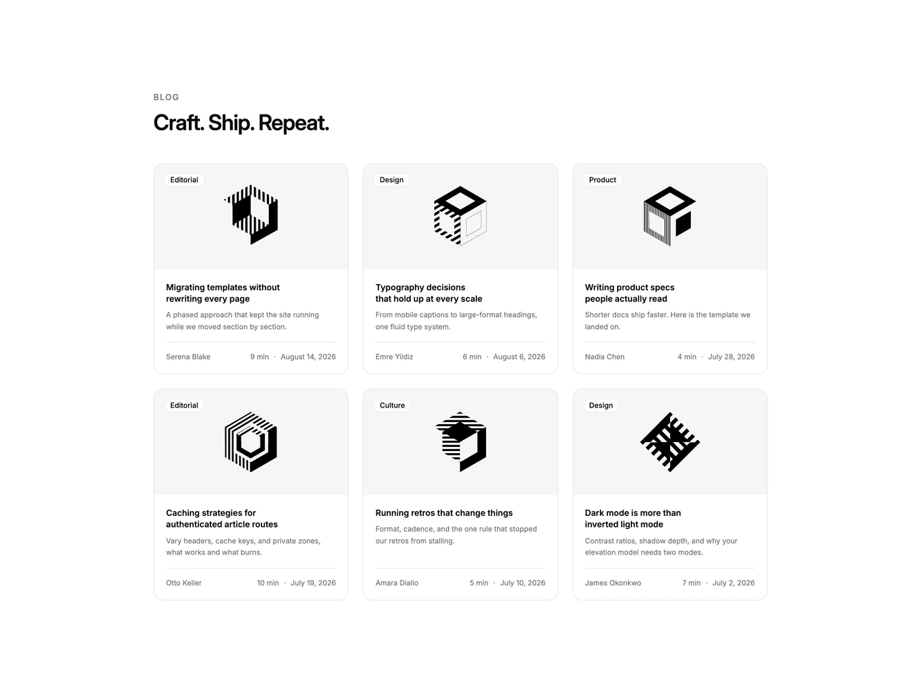
Blog60 is a three-column photo grid built with shadcn/ui surfaces. A label and heading introduce six cards. Each card has a cover with a frosted category pill and a round arrow that appears on hover, then title, excerpt, and a footer row with author, read time, and date.
Images zoom slightly on hover. The overlay controls sit on a blurred background chip so they stay readable on photography. Card bodies are compact with a hairline above the metadata.
The hover arrow is a small distinctive interaction on an otherwise standard card grid. Complexity is moderate and image-driven: six covers plus short excerpts fill the layout.
On smaller screens the grid drops to two columns, then one.