
Blog 13 block design & features
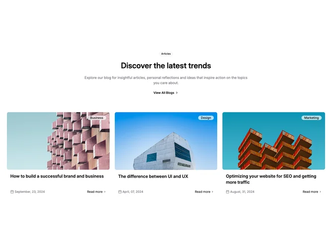
Blog13 stacks a concise centered preamble atop a three-up article grid, using shadcn/ui outline badges, lucide calendar markers, and chevron-accented links for orientation. The introductory stack repeats badge, headline, paragraph, and “View All Blogs” anchor before the masonry-simple columns begin.
Glancing at tile styling, each article leads with edge-to-edge imagery and a frosted secondary badge pinned to the corner, followed by a bold title block and a split footer aligning dated metadata against a text-only read-more control.
It lands between marketing landing succinctness and editorial rhythm: fewer moving parts than Blog11 yet richer labeling than Blog12’s author rows.
Spacing breathes on desktop thanks to wider gutters while phones collapse to a single stacked column without losing the anchored badges.