
Blog 34 block design & features
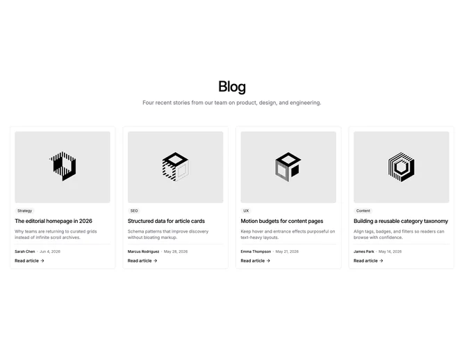
Blog34 opens with a centered heading and description, then a shadcn/ui grid of four equal cards on large screens. Each linked card has a hairline border, internal padding, a four-by-three thumbnail with rounded corners, a secondary category badge, a medium-weight title, a three-line summary, and a footer separated by a top rule with author name, publish date, and a read link with arrow icon.
Visually the block reads as tidy and card-forward rather than image-overlay editorial. Hover states lighten the card background and scale the photo slightly, while typography stays restrained so metadata and titles remain easy to scan across a full row.
The layout feels balanced and catalog-like: four peers of equal weight with no featured span or bento asymmetry. Complexity is moderate and content-driven, needing four posts with imagery, labels, bylines, and dates.
On smaller breakpoints the grid steps down to two columns, then one, keeping the same bordered card structure throughout.