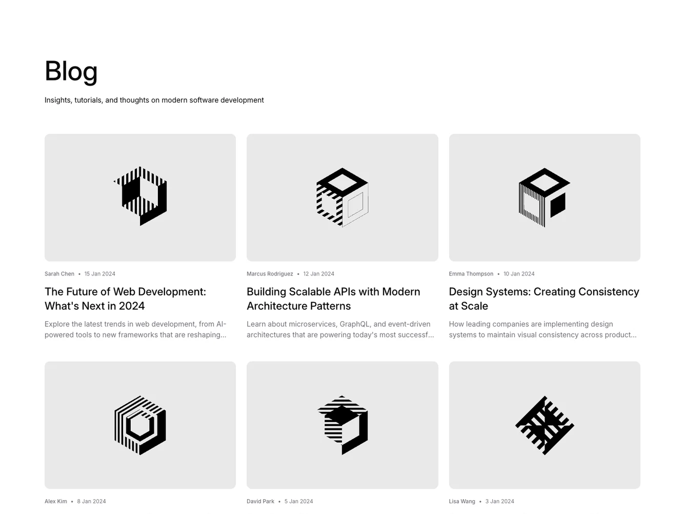
Shadcn UI Blog Block
The Blog6 component is a shadcn block designed to display a collection of articles or blog posts in a visually appealing grid layout. By organizing posts into a series of cards, it presents key information such as the title, author, and publication date, enticing users to delve deeper into the content. The component seamlessly integrates well-structured visual elements with interactive components, creating an engaging experience for users exploring a set of written content.
In more detail, this shadcn ui component presents each post with a thumbnail image, a succinct summary, and metadata about the post. The design ensures that vital information is easy to access, while the hover effects and transitions provide a polished, interactive feel that guides user interaction without overwhelming them. The component’s layout adjusts the number of columns based on the screen size, enhancing readability across devices. Additionally, the View all posts button offers users a convenient call to action, encouraging further engagement with the content.
Dependencies
| Package | Type |
|---|---|
button @shadcn | Registry |
