
Blog 63 block design & features
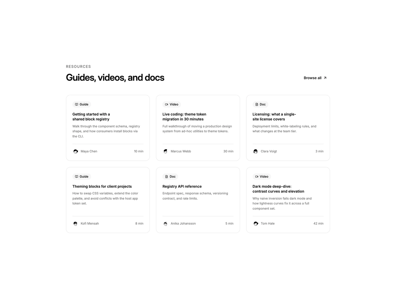
Blog63 is a resource library grid built with shadcn/ui Button. A label and heading sit beside a browse-all ghost action, then a three-column set of linked cards. Each card opens with a muted type chip and icon for guide, video, or doc, then title, description, and a footer with avatar, author, and duration. A corner arrow appears on hover.
There are no cover photos. Type chips and excerpt length differentiate entries instead of color-coded brand palettes. Cards share bordered shells and a light hover shadow.
The mixed media types make this a library pattern rather than a news grid. Complexity is moderate and content-driven: six resources with type, author, and duration fill the layout.
On smaller screens the grid drops to two columns, then one.