


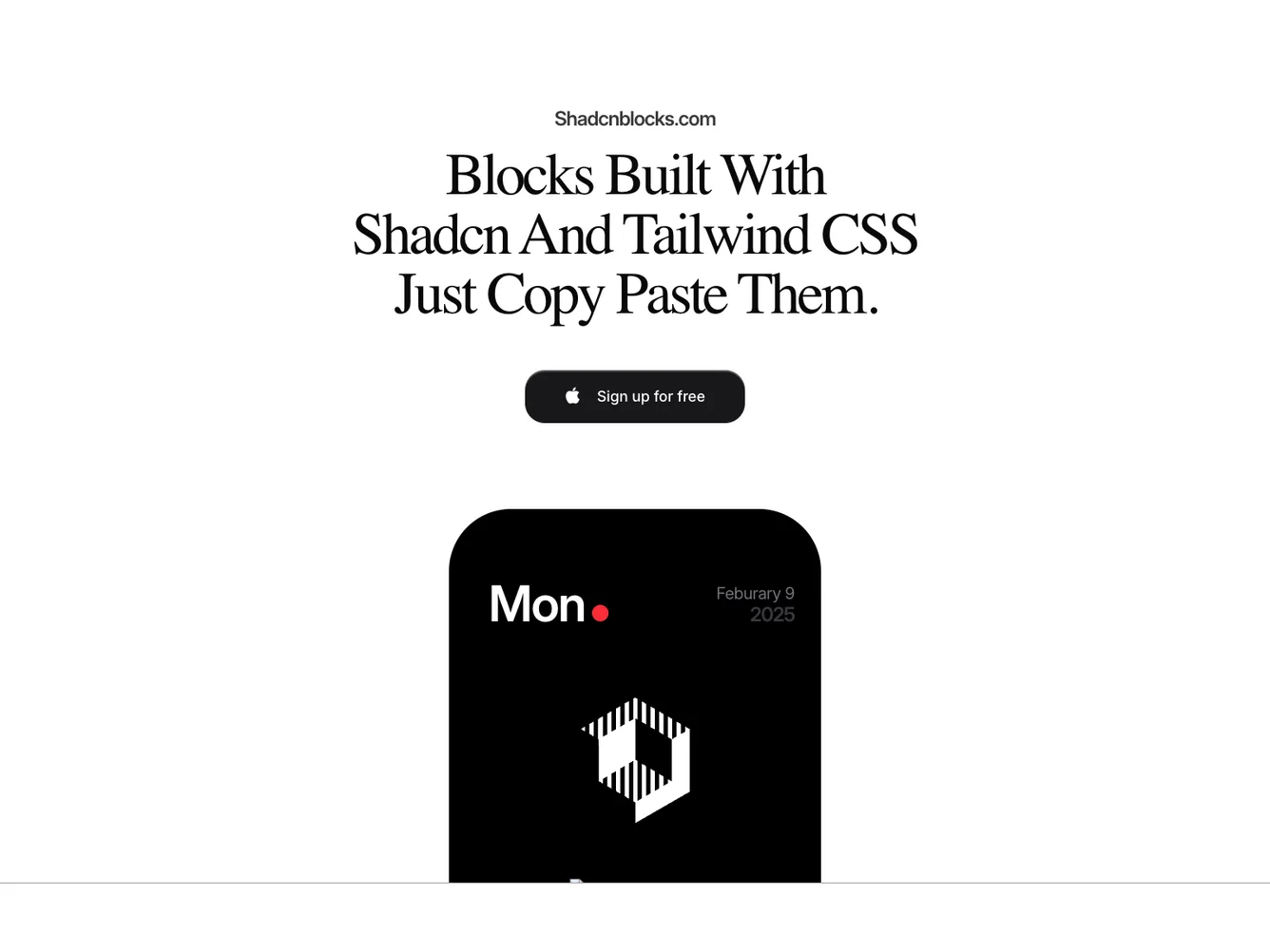


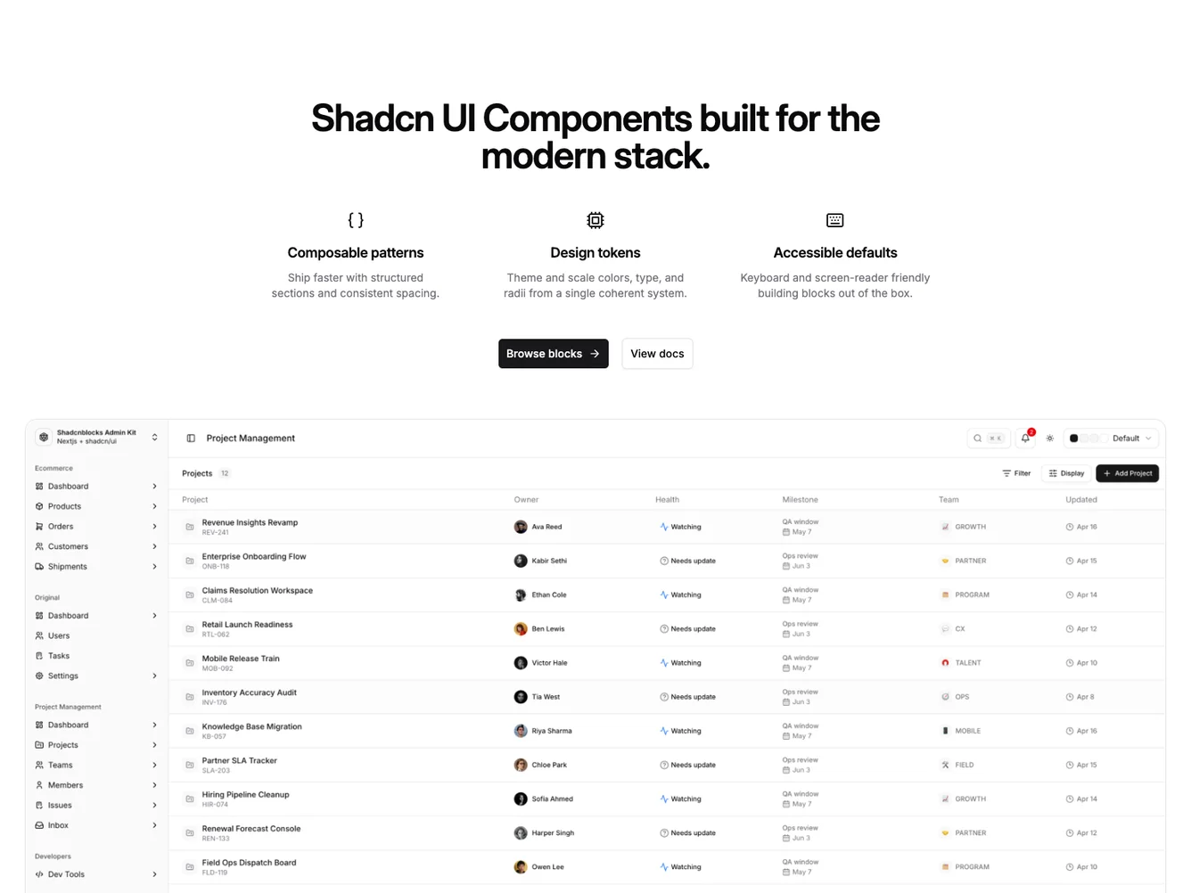
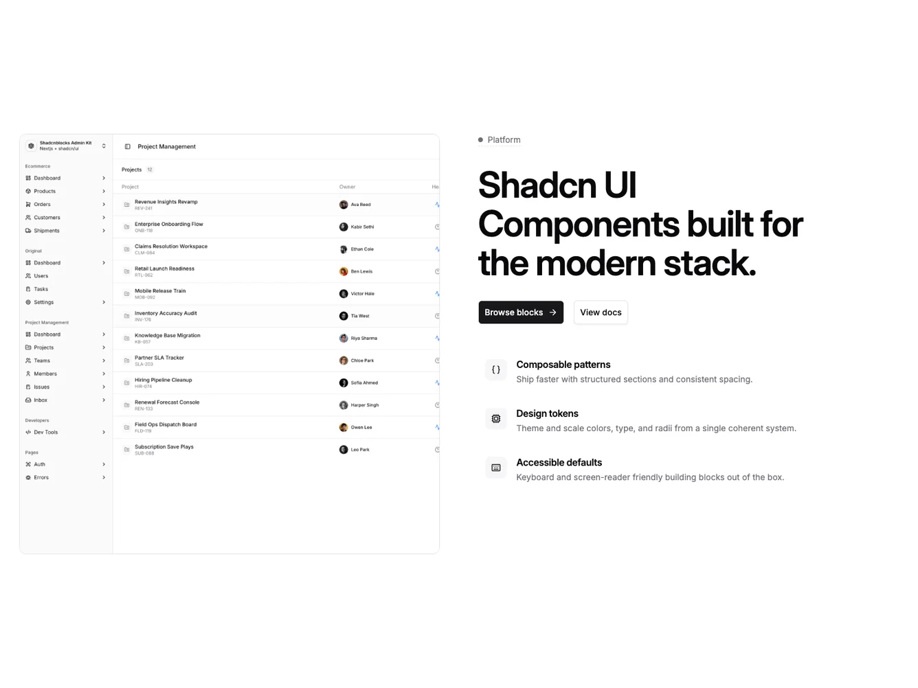
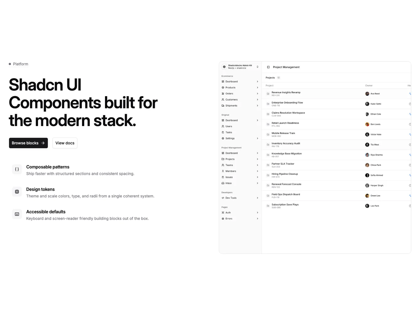
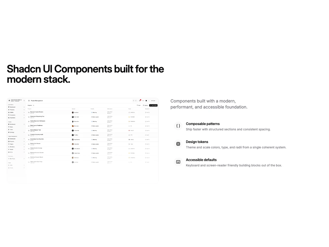

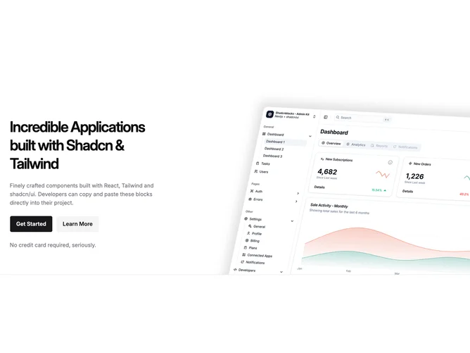


Shadcn UI Hero Blocks, Sections & Components
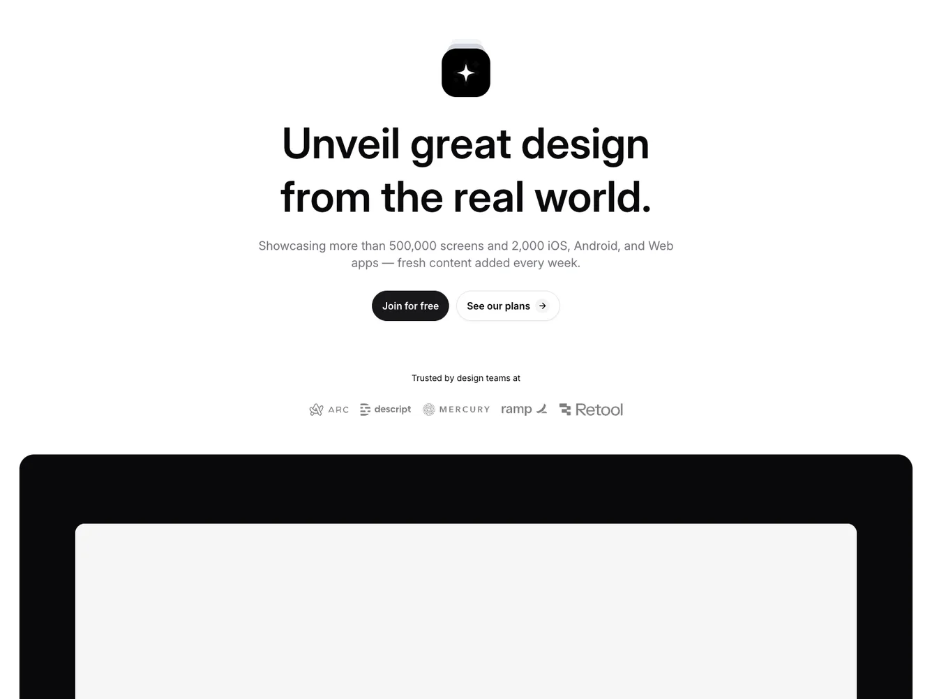
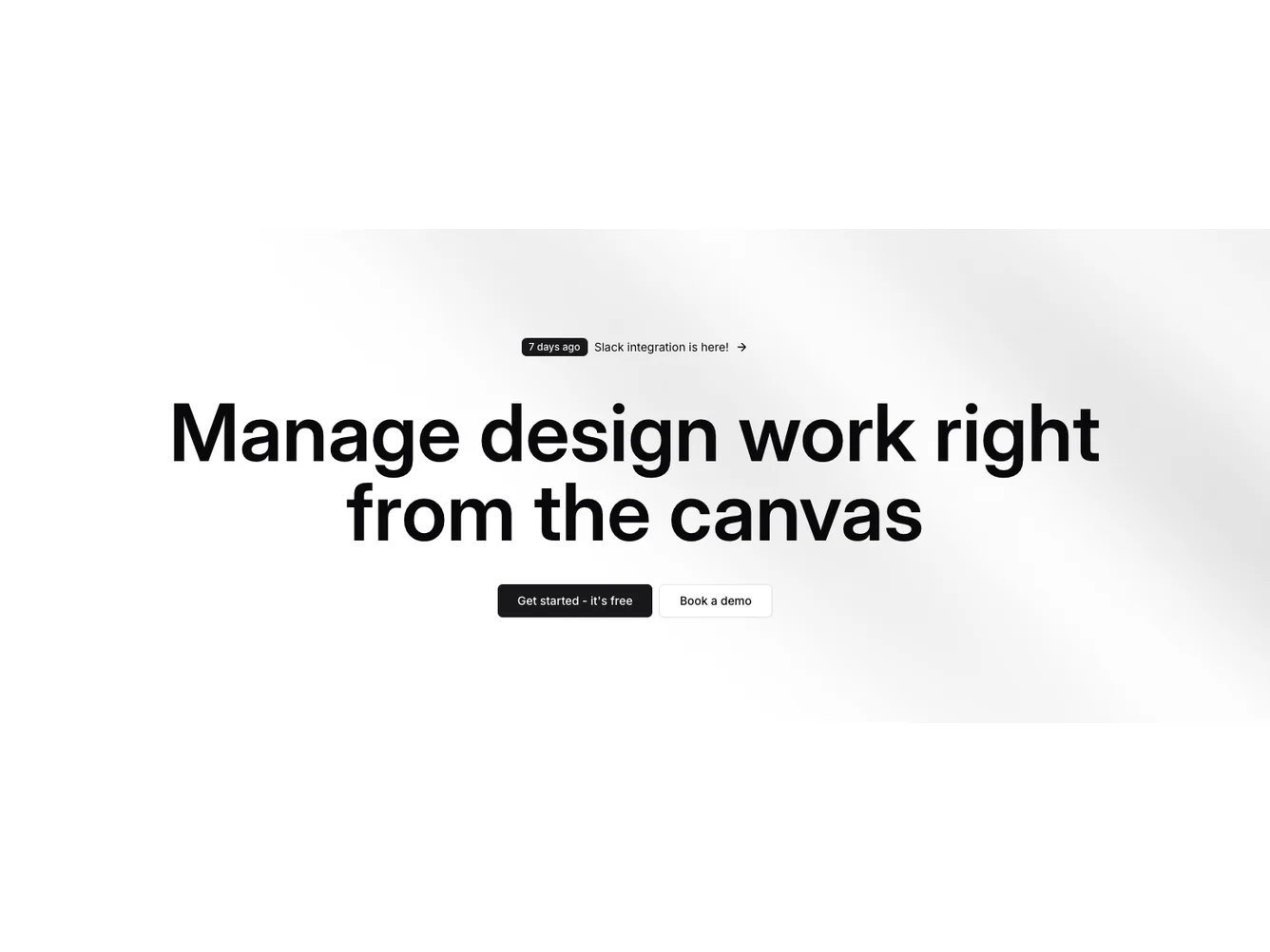
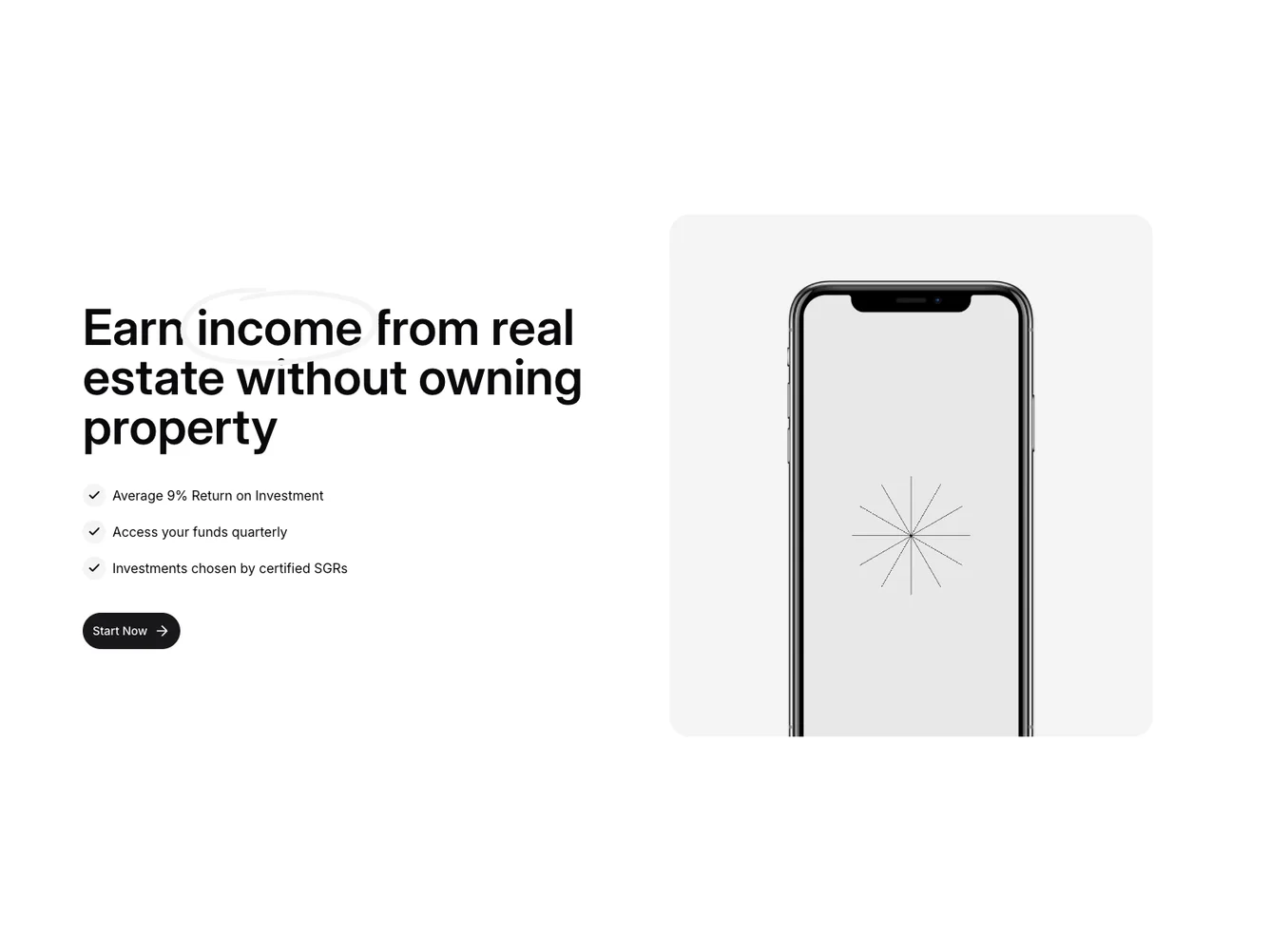
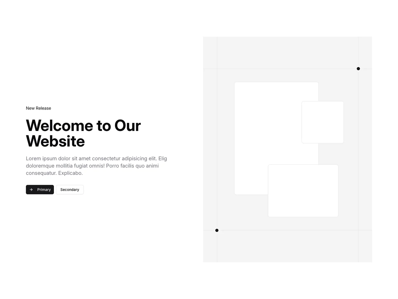
Hero blocks set the tone for your entire page. They’re the first thing visitors see — a full-width section at the top that combines a compelling headline, supporting copy, imagery, and a call-to-action into a single, high-impact component. Whether you’re launching a SaaS product, showcasing a portfolio, or building a marketing site, the hero section is where you make your first impression count.
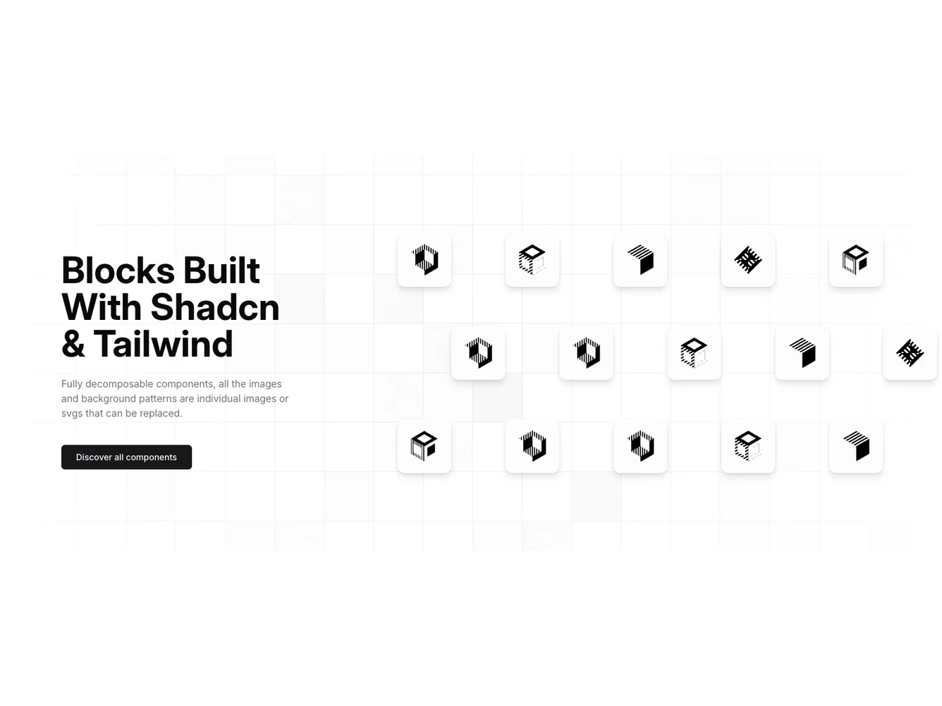
Each block is a self-contained React component which you can copy/paste the code or install via the shadcn CLI. You own the code and can modify however you like, or us AI and LLMS to quickly change the design.
Our hero block collection spans split layouts, fullscreen backgrounds, video heroes, carousel sliders, and minimal text-focused designs. Each variant is built with shadcn/ui components and Tailwind CSS, giving you consistent theming, dark mode support, and responsive behavior out of the box. Drop one into your Next.js, Astro, or Vite project and customize the content to match your brand.
Choosing the Right Hero Section
Different goals call for different hero sections. We’ve organized our hero blocks into subgroups so you can find the right layout for your use case:
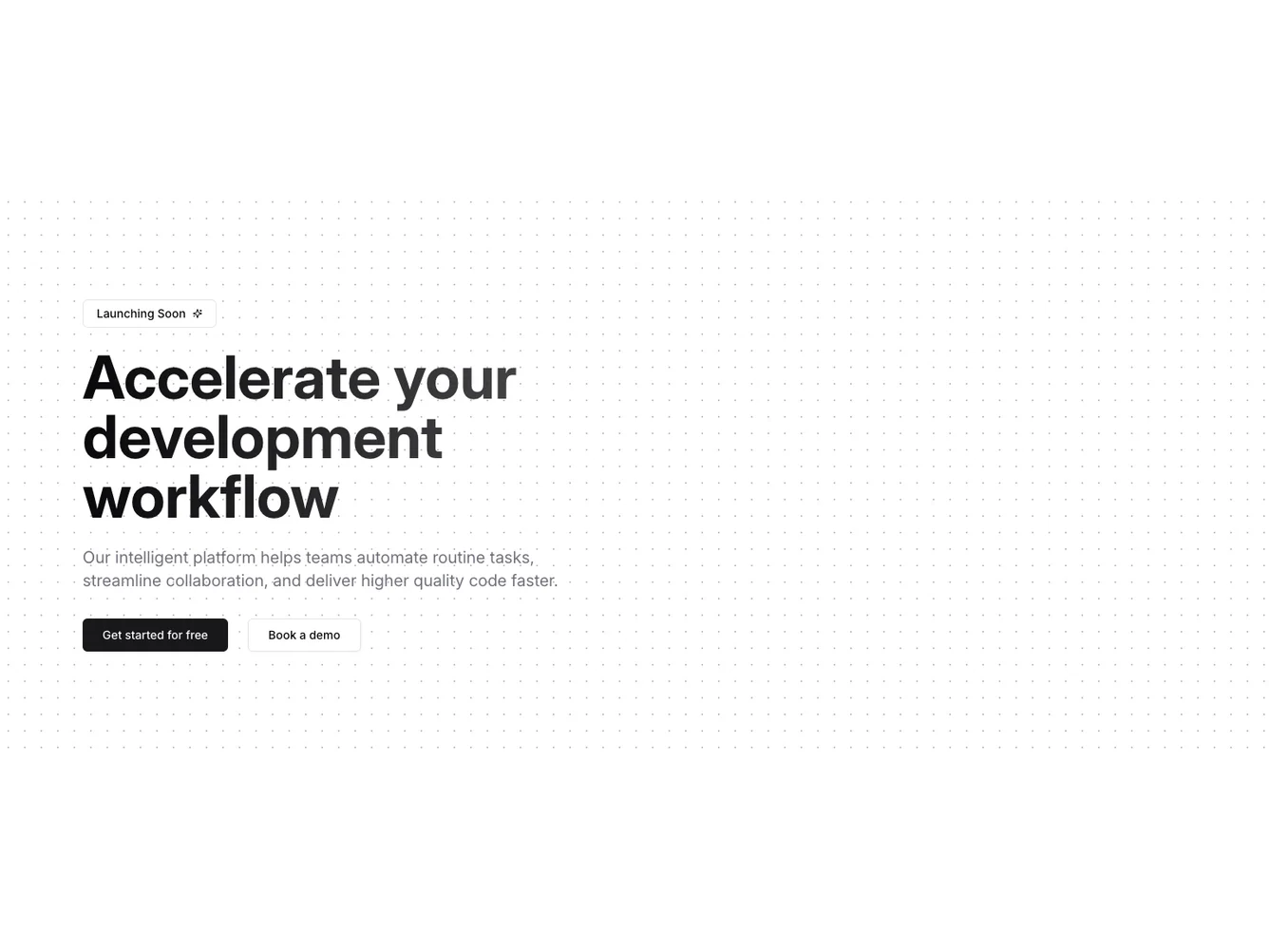
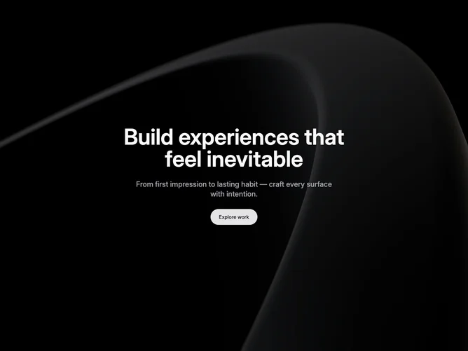
- Shadcn Hero Basic - Clean, straightforward hero layouts with minimal visual complexity.
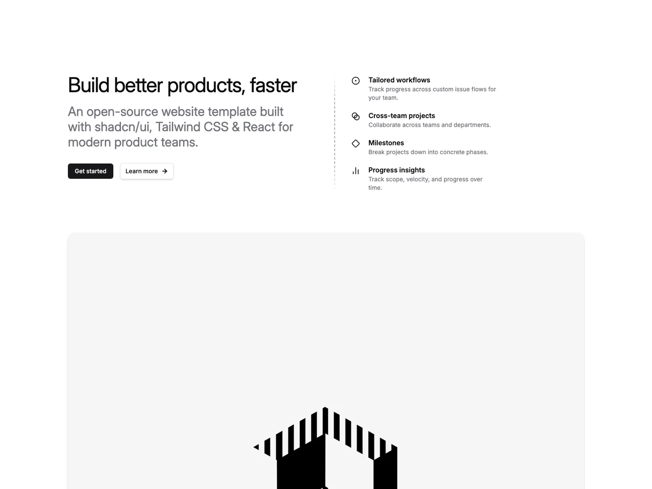
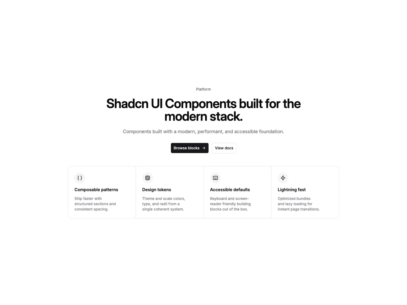
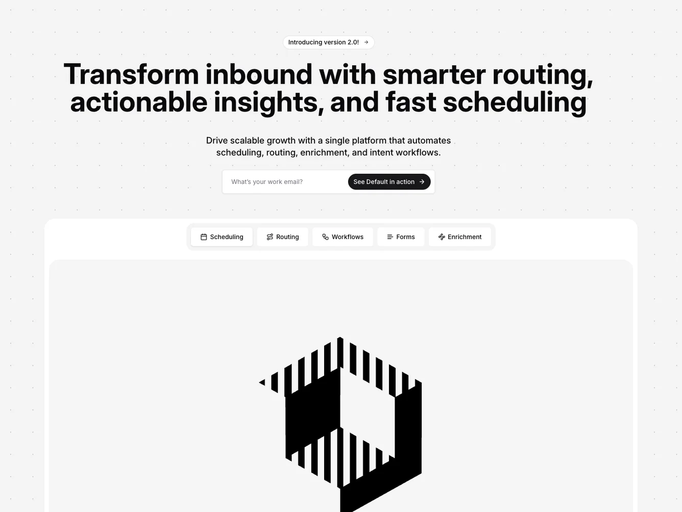
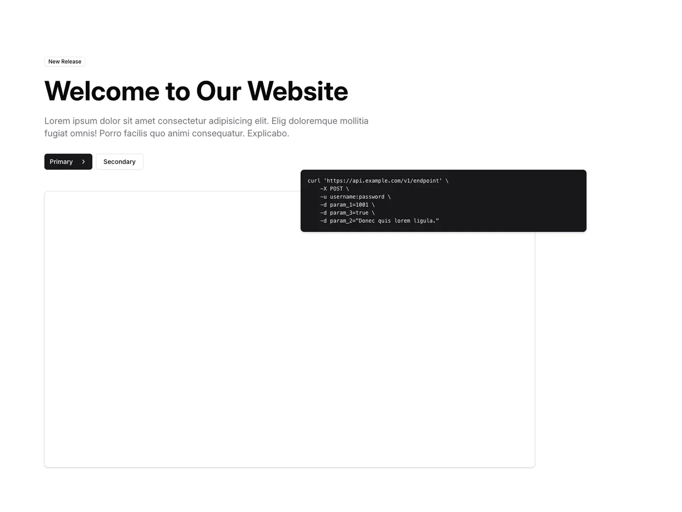
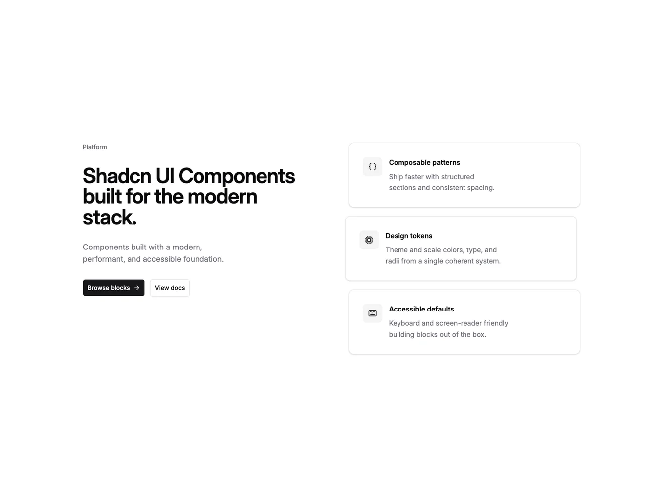
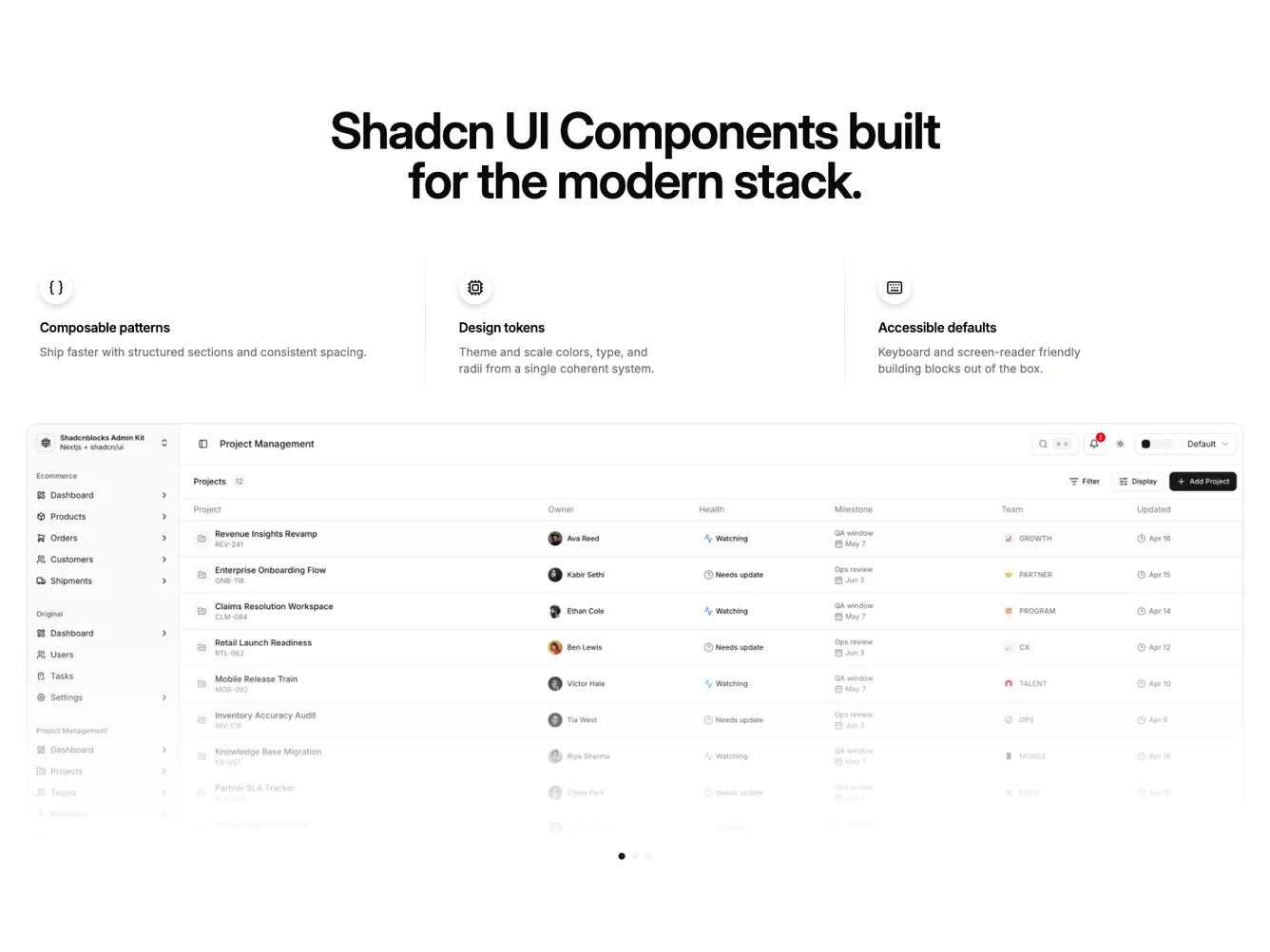
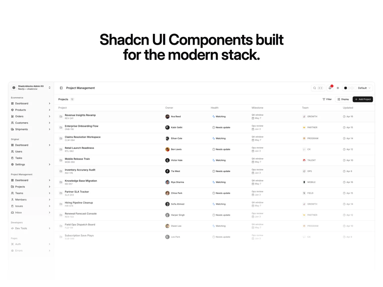
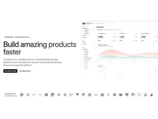
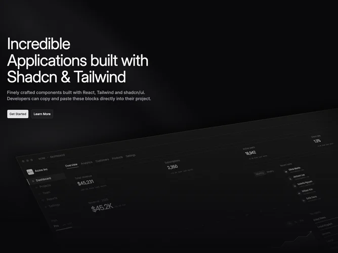
- Shadcn Hero Dev Tools - Hero Dev Tools layouts for landing pages, product pages, and marketing sites.
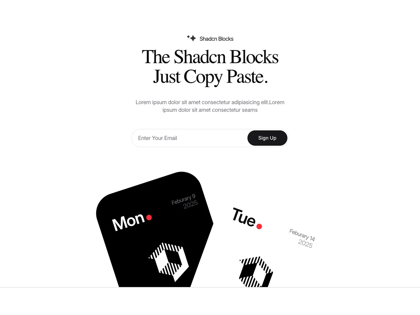
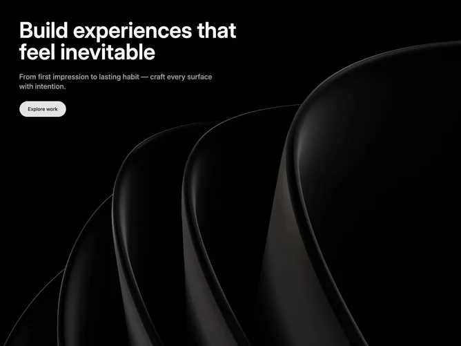
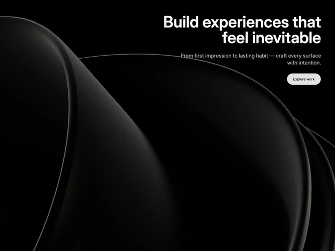
- Shadcn Hero Other - Unique and creative hero layouts that go beyond standard patterns.
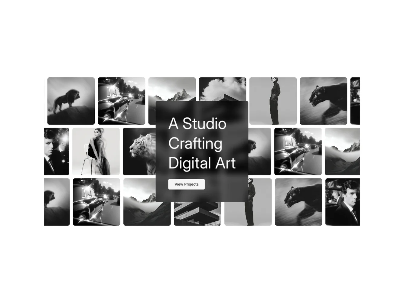
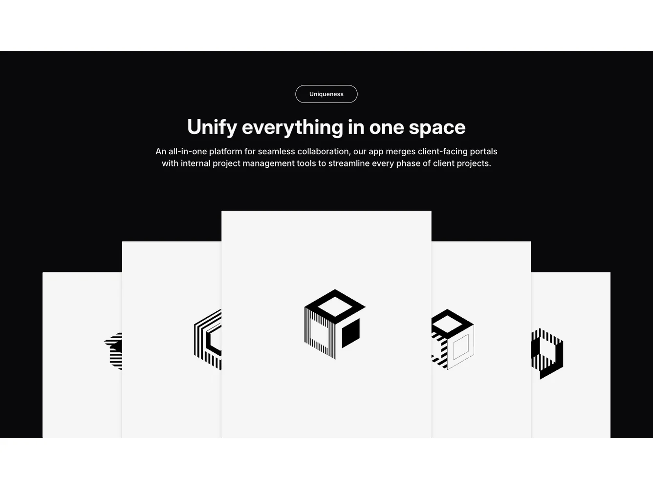
- Shadcn Hero Collage - Hero Collage layouts for landing pages, product pages, and marketing sites.
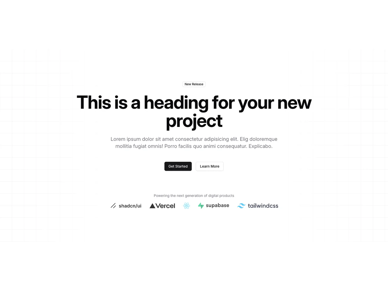
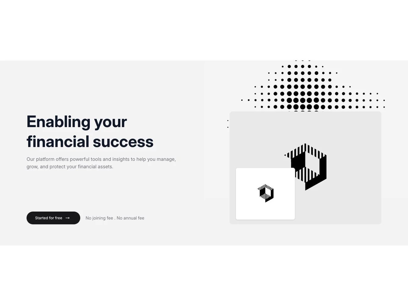
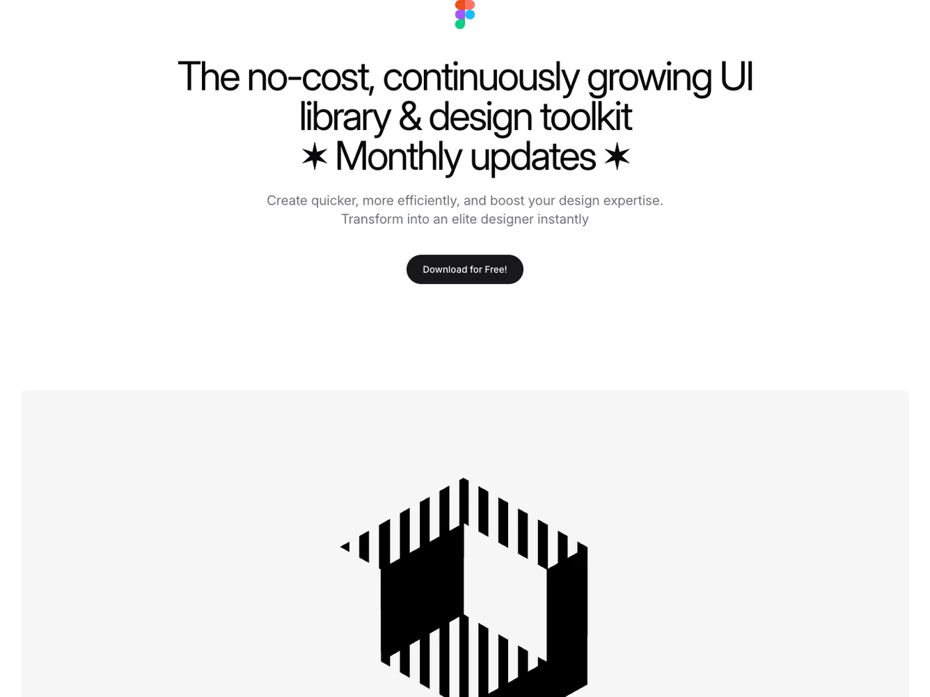
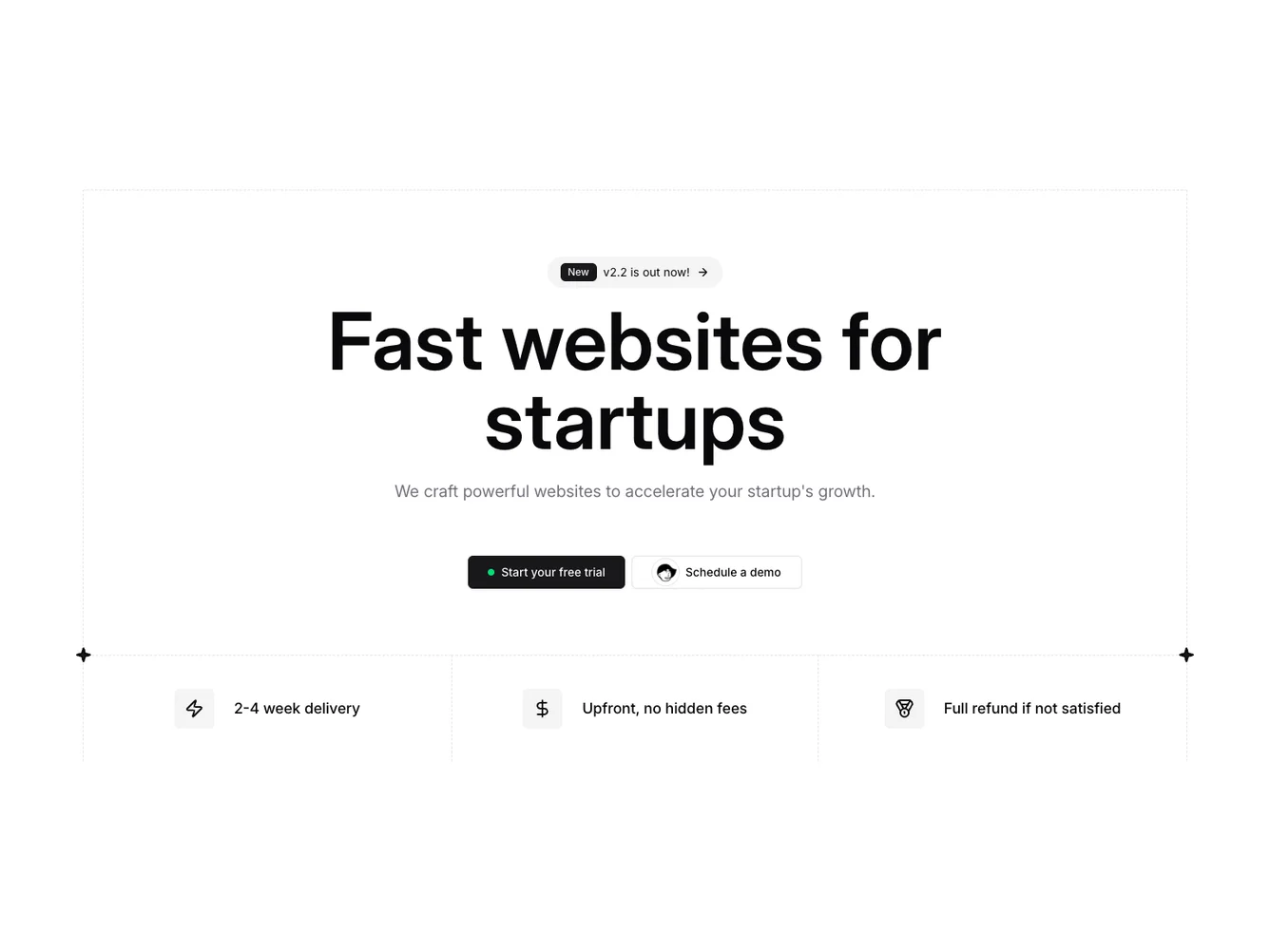
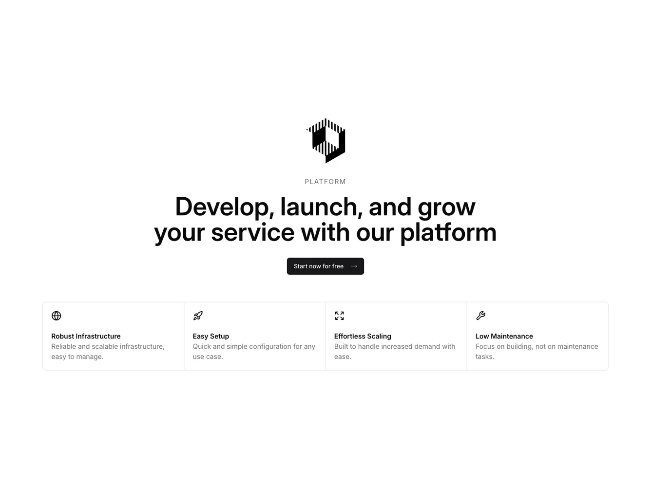
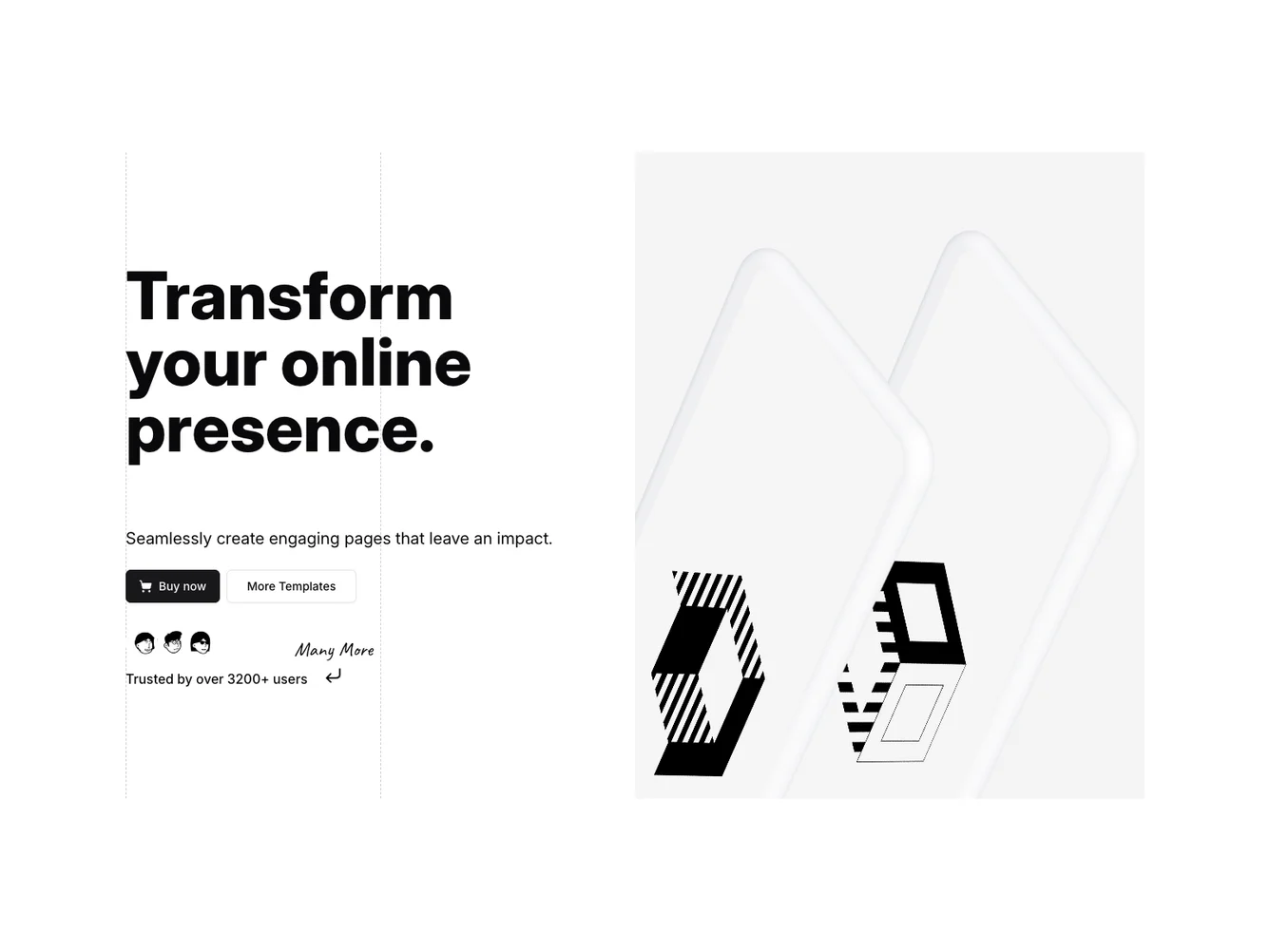
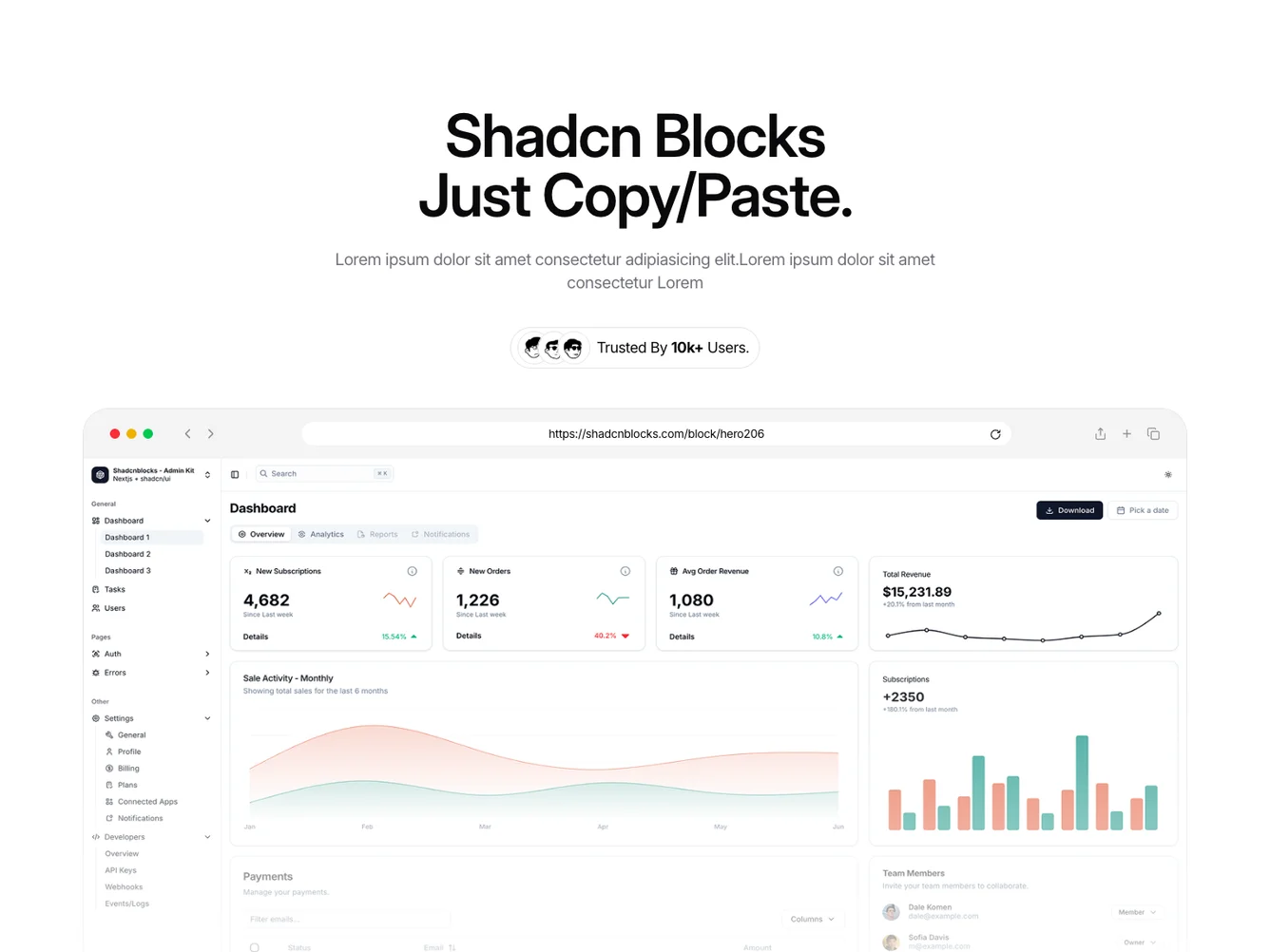
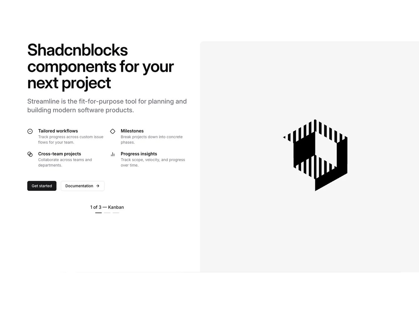
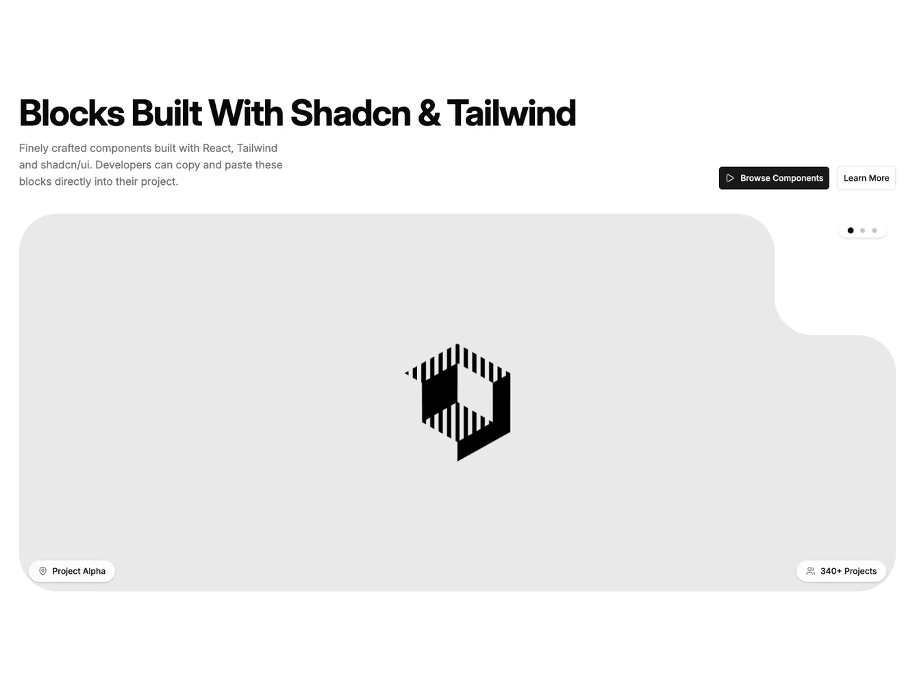
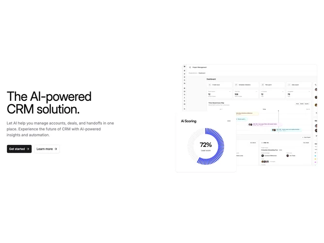
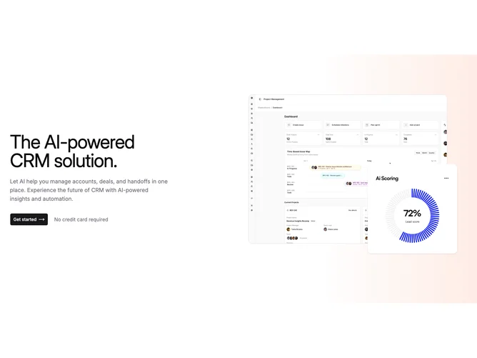
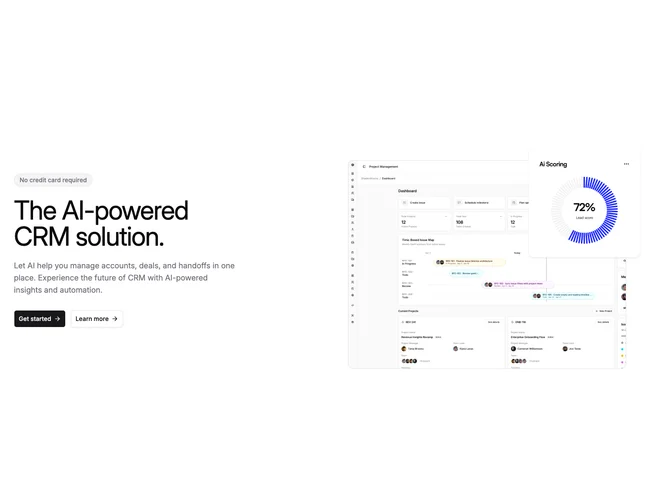
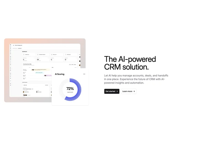
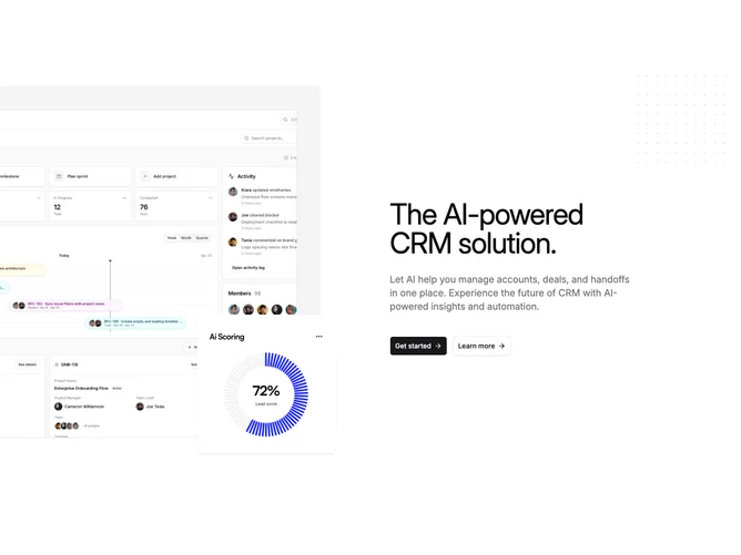
- Shadcn Hero Saas - Hero Saas layouts for landing pages, product pages, and marketing sites.
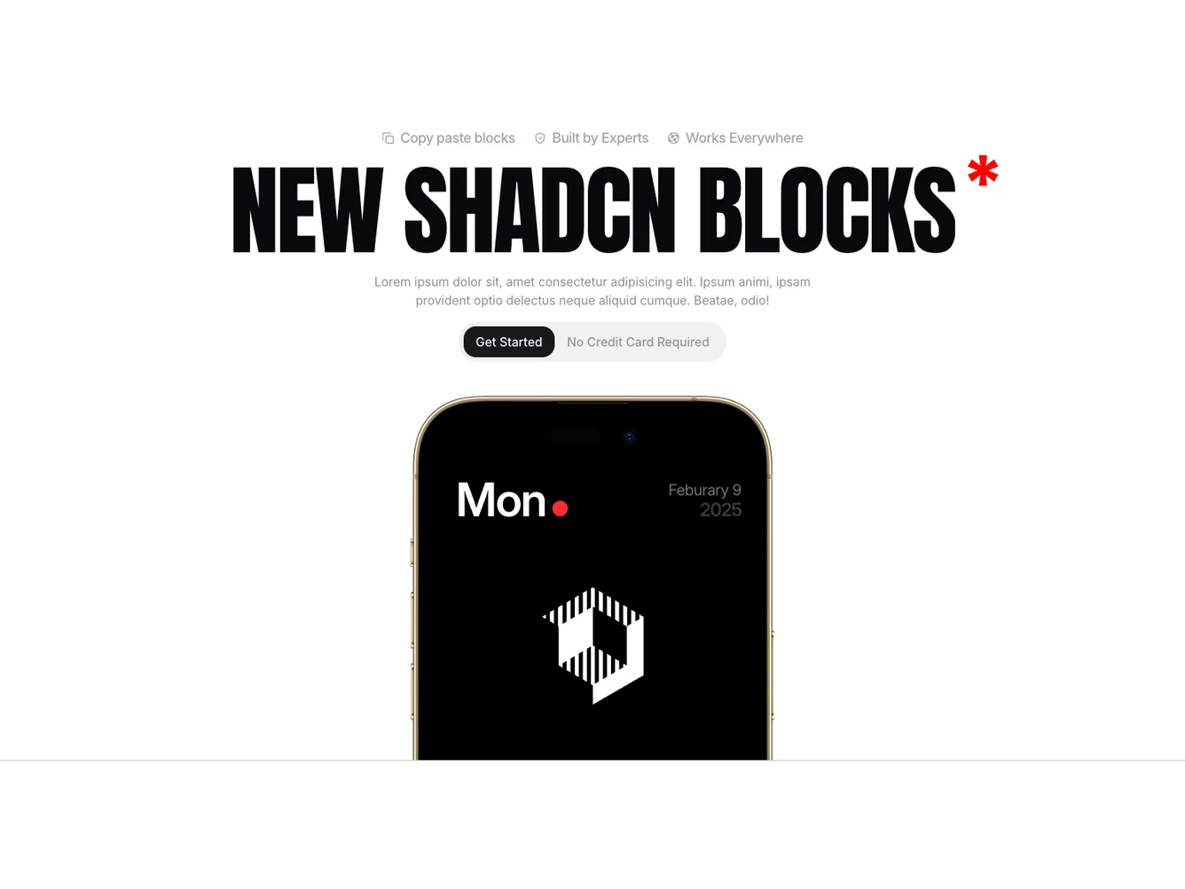
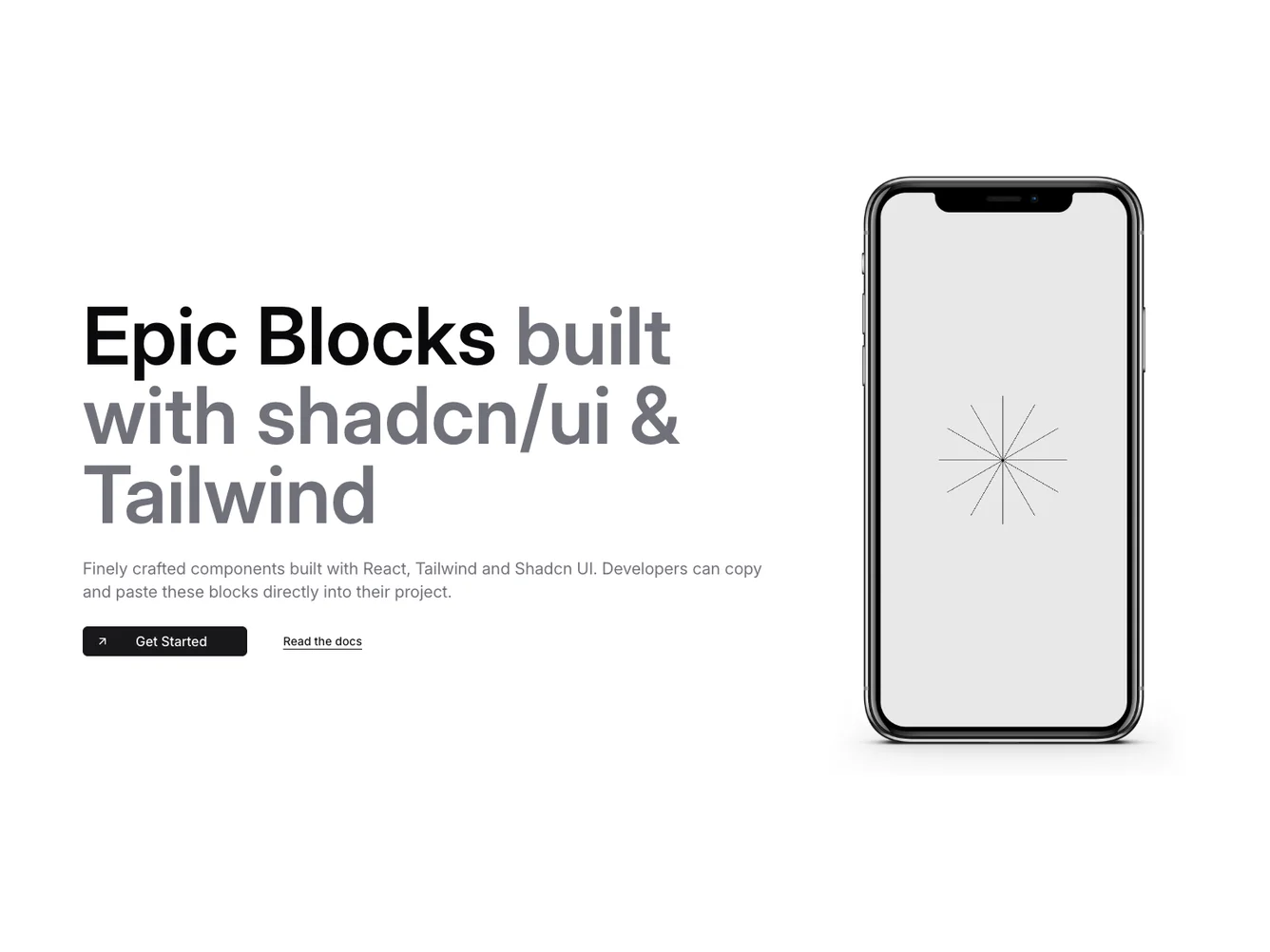
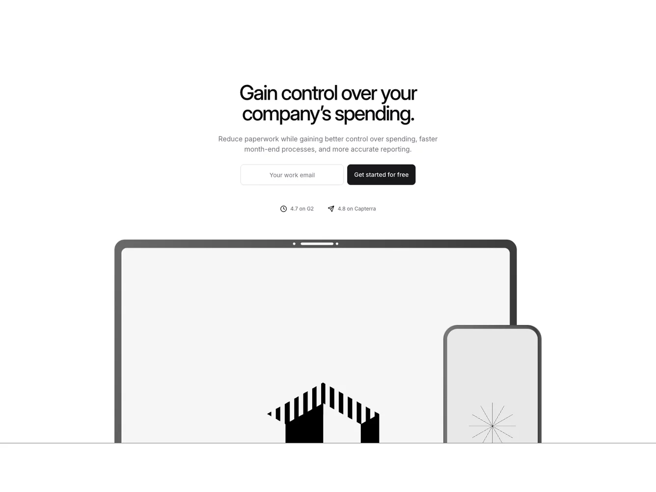
- Shadcn Hero Iphone - Hero Iphone layouts for landing pages, product pages, and marketing sites.
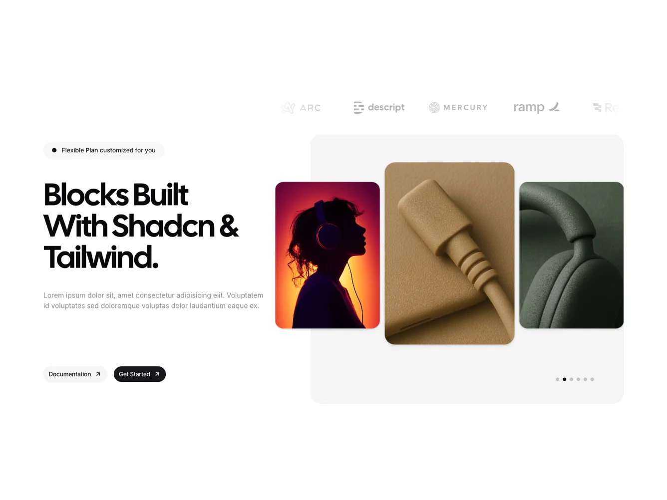
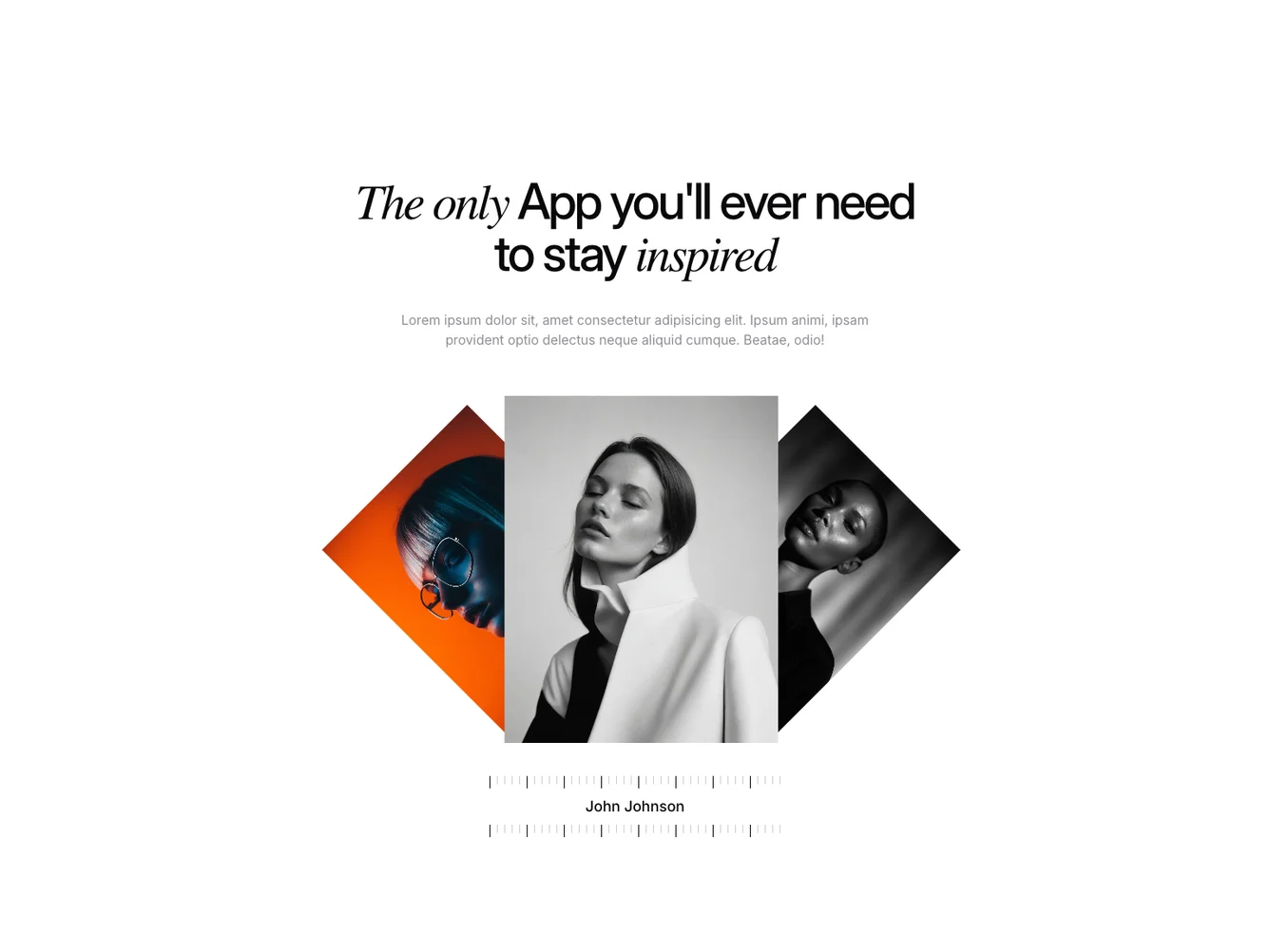
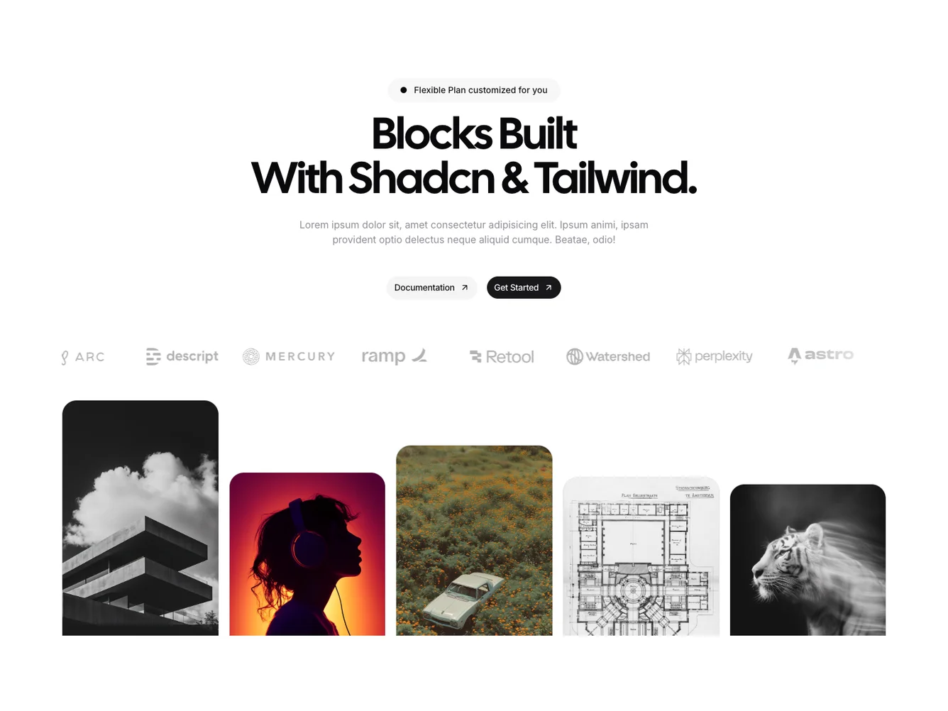
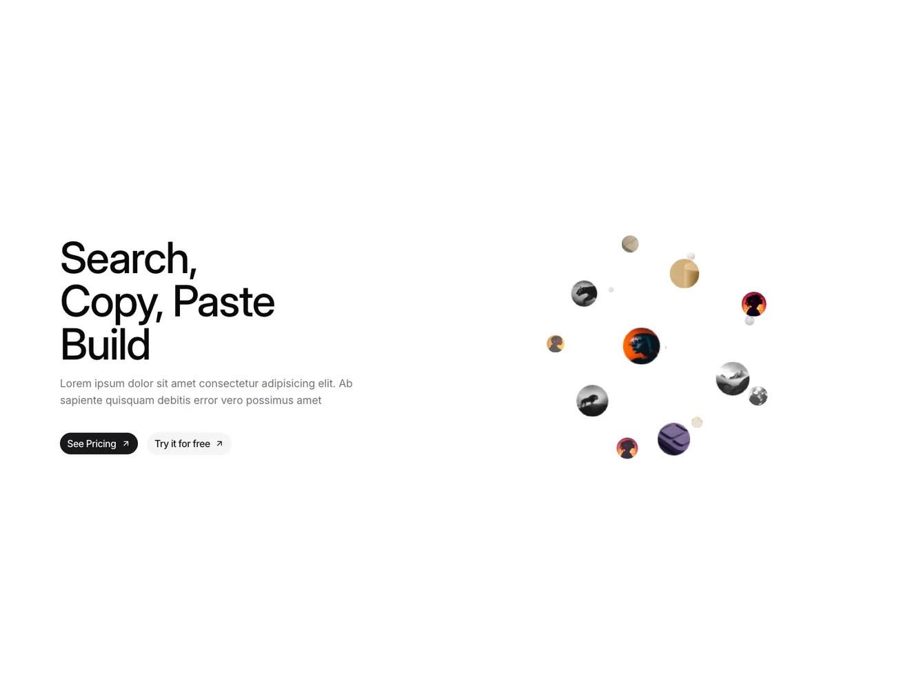
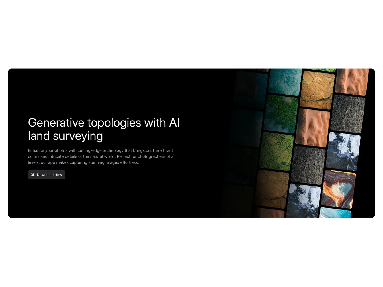
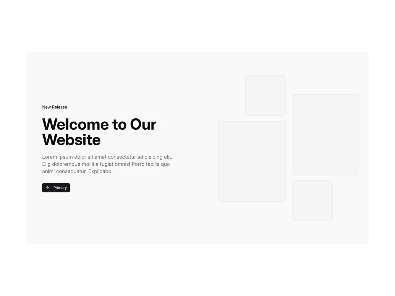
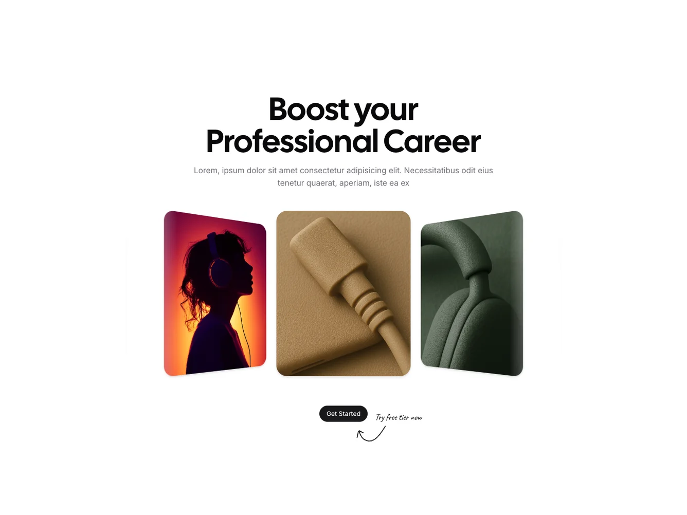
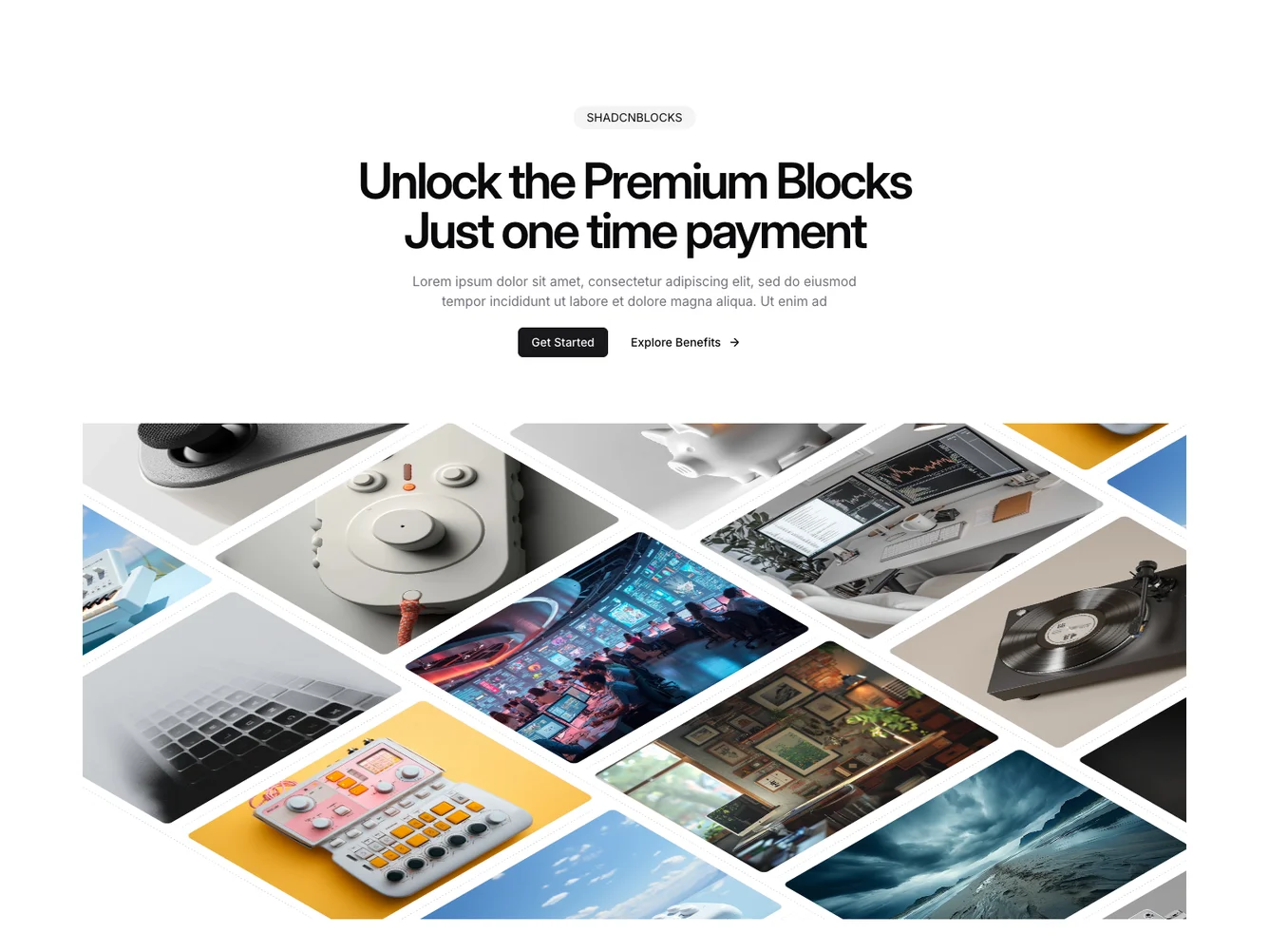
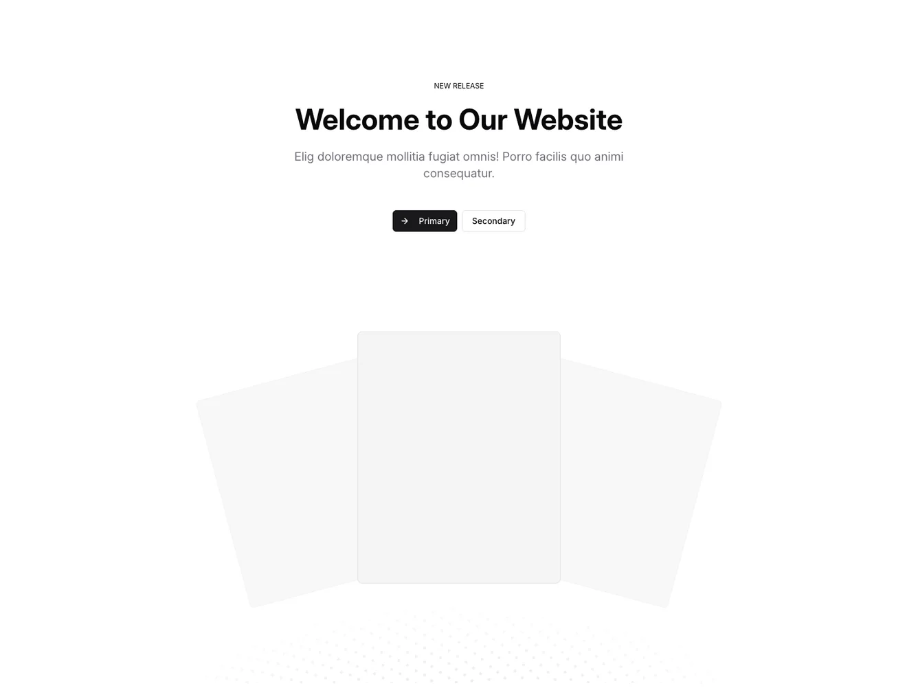
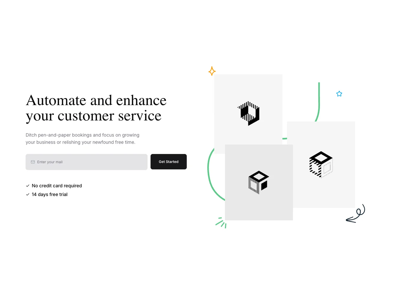
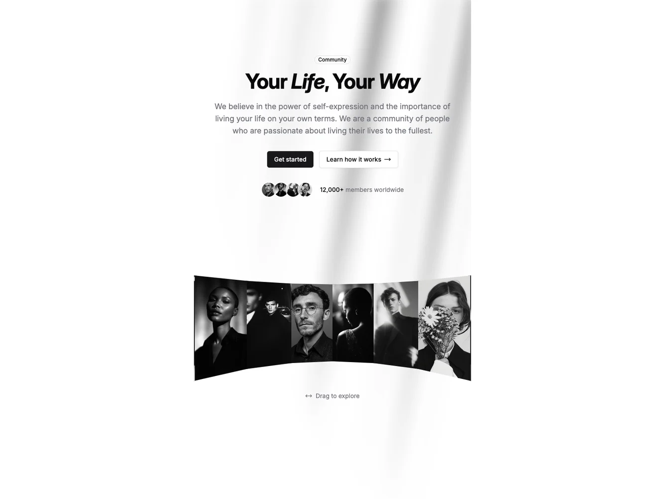
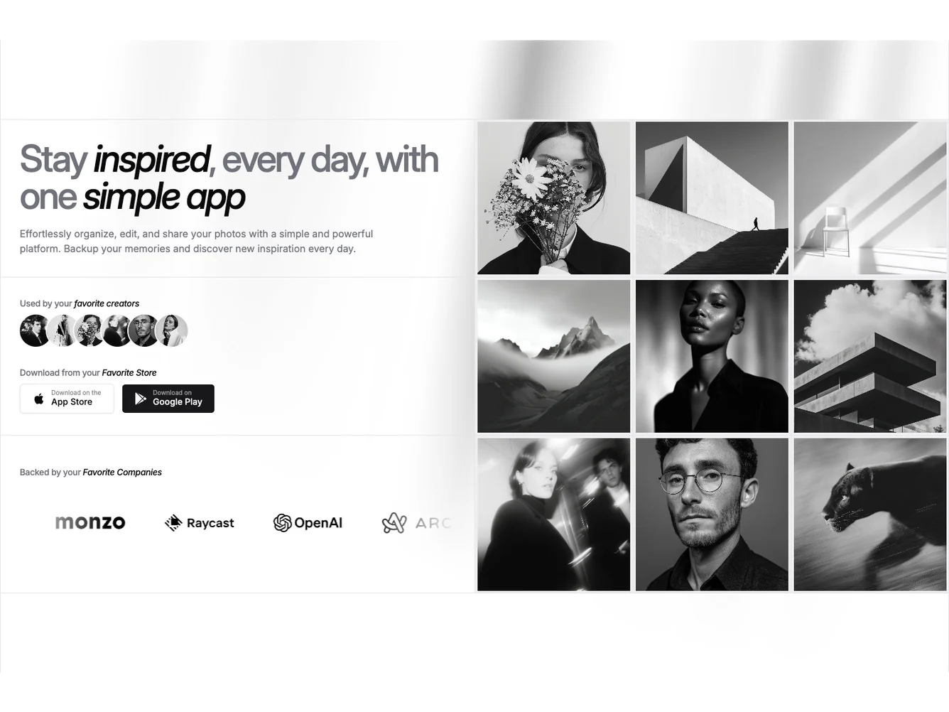
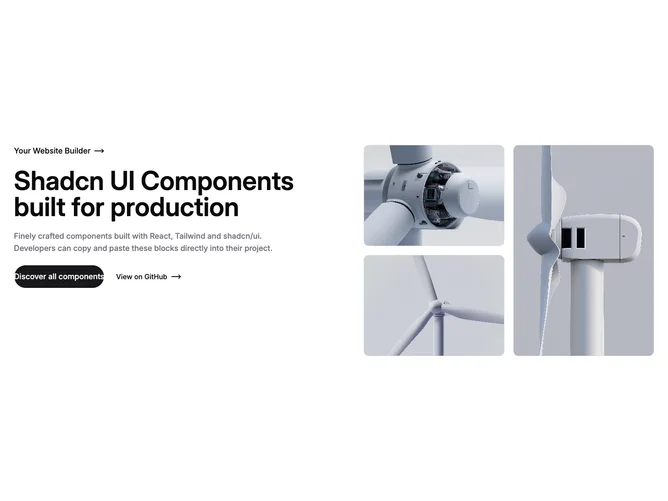
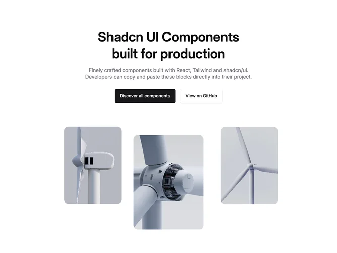
- Shadcn Hero Tri Image - Marketing heroes with three framed portrait or lifestyle photos in collage, bento, overlap, or fan layouts.
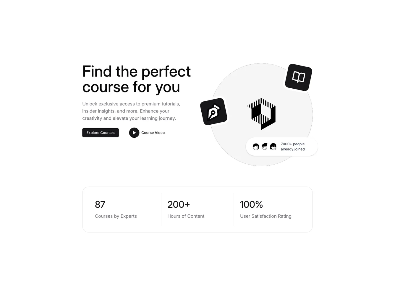
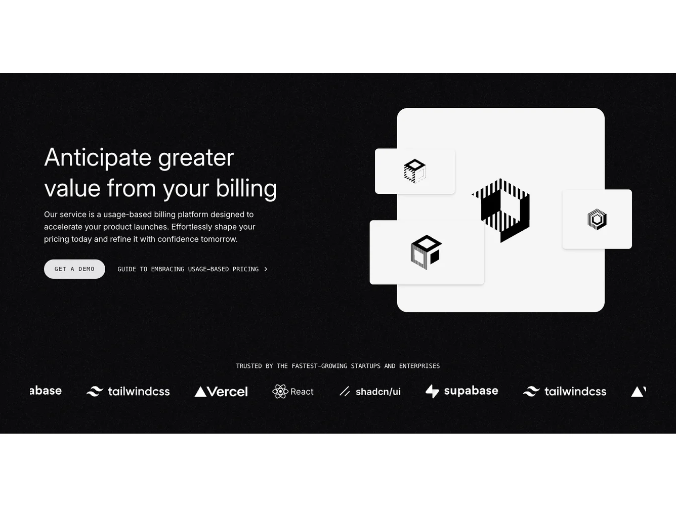
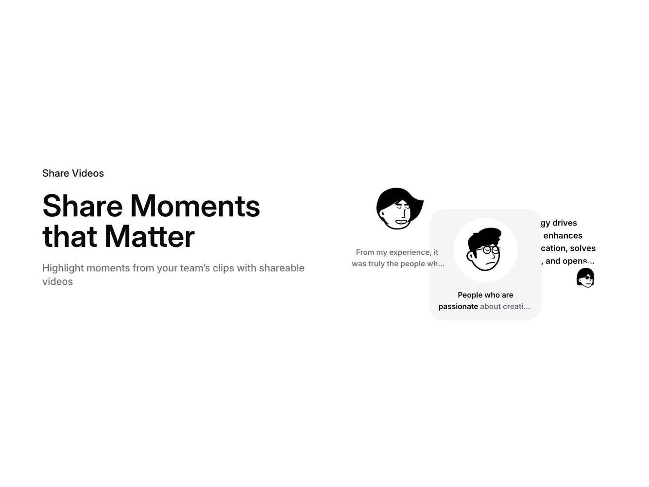
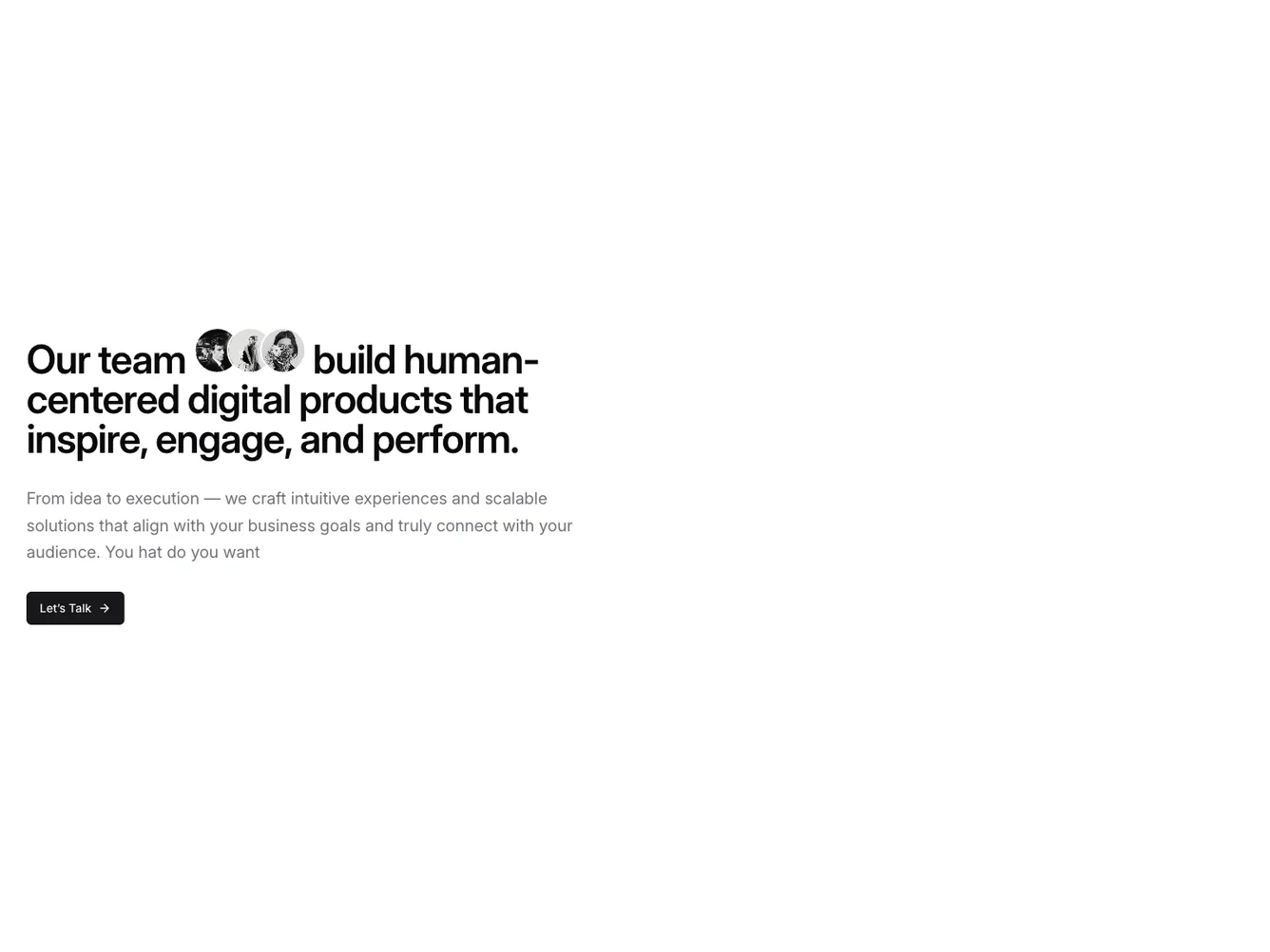
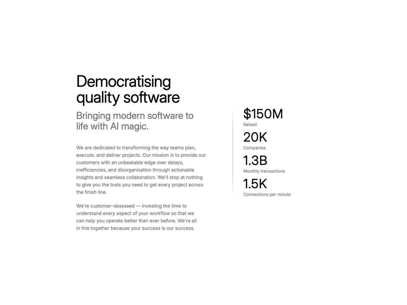
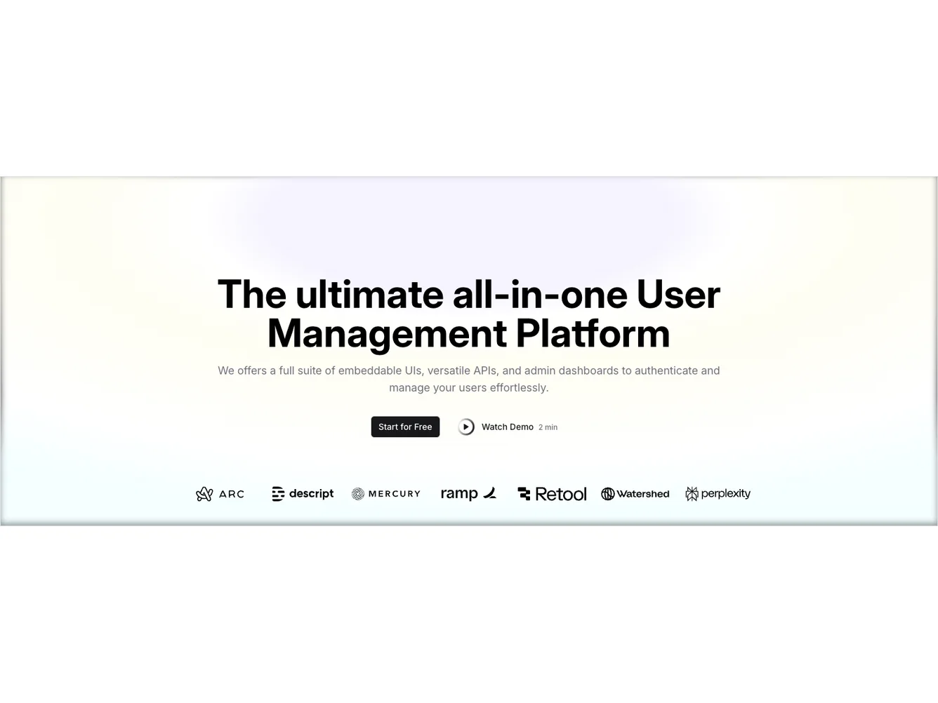
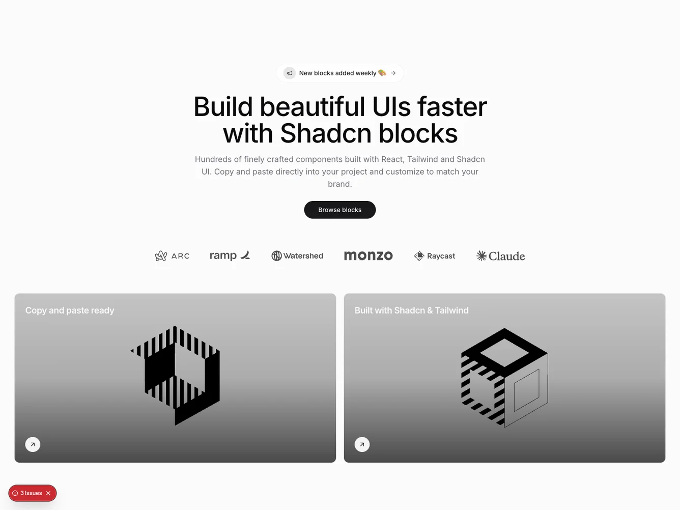
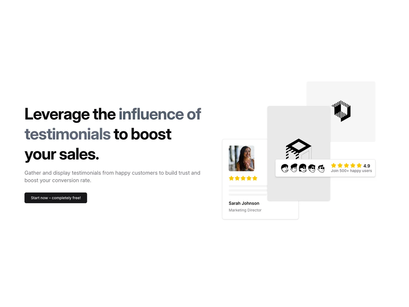
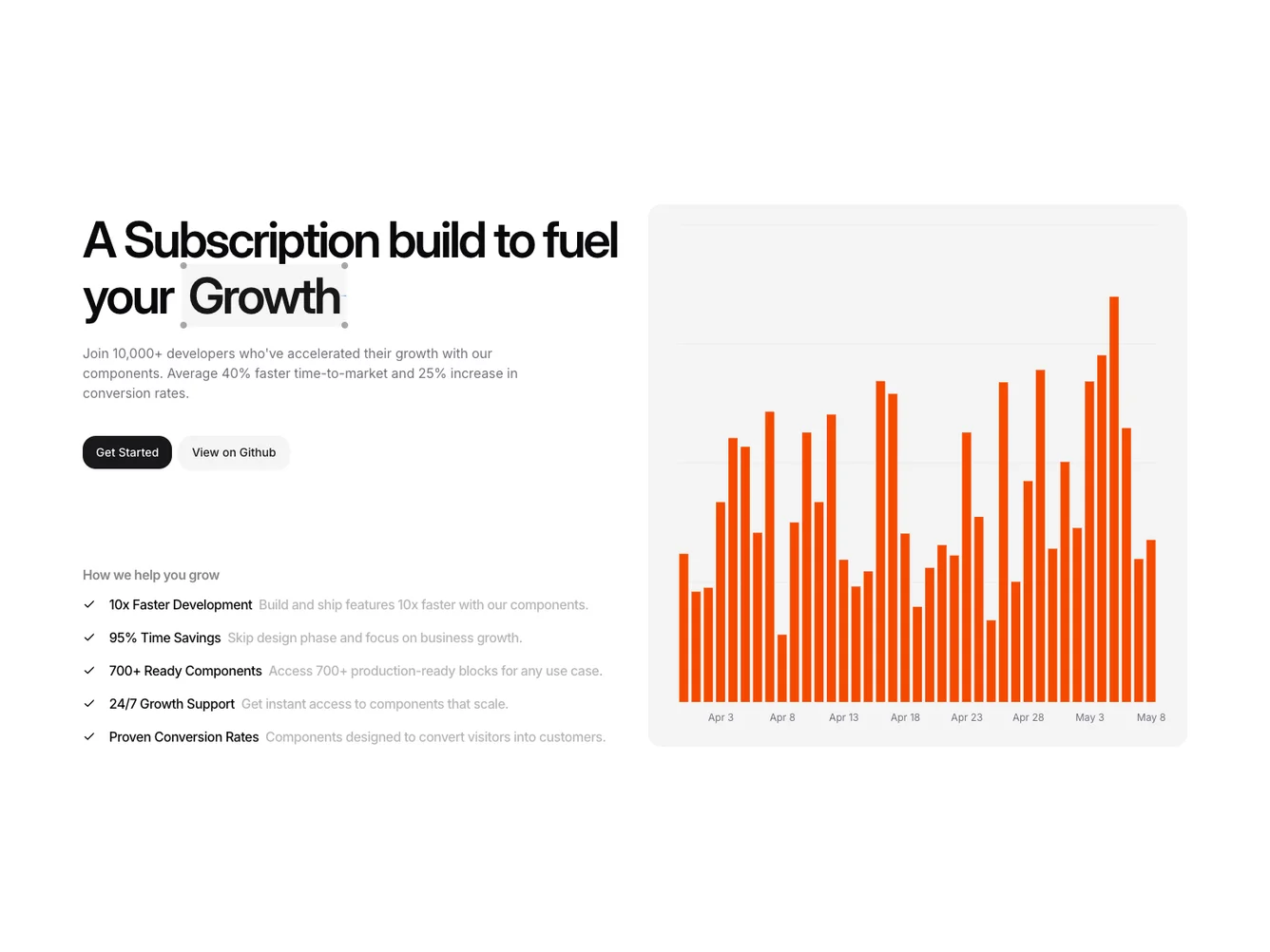
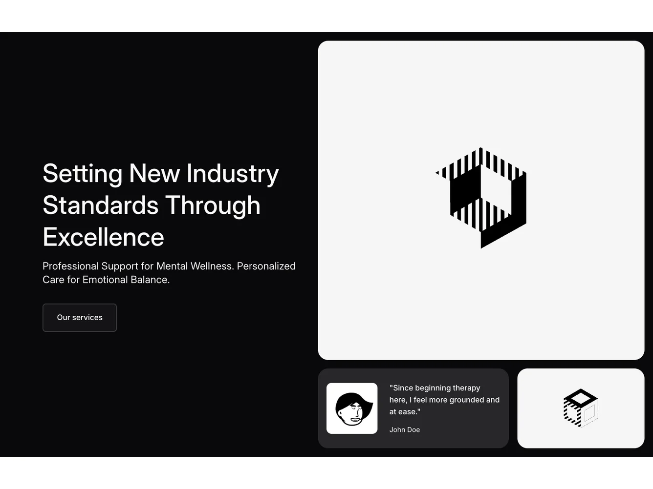
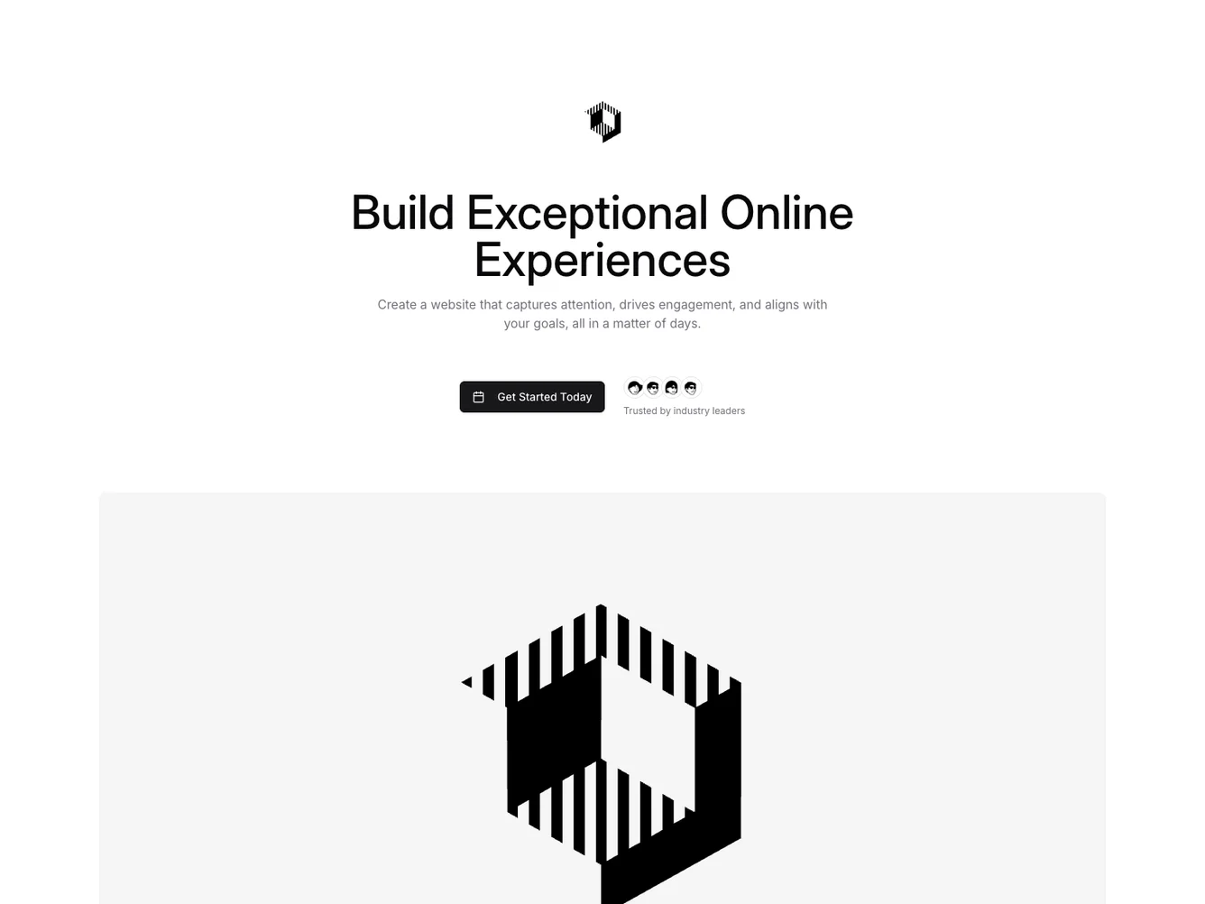
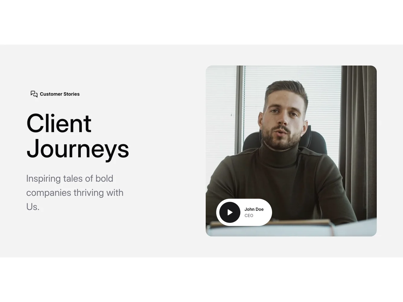
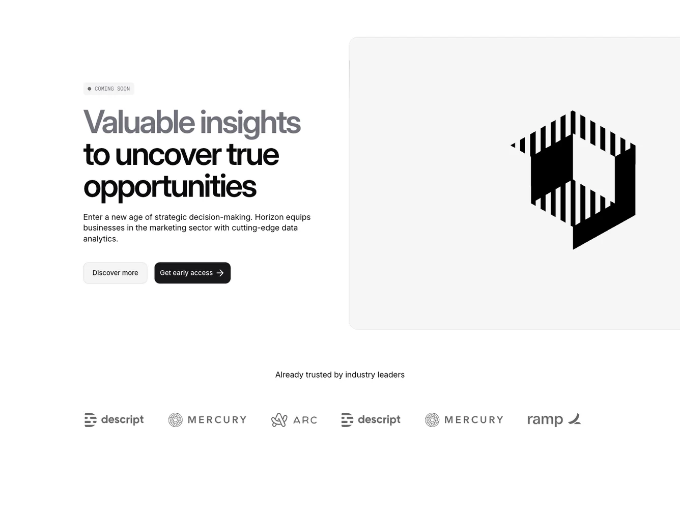
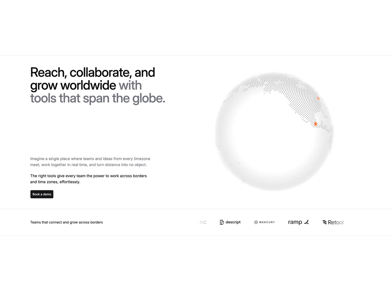
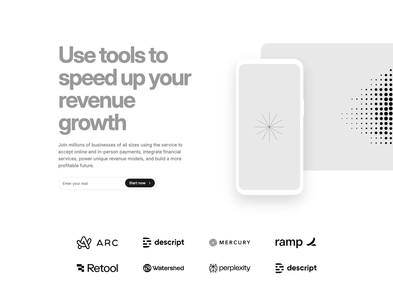
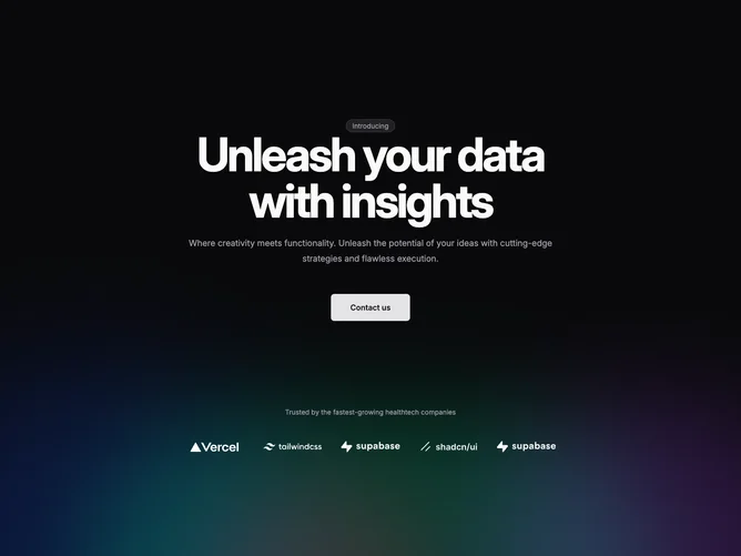
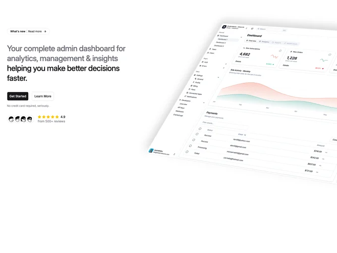
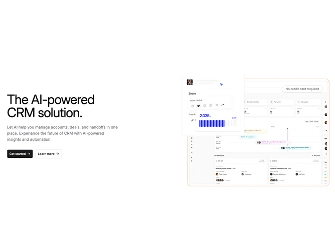
- Shadcn Hero Social Proof - SaaS heroes with customer proof—reviews, avatars, product screenshots, and energetic office portraits.
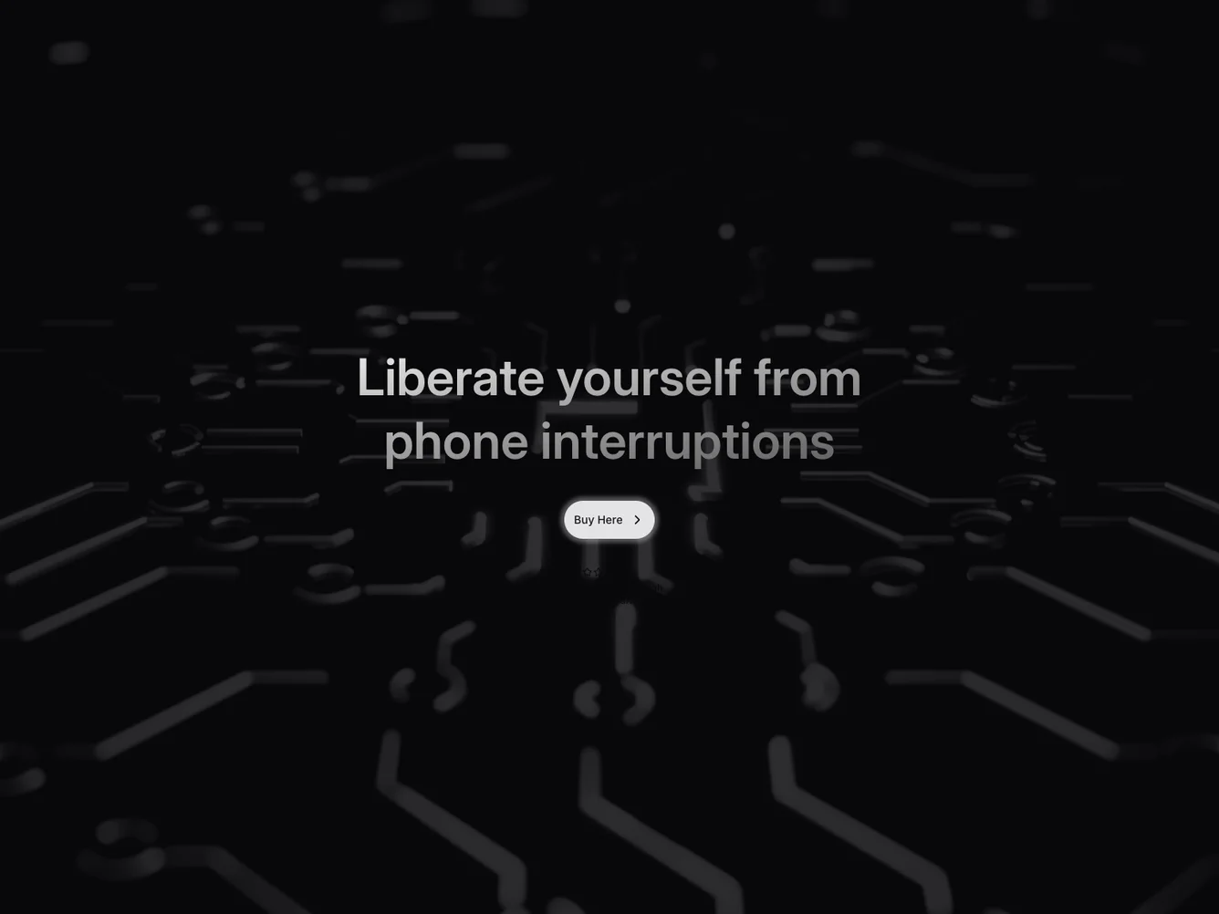
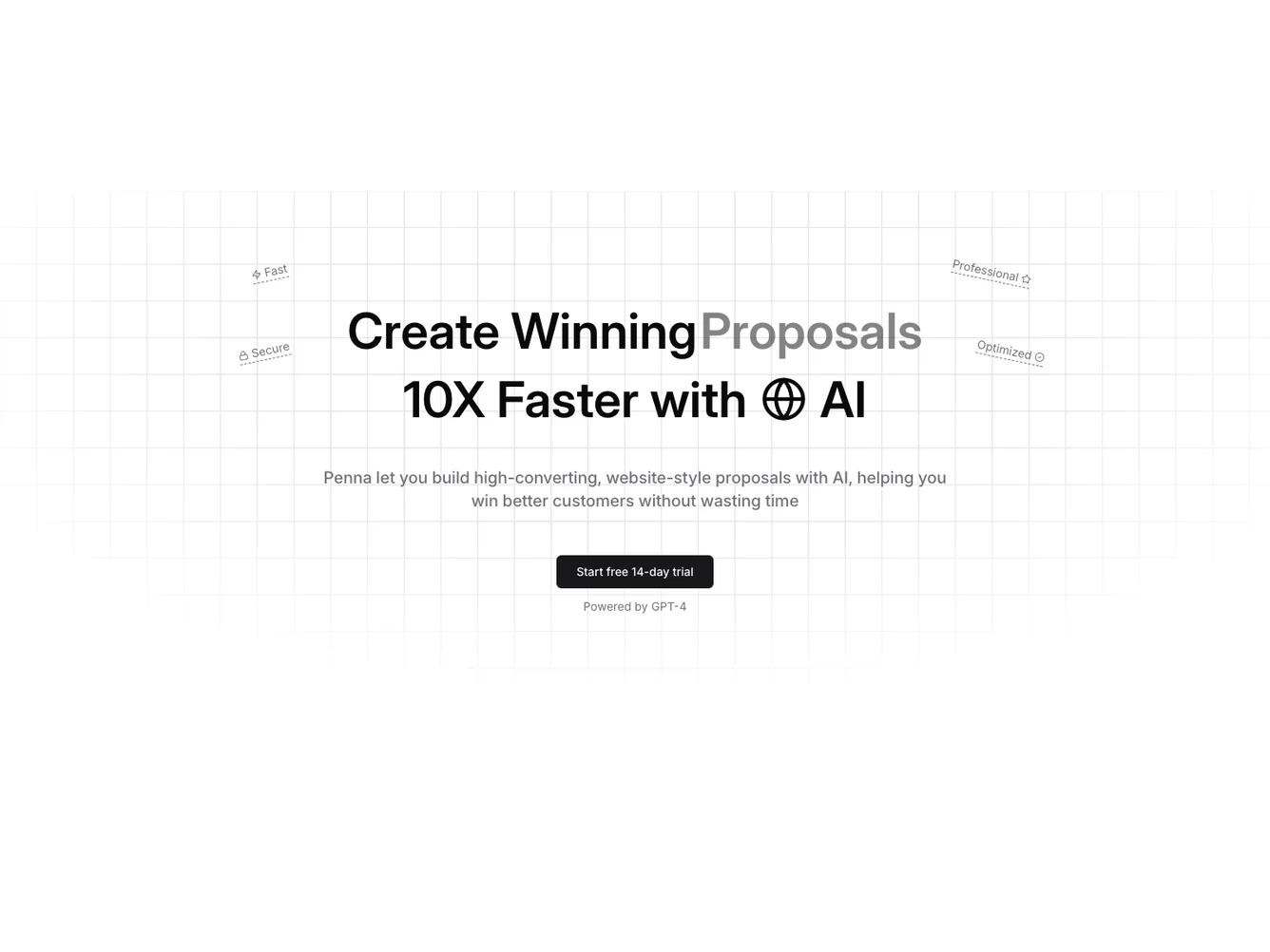
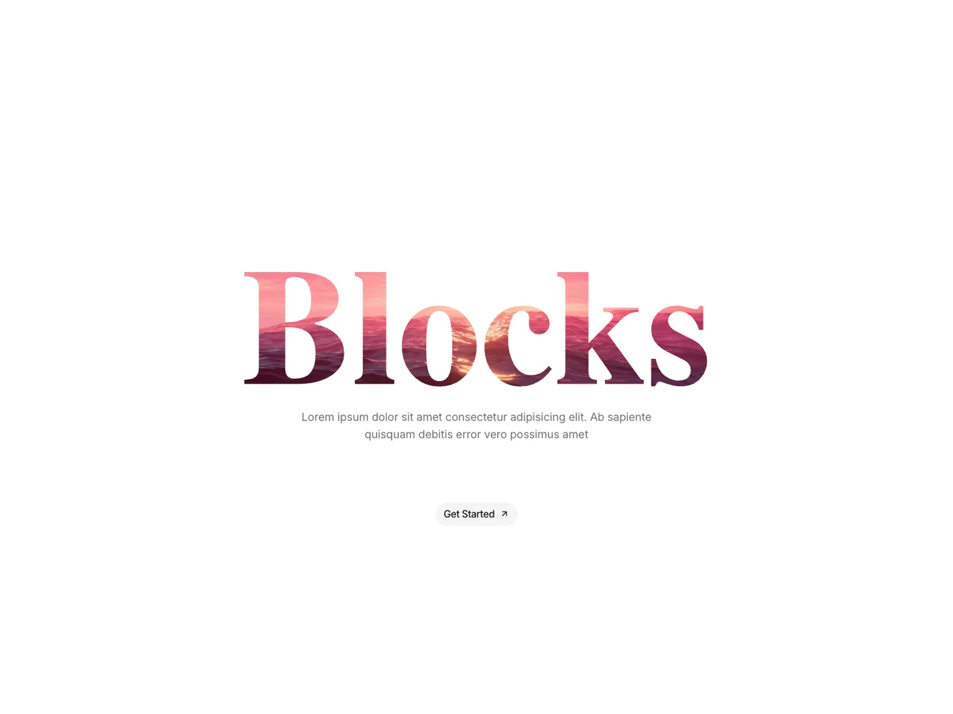
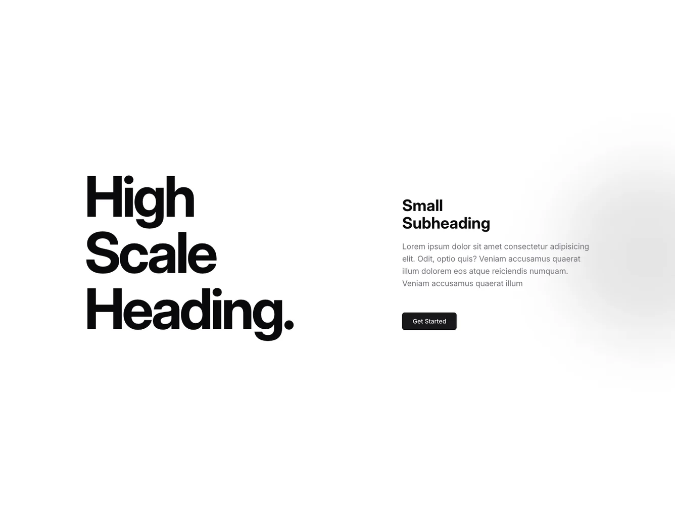
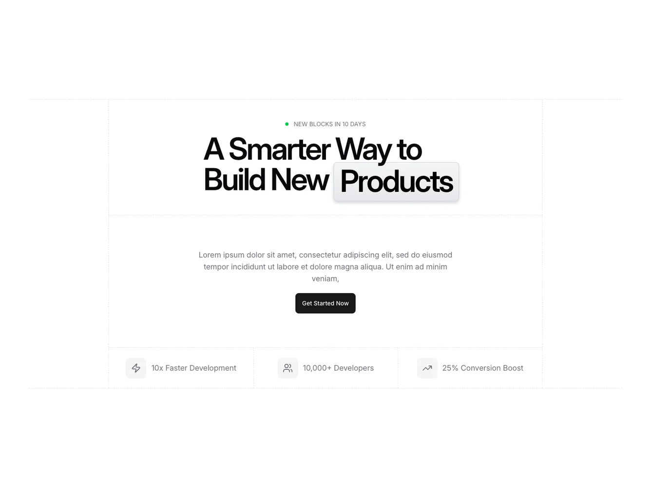
- Shadcn Hero Impact Text - Hero Impact Text layouts for landing pages, product pages, and marketing sites.
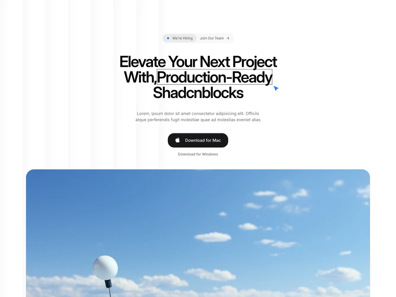
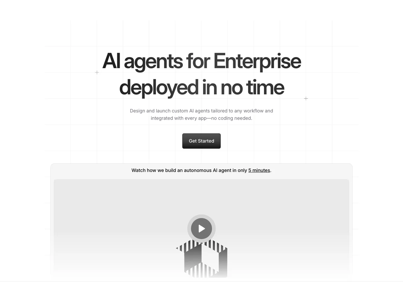
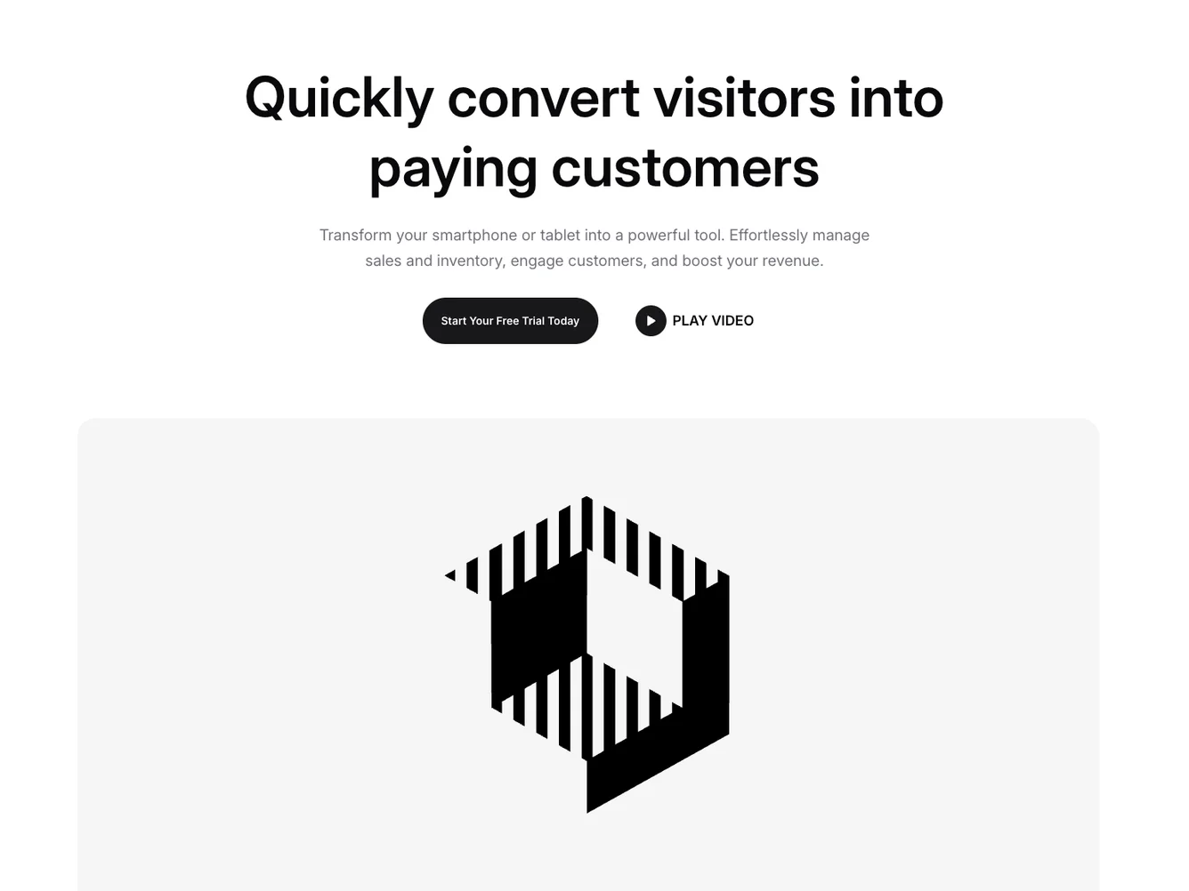
- Shadcn Hero Video - Video-integrated hero layouts for product demos and brand storytelling.
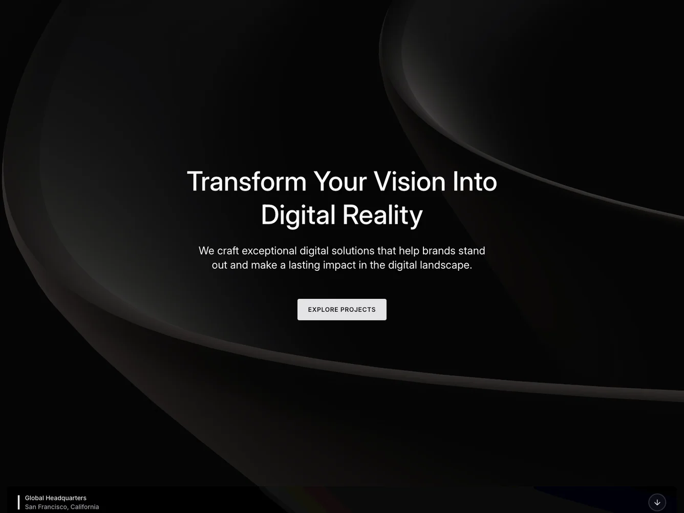
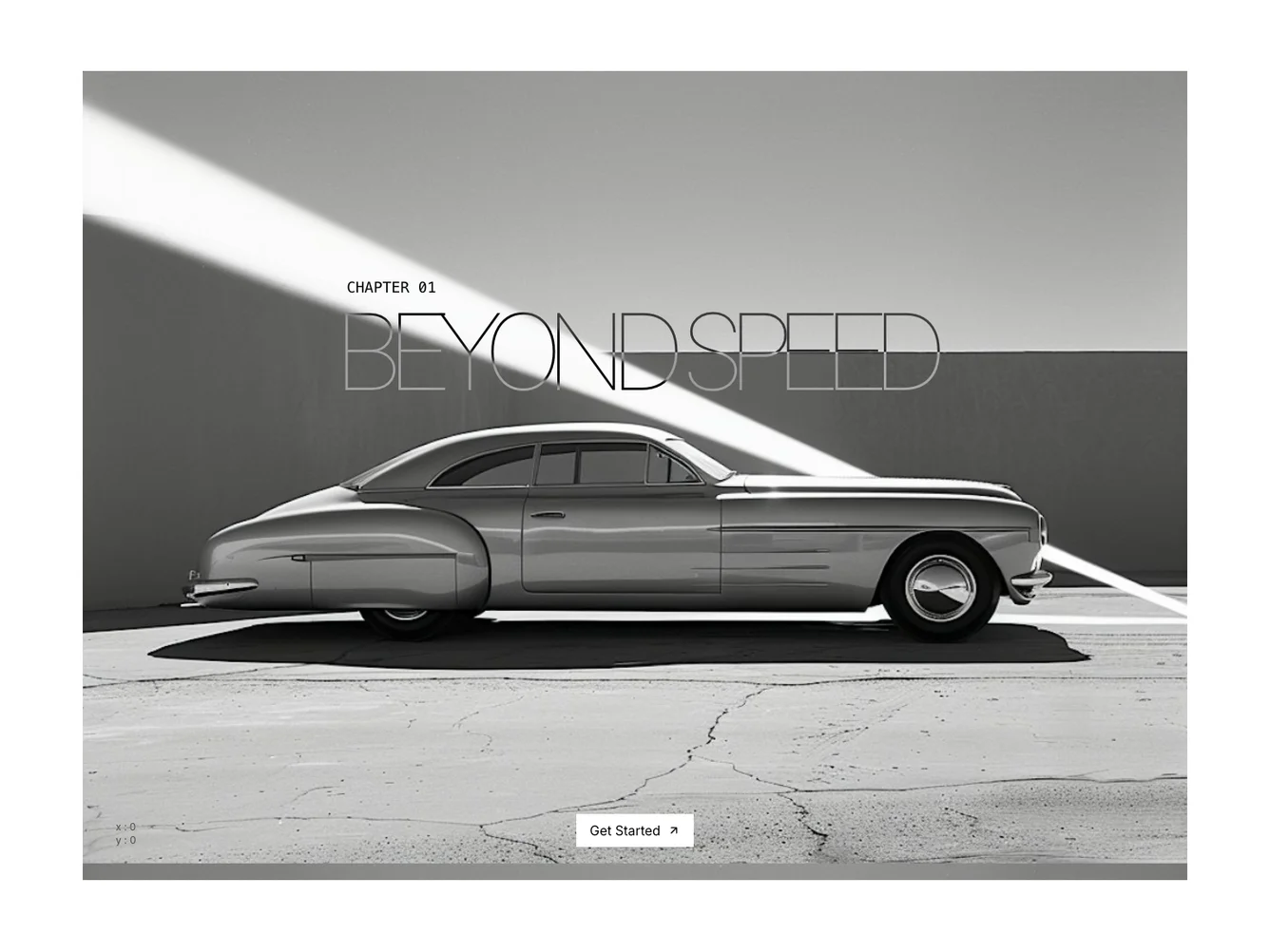
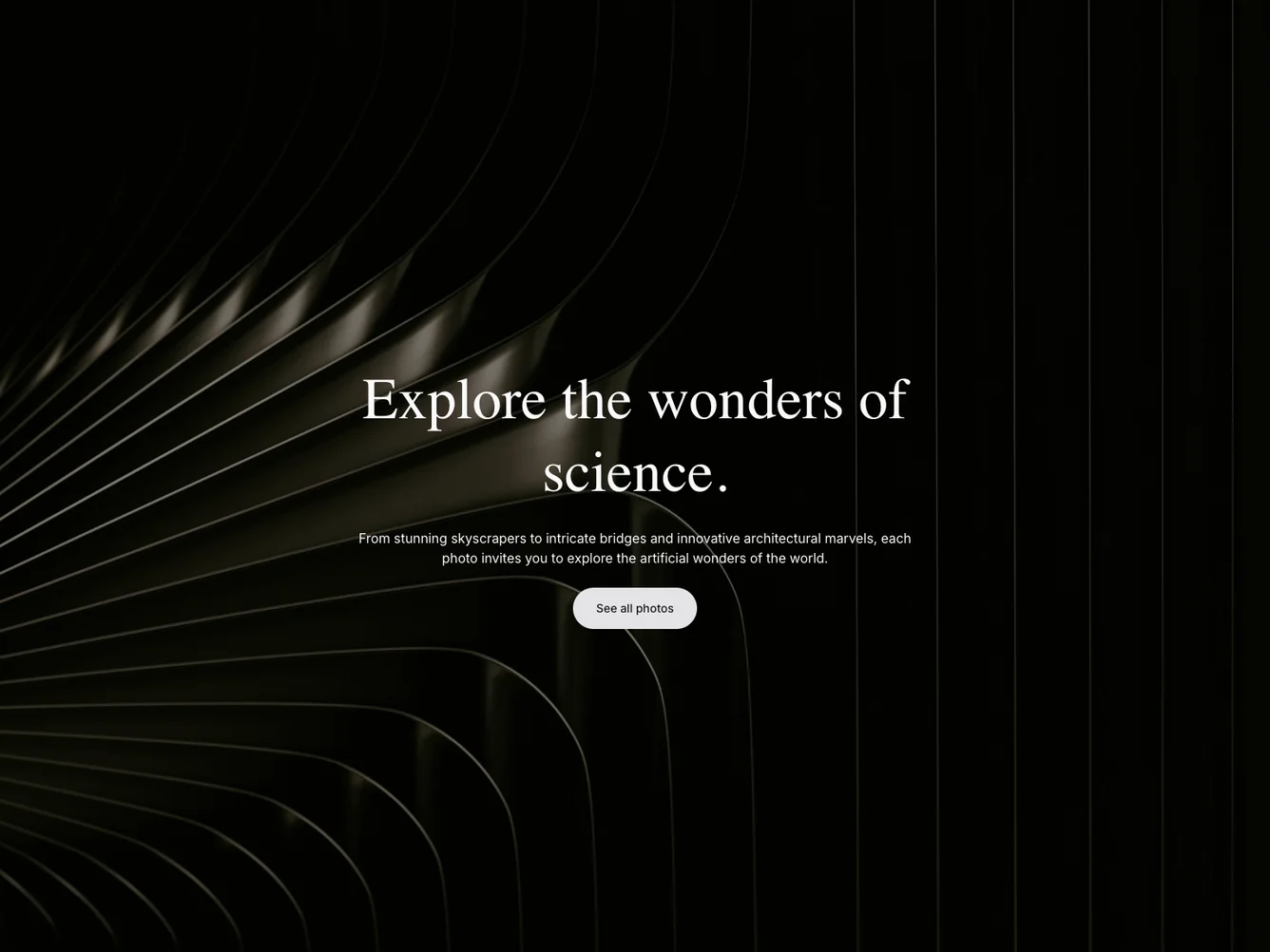
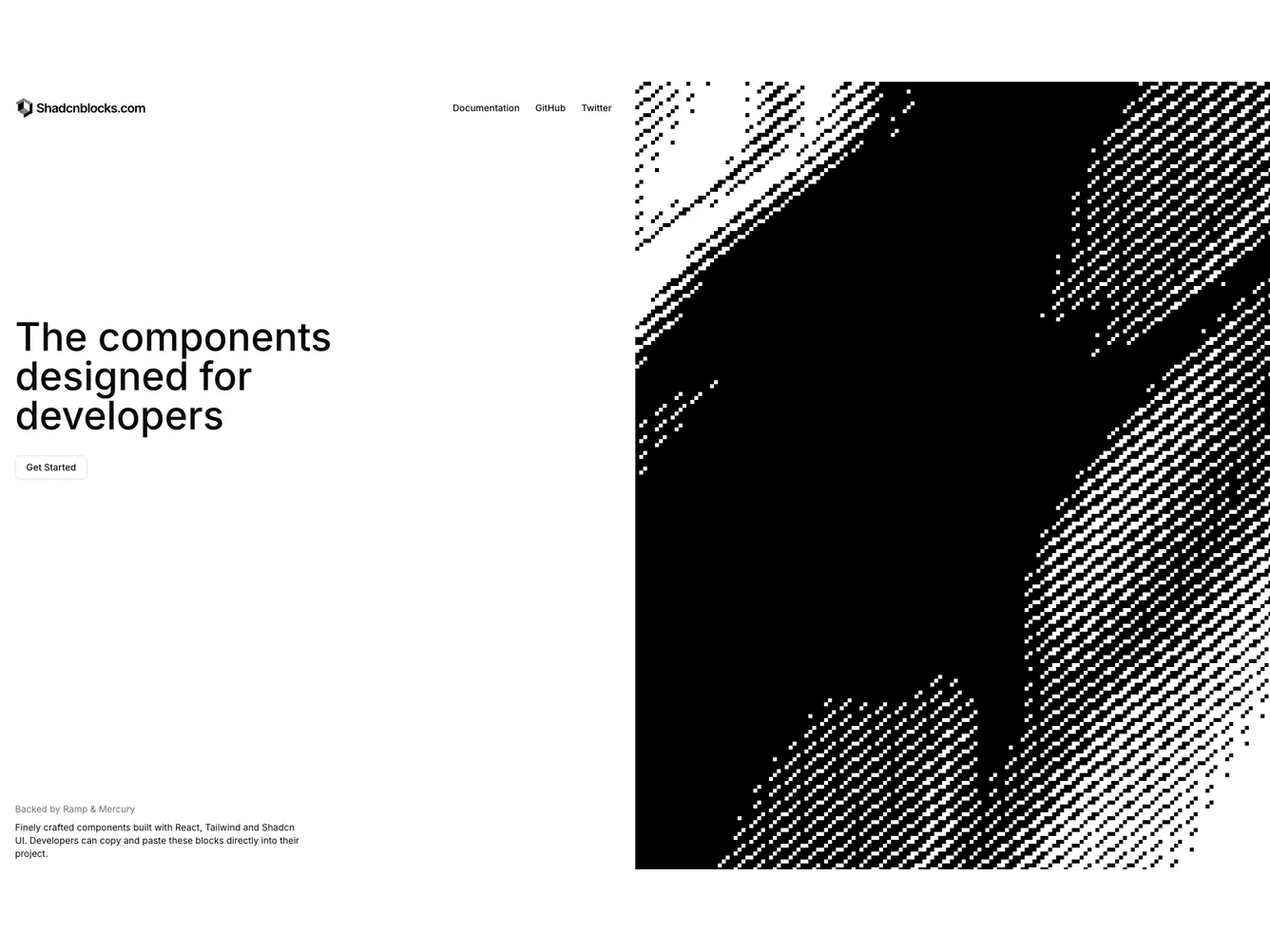
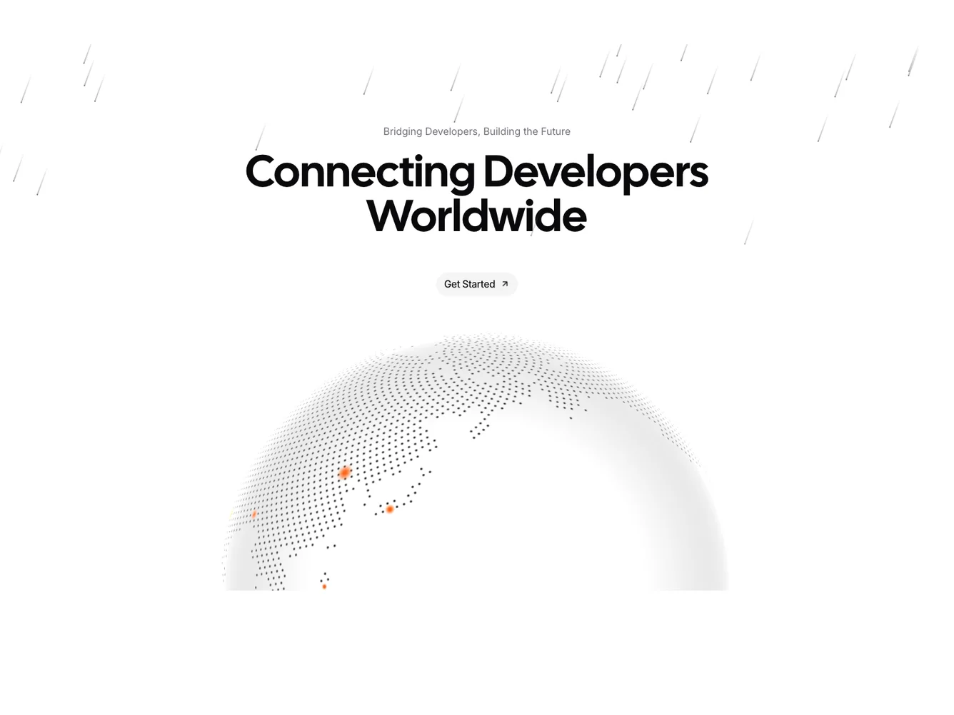
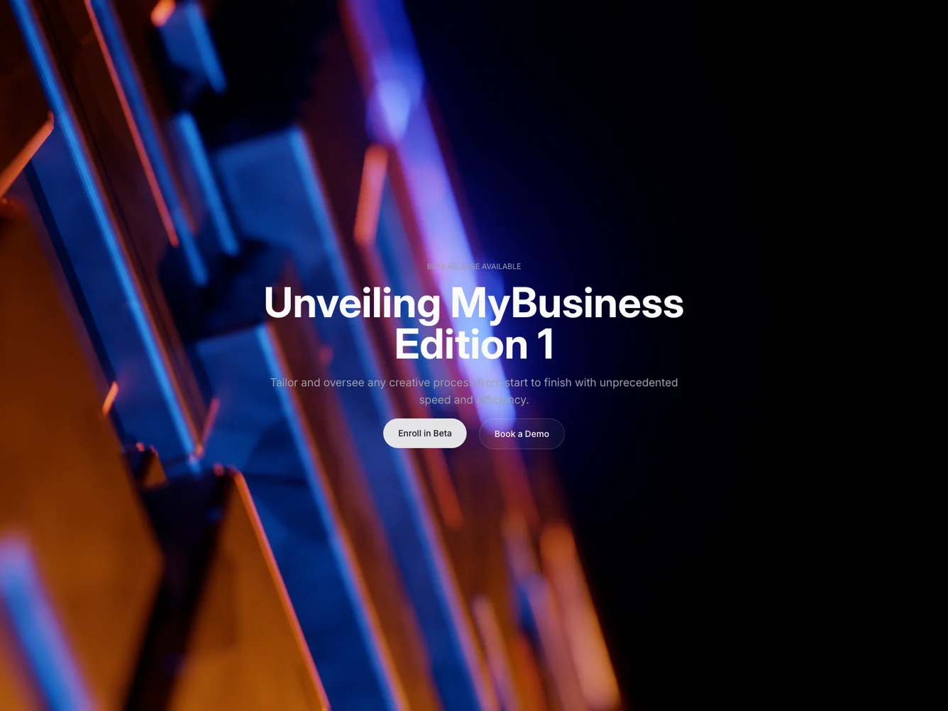
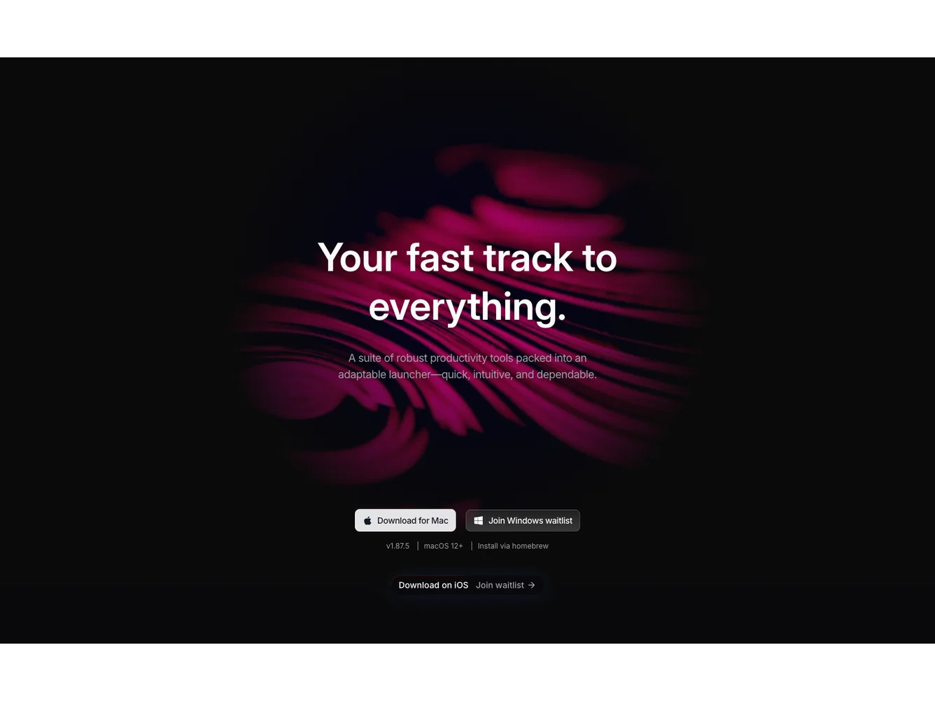
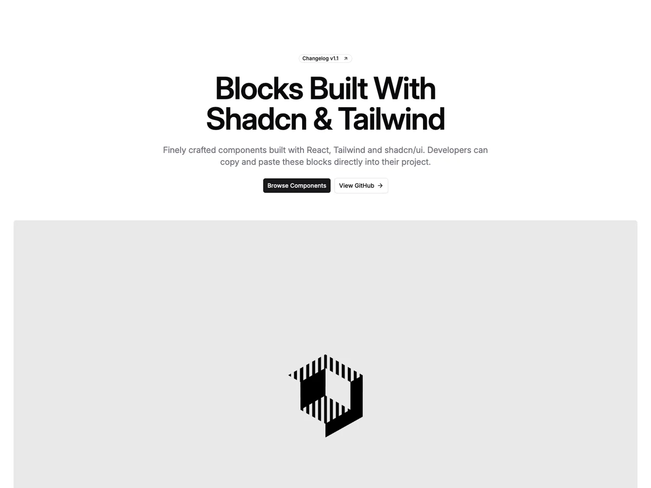
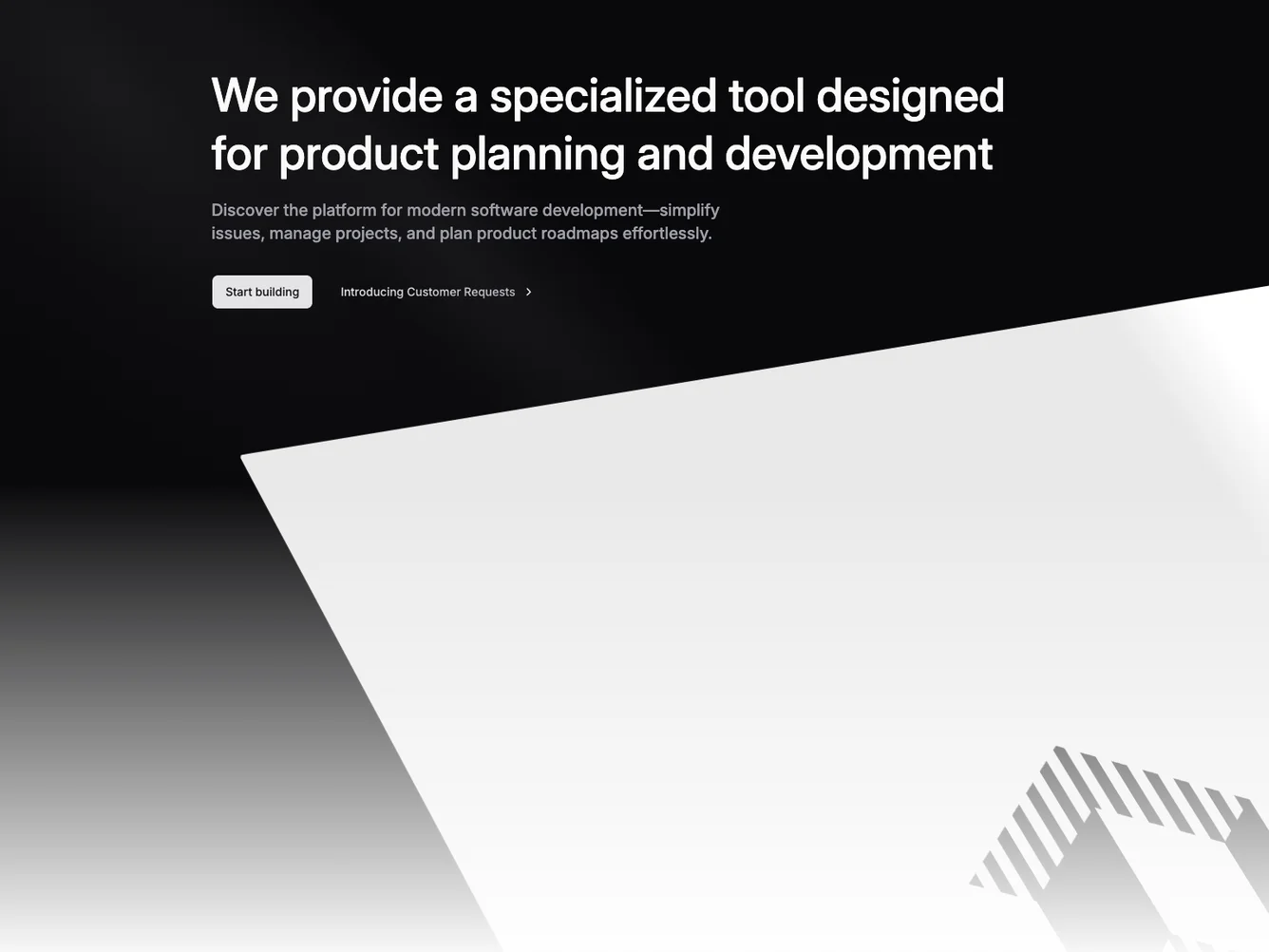
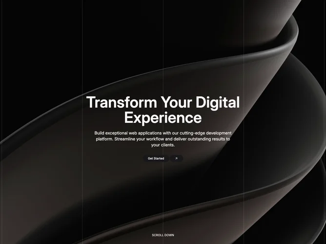
- Shadcn Hero Fullscreen - Edge-to-edge hero layouts that fill the entire viewport.
- Shadcn Hero Fullscreen Video - Edge-to-edge hero layouts that fill the entire viewport.
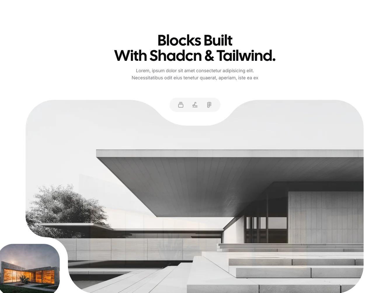
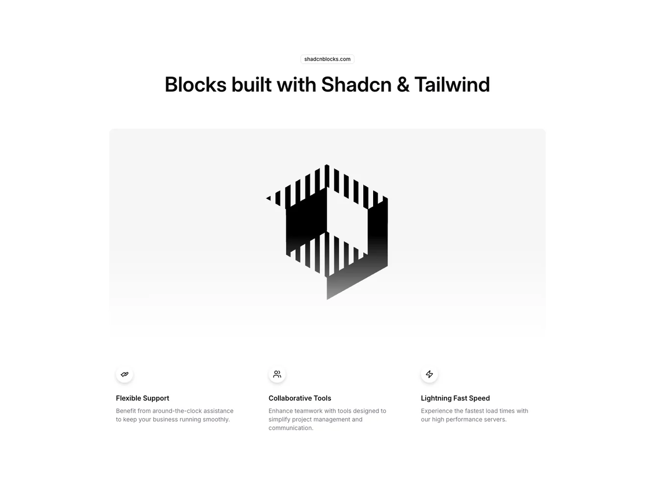
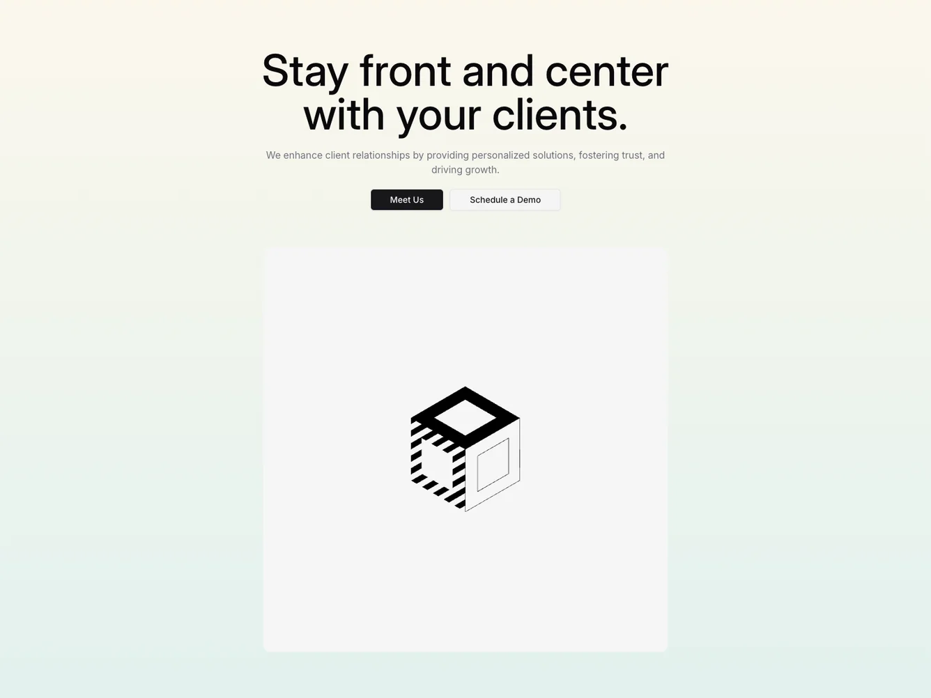
- Shadcn Hero Isometric - Hero Isometric layouts for landing pages, product pages, and marketing sites.
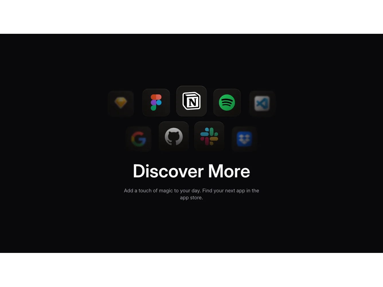
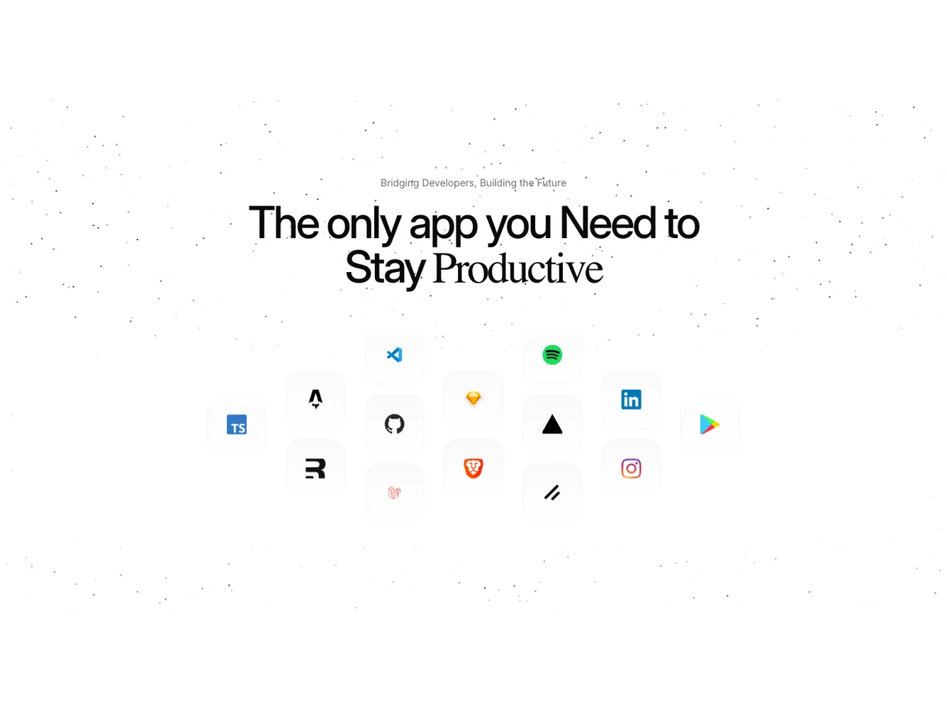
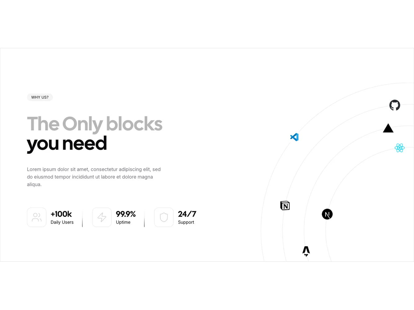
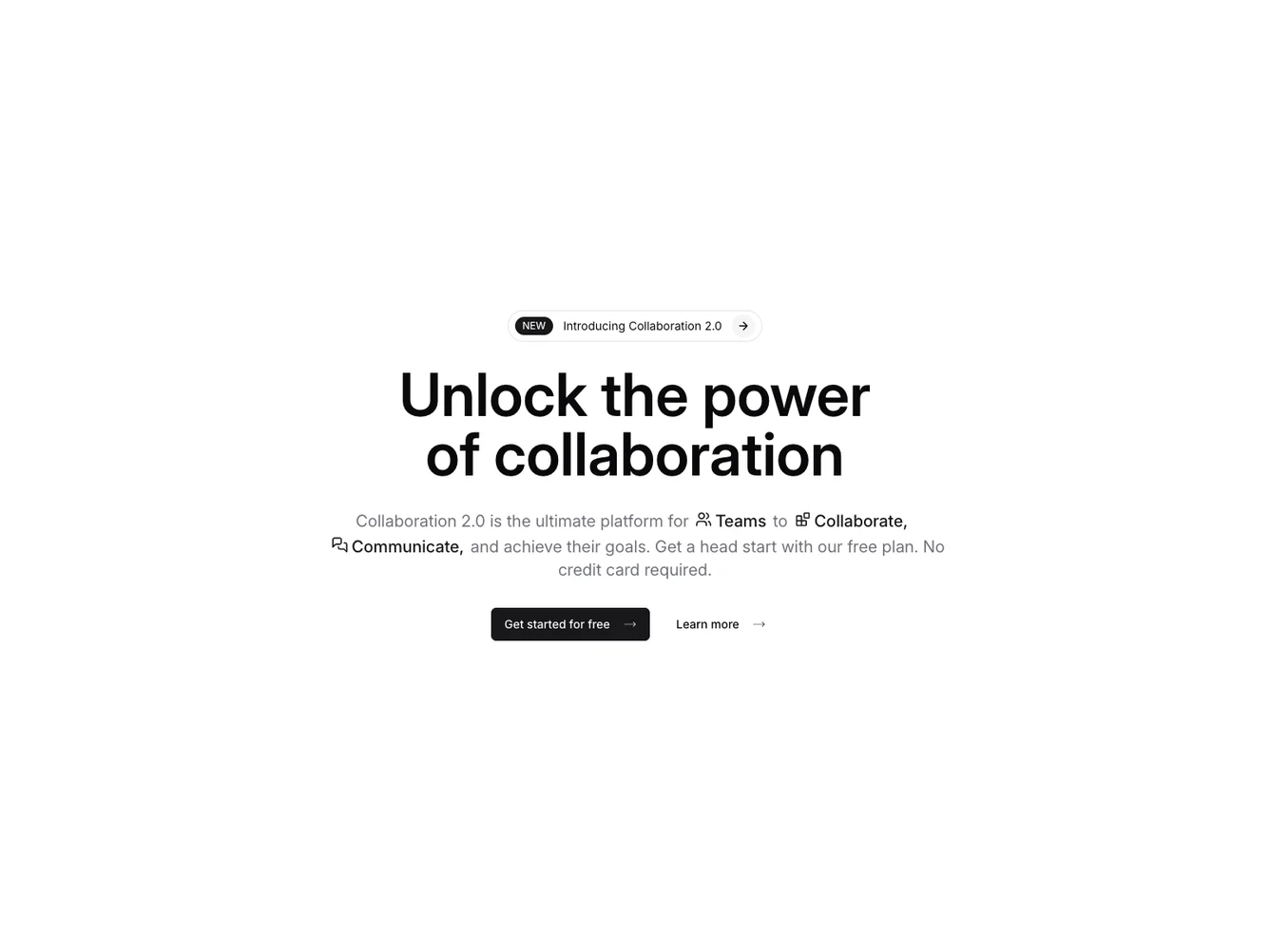
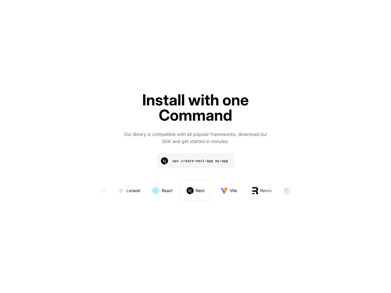
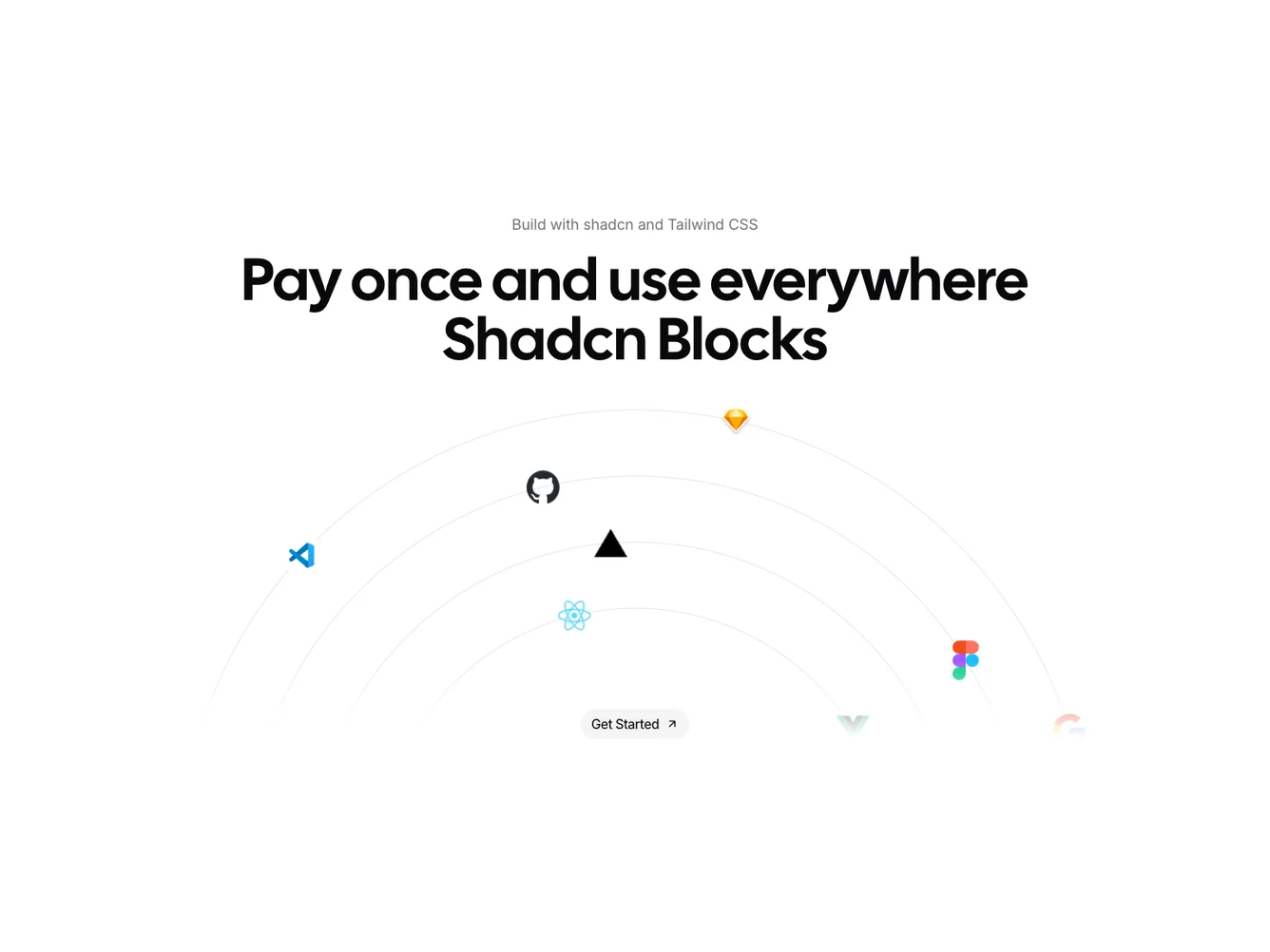
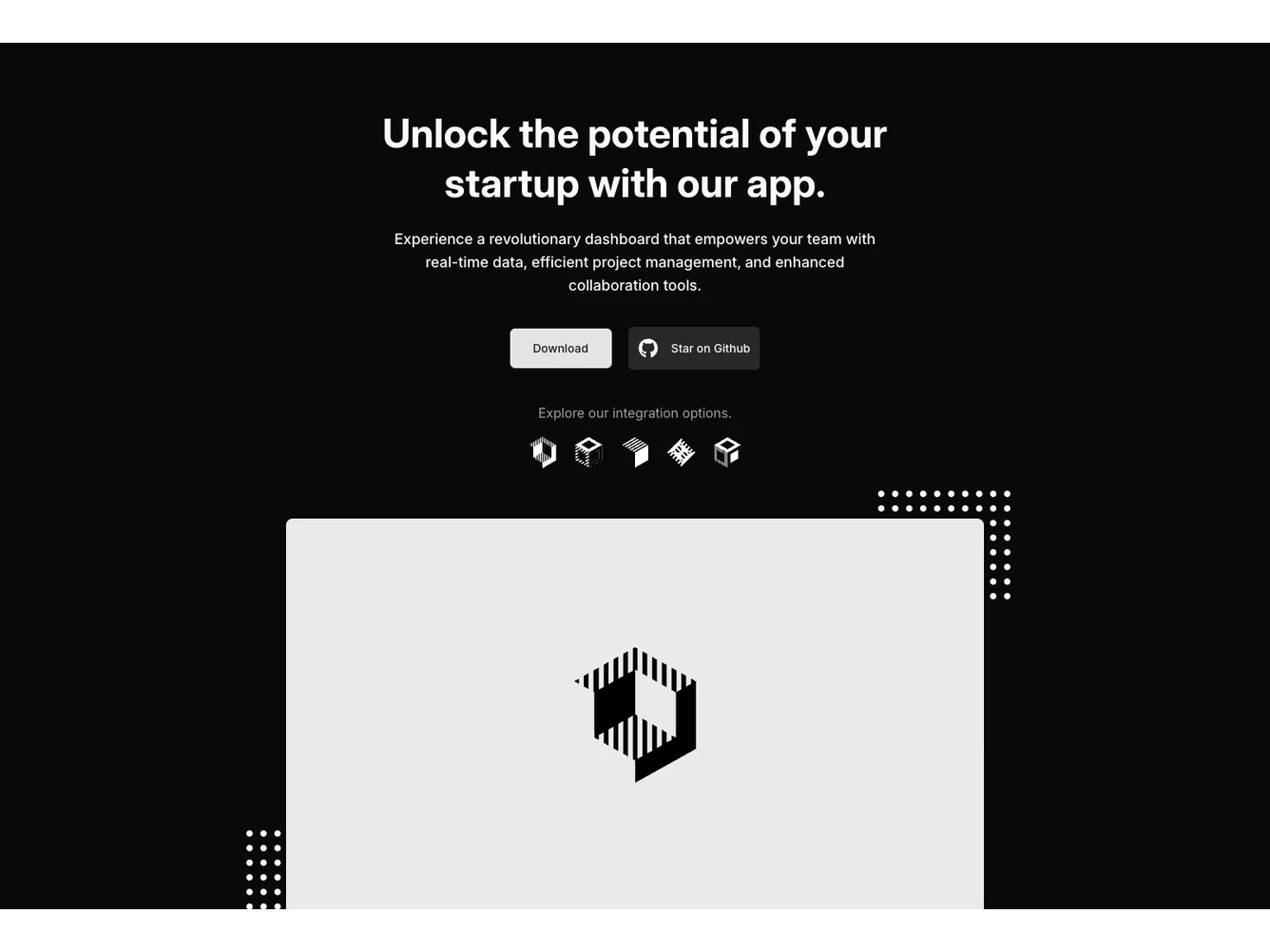
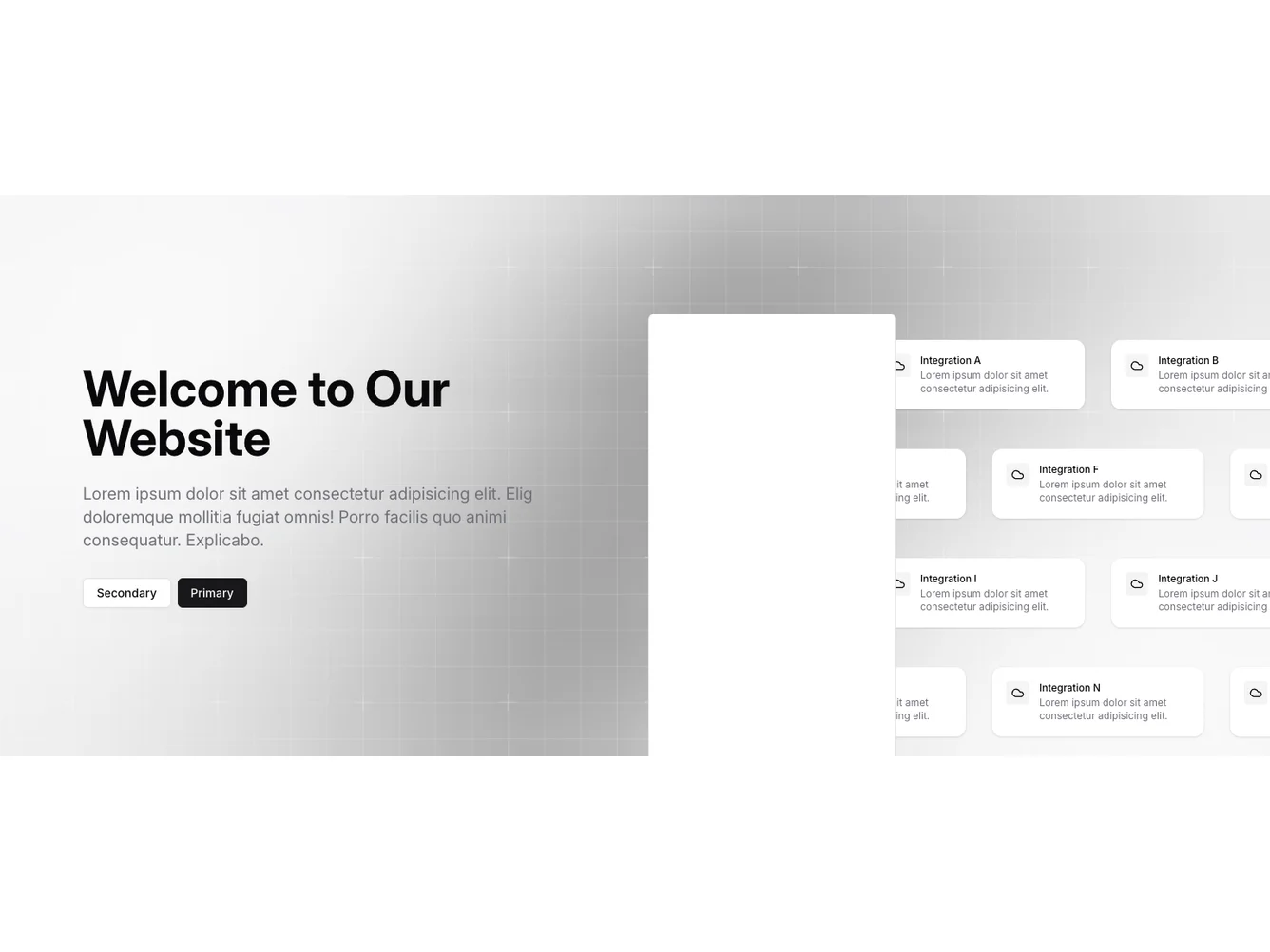
- Shadcn Hero Integrations - Hero Integrations layouts for landing pages, product pages, and marketing sites.
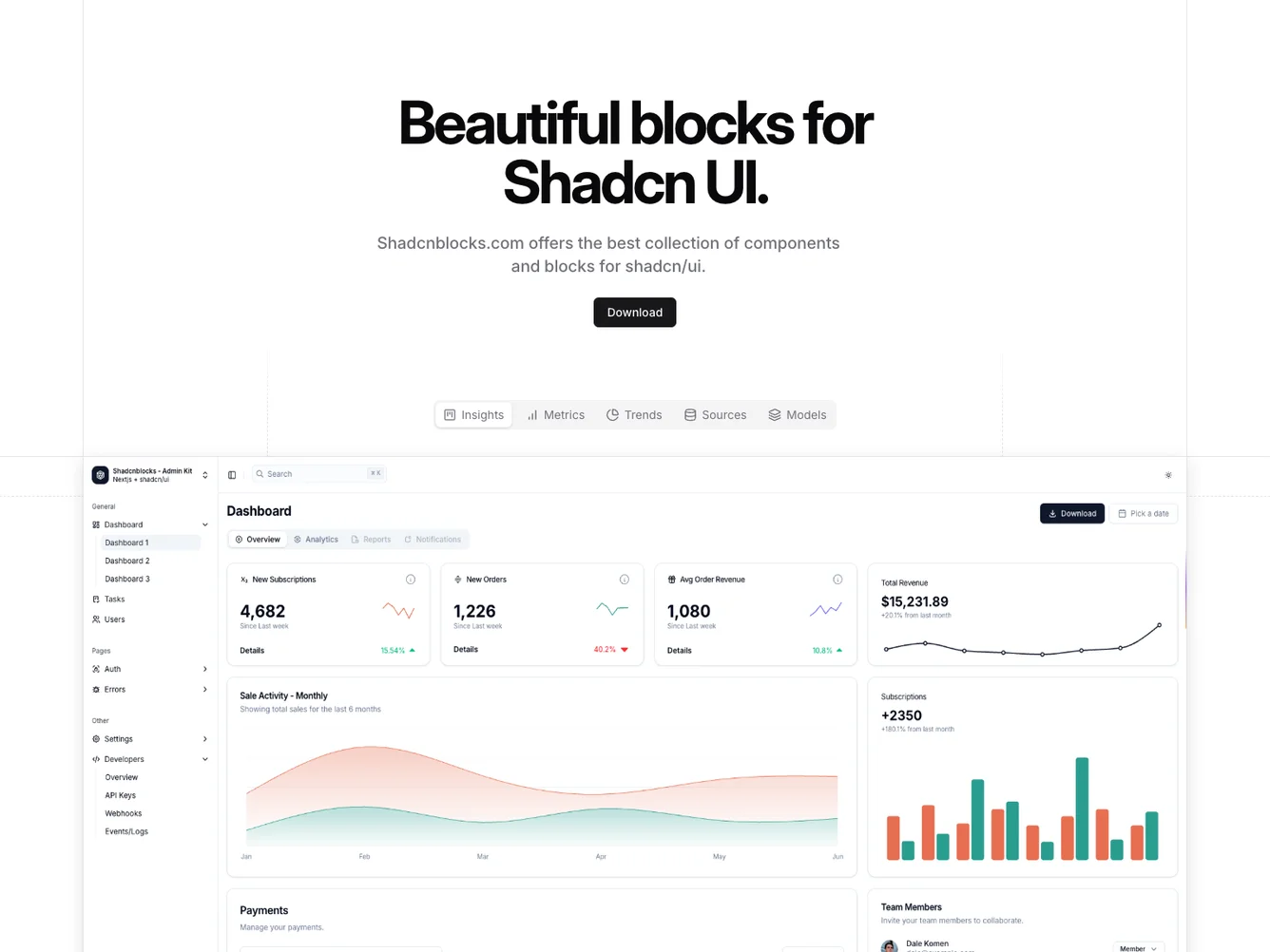
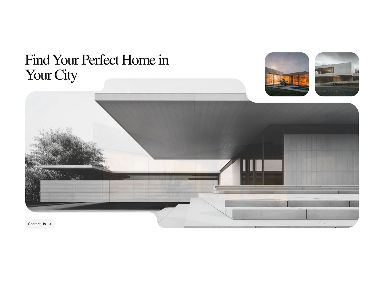
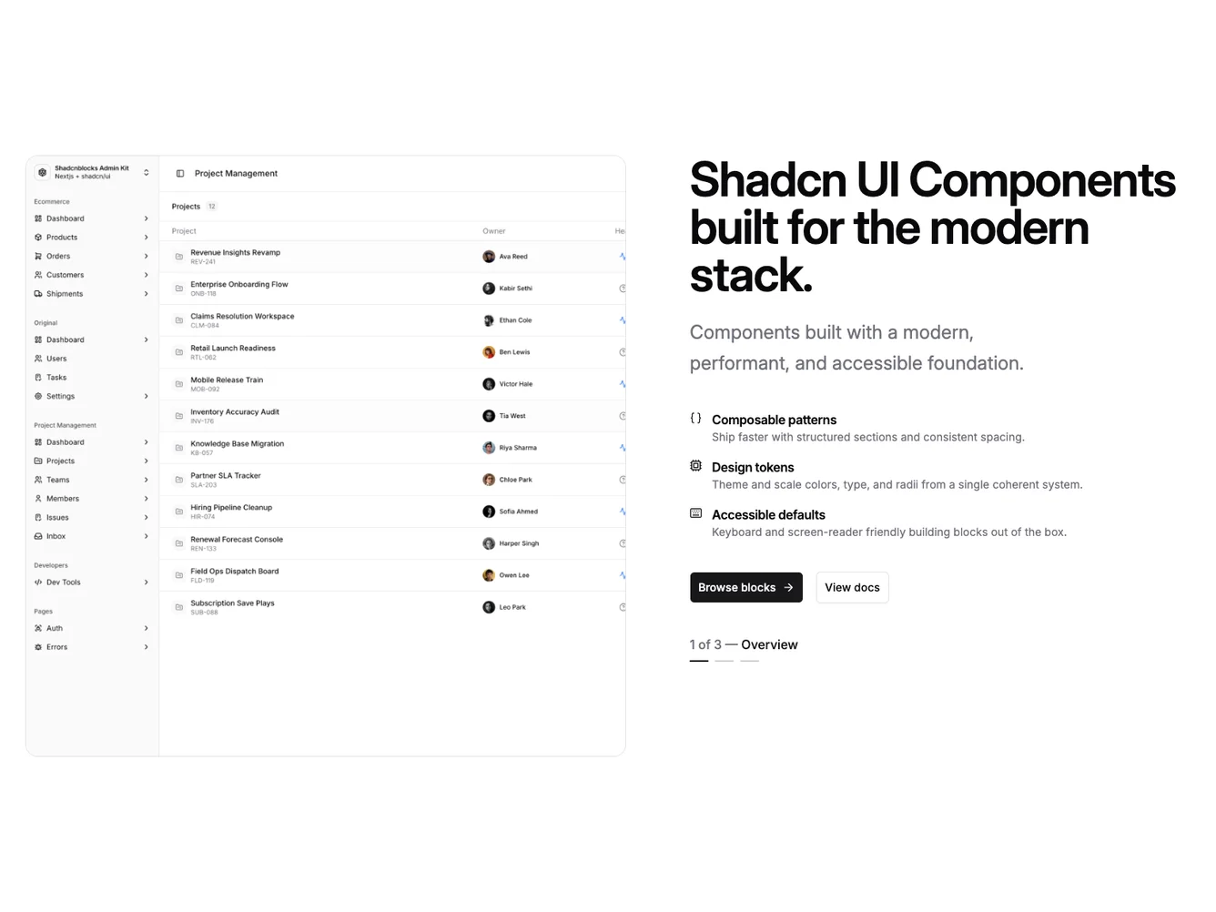
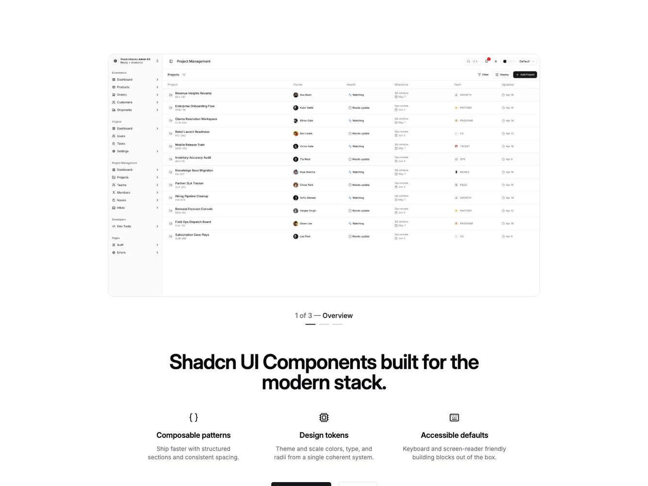
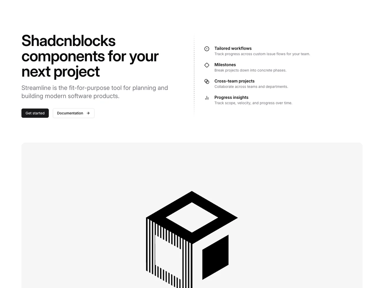
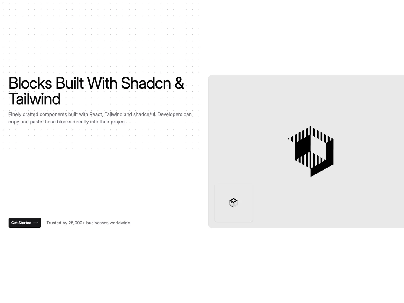
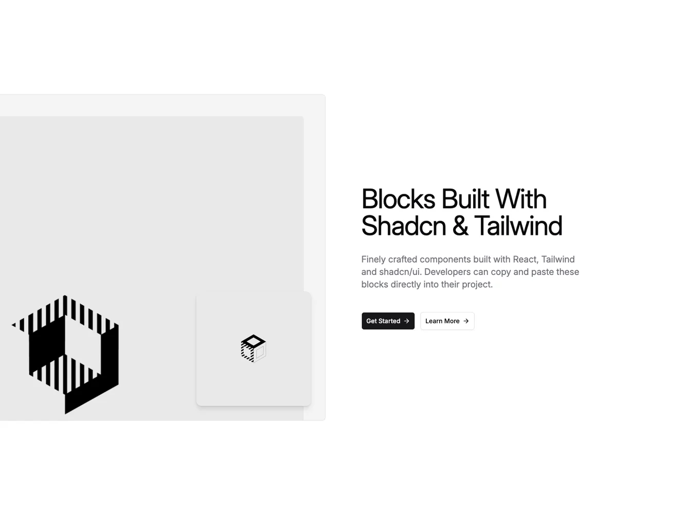
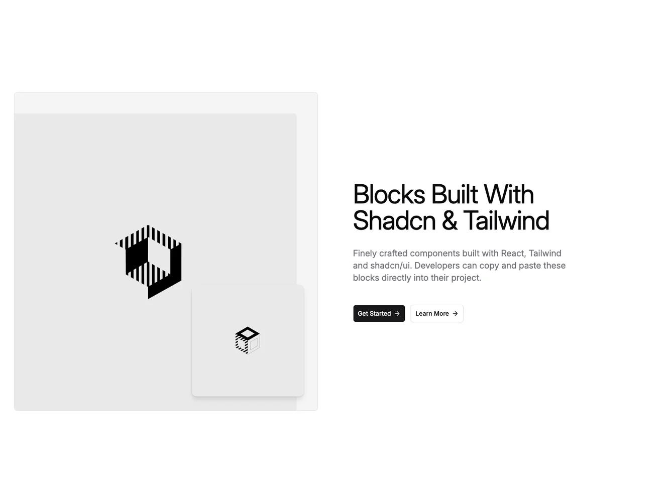
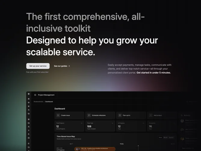
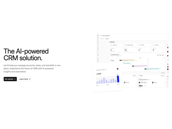
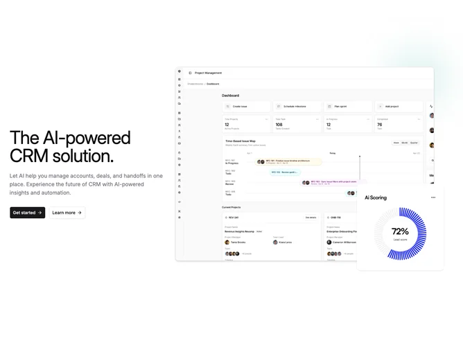
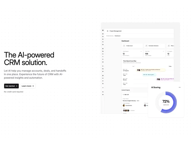
- Shadcn Hero Inset Image - Two-column SaaS heroes with a main dashboard screenshot and a square UI detail inset offset outside the main image.
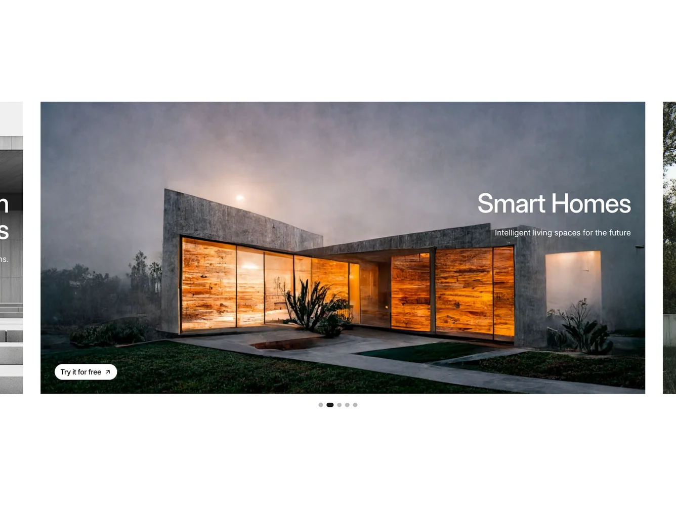
- Shadcn Hero Feature Slider - Swipeable hero carousel and slider layouts for compact multi-item display.
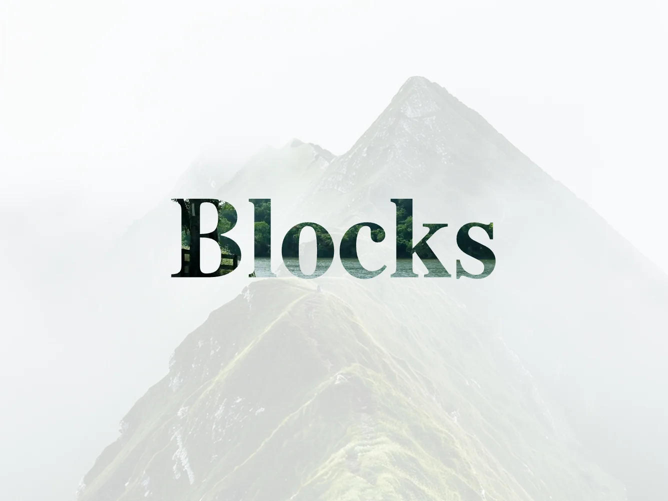
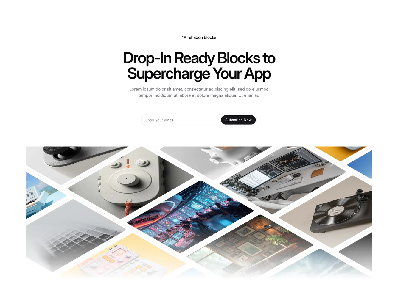
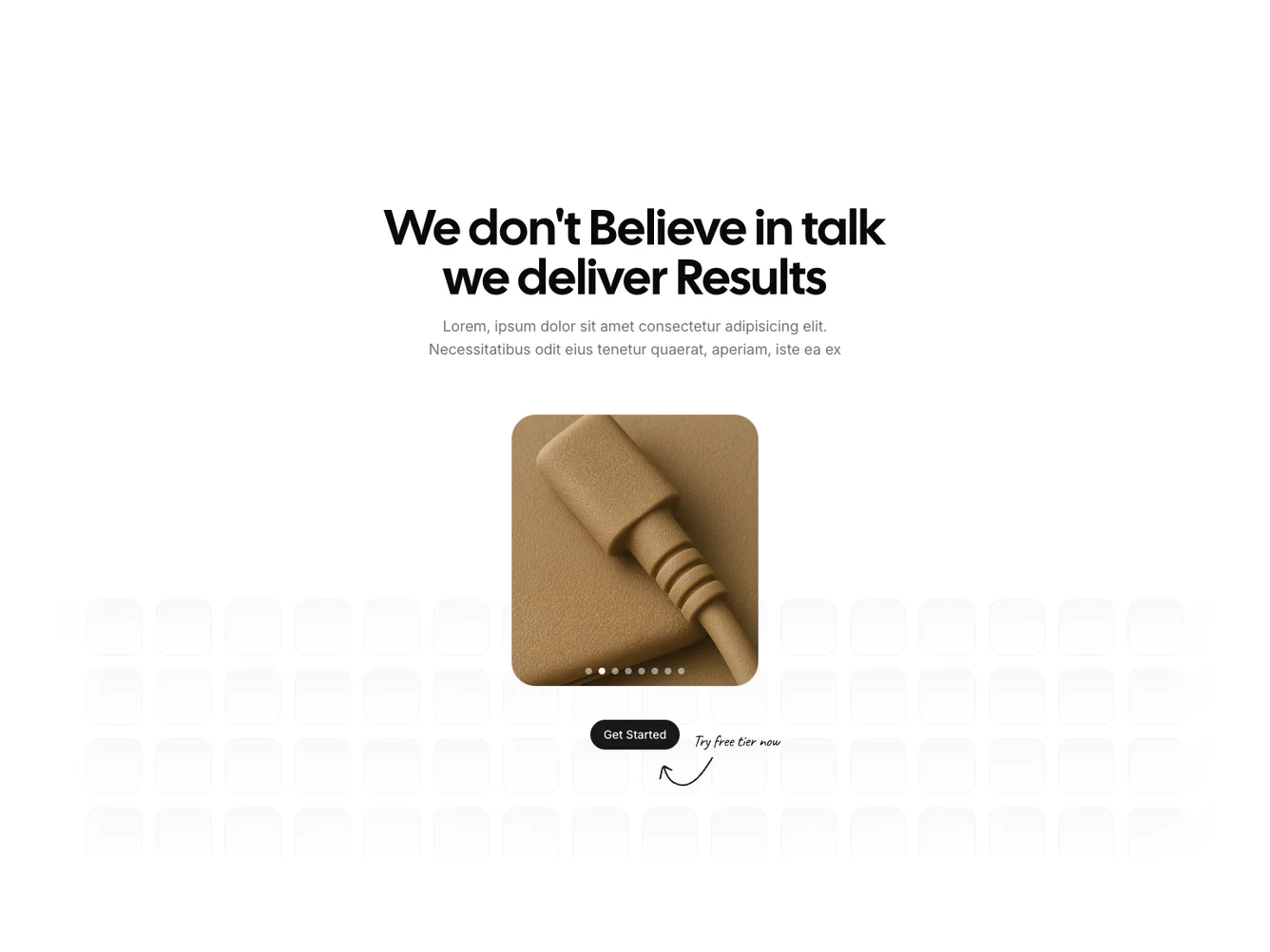
- Shadcn Hero Photo Marquee - Image-focused hero layouts with prominent photography or illustrations.
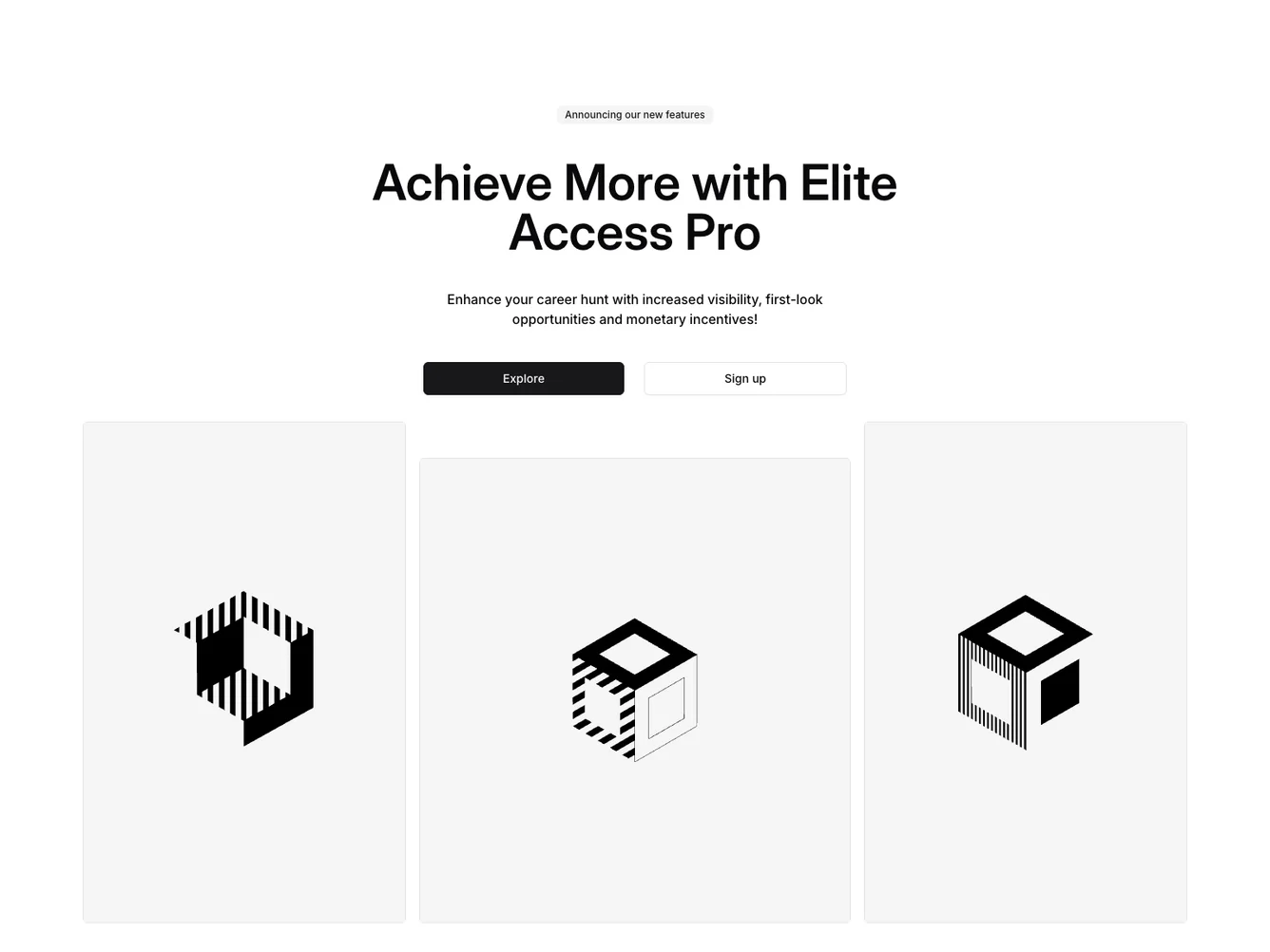
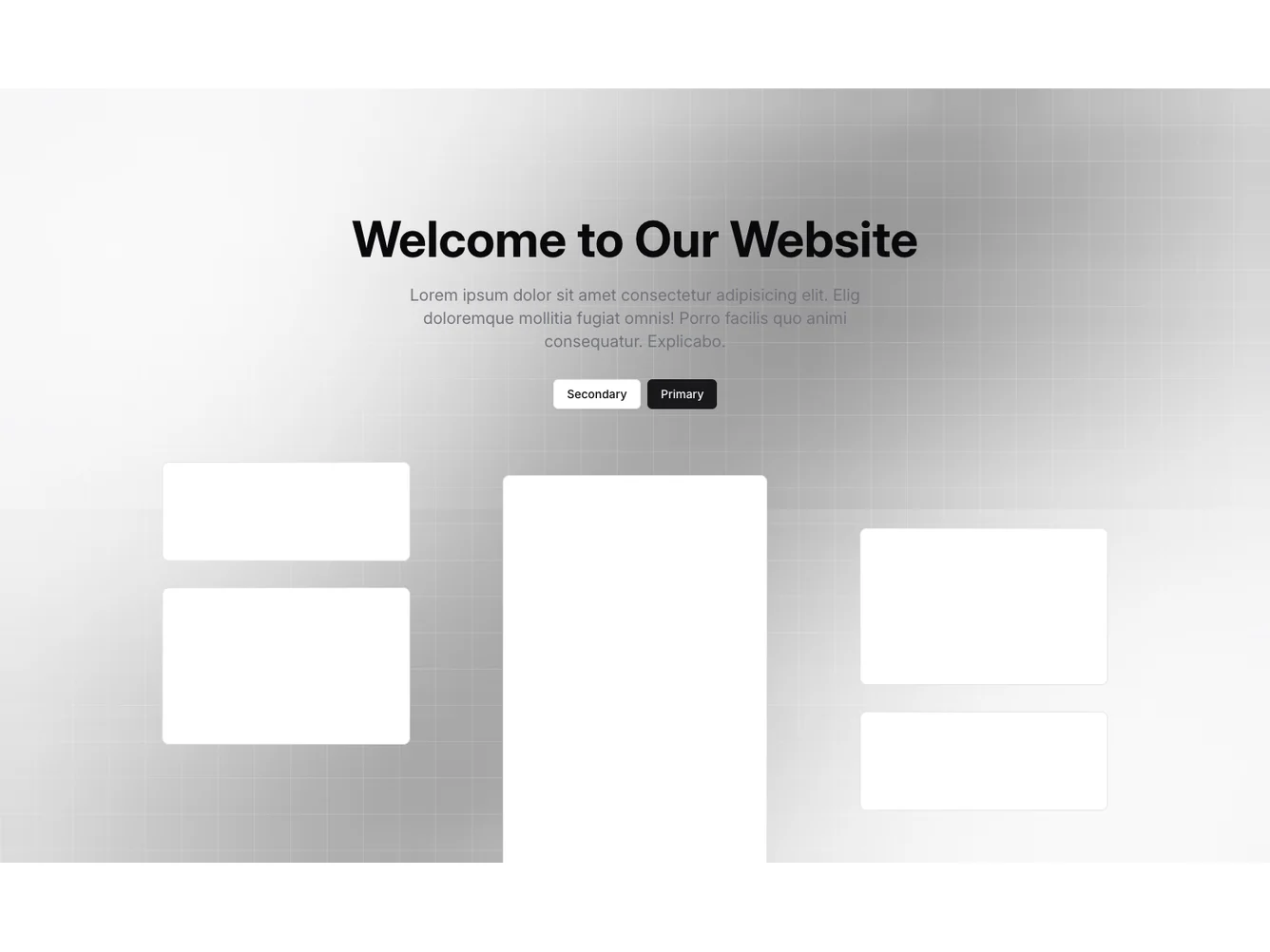
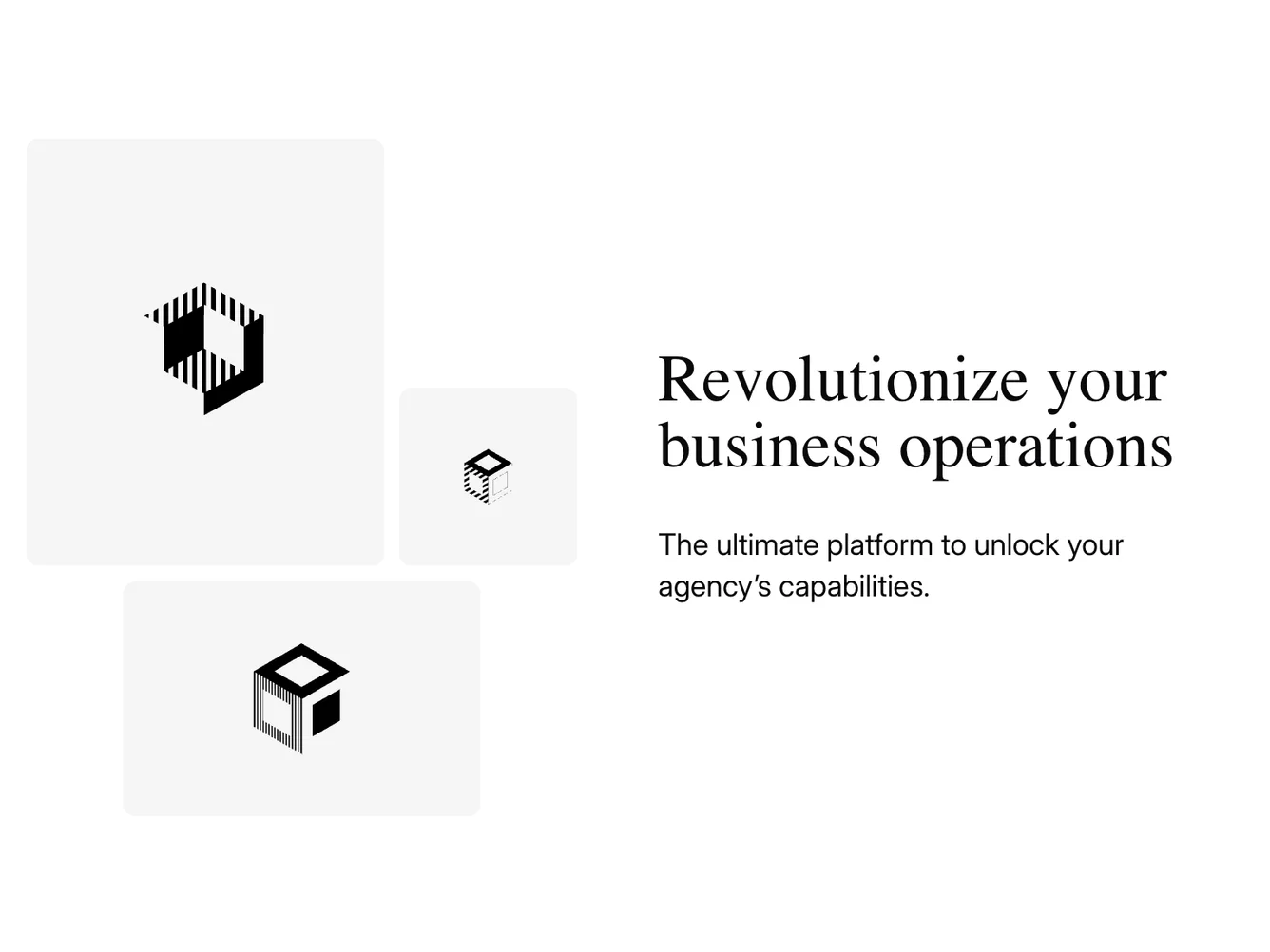
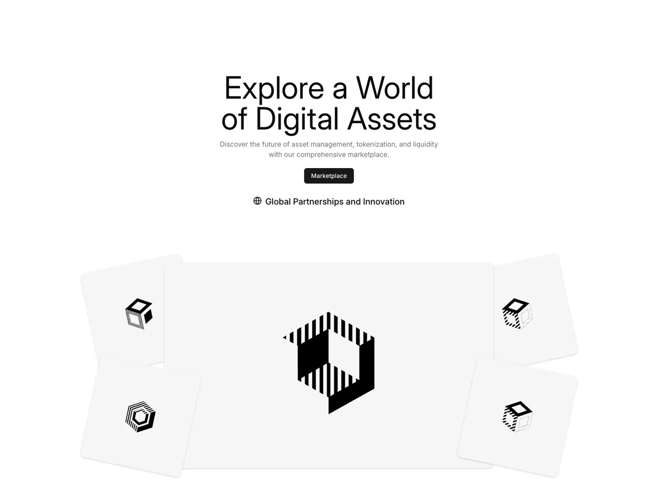
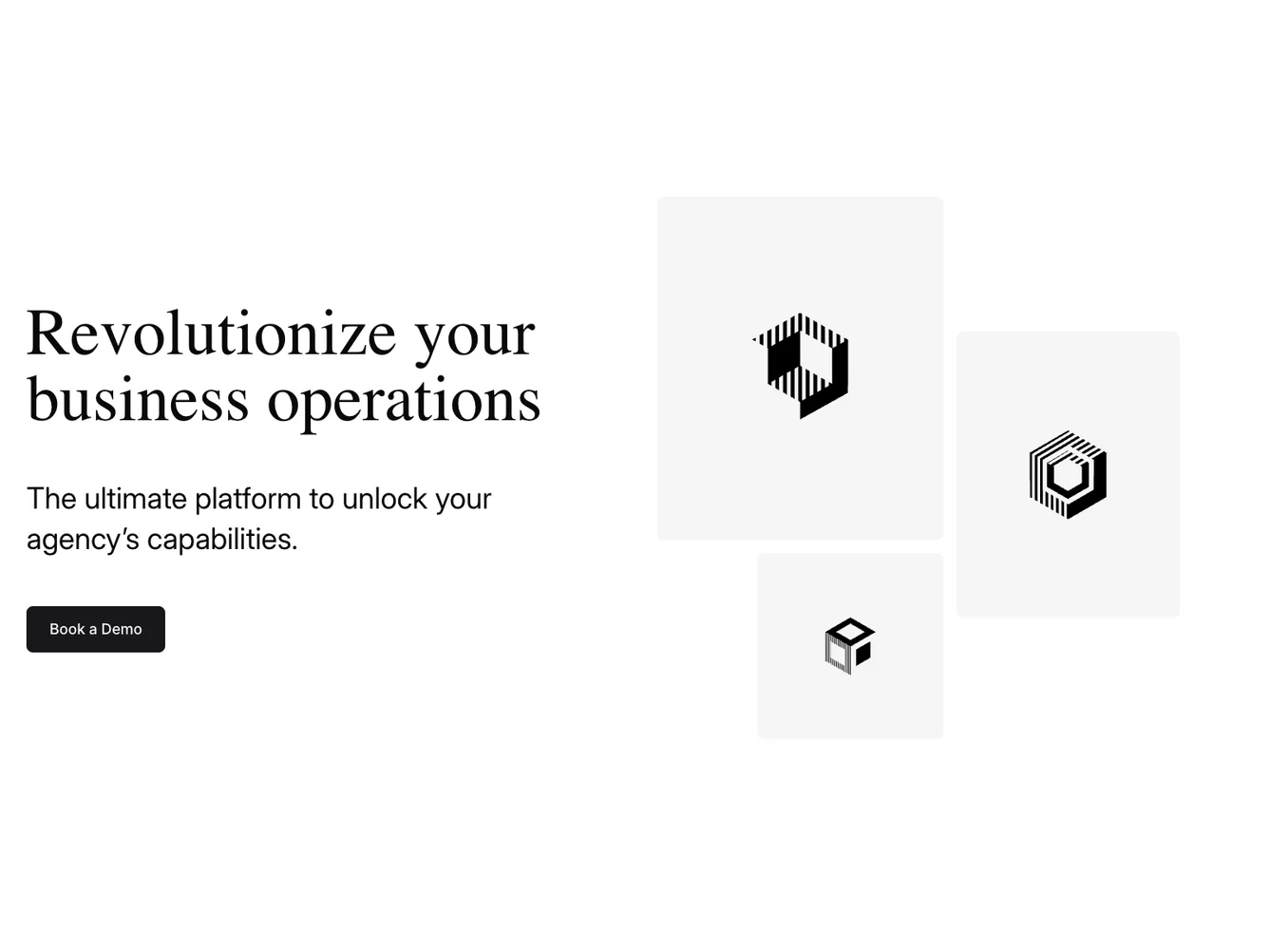
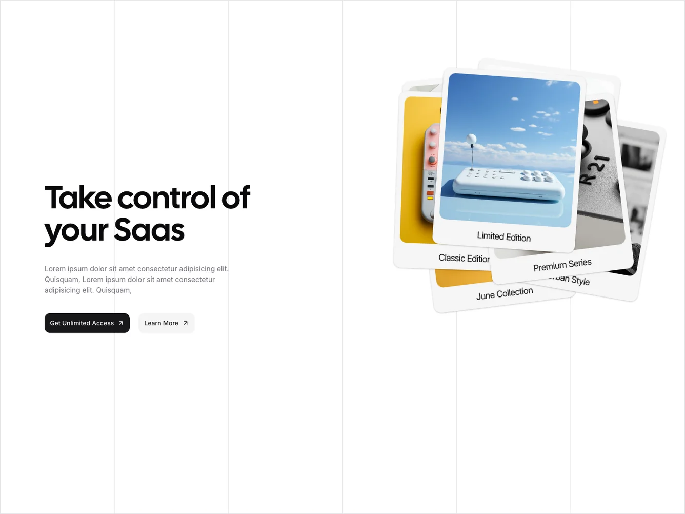
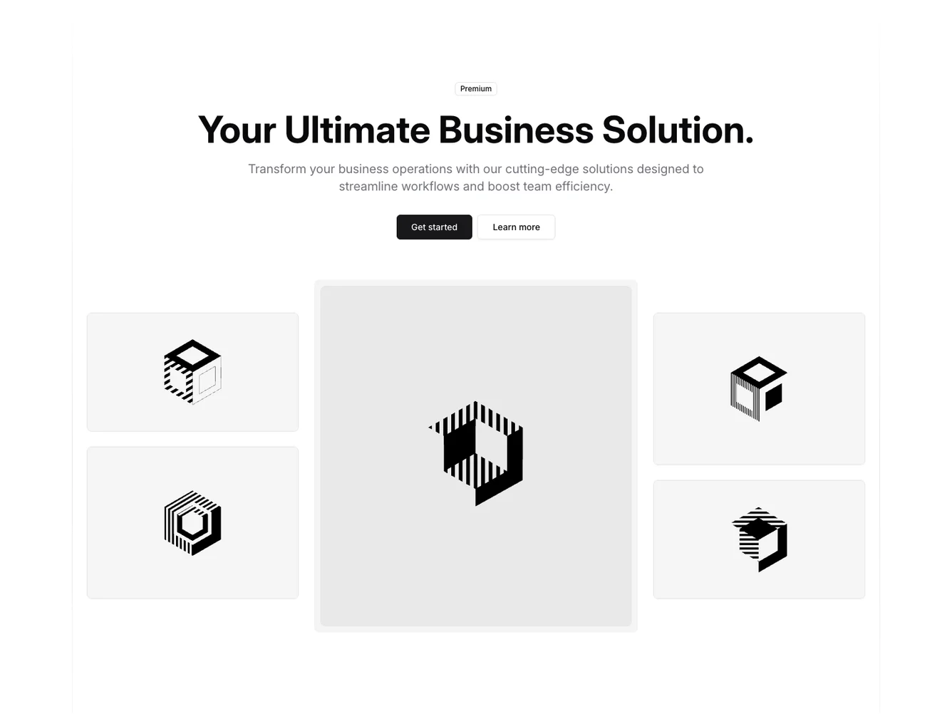
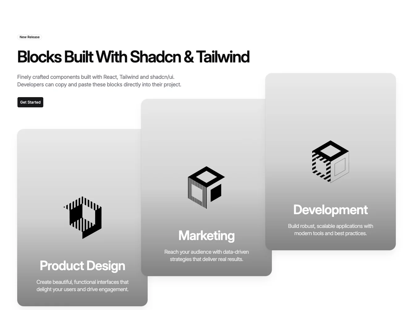
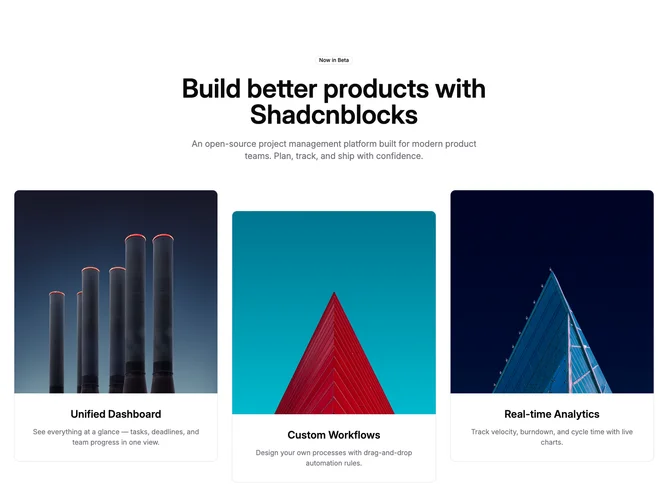
- Shadcn Hero Cards - Marketing heroes where card components—photo cards, overlapping portraits, or icon grids—carry the visual story below the headline.
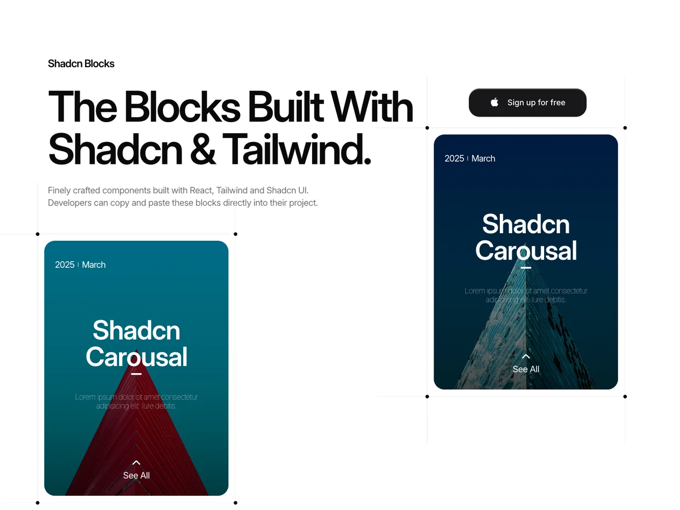
- Shadcn Hero Carousel - Swipeable hero carousel and slider layouts for compact multi-item display.
- Shadcn Hero Cutout Gallery - Hero Cutout Gallery layouts for landing pages, product pages, and marketing sites.
- Shadcn Hero Fullscreen Ambient - Edge-to-edge hero layouts that fill the entire viewport.
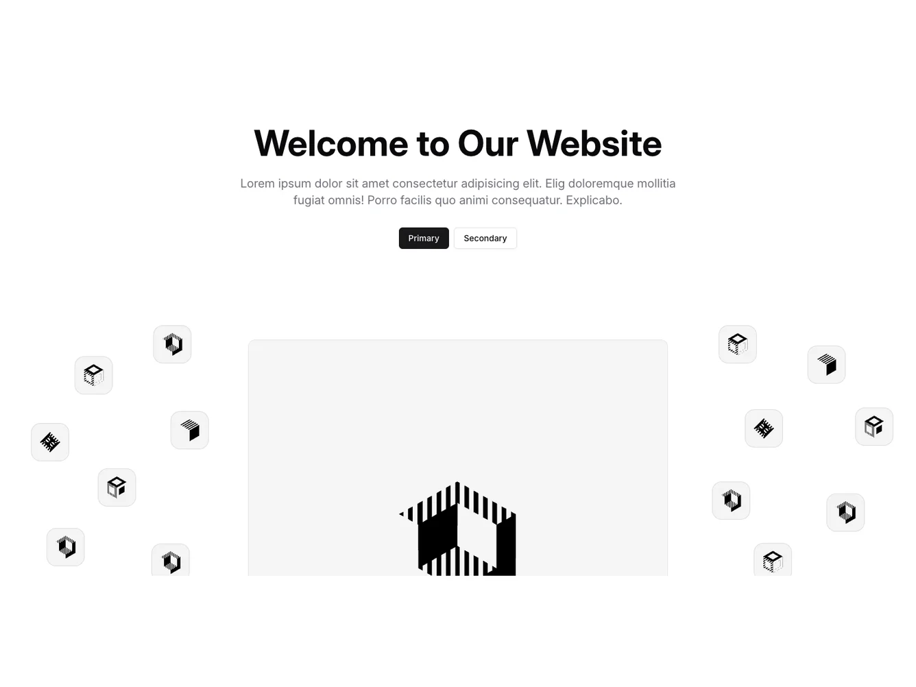
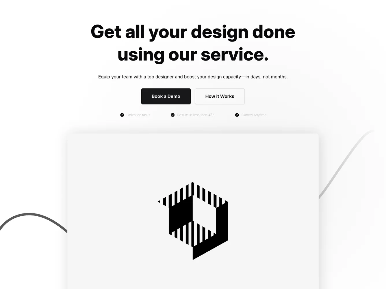
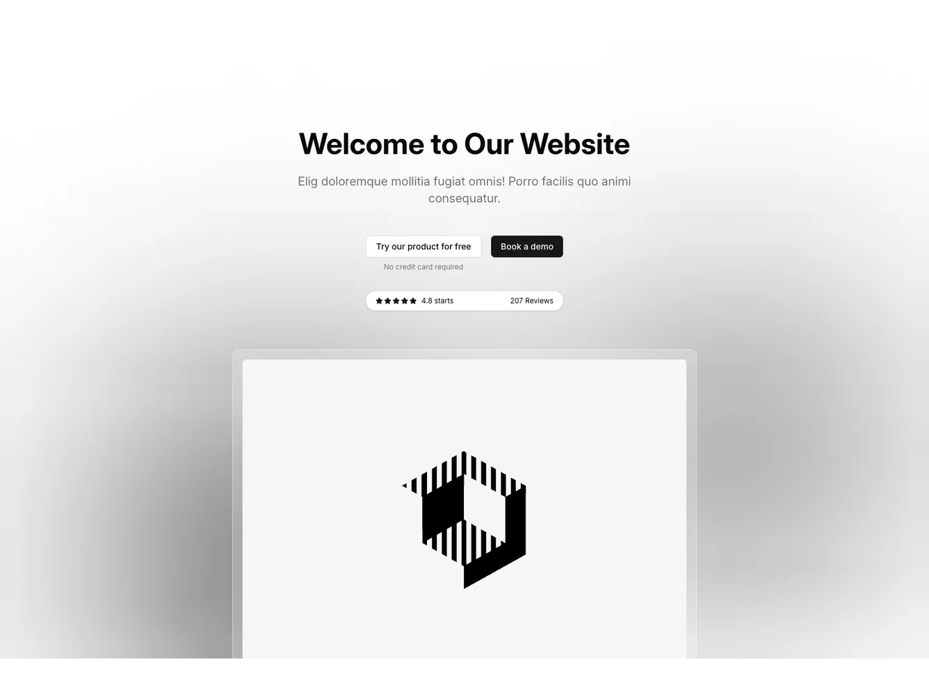
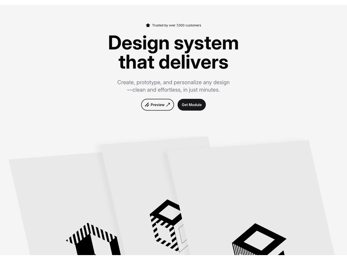
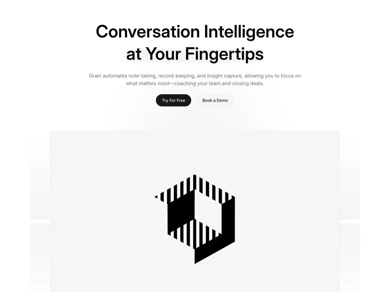
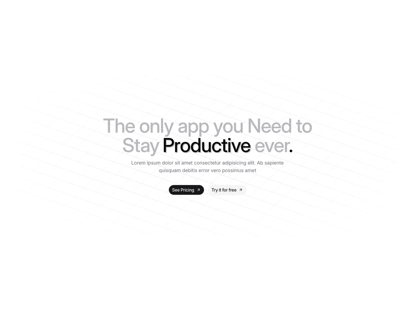
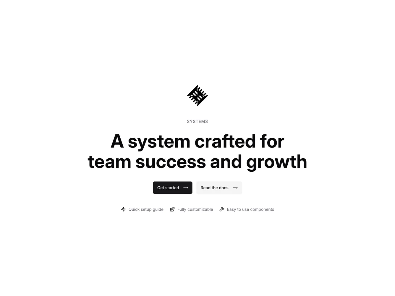
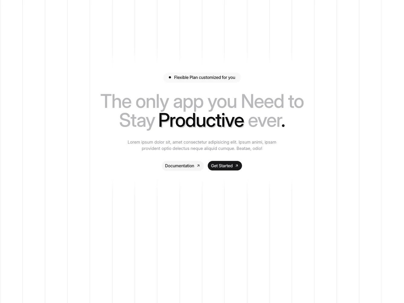
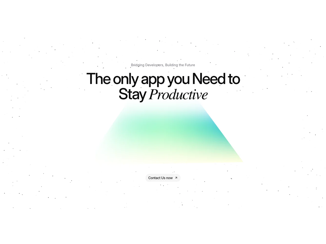
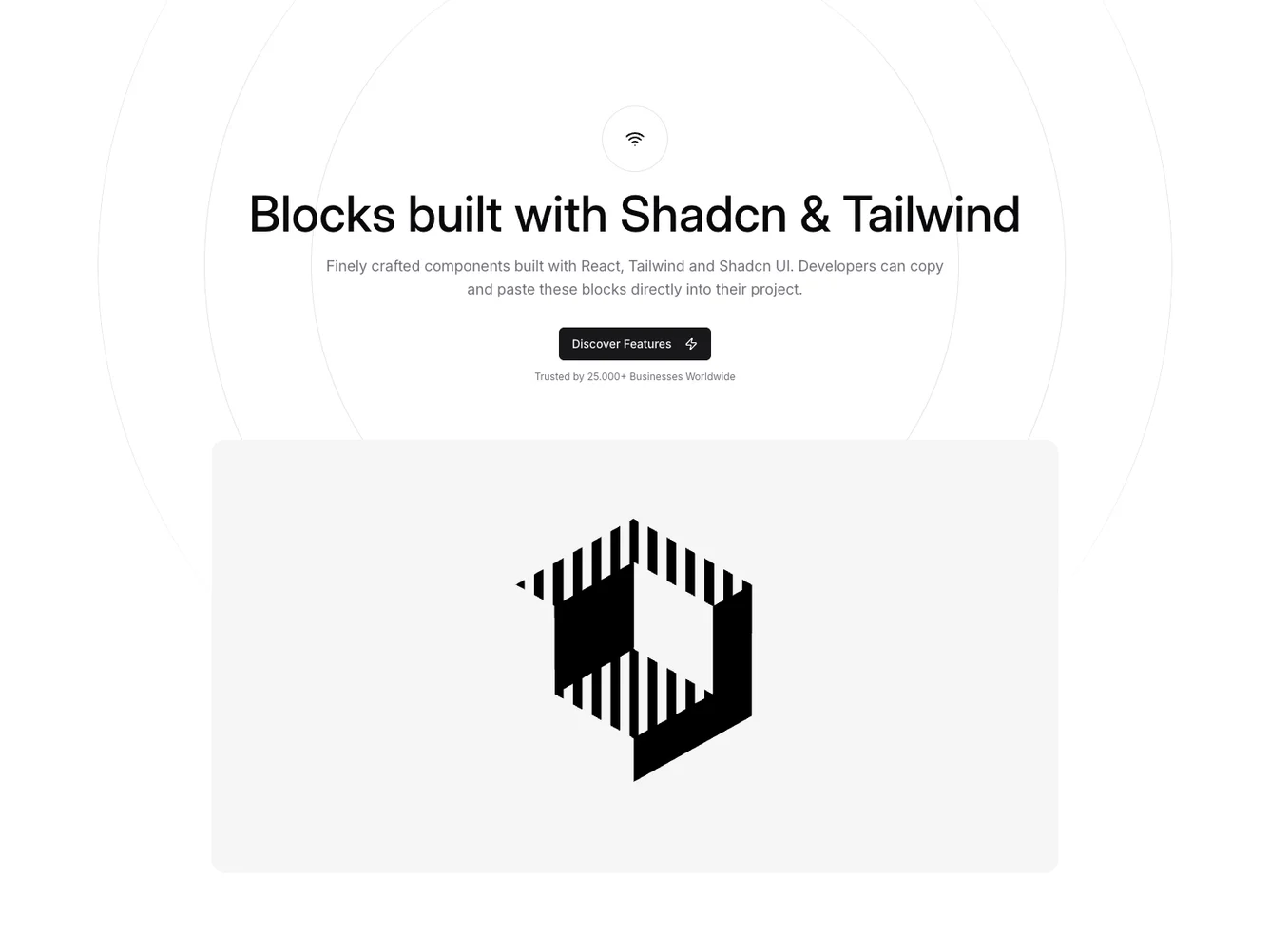
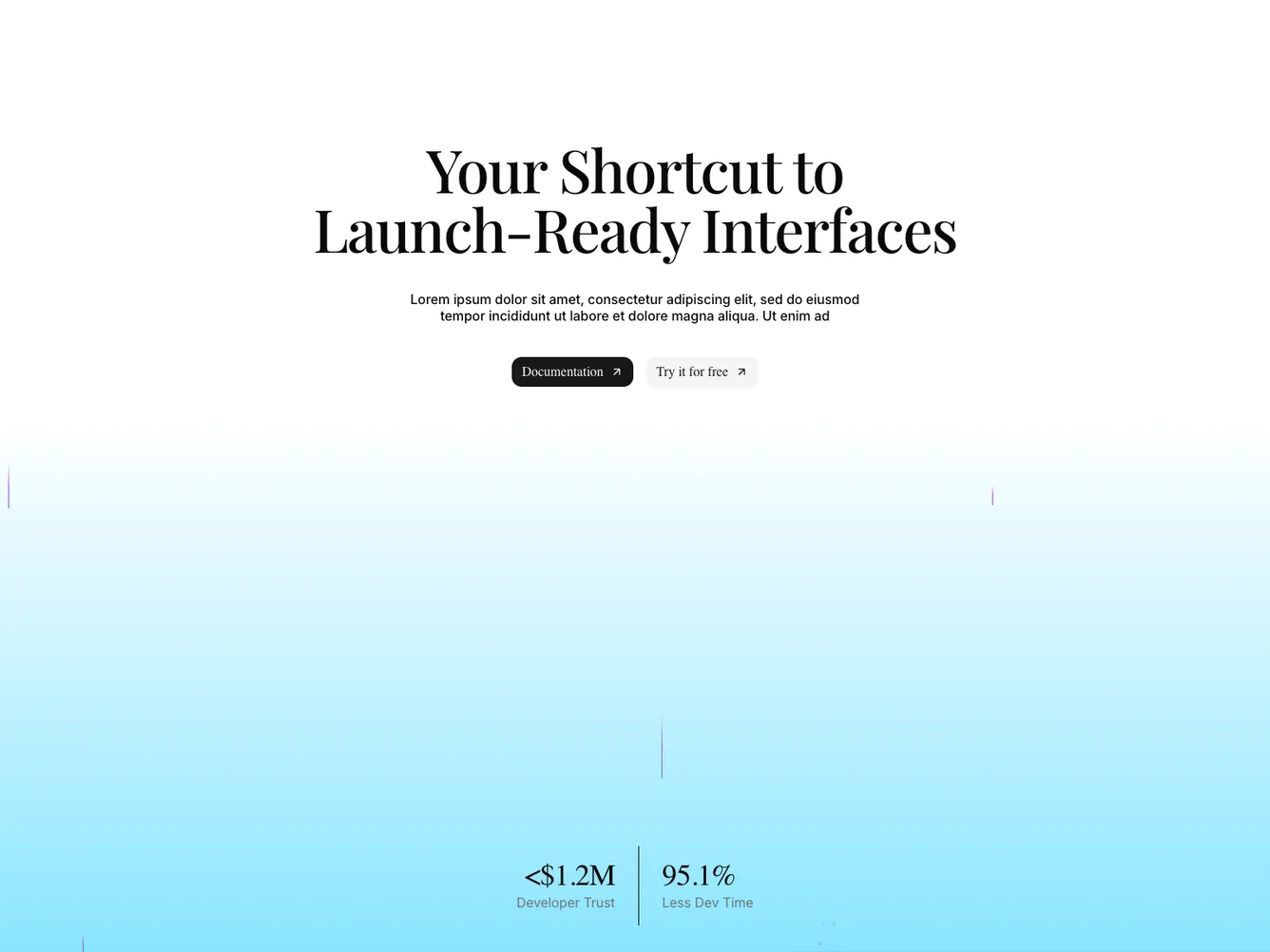
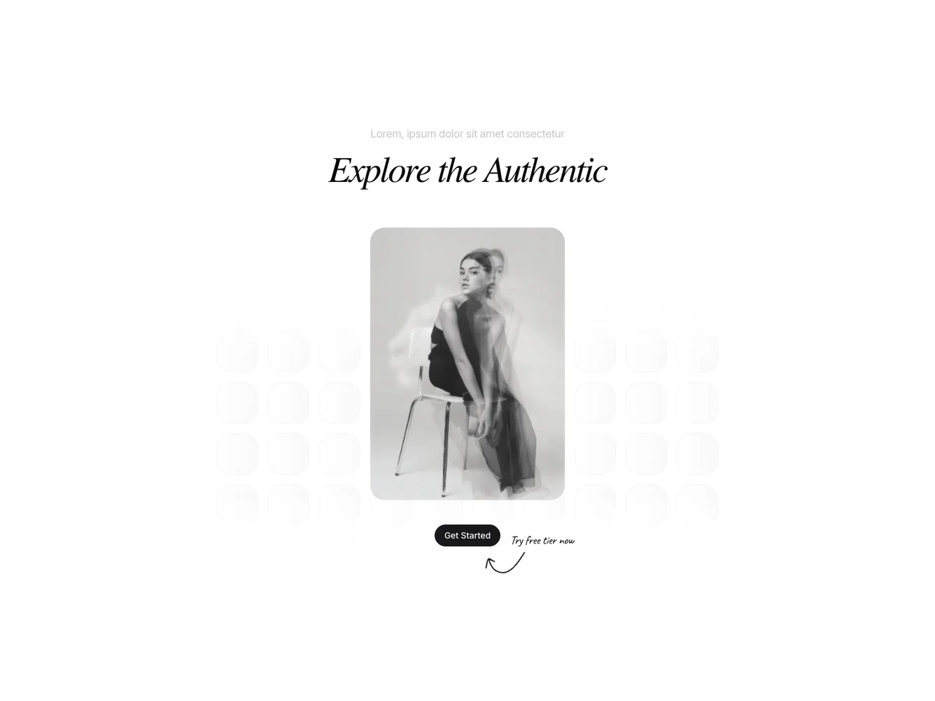
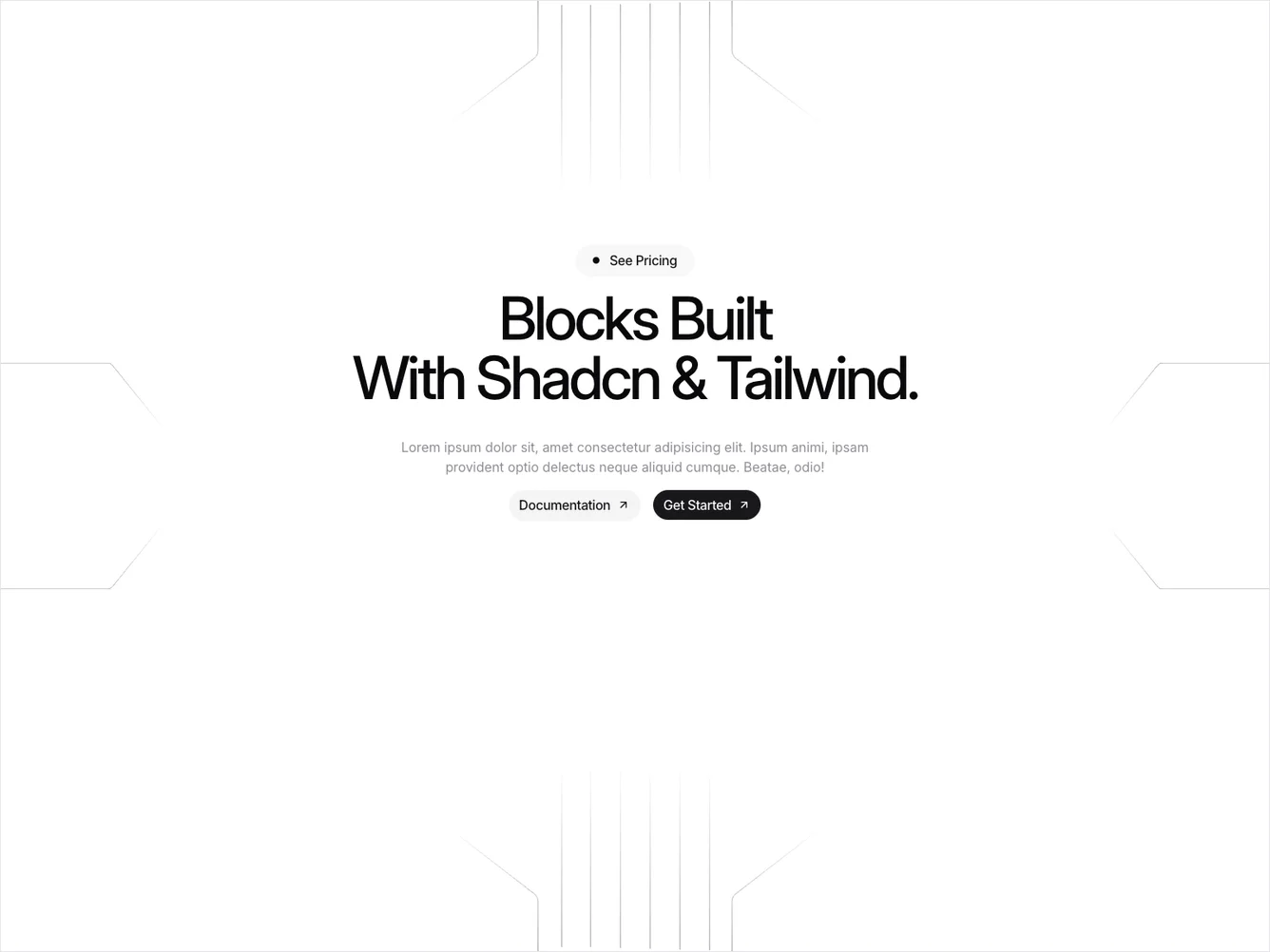
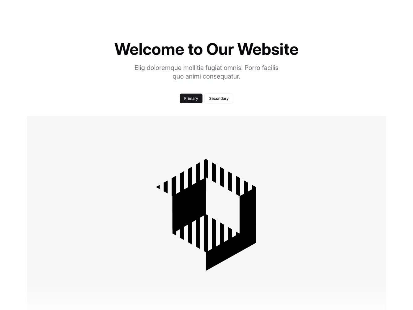
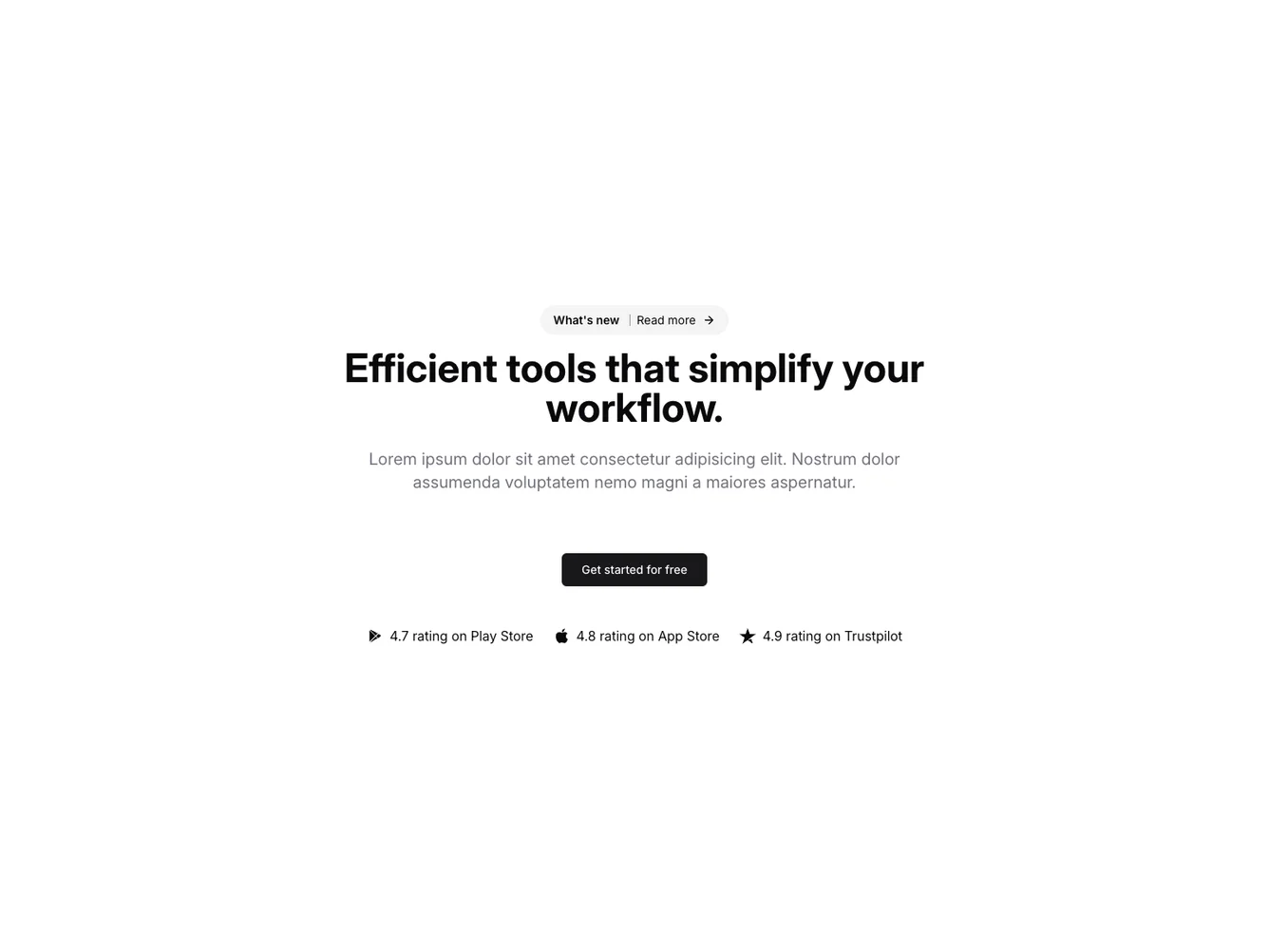
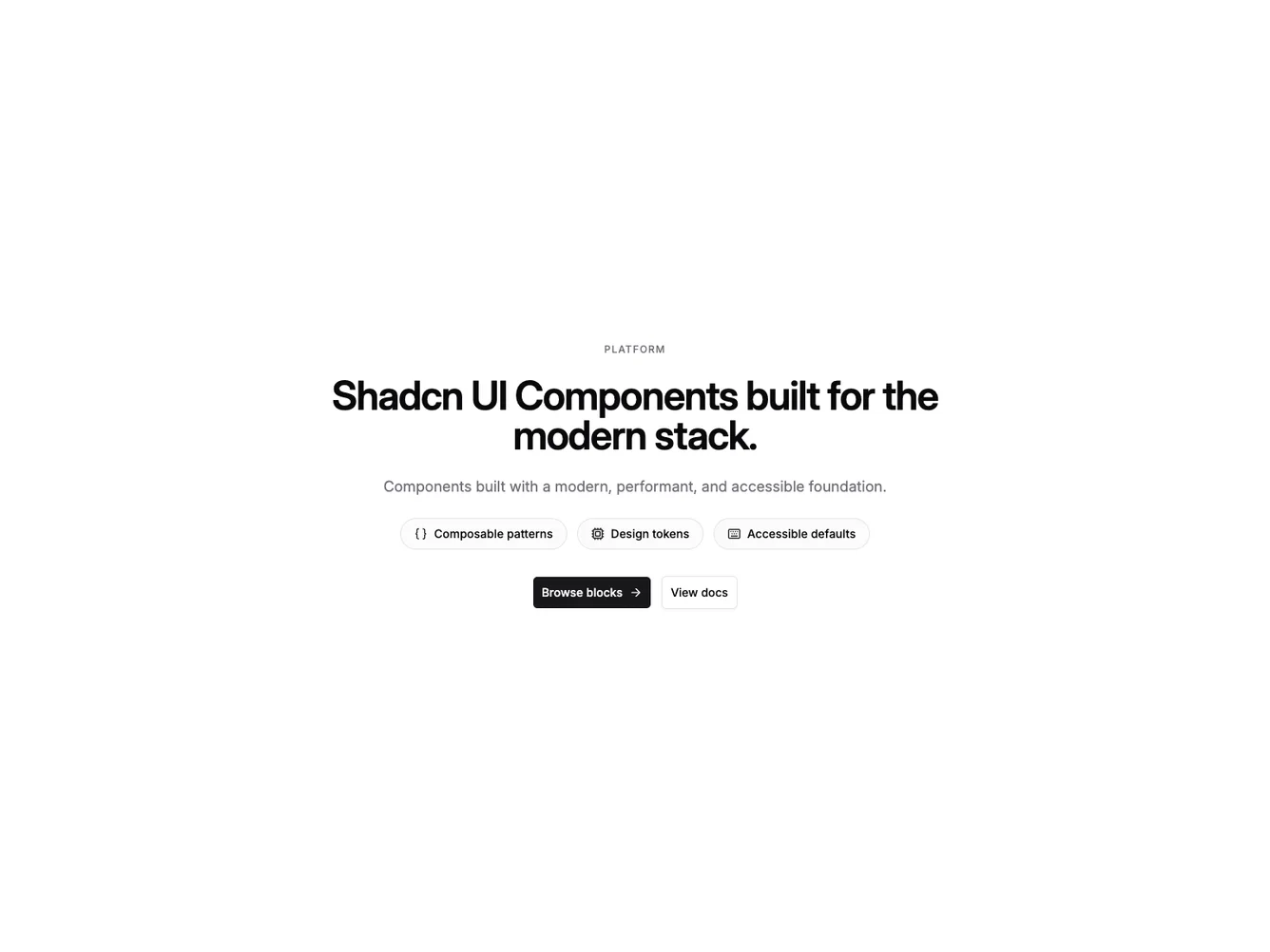
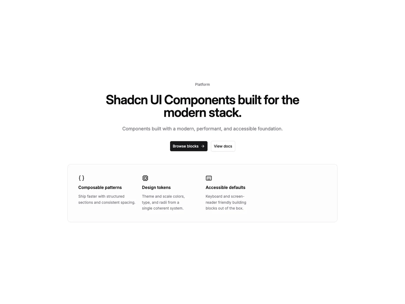
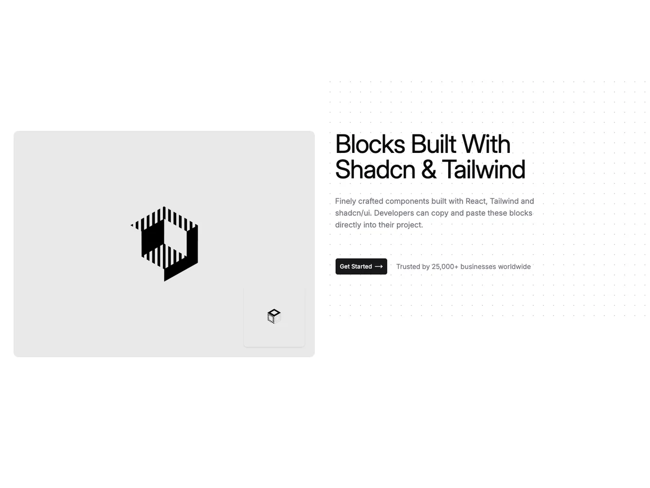
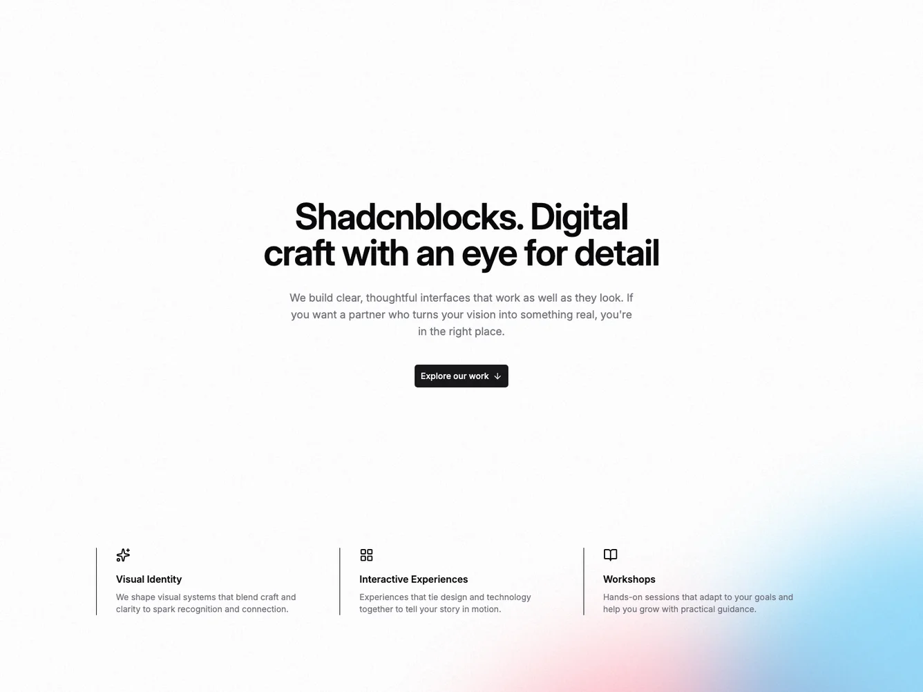
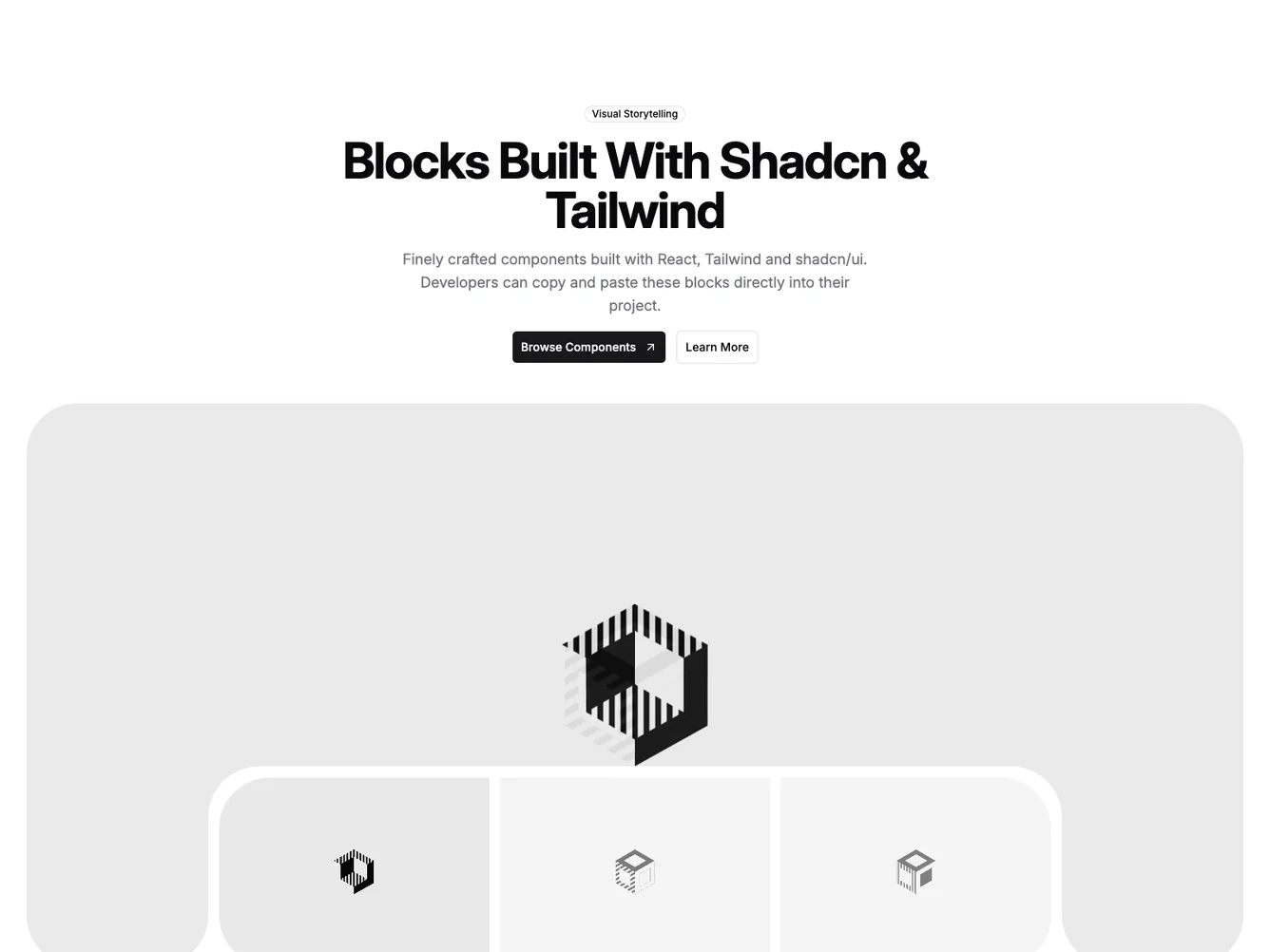
- Shadcn Hero Center Text - Centered hero layouts with symmetrical content alignment.
- Shadcn Hero Slider - Swipeable hero carousel and slider layouts for compact multi-item display.
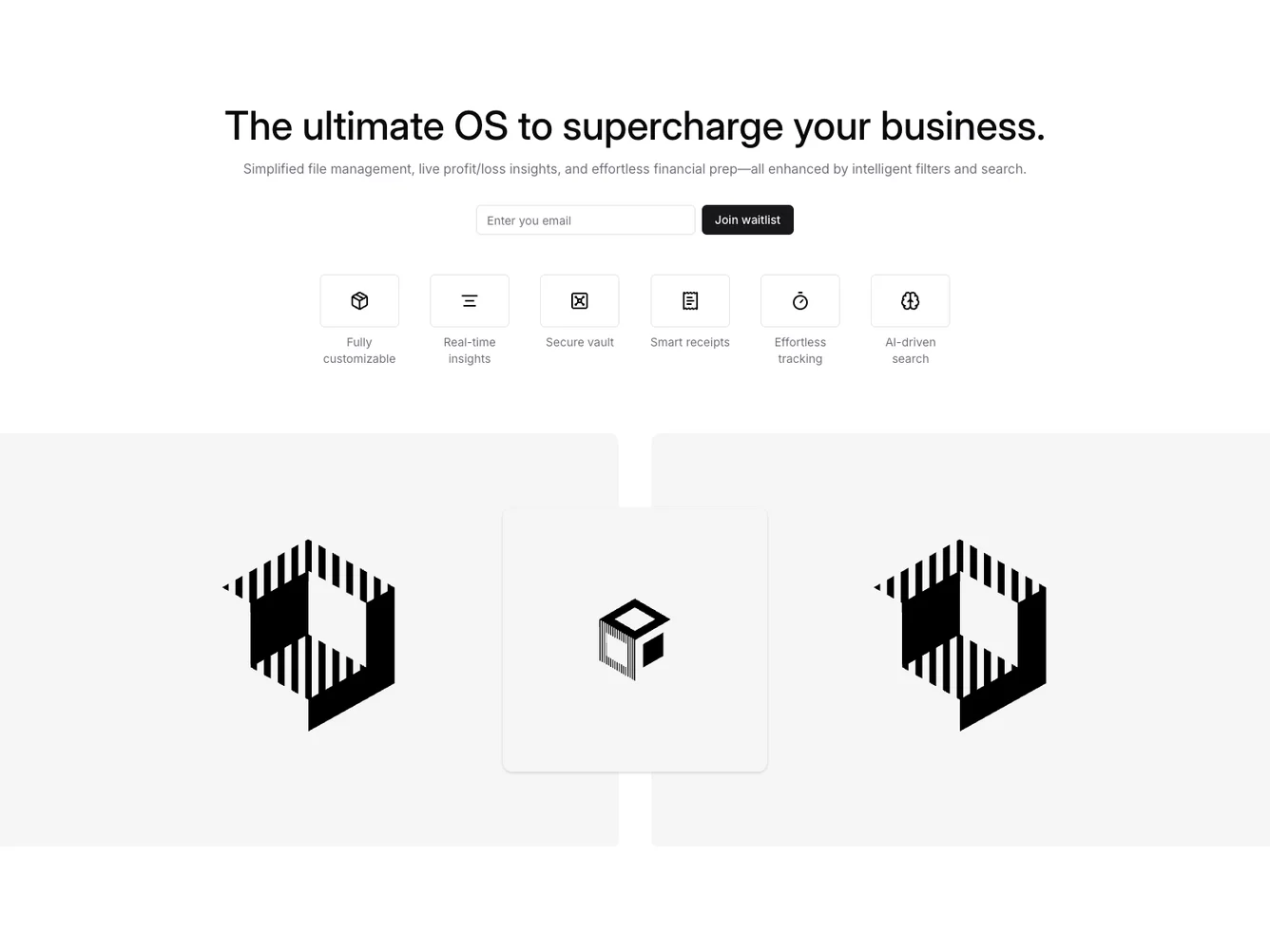
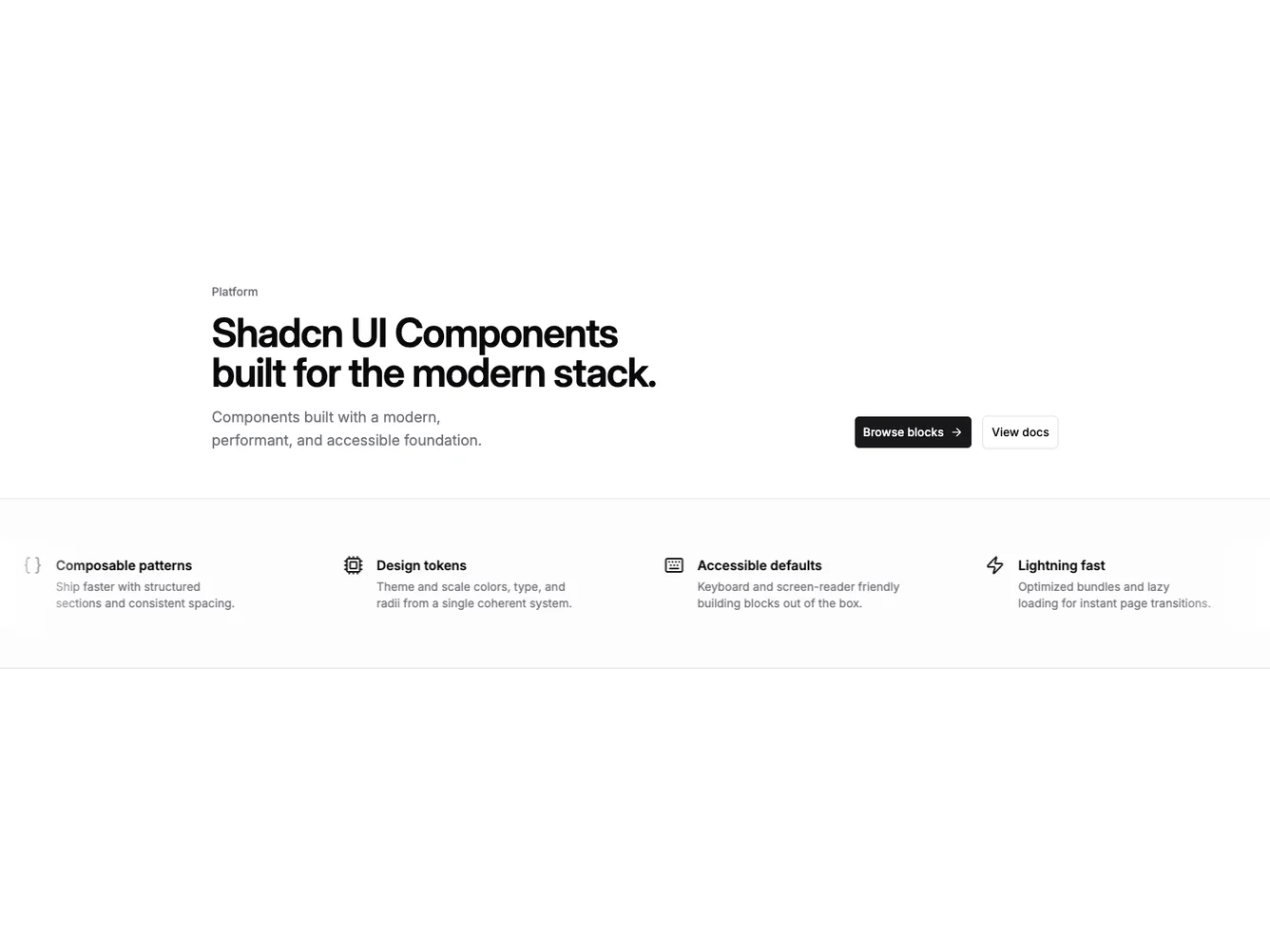
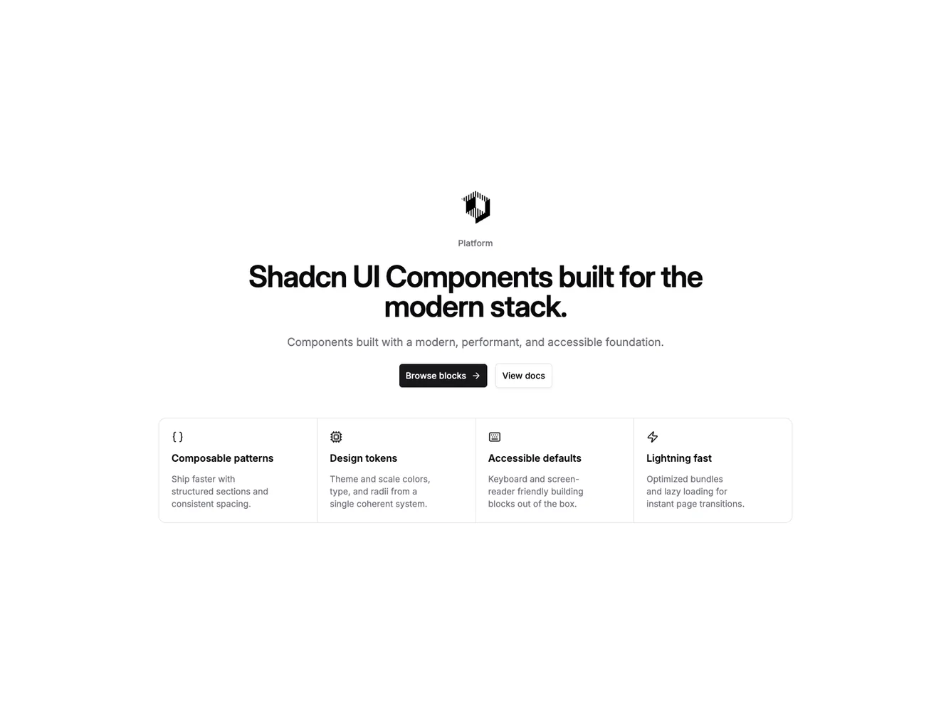
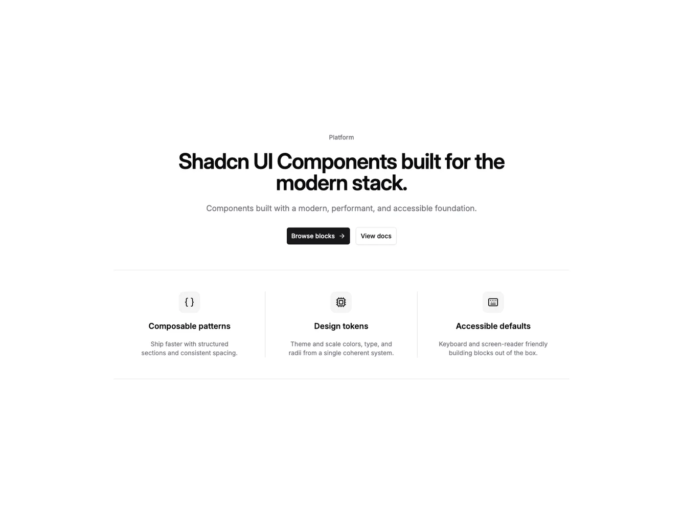
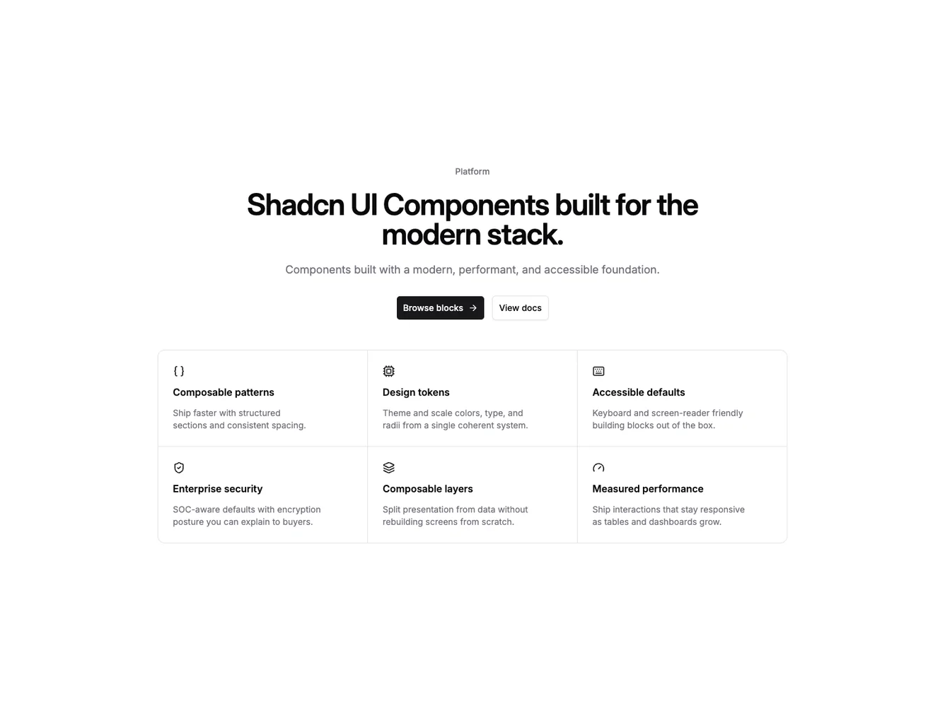
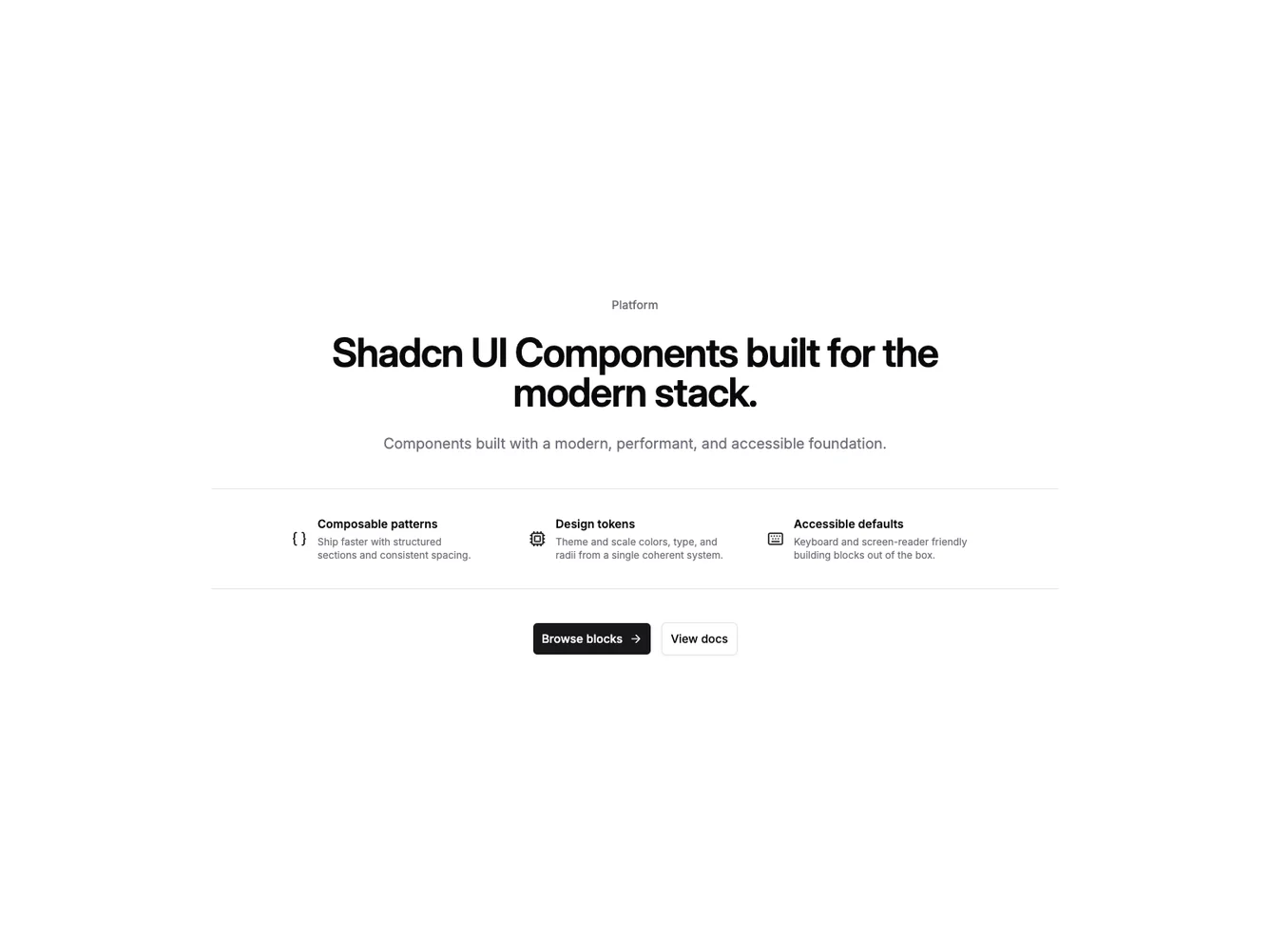
- Shadcn Hero Feature Icons - Hero Feature Icons layouts for landing pages, product pages, and marketing sites.
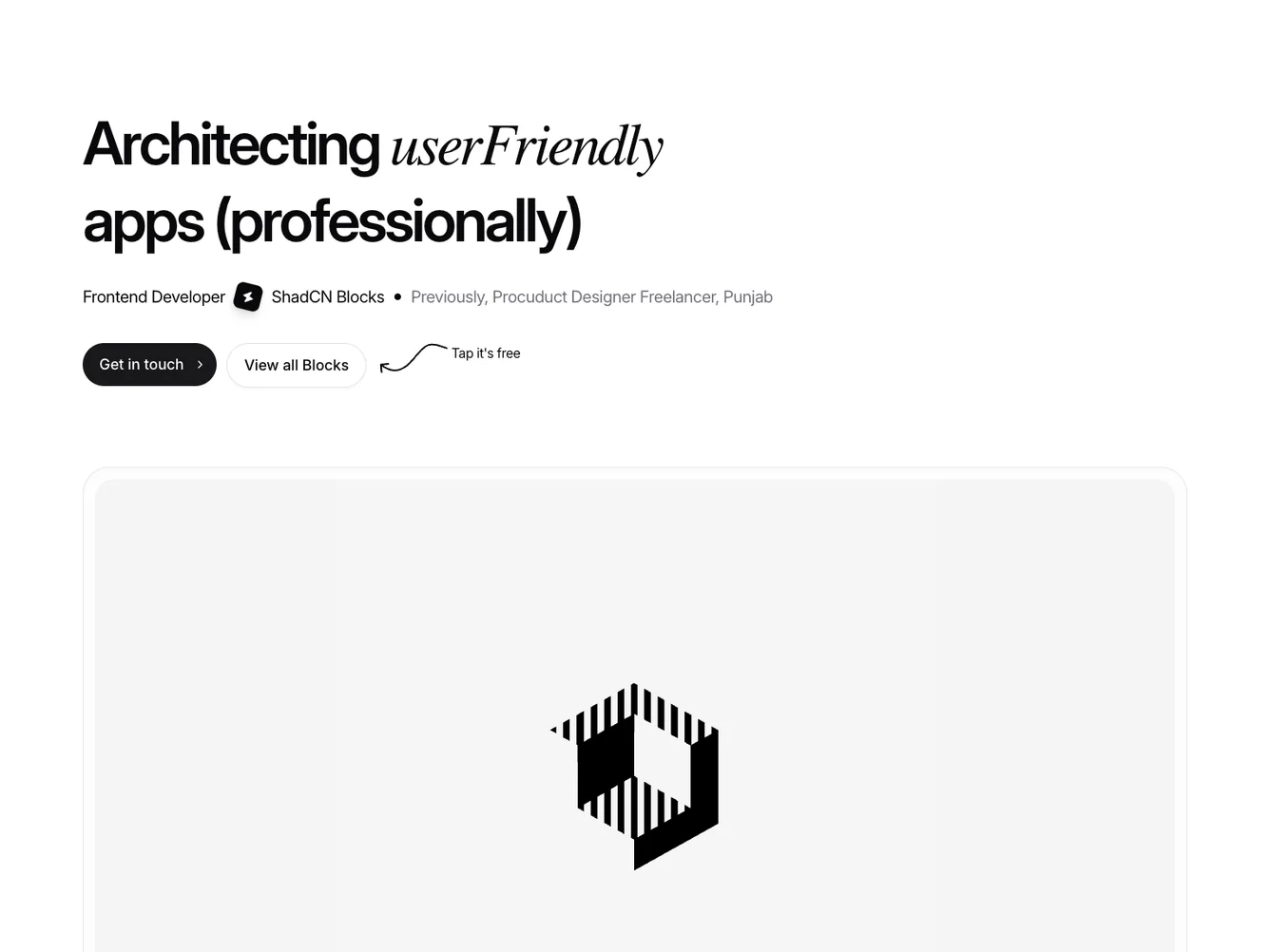
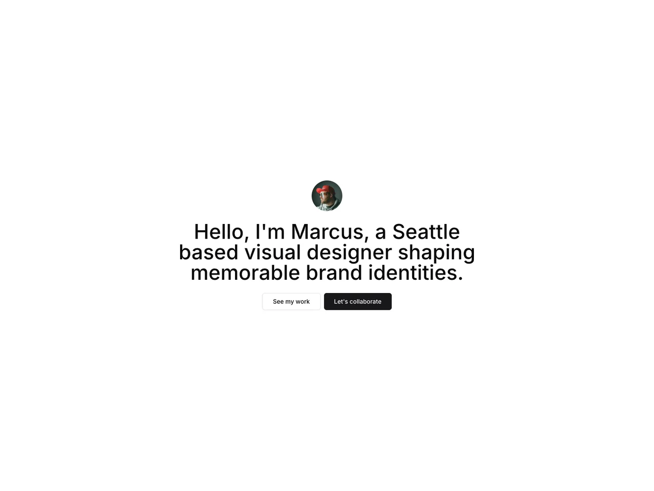
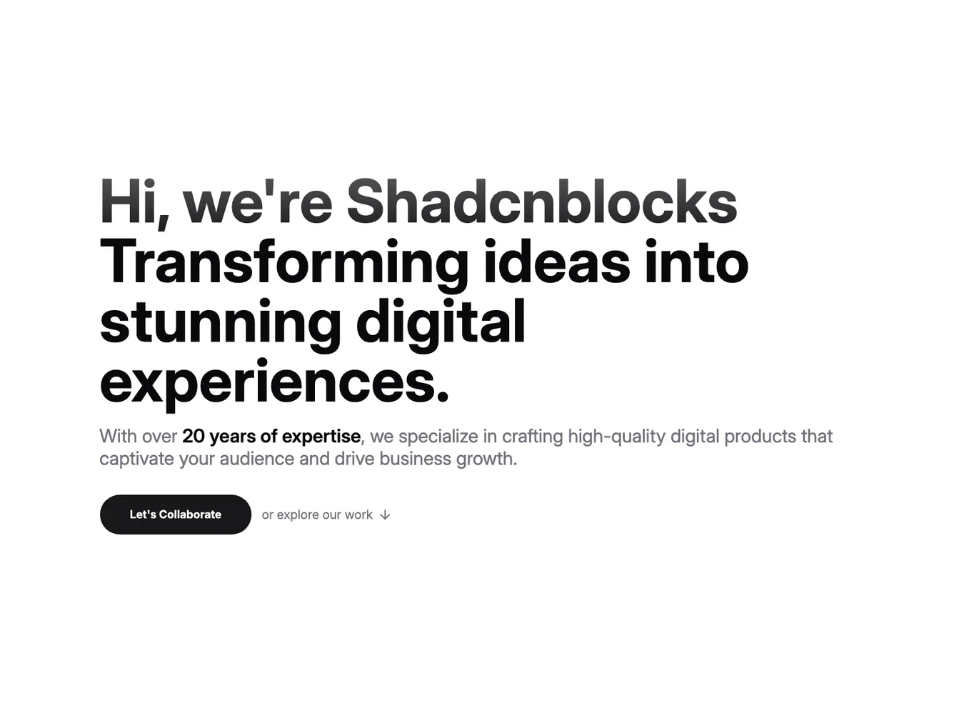
- Shadcn Hero Personal - Hero Personal layouts for landing pages, product pages, and marketing sites.
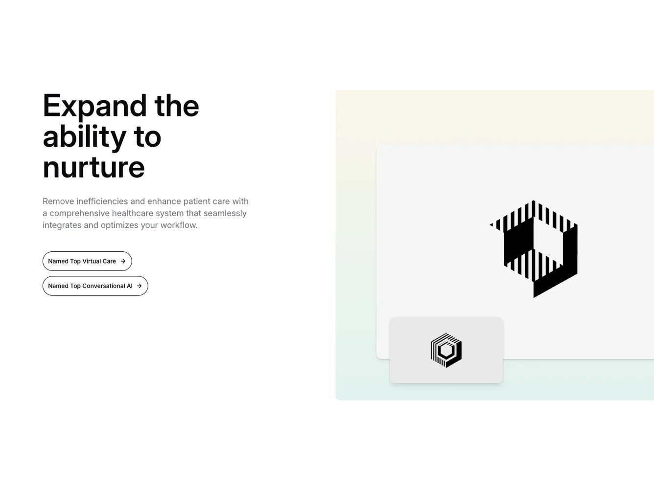
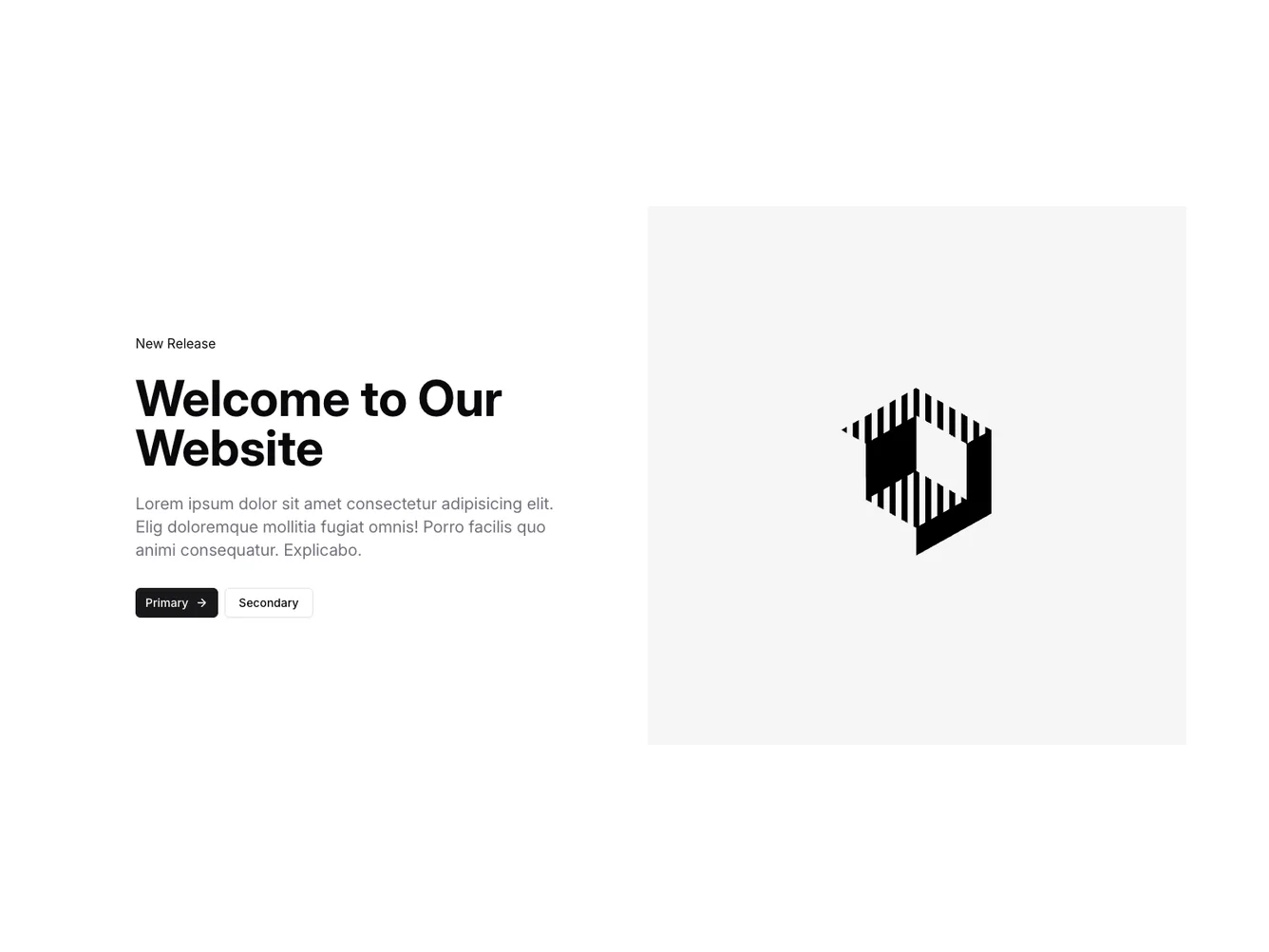
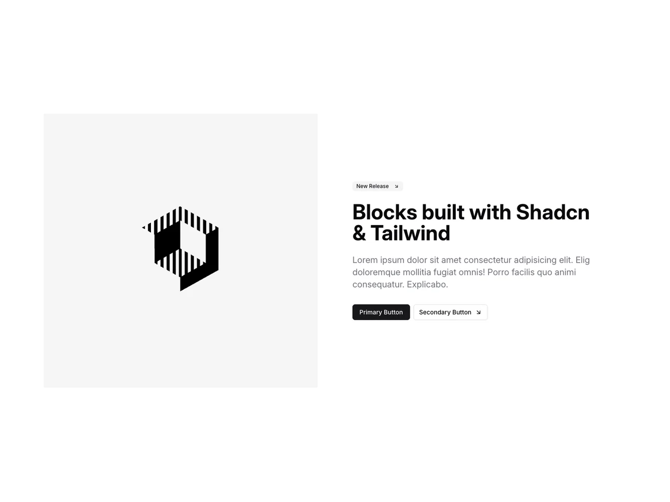
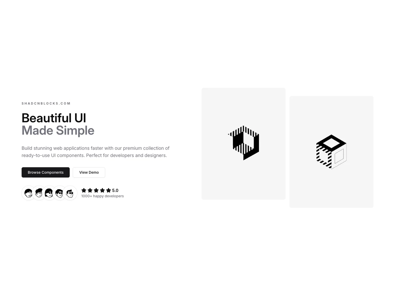
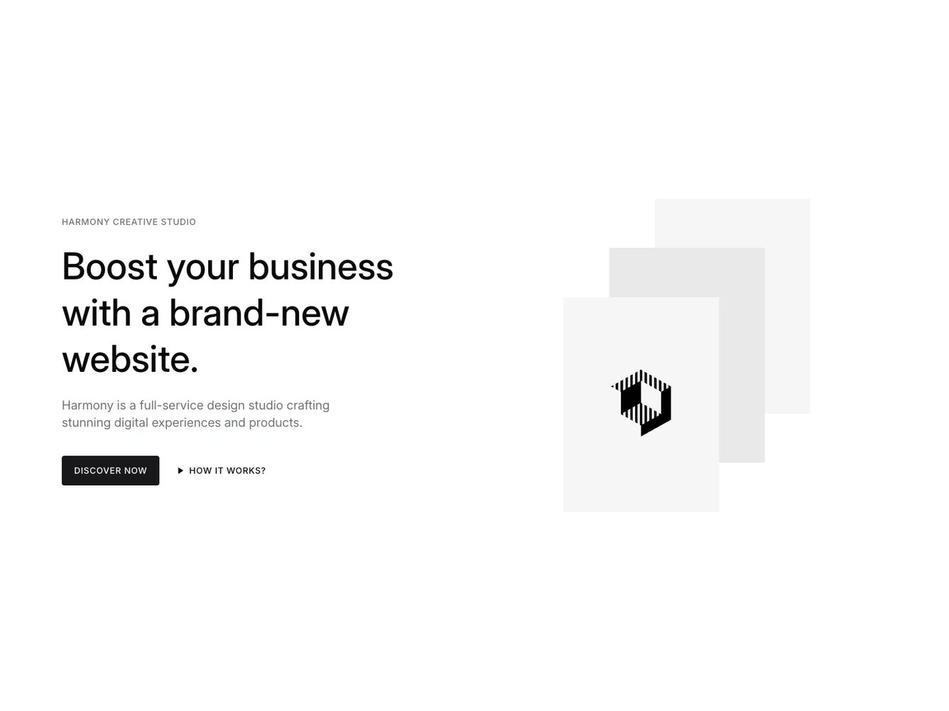
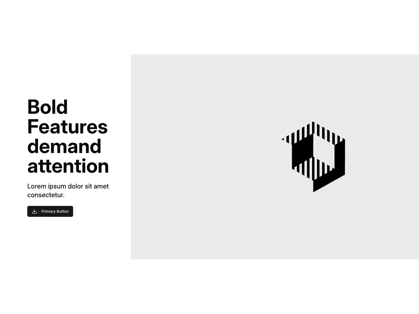
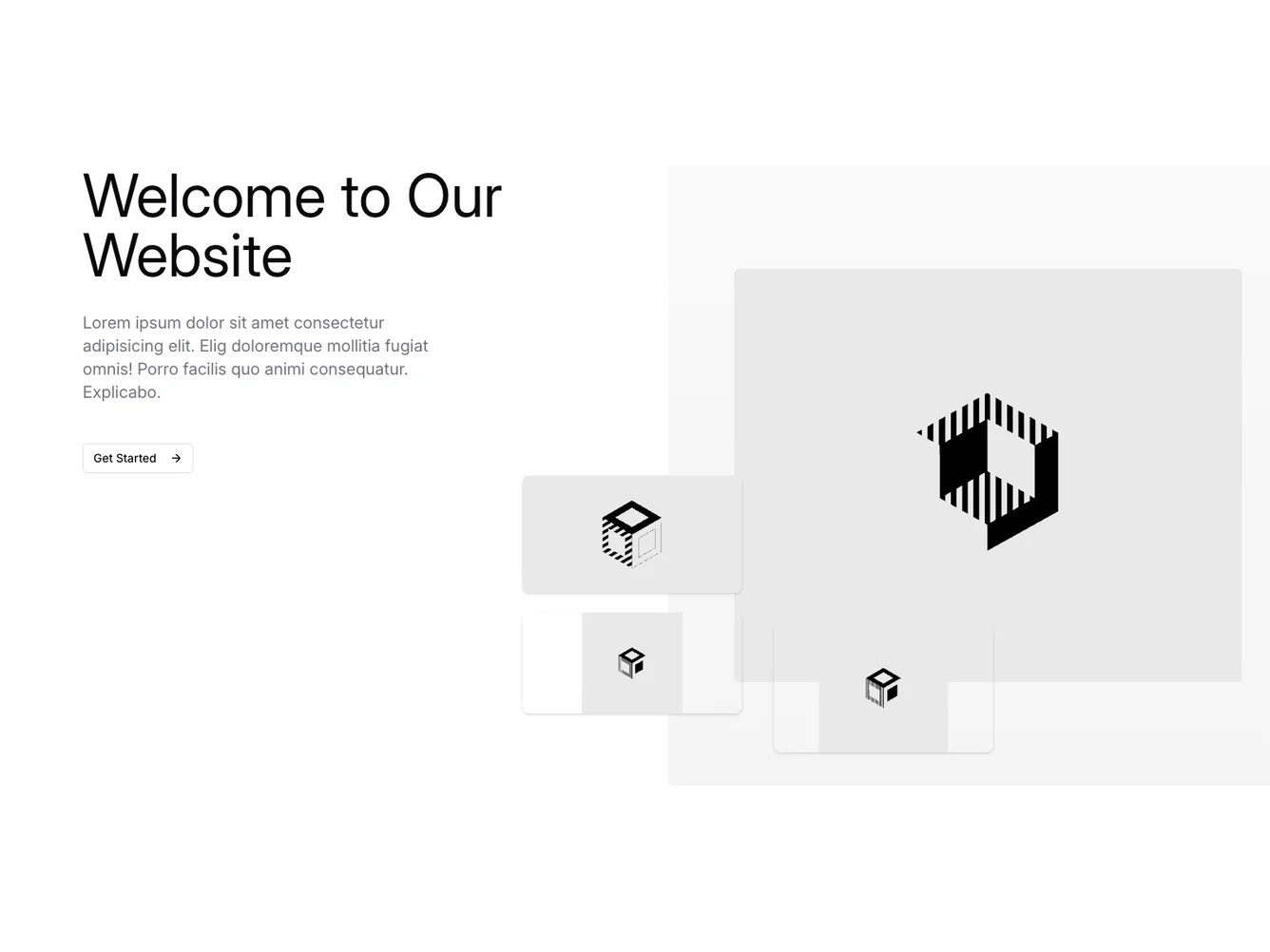
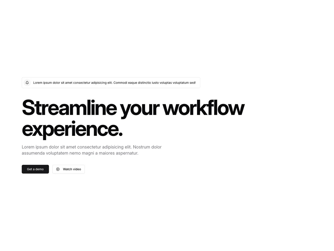
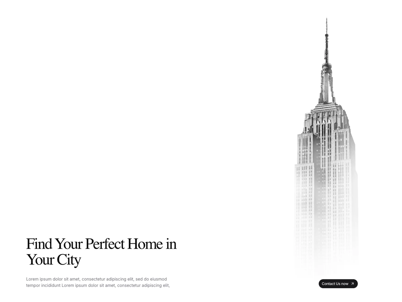
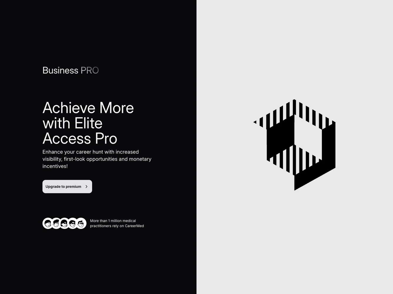
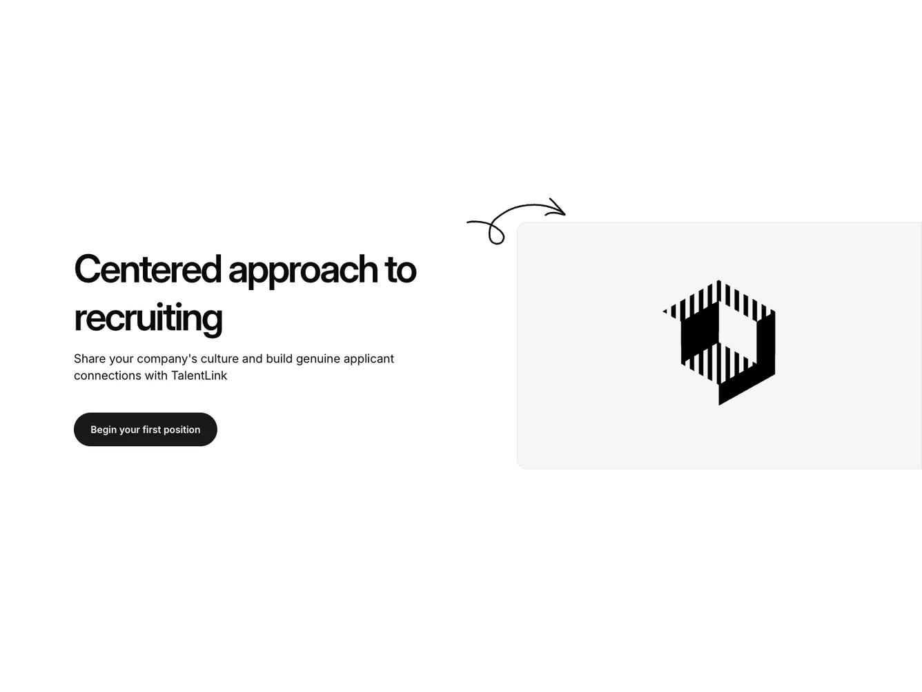
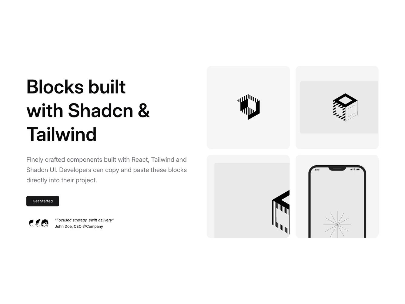
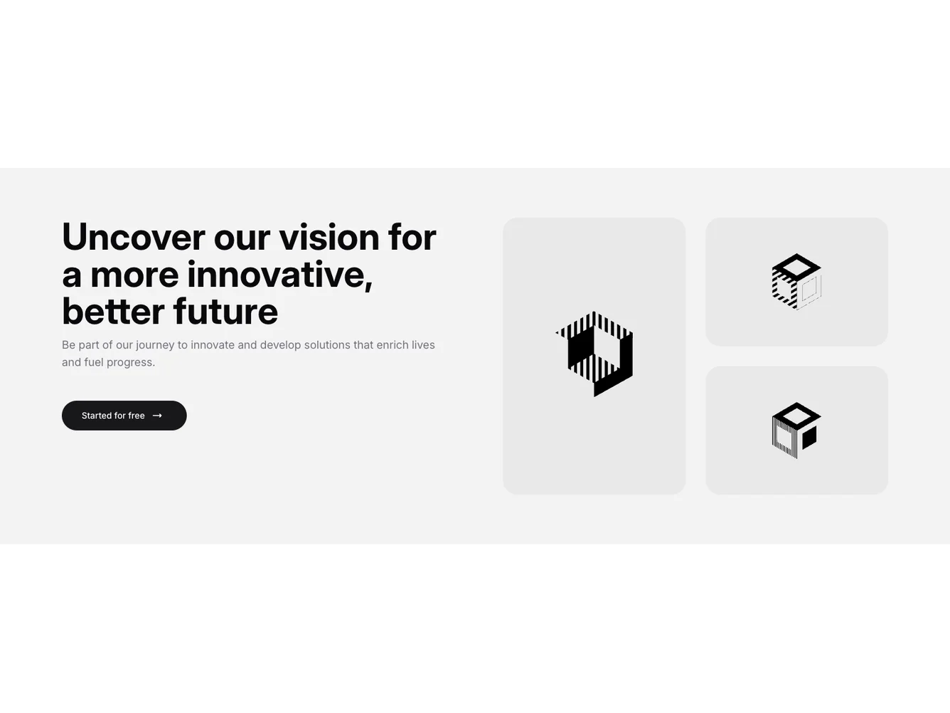
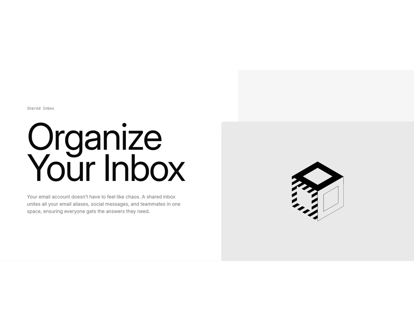
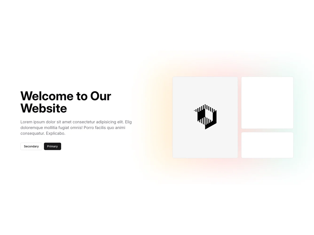
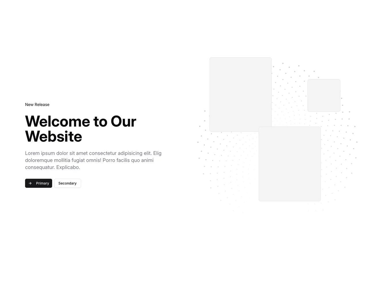
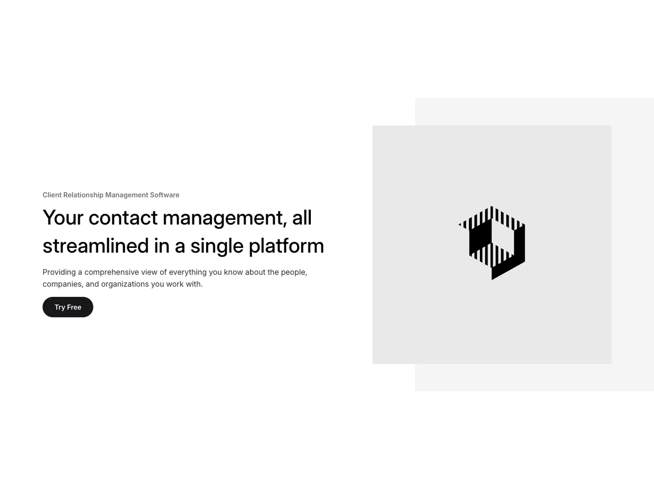
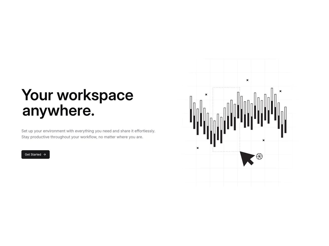
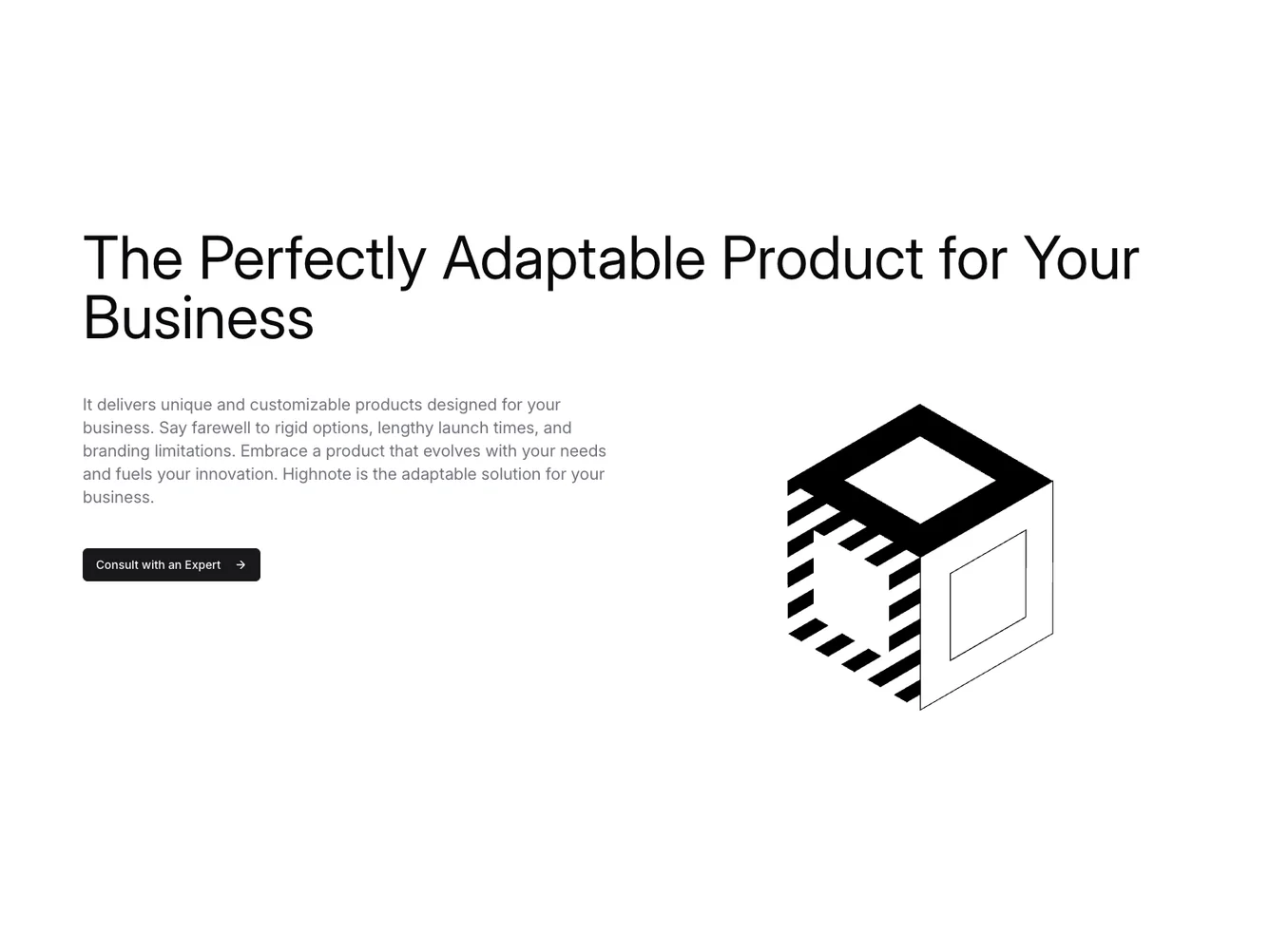
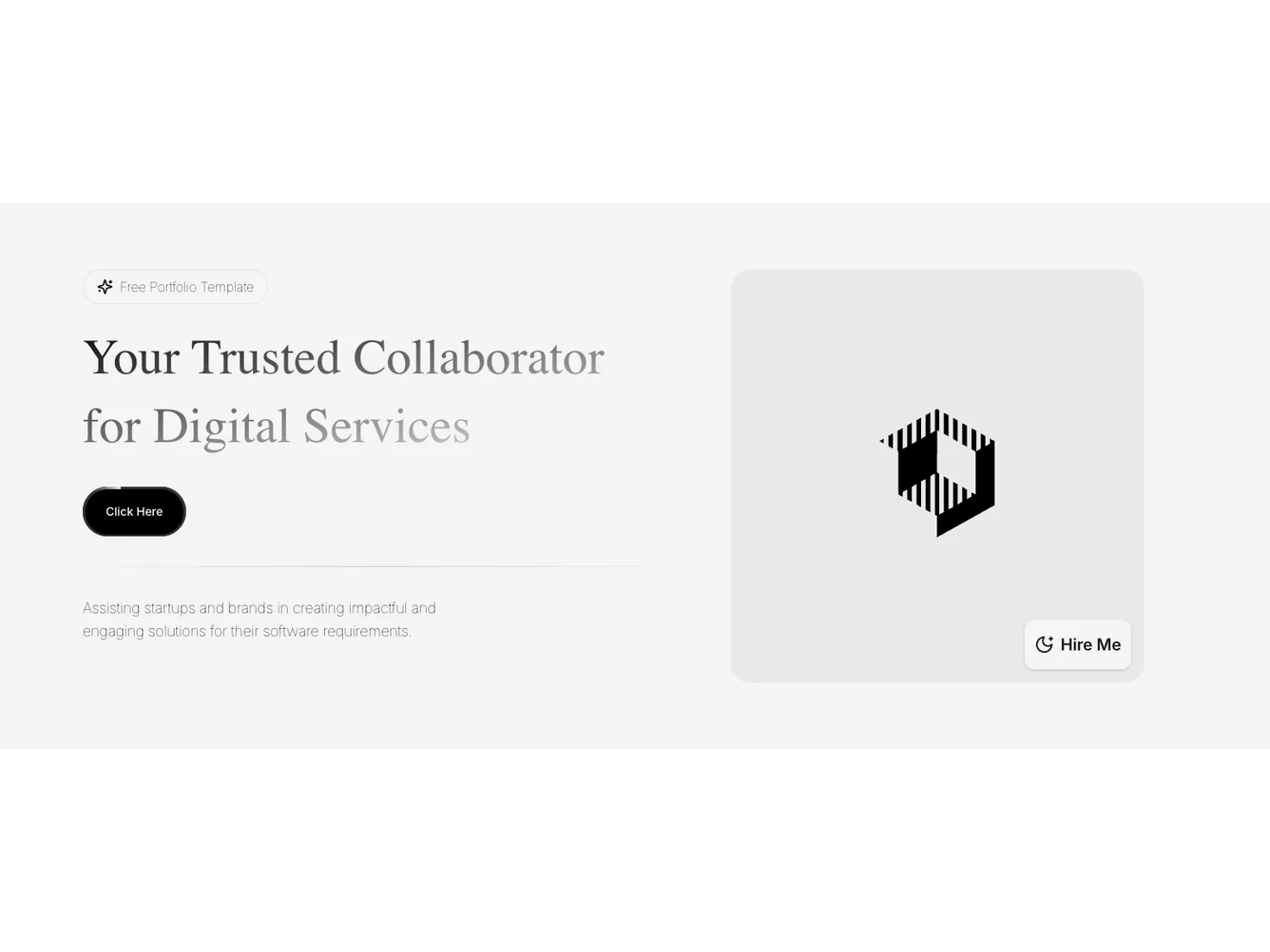
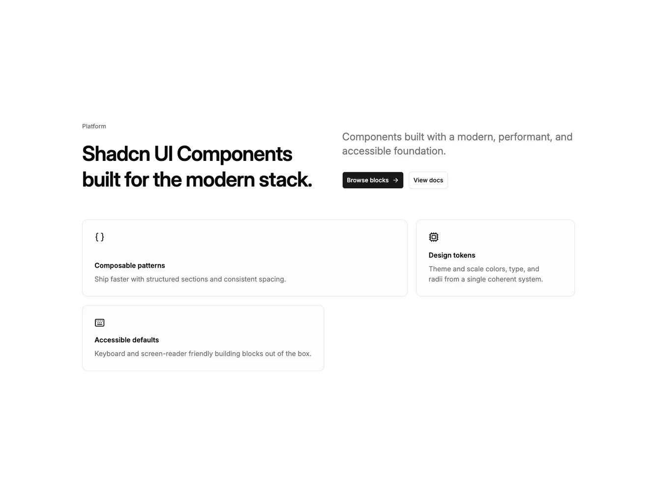
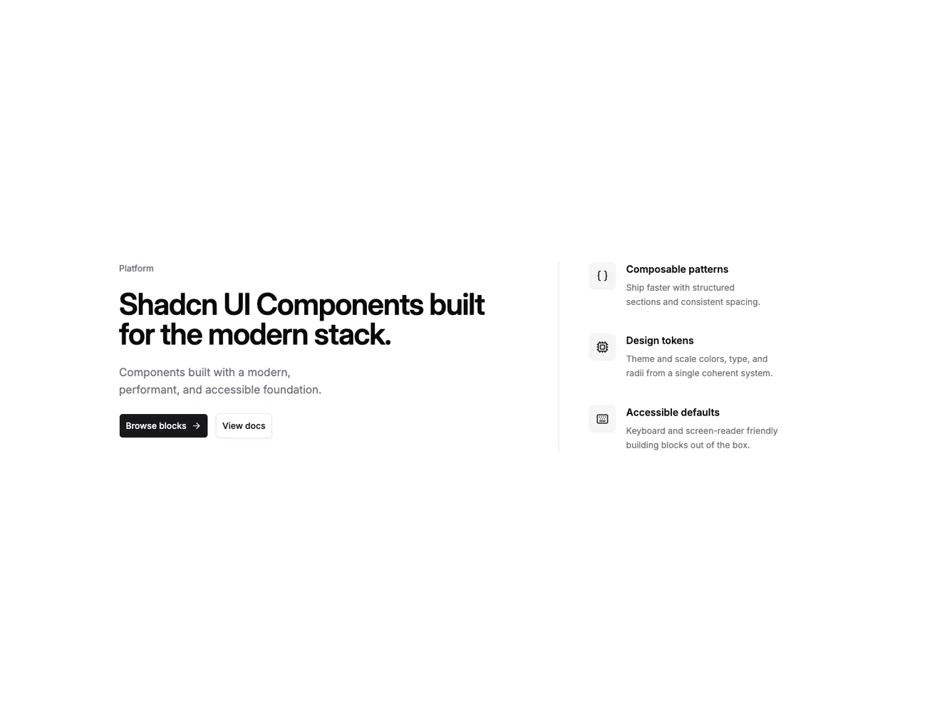
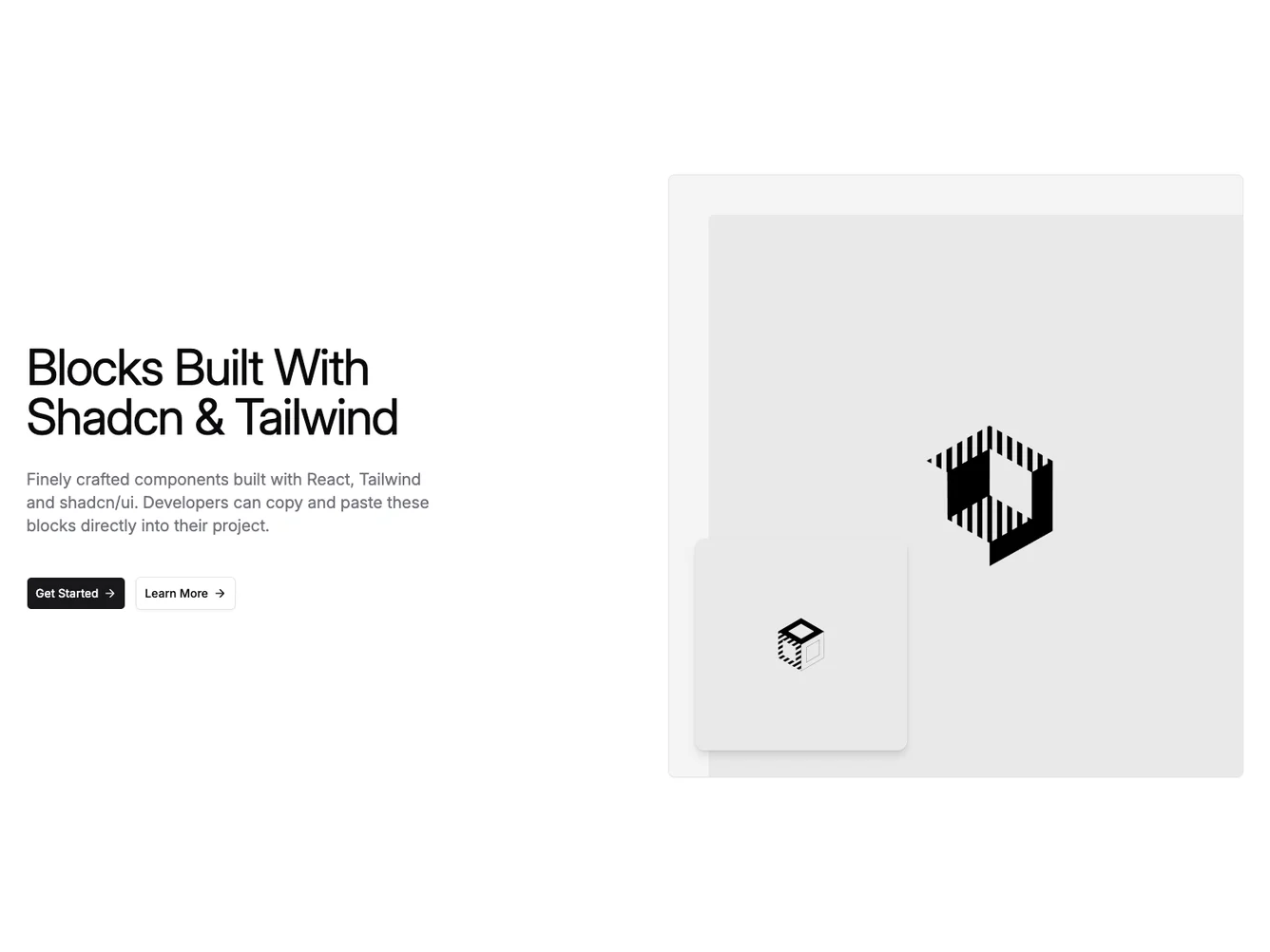
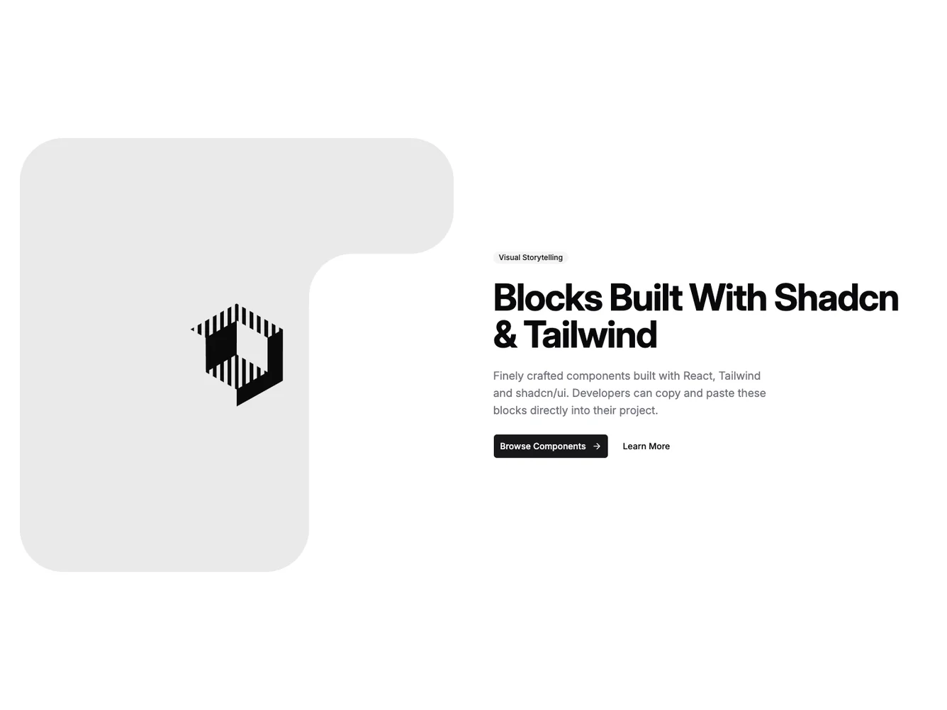
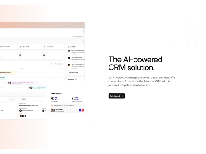
- Shadcn Hero Split - Two-column hero layouts with content on one side and imagery on the other.
Frequently Asked Questions
How are Shadcnblocks hero blocks built?
Shadcnblocks hero blocks are built with React, Tailwind CSS, and shadcn/ui components.
What technologies are used to build Shadcnblocks hero sections?
Shadcnblocks hero sections are built with React, Tailwind CSS, and shadcn/ui components. They use standard React components and Tailwind utility classes for styling.
What frameworks do Shadcnblocks hero components work with?
Shadcnblocks hero components work with any React-based framework including Next.js, Remix, Astro, and Vite.
Can I customize Shadcnblocks hero blocks?
Yes. Every block is source code you add directly to your project. You can modify the text, images, colors, layout, and behavior using standard React and Tailwind patterns.
Do Shadcnblocks hero sections support dark mode?
Yes. All blocks use shadcn/ui’s theming system and support light and dark mode out of the box.
How do I install a Shadcnblocks hero block?
The best way to install a Shadcnblocks hero block is to use the shadcn CLI: npx shadcn add @shadcnblocks/{blockId}.
Can I copy and paste the code into my project?
Yes. Every block is ready to copy and paste the code directly into your project. Just click the “code” tab on any block to view the source code.