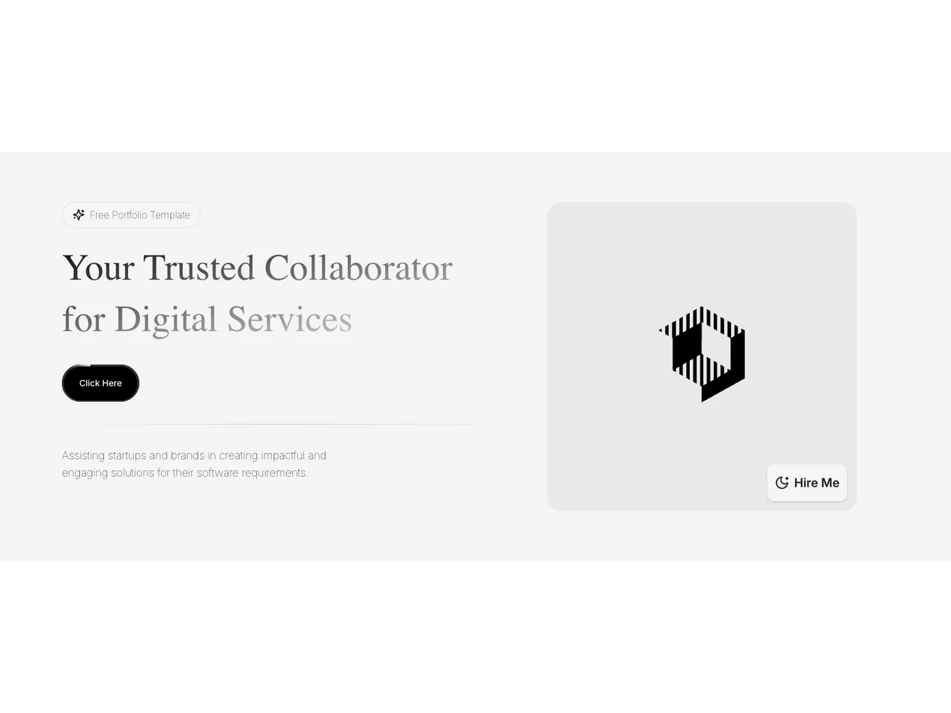
Shadcn UI Hero Block
The Hero107 component is a visually captivating layout designed primarily for use as a hero section in digital portfolios or professional landing pages. It presents an engaging introduction to one's digital services with strategically placed typography and interactive elements that draw user attention. This shadcn block effectively combines animated elements and dynamic visuals, making it a compelling choice for grabbing user attention and giving a professional look to a web presence.
Diving deeper, the Hero107 component is structured as a two-column layout with a prominent heading that introduces the provider as a trusted collaborator in digital services. This shadcn ui component feature includes an animated button element inviting users to explore further, asserting assurance through motion and styling. The design is supplemented by a resonance of a heading and various animated elements — notably the Sparkles and MoonStar icons integrated into the call-to-action buttons. Additionally, the component features an options button styled aesthetically to enhance interactivity, engaging visitors with its contemporary approach.
Dependencies
| Package | Type |
|---|---|
| lucide-react | NPM |
aspect-ratio @shadcn | Registry |
button @shadcn | Registry |
