Hero 170 block design & features
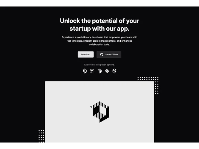
Hero170 is a single-column hero built with shadcn/ui capped to a moderate reading width. It delivers a startup-style headline and body, a primary download button beside a secondary GitHub star treatment using the react-icons mark, then muted helper text and a row of ghost icon buttons for integration brands. Below, a wide aspect-video-style illustration sits in a rounded top frame while dotted SVG flourishes anchor the corners.
Dark background and inverted icon treatments keep the hero app-focused. Typography stays crisp with balanced spacing between CTA pairs and the integration strip.
Standard SaaS landing pattern with an extra integration logo row for ecosystem credibility and a large product visual for quick scanning.
Decor dots hide on small widths in the underlying CSS to reduce clutter when the preview image narrows.