Hero 1 block design & features
This block is a text-first split hero built with shadcn/ui Badge and Button components. On large breakpoints the copy column sits in the first grid track and the image in the second; on small screens the text stack stays first in the document so the narrative leads, with the graphic below. The block uses theme tokens for borders, muted body copy, and standard outline and default button variants.
The content column is centered on mobile and flips to left-aligned from the large breakpoint, with CTAs in a full-width vertical group on narrow viewports and a horizontal row from sm, staying start-aligned on lg. The primary action uses a trailing arrow icon; the secondary uses the outline variant.
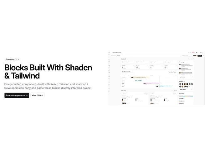
The hero graphic uses an aspect-video frame, rounded corners, a full border, and top-weighted cropping so screenshots stay composed predictably.
This is a common landing layout when you want the headline and actions to be read before the visual, while still giving the image roughly half the row on desktop.