Hero 47 block design & features
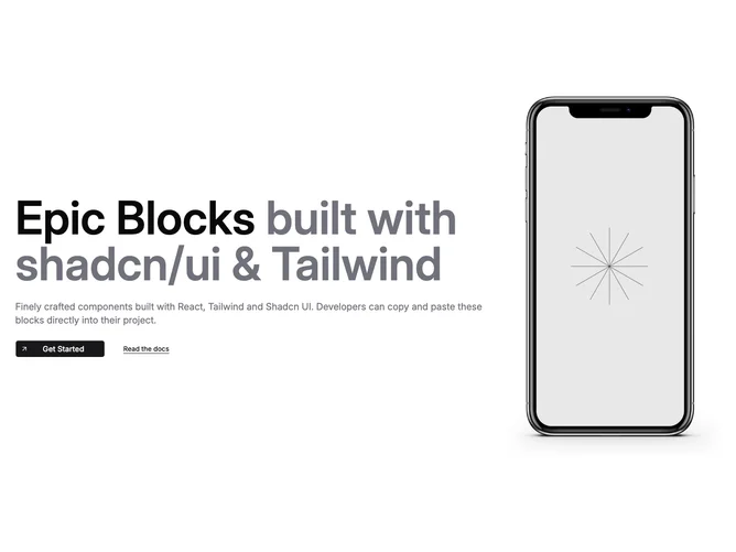
Hero47 pairs editorial typography with hardware framing using shadcn/ui buttons and anchors on the left while a device silhouette masks product imagery on the right. Props separate heading stem, muted continuation phrase, description, and paired actions so teams can remix messaging without touching layout math.
The primary control stacks iconography above label inside one composite anchor, while the secondary stays an understated underlined text link for documentation hops.
Visual personality skews developer-market minimal: plenty of whitespace, restrained borders, and reliance on one tall screenshot crop rather than collage.
Layouts stack vertically on small screens but regain side-by-side rhythm once horizontal space returns.