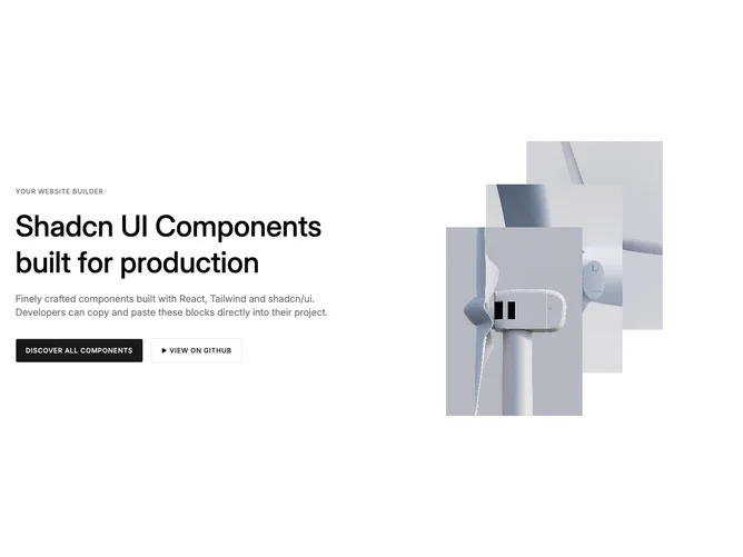
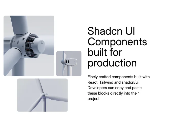
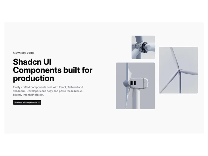
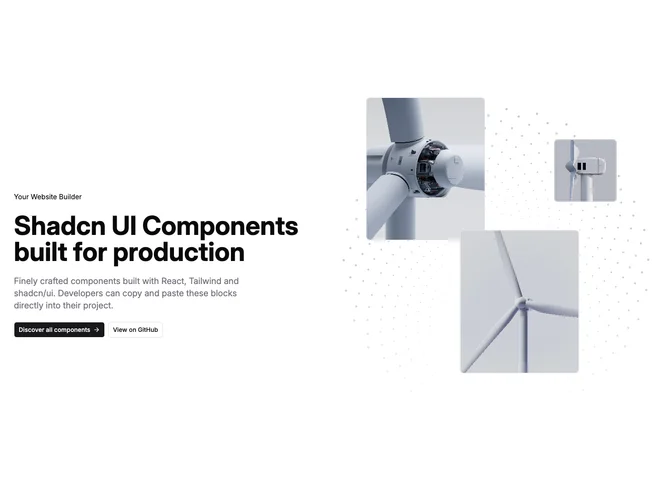
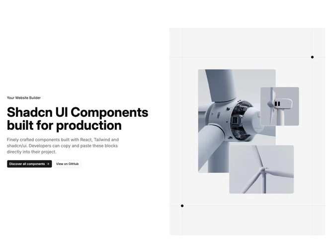
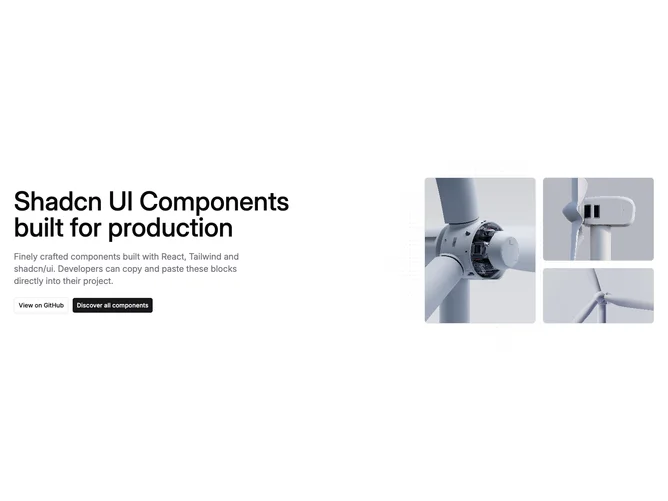
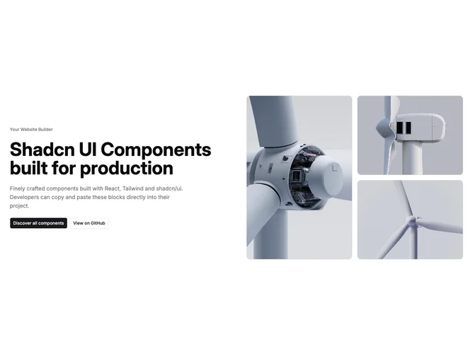
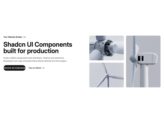
Shadcn Hero Tri Image Blocks

Browse and download 14+ Shadcn UI Hero Tri Image blocks. Built with React, Tailwind and shadcn/ui. These shadcn components are ready to download, copy and paste or install with the shadcn registry.

Shadcn Hero 83 - Centered hero with announcement badge and triptych

Centered hero with announcement badge and triptych

Shadcn Hero 99 - Centered hero with pill link and asymmetric photo grid

Centered hero with pill link and asymmetric photo grid

Shadcn Hero 185 - Editorial split hero with offset portrait duo

Editorial split hero with offset portrait duo

Shadcn Hero 173 - Studio hero with triple portraits and promo dialog

Studio hero with triple portraits and promo dialog

Shadcn Hero 165 - Split hero with serif headline and pastel tri-image lattice

Split hero with serif headline and pastel tri-image lattice

Shadcn Hero 178 - Support hero with mono label and triple photo stack

Support hero with mono label and triple photo stack

Shadcn Hero 39 - Rounded shell hero with geometric collage

Rounded shell hero with geometric collage

Shadcn Hero 166 - Split hero with crossfading image stacks and demo button

Split hero with crossfading image stacks and demo button

Shadcn Hero 158 - Vision hero with bento image trio

Vision hero with bento image trio

Shadcn Hero 35 - Split hero with lattice collage and paired CTAs

Split hero with lattice collage and paired CTAs

Shadcn Hero 30 - Split hero with mesh glow and layered imagery

Split hero with mesh glow and layered imagery

Shadcn Hero 50 - Centered hero with survey banner and layered screenshots

Centered hero with survey banner and layered screenshots

Shadcn Hero 38 - Split hero with dotted spiral art and framed rectangles

Split hero with dotted spiral art and framed rectangles

Shadcn Hero 172 - Hero with email signup and overlapping tri-images

Hero with email signup and overlapping tri-images

Shadcn Hero Tri Image Blocks

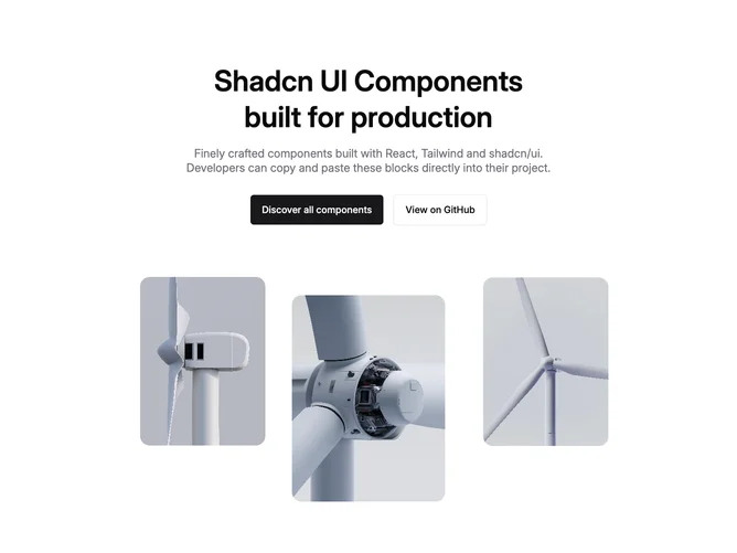
A shadcn hero tri image block features prominent imagery as a central design element. These layouts leverage photography or illustrations to create visual impact and reinforce messaging.

Each block is a self-contained React component which you can copy/paste the code or install via the shadcn CLI. You own the code — customize the layout, content, and styling using Tailwind utility classes.