Shadcn Hero Fullscreen Blocks

Browse and download 11+ Shadcn UI Hero Fullscreen blocks. Built with React, Tailwind and shadcn/ui. These shadcn components are ready to download, copy and paste or install with the shadcn registry.

Shadcn Hero 174 - Full-viewport photo hero with anchored footer ribbon

Full-viewport photo hero with anchored footer ribbon

Shadcn Hero 139 - Full-height insights hero with tech wordmarks

Full-height insights hero with tech wordmarks

Shadcn Hero 140 - Photo-shell hero with new badge and partner marks

Photo-shell hero with new badge and partner marks

Shadcn Hero 198 - Left-aligned fullscreen hero with serif headline

Left-aligned fullscreen hero with serif headline

Shadcn Hero 199 - Right-aligned fullscreen hero with serif headline

Right-aligned fullscreen hero with serif headline

Shadcn Hero 254 - Full-height hero with grid veil and motion headline

Full-height hero with grid veil and motion headline

Shadcn Hero 145 - Hiring hero with rotating role titles

Hiring hero with rotating role titles

Shadcn Hero 157 - Photo hero anchored with architectural headline

Photo hero anchored with architectural headline

Shadcn Hero 78 - Fullscreen photo hero with serif headline and grain veil

Fullscreen photo hero with serif headline and grain veil

Shadcn Hero 79 - Full-viewport photo hero with headline band

Full-viewport photo hero with headline band

Shadcn Hero 193 - Centered fullscreen hero with serif headline

Centered fullscreen hero with serif headline

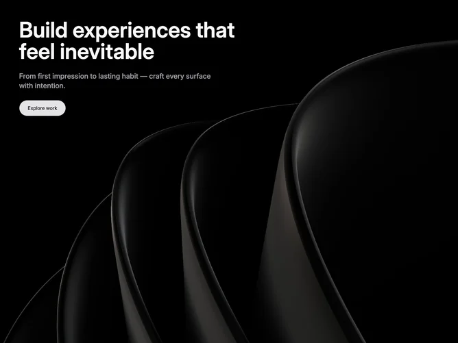
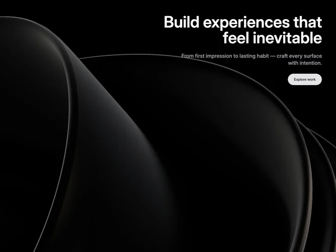
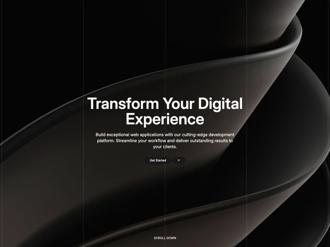
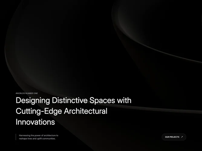
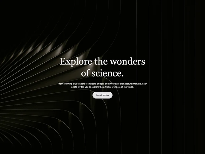
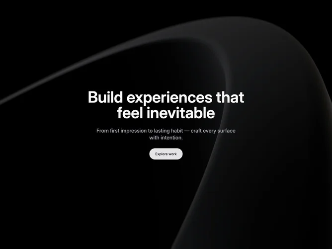
Shadcn Hero Fullscreen Blocks, Sections & Components

A shadcn hero fullscreen block expands to fill the entire viewport, creating an immersive hero experience. Fullscreen layouts command attention and work well for bold, visually-driven sections.

Each block is a self-contained React component which you can copy/paste the code or install via the shadcn CLI. You own the code — customize the layout, content, and styling using Tailwind utility classes.