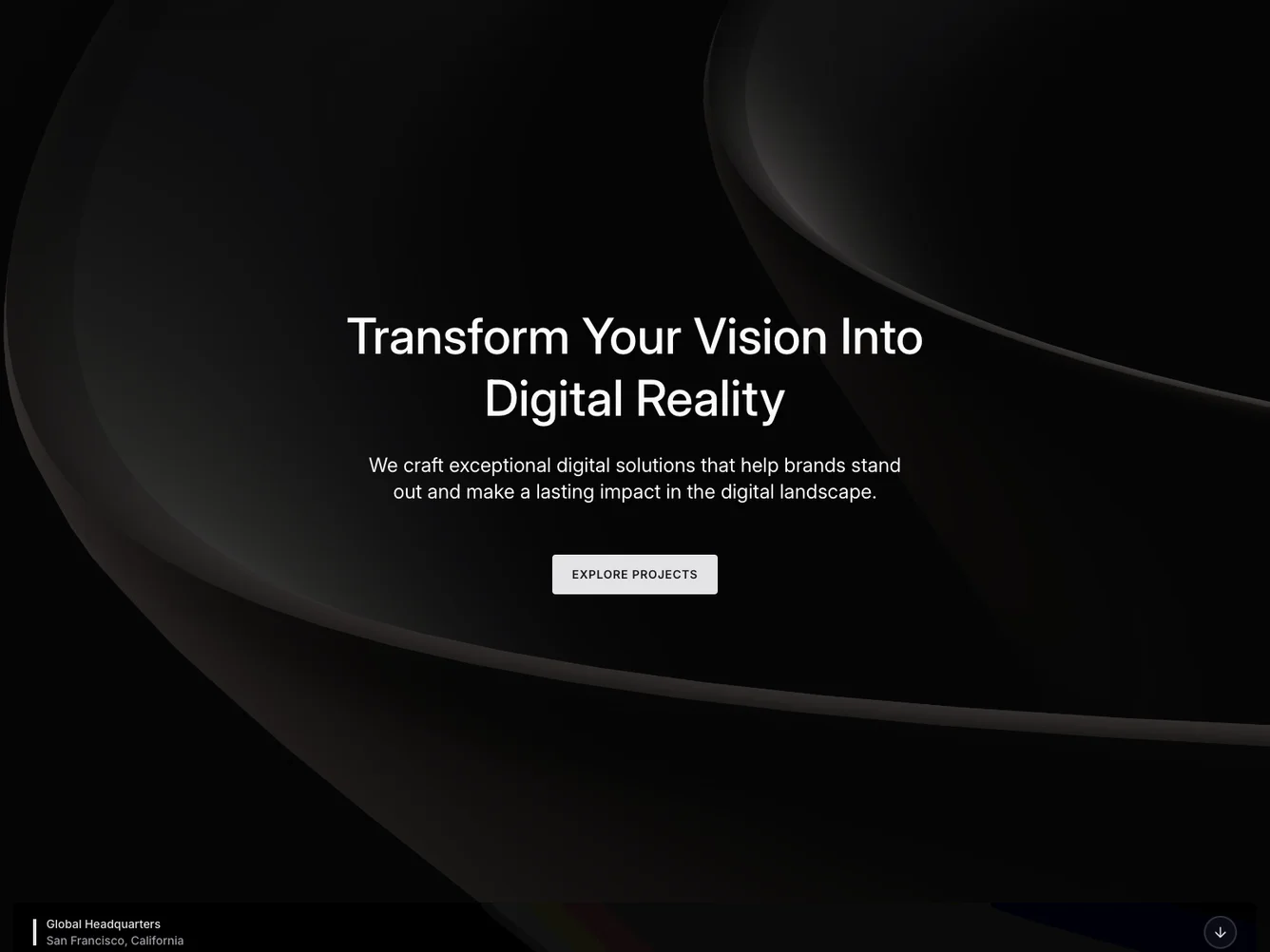
Shadcn UI Hero Block
The Hero174 component serves as an impactful introductory section designed to captivate users with a combination of visually appealing elements and engaging text. It is structured to highlight key information and provide a call to action that encourages user interaction. This component is perfect for setting the tone of a webpage by showcasing a company's mission or services through a compelling hero banner.
In more detail, the Hero174 component features a full-width background image overlaid with a dark tint to enhance text readability. It includes a title and a descriptive paragraph centered on the page, both designed to draw attention. Below the text, a call-to-action button invites users to explore further, adding interactivity. Additionally, the component has a visually distinct banner that displays location information and an arrow button, reinforcing the theme of guidance and invitation to scroll down.
Dependencies
| Package | Type |
|---|---|
| lucide-react | NPM |
| react | NPM |
button @shadcn | Registry |
