Hero 35 block design & features
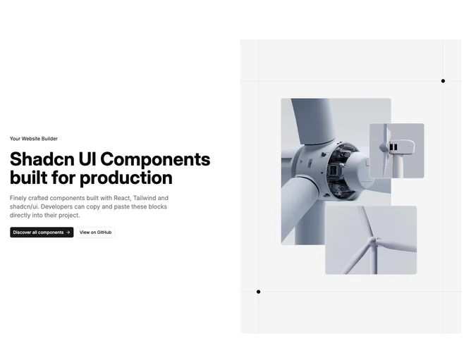
Hero35 is a split hero built with shadcn/ui that divides attention between conversational copy with twin buttons and an ornamental collage grid built from borders, corner rings, and three inset photo tiles at different scales.
Typography follows the familiar marketing rhythm: badge line, bold headline, muted paragraph, then stacked CTAs that widen on phones before sitting side by side on wider layouts.
The collage side reads like drafting-table geometry with accent wash and hairline rules, giving creative-studio flair compared with plain split photography.
Large breakpoints retain asymmetric balance because the lattice occupies full column height while text stays vertically centered through padding.