Shadcn UI Hero Block
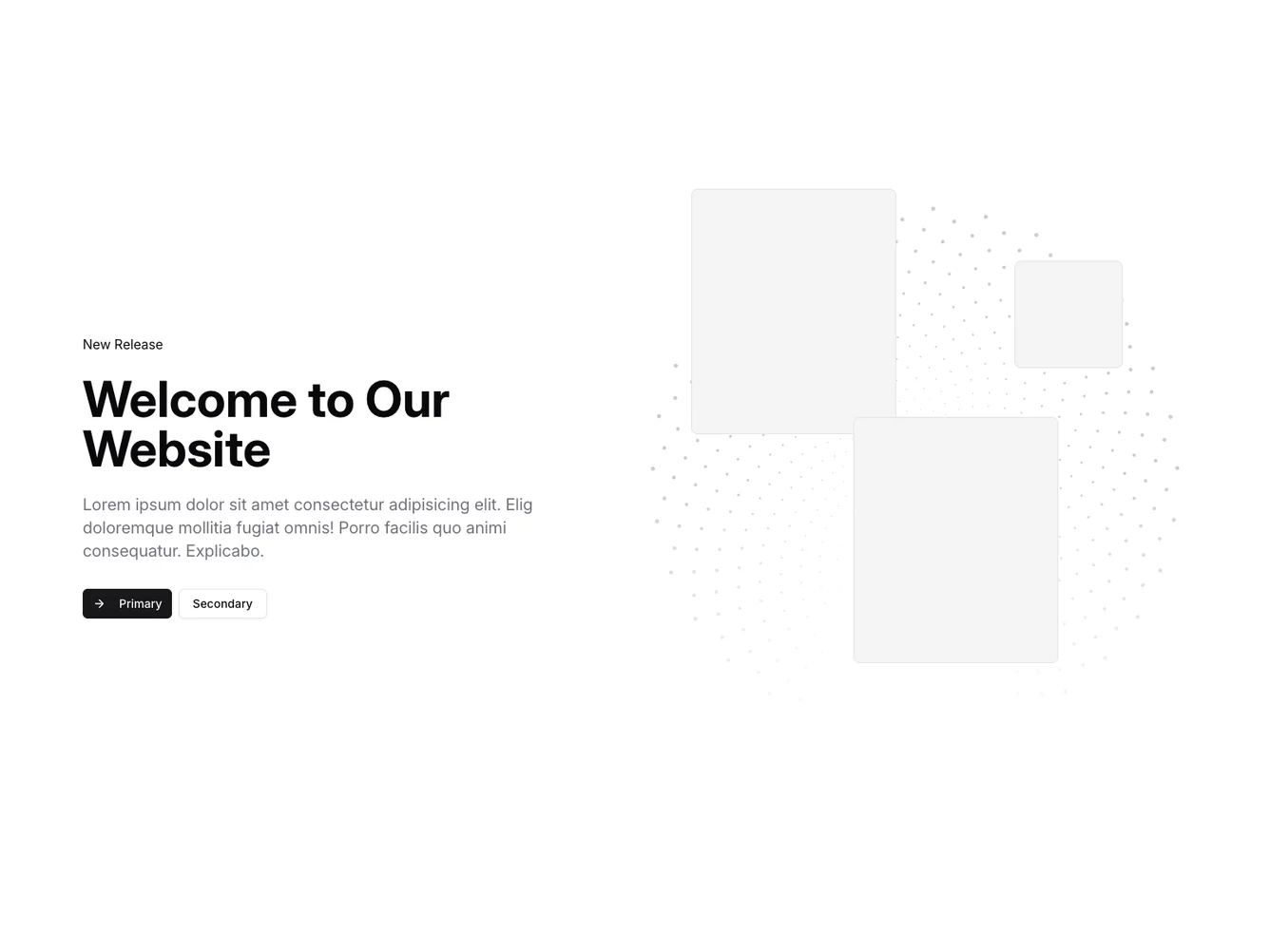
The Hero38 component serves as an engaging introductory section for a webpage, combining eye-catching visuals with prominently placed textual elements. It highlights a new release or announcement with bold messaging and interactive buttons to engage site visitors. Designed as a compelling first impression, this section integrates graphics and text to captivate users instantly.
This shadcn block features a grid layout dividing the content into two main areas: a text-focused section and a visually appealing graphic representation. The text area includes a headline, description, and call-to-action buttons, arranged for both center and left alignment depending on screen size, enhancing readability. On the other side, dynamic SVG graphics arranged in a pattern add a unique visual flair that draws users' attention. This effectively combines structured content delivery with an artistic touch.
Dependencies
| Package | Type |
|---|---|
| lucide-react | NPM |
button @shadcn | Registry |
