Hero 50 block design & features
Hero50 is a centered hero built with shadcn/ui. A pill-shaped announcement anchor mixes body copy, divider icon, and emphasized trailing link text suited to surveys or timed campaigns. Below, centered headline and muted paragraph give room for community-focused storytelling before solid and outline large buttons align horizontally when space allows.
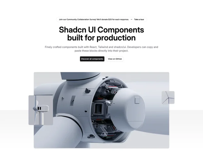
The media band introduces a tall rounded screenshot lifted by layered shadows while a subtle vertical gradient wash separates hero from page chrome; supplemental thumbnails dock along left and right midlines on medium screens upward.
Product-launch geometry with a dominant center capture and flanking stills. Complexity is moderate from the layered photo staging plus dual CTAs and optional announcement row.
Mobile hides peripheral thumbnails but preserves the central screenshot stack for continuity.