Hero 83 block design & features
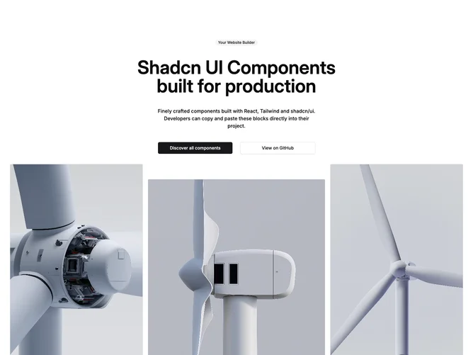
Hero83 is a centered marketing hero built with Shadcn UI. The upper block stacks a secondary badge, a multi-line headline, short supporting copy, and two large buttons that stretch on phones then sit side by side on wider layouts. Under that, three ratio-locked frames sit in one row with deliberate width weights so the middle canvas reads as the hero width.
Alignment is strictly center so the type block feels like a podium announcement. Images use thin borders, top-weighted crops, and muted cards so photography stays crisp against a plain background.
Classic launch geometry: announce, explain, give two paths, then show product stills. Complexity is moderate thanks to the trio of locked-ratio images plus dual CTAs.
Narrow viewports keep the vertical stack; the triptych squeezes proportionally while preserving the width mix.