

Hero 39 block design & features
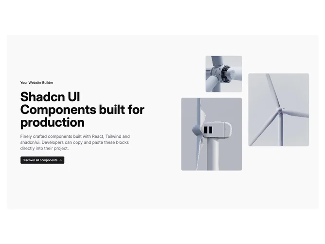
Hero39 wraps a two-column layout inside a softened rounded panel so the split reads as one contained module rather than edge-to-edge chrome. The text column stacks a badge line, bold headline, muted paragraph, and single primary shadcn/ui button with trailing arrow while alignment shifts from centered on phones to left-led on large screens.
Opposite column holds three photos positioned at different corners inside a tall frame with hairline borders and accent fills peeking behind the crops.
Palette relies on a shared accent wash plus bordered rectangles, giving creative toolkit energy with real photography instead of empty placeholders.
The overlapping anchors create depth without animation; spacing stays generous inside the shell on all breakpoints.