Hero 30 block design & features
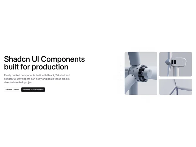
Hero30 is a split hero built with shadcn/ui. The left column centers on small screens then left-aligns on large breakpoints with headline, supporting paragraph, and outline plus solid buttons. The right column groups three photos: one tall portrait beside two stacked landscape tiles whose combined height matches the primary frame.
Behind the photography sits a faint plus-sign grid inside a soft circular fade, so the pattern dissolves rather than ending in a hard box. Bordered rounded frames keep the images crisp against open background.
Restrained and product-focused with editorial photo staging. The staggered tile heights are the main layout signature.
On medium widths only the tall primary photo shows; the stacked pair returns at small-large and extra-large breakpoints.