Hero 173 block design & features
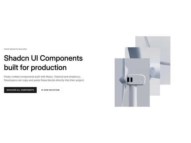
Hero173 is a two-column studio hero built with shadcn/ui. Copy leads with uppercase eyebrow typography, oversized headline lines, roomy supporting prose, a filled primary route, and an uppercase ghost control that opens a walkthrough video inside a modal iframe. Imagery staggers three portrait crops diagonally to imply depth behind the typography column.
Muted photography holds center stage while typography keeps strong contrast without heavy borders.
Quiet editorial pacing that only animates perception once the viewer opens the video.
Responsive spacing tightens the grid but retains the overlapping portrait choreography on tablet and desktop.